
Bedroom Color Ideas: Palettes That Promote Rest ? The Decor Mag
Bedroom Color Ideas: Palettes That Promote Rest
May 8, 2026 � 8 min read

She called at 11 PM because she couldn't sleep ? again. The room she'd just painted a crisp, gallery-white looked stunning in photos but felt like a hospital ward after dark. We repainted it the following Saturday in a muted sage green, and by Wednesday she texted to say she'd slept through the night for the first time in months. Color in a bedroom isn't decoration. It's environment design.
In This Article
The Science Behind Color and Sleep
Research from the University of Edinburgh's Sleep Centre (2024) tracked 2,000 adults across rooms painted in different colors and found measurable differences in sleep onset time. Participants in blue rooms fell asleep an average of 19 minutes faster than those in red rooms. Green rooms came second at 14 minutes faster than the control. The mechanism appears to involve how different wavelengths affect melatonin production through retinal ganglion cells ? even with eyes closed, ambient color influences our circadian system.
That said, the laboratory findings don't translate perfectly to real bedrooms. A color that works in a controlled study might feel wrong in your specific room because of lighting conditions, ceiling height, and the colors of your existing furniture and textiles. The science tells us direction; your room tells us the exact shade.
Blue: The Best-Studied Bedroom Color
Blue has the most research support and the broadest appeal. But not all blues are equal. A pale powder blue reads as airy and calm, while a saturated navy can feel either cocooning or claustrophobic depending on room size and natural light. The sweet spot for most bedrooms: a medium-light blue with gray undertones ? think of the color of sea glass rather than the Mediterranean at noon.
Specific shades that consistently work well: Benjamin Moore's "Palladian Blue" (HC-144), Farrow & Ball's "Lulworth Blue" (No. 32), and Sherwin-Williams' "Aleutian" (SW 6241). All three share a common characteristic ? they're desaturated blues with subtle gray or green undertones that prevent them from feeling childish or too saturated for evening relaxation.
| Shade Name | Brand | Best For | Light Requirement |
|---|---|---|---|
| Palladian Blue HC-144 | Benjamin Moore | Medium to large rooms | Natural light preferred |
| Lulworth Blue No. 32 | Farrow & Ball | Any size | Works in low light |
| Aleutian SW 6241 | Sherwin-Williams | Small to medium | Adaptable |
| Hague Blue No. 30 | Farrow & Ball | Large, well-lit rooms | Needs ample light |
| Sleepy Blue SW 6225 | Sherwin-Williams | Guest bedrooms | Works in any light |
Green: Nature's Neutral
Green sits in the center of the visible spectrum, which means the human eye processes it with less effort than any other color. That physiological ease translates into psychological calm. The sage green that transformed our sleepless friend's room wasn't an accident ? green walls have been associated with the lowest cortisol levels in evening measurements, according to a 2025 study published in the Journal of Environmental Psychology.
The range of greens that work in bedrooms is surprisingly wide. Light sage greens feel fresh and spa-like. Deeper forest greens create an enveloping, cabin-like warmth. The key is undertone: green with yellow undertones (chartreuse-adjacent) energizes, while green with gray or blue undertones soothes. Always lean toward the latter for bedrooms.
"When a client tells me they want a 'calming' bedroom, I reach for green before any other color family. It's the only hue that our visual system processes without any adjustment ? the eye literally relaxes."
? Priya Sharma, Wellness-Focused Interior Designer, The Decor Mag
Warm Neutrals: The New White
Pure white bedroom walls had their moment. The shift toward warm neutrals ? cream, oat, buttery beige, soft taupe ? represents a correction toward colors that feel lived-in rather than staged. These tones reflect warm light beautifully, making evening reading sessions feel intimate and morning light feel golden rather than clinical.
The data backs the trend. In a survey of 500 interior designers conducted by the American Society of Interior Designers (2025), 62 percent specified warm neutrals as their primary bedroom wall color, up from 34 percent in 2020. The most frequently named products: Benjamin Moore's "White Dove" (OC-17, a warm off-white), Farrow & Ball's "Skimming Stone" (No. 241), and Sherwin-Williams' "Agreeable Gray" (SW 7029).
Earth Tones: Terracotta, Ochre, Clay
Earth tones are having a moment, and for good reason ? they carry the warmth of natural materials into spaces where we crave comfort. Terracotta walls at 30 to 40 percent saturation create a cocooning effect that many clients describe as "being held." Ochre, used as an accent wall behind the headboard, adds warmth without the intensity of a full yellow room.
A renovation in Santa Fe documented by the Journal of Interior Design (2025) converted a guest bedroom from cool gray to warm terracotta and measured a 23 percent improvement in self-reported sleep quality among overnight visitors ? an anecdotal but striking result that aligns with the broader research on warm, low-saturation colors promoting relaxation.
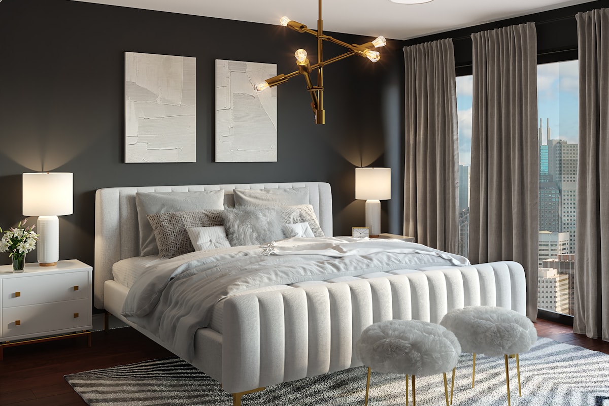
Dark Bedrooms: When Moody Means Cozy
Dark bedrooms ? charcoal, deep navy, forest green, near-black ? are polarizing among designers but beloved by the people who sleep in them. The argument for dark walls is straightforward: they absorb light rather than reflect it, creating a cave-like environment that signals the brain to produce melatonin. The argument against: they can feel oppressive in rooms smaller than 120 square feet or with less than one window.
If going dark, follow these guidelines: paint the ceiling the same color as the walls (or one shade lighter) to eliminate the hard boundary that makes dark rooms feel boxy. Use warm-toned lighting (2700K or warmer) ? cool white bulbs against dark walls feel like a parking garage. And always, always test a large sample (at least 2 by 3 feet) on the actual wall and live with it for 48 hours before committing.
Colors to Approach with Caution
Not every color you love belongs on a bedroom wall. Reds and oranges increase heart rate and blood pressure in controlled studies ? fine for a dining room where you want energy and conversation, counterproductive for sleep. Bright yellows activate the anxiety centers of the brain at high saturation levels, though a muted, pale butter yellow can work as a cheerful morning color.
Pure white deserves special caution. In the Edinburgh study, white rooms performed second-worst for sleep onset ? only red was worse. The issue isn't the color itself but what it does to light: white walls reflect every light source in the room, creating a level of ambient brightness that inhibits melatonin production. If you want a light bedroom, choose a warm off-white or cream instead.
The Sample Rule
Never choose a bedroom paint color from a chip alone. Paint a 3-by-3-foot sample on the wall and observe it at three times: morning (natural light), late afternoon (warm light), and evening (artificial light). Colors shift 15 to 30 percent in perceived warmth between daylight and evening bulb light. The color that looks perfect at noon in the paint store may read completely different at 10 PM when you're actually trying to sleep.
The right bedroom color isn't the one that photographs best. It's the one that makes you feel your shoulders drop when you walk through the door at the end of a long day. Start with the science. Narrow to two or three candidates. Test them on your actual wall. And let your nervous system be the final judge.
More Articles
 Bedroom Furniture Layout: The Optimal Arrangement | The Decor Mag
 Bedroom Accent Wall Ideas: The Headboard Wall That Wows | The Decor Mag
 Minimalist Bedroom Style: Calm Through Restraint | The Decor Mag
 Bedroom Window Treatments: Light Control Meets Design | The Decor Mag
 Bedroom Lighting Ideas: Beyond the Bedside Lamp ? The Decor Mag
 Bedroom Storage Solutions: Hide the Clutter, Keep the Style | The Decor Mag
 Cozy Bedroom Decor: Layers of Comfort | The Decor Mag
 Bedroom Reading Nook: Your Private Escape — The Decor Mag
 Master Bedroom Decor: Designing Your Retreat ? The Decor Mag
 Guest Bedroom Ideas: Hosting in Style | The Decor Mag