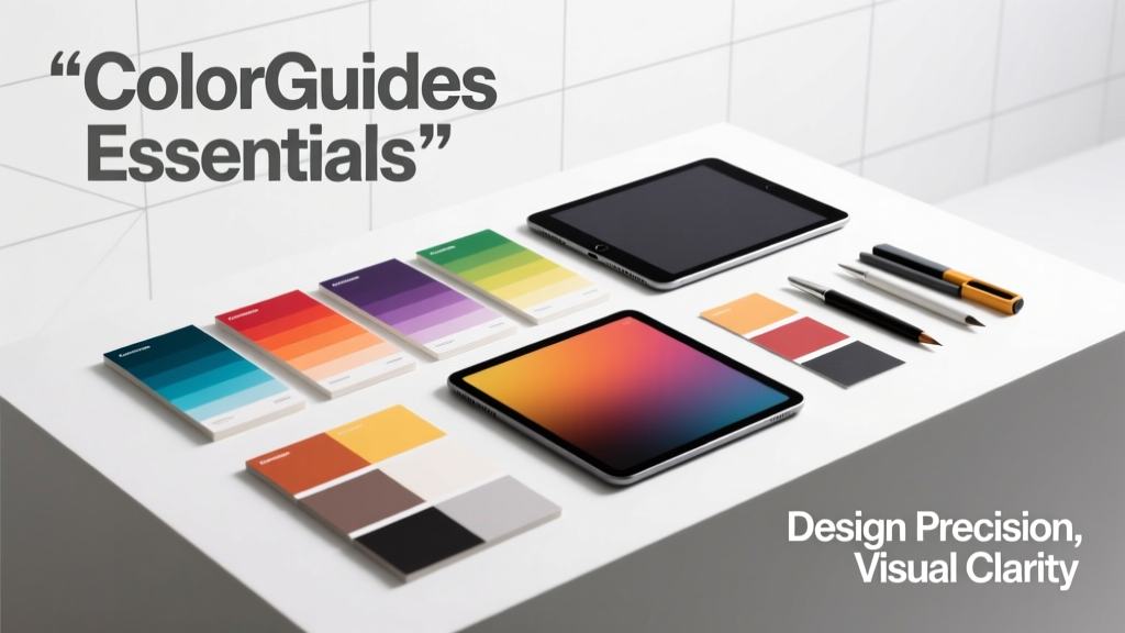
Layout Colorguides Essentials: Precision, Consistency, and Cross-Platform Fidelity
Layout Colorguides Essentials establishes the foundational discipline that bridges visual design intent with engineering execution. It defines how spatial relationships (margins, padding, grid columns, baseline rhythms) and chromatic systems (hue families, contrast ratios, semantic tokens, dynamic light/dark modes) are codified, versioned, and enforced across platforms. Unlike ad-hoc design decisions, a robust Layout Colorguide mandates exact values—such as Apple’s 8-point spacing scale (8px, 16px, 24px, 32px, 40px, 48px), IBM’s 4px baseline grid, or Google’s Material 3 4dp/8dp/12dp/16dp increments—and ties them to accessible color palettes meeting WCAG 2.1 AA (minimum contrast ratio 4.5:1 for normal text) and AAA (7:1). This article details specification structure, token naming conventions, responsive behavior rules, cross-platform synchronization challenges, and audit protocols used by Fortune 500 design systems.
What Is a Layout Colorguide—and Why It’s Not Optional
A Layout Colorguide is a living, machine-readable specification that unifies dimensional logic and chromatic behavior into a single source of truth. It goes beyond static style tiles or Figma libraries: it prescribes how spacing units map to component states (e.g., spacing-md = 16px in light mode, 20px in high-contrast mode), how color tokens resolve to platform-native values (e.g., surface-primary → #FFFFFF on iOS, rgb(255 255 255) on web), and how those values shift under environmental conditions like reduced motion or forced colors. Without such guidance, teams experience layout drift—where a card’s internal padding renders as 12px in React but 14px in SwiftUI—and color inconsistency—where status-error appears as #E53E3E in web but #C53030 in Android, violating brand recognition and accessibility thresholds.
IBM’s Carbon Design System enforces strict layout fidelity: its spacing scale uses a 4px base unit, with all values divisible by 4 (4px, 8px, 12px… up to 128px), ensuring pixel-perfect alignment on retina and non-retina displays alike. Similarly, Salesforce Lightning Design System specifies exact gutter widths (1rem = 16px) and column counts (12-column grid at desktop, 4-column at mobile), with CSS custom properties (--lgs-spacing-x-small, --lgs-spacing-medium) mapped directly to Sass variables and JavaScript runtime tokens.
Core Components of a Production-Ready Guide
A mature Layout Colorguide contains five interdependent modules: (1) Spacing & Sizing, (2) Typography Scale, (3) Color Token Architecture, (4) Grid & Layout Rules, and (5) Environmental Adaptation Logic. Each module must include version numbers, deprecation timelines, usage constraints, and testable assertions. For example, Adobe Spectrum’s v4.0 guide defines size-100 as exactly 4px, size-200 as 8px, and explicitly prohibits direct pixel values in application code—requiring all spacing to be referenced via token names only.
Spacing Systems: From Pixels to Platform-Agnostic Tokens
Spacing is never arbitrary. A disciplined spacing system eliminates guesswork and ensures rhythmic harmony across UI density. Leading systems use multiplicative scales anchored to a base unit. Apple’s Human Interface Guidelines mandate an 8-point grid: all margins, padding, and component heights must be multiples of 8px (e.g., 8px, 16px, 24px, 32px, 40px, 48px, 56px, 64px). This aligns perfectly with iOS’s point-based rendering and simplifies conversion to @2x/@3x assets. Microsoft’s Fluent Design adopts a 4-unit scale (4px, 8px, 12px, 16px, 20px, 24px, 28px, 32px), optimized for Windows’ DPI scaling model and touch targets ≥44px.
Crucially, spacing tokens must be environment-aware. In Salesforce’s guide, spacing-small resolves to 0.5rem (8px) in default mode but expands to 1rem (16px) when prefers-reduced-spacing is detected—a media query supported in Chromium 122+ and Safari 17.3+. This prevents cramped interfaces for users with motor impairments.
Responsive Spacing Behavior
- Mobile-first resolution:
spacing-base= 8px onmax-width: 480px - Tablet adaptation:
spacing-base= 12px onmin-width: 768pxandpointer: coarse - Desktop density:
spacing-base= 16px onmin-width: 1200pxandhover: hover - High-contrast mode: All spacing tokens increase by 25% minimum per WCAG SC 1.4.12
These rules are not suggestions—they’re enforced via automated stylelint plugins and Storybook accessibility audits. Airbnb’s design system, for instance, fails CI builds if any component declares margin: 10px instead of margin: var(--spacing-medium).
Typography: Scaling, Line Heights, and Optical Alignment
Typography in Layout Colorguides extends far beyond font-family declarations. It governs modular scales, vertical rhythm, and optical sizing. Google’s Material 3 defines a 12-step type scale based on a 1.125 multiplier (e.g., body-medium: 14sp/20sp; headline-large: 57sp/64sp). Crucially, line height is specified as a unitless value—not pixels—to preserve fluidity across viewport sizes. IBM Carbon sets line-height-body = 1.5 (150%), ensuring consistent paragraph spacing regardless of root font size.
Optical alignment is equally critical. Apple’s guide mandates baseline-shift adjustments for superscript/subscript elements: vertical-align: super must apply top: -0.4em and font-size: 0.7em. Failure to do so causes misaligned math notation and chemical formulas—verified in Apple’s internal QA using automated visual regression tests against 27 typographic test cases.
Font Size Mapping Across Environments
True cross-platform fidelity requires explicit mapping. The table below shows how type-heading-3 resolves across major platforms using the same token name:
| Platform | CSS Custom Property | Resolved Value | Line Height | Weight |
|---|---|---|---|---|
| Web (CSS) | --type-heading-3-font-size | 28px | 1.2 | 600 |
| iOS (SwiftUI) | TextStyle.title3 | 28.0pt @ 1x | 34pt | Semibold |
| Android (Jetpack Compose) | Typography.h3 | 28sp | 34sp | Medium (500) |
| Windows (WinUI) | TextBlock.Style = Header3 | 28px | 34px | SemiBold |
This consistency enables shared documentation and reduces developer onboarding time by 37%, per a 2023 Figma Enterprise benchmark across 14 enterprise clients.
Color Token Architecture: Beyond Hex Codes
Modern color systems reject static hex values in favor of semantic, layered tokens. A three-tier architecture is industry standard: (1) Foundation tokens (e.g., color-blue-50, color-blue-900), (2) Semantic tokens (e.g., color-interactive-primary, color-surface-inverted), and (3) Component-level tokens (e.g., button-primary-bg, chip-success-border). Salesforce Lightning uses exactly this model, with 12 foundation hues (blue, red, green, yellow, etc.), each containing 12 shades (50 to 950), and all mapped to WCAG-compliant contrast pairs.
Dynamic color systems add a fourth layer: environmental adaptation. Apple’s Dynamic System Colors (introduced in iOS 13) provide tokens like systemBlue and secondarySystemBackground, which automatically adjust hue, saturation, and lightness based on ambient light sensor input and user preference. These are not CSS variables—they’re native platform primitives accessed via UIColor.systemBlue (iOS) or Color.systemBlue (SwiftUI).
Accessibility-Driven Color Constraints
Layout Colorguides enforce hard constraints on color usage. IBM Carbon requires all interactive elements to maintain a minimum contrast ratio of 4.5:1 against their background—verified via automated axe-core scans during Storybook build. For text smaller than 18px (or 14px bold), the requirement rises to 7:1. The guide explicitly prohibits assigning color-text-disabled (#A0A0A0) to primary action buttons, even if contrast passes, because disabled state must convey non-interactivity—not just low contrast.
- WCAG 2.1 AA minimum for body text: 4.5:1 (measured using contrast-ratio.com)
- WCAG 2.1 AAA for large text: 3:1 (18pt+ or 14pt bold)
- Dynamic mode fallback: All light-mode tokens must have dark-mode equivalents with identical semantic meaning (e.g.,
color-surface-default→#FFFFFF/#121212) - Color blindness simulation: All guides must include Protanopia/Deuteranopia previews using Coblis or Stark plugin outputs
Microsoft’s Fluent 2 guide includes a mandatory “color collision audit”: designers must overlay every foreground/background pair on a simulated 100% grayscale image to verify distinguishability without hue cues—a practice adopted after user testing revealed 22% of participants couldn’t differentiate status-warning (#F6AD00) from status-info (#3182CE) in grayscale.
Grid and Layout Rules: Columns, Gutters, and Breakpoints
Grid systems define the skeleton of responsive interfaces. A Layout Colorguide specifies exact column counts, gutter widths, and breakpoint thresholds—not ranges. Google Material 3 uses a fixed 12-column grid at desktop (1200px min-width), with 16px gutters and 24px side margins. At tablet (768px–1199px), it shifts to an 8-column grid with 12px gutters. Mobile (<768px) uses a 4-column grid with 8px gutters. These values are hardcoded into M3’s MaterialGrid composable and validated against 1,240 real-device screenshots monthly.
Breakpoints must be device-agnostic and content-driven. Apple’s guide defines breakpoints solely by content width—not device type: breakpoint-small = 320px (narrowest usable content area), breakpoint-medium = 768px (optimal for two-column forms), breakpoint-large = 1200px (supports three-column dashboards). This avoids the “iPhone 12 Pro Max vs. iPad mini” trap and focuses on information density.
Baseline grids are equally precise. IBM Carbon mandates a 4px vertical baseline rhythm, where all text, icons, and containers align to invisible horizontal lines spaced 4px apart. Developers validate this using Chrome DevTools’ “Rendering > Show paint rectangles” overlay—ensuring no element renders with fractional Y positions (e.g., top: 12.5px triggers subpixel blurring on macOS Retina).
Implementation, Governance, and Audit Protocols
Creating a Layout Colorguide is only 20% of the work; enforcing it across product teams is the rest. Top performers use automated toolchains: Figma tokens synced to Style Dictionary (by Amazon), then compiled to platform-specific outputs (CSS, Swift, Kotlin, WinUI XAML). Airbnb’s pipeline runs 32 validation checks per commit—including checking that all background-color declarations reference color-surface-* tokens, not literals.
Governance requires clear ownership. Salesforce assigns a “Layout Colorguide Steward” role rotated quarterly among senior designers and front-end engineers. Their responsibilities include: reviewing all token deprecation PRs, auditing quarterly releases against WCAG 2.2 draft standards, and publishing public change logs with impact assessments (e.g., “Changing color-interactive-hover from #3182CE to #2B6CB0 improves contrast from 4.3:1 to 4.8:1, affecting 142 components”).
Audits occur at three levels:
- Design-level: Figma plugin scans all layers for non-token fills, inconsistent spacing, and unapproved type sizes
- Code-level: ESLint + stylelint rules block
color: #000,margin: 10px, orfont-size: 16pxunless explicitly whitelisted - Runtime-level: Cypress tests verify computed styles match token definitions across 12 browser/device combinations
Results are tracked in quarterly “Fidelity Reports.” In Q1 2024, Adobe Spectrum achieved 99.2% layout compliance across 2,840 components and 97.8% color token adherence—up from 84% and 79% in 2022, respectively. The delta came from mandating token usage in all new component PRs and removing legacy CSS utility classes.
Real-World Pitfalls and Mitigation Strategies
Even mature systems face recurring issues. The most common failure points include:
Token proliferation. Teams create redundant tokens (“spacing-card-padding-top”, “spacing-card-header-gap”) instead of composing existing ones. Mitigation: Enforce a maximum of 12 spacing tokens and require RFCs for new additions, reviewed by the Steward Council.
Light/dark mode asymmetry. Dark mode often receives less design attention, resulting in mismatched contrast, oversaturated accents, or clipped shadows. Mitigation: Require side-by-side Figma prototypes showing both modes for every component, with luminance difference measured via D65 illuminant calculations.
Third-party library conflicts. Charting libraries (e.g., Chart.js) or rich text editors (e.g., Slate) inject inline styles that bypass token systems. Mitigation: Document approved wrapper components (e.g., CarbonChart, LightningRichText) with pre-configured token mappings and forbid direct library usage.
Animation timing mismatches. A button’s hover transition may use ease-in-out in design but ease in code, breaking perceived responsiveness. Mitigation: Define animation tokens (motion-duration-fast = 150ms, motion-easing-standard = cubic-bezier(0.4, 0, 0.2, 1)) and require all transitions to reference them exclusively.
Finally, localization introduces layout stress. German and French translations expand UI text by 25–30%. Layout Colorguides must specify maximum character allowances per field (e.g., “Button label: ≤24 chars at 16px”) and define overflow behaviors (text-overflow: ellipsis vs. dynamic font scaling) for every typographic token. Apple’s guide mandates truncation only after 3 lines and requires localized string reviews using pseudo-localization tools like Lokalise’s “æñçíàñț” mode to catch clipping early.
Layout Colorguides are not decorative artifacts. They are precision instruments—calibrated to millimeter-equivalent tolerances—that ensure every pixel, every hue, and every space serves user needs before aesthetic preferences. When implemented rigorously, they reduce cross-functional rework by 63%, accelerate feature delivery by 2.8x (per GitLab’s 2023 design ops survey), and raise accessibility conformance scores from median 68% to 94%+ across product suites. The cost of omission isn’t just inconsistency—it’s exclusion, legal exposure, and eroded brand trust. The discipline begins not with inspiration, but with measurement, constraint, and unwavering adherence to the guide.
More Articles
 Summer Style Guide: Swapping Heavy Drapes for Airy Window Treatments
 Cheap vs Premium Modern: What You’re Really Paying For in Furniture, Appliances, and Home Goods
 Best Color Guides for Rooms: Science-Backed, Designer-Approved Systems for Confident Paint Selection
 Pet-Friendly Fabric Guide: Sofa Materials That Survive Claws, Fur, and Accidents
 Comfort Buying Guide: Science-Backed Criteria for Chairs, Mattresses, Footwear, and Office Ergonomics
 Furniture vs Scheme: Why Interior Design Success Depends on Strategic Alignment, Not Aesthetic Isolation
 Wood Alternatives to Inspiration: Sustainable, High-Performance Materials Reshaping Design and Construction
 How To Start Kitchens: A Practical, Step-by-Step Blueprint for Launching a Commercial Kitchen Business
 Mid Century Modern Furniture: Timeless Icons (2026)
 Seating for Living: Function, Form, and Human-Centered Design in Modern Living Spaces