Master Bedroom Color Palettes That Calm
Color Sets the Mood
The colors you choose for your master bedroom have a measurable effect on your mood and sleep quality. Cool, muted tones promote relaxation; warm, saturated tones energize. For a bedroom, you generally want the former — but that doesn't mean boring. Here are palettes that balance calm with character.
Palette 1: Sage and Cream
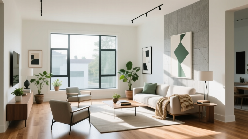
Soft sage green on the walls paired with cream bedding and natural wood furniture creates a nature-inspired retreat. Sage is versatile — it reads as a neutral but adds more depth than beige or gray. Accent with brass hardware and woven textures.
- Walls: Soft sage (Benjamin Moore October Mist or similar)
- Bedding: Cream linen or percale cotton
- Furniture: Light oak or walnut
- Accents: Brass, terracotta ceramics
Palette 2: Dusty Blue and Warm Gray
Dusty blue walls with warm gray upholstery and white trim create a sophisticated, coastal-inspired bedroom. This palette works in both traditional and modern settings. Add texture through nubby throws and woven baskets.
Palette 3: Warm Taupe and Ivory
Taupe (a blend of gray and brown) is the ultimate neutral bedroom color — warm enough to feel cozy, cool enough to feel spacious. Pair with ivory bedding, a charcoal throw, and matte black fixtures for a layered monochromatic look.
Palette 4: Muted Lavender and Soft White
Lavender has long been associated with sleep and relaxation. A muted, grayed lavender (not bright purple) on bedroom walls creates a gentle, restful atmosphere. Pair with crisp white bedding and light gray accents.
Palette 5: Charcoal and Warm Wood
For those who prefer drama, deep charcoal walls create a cocoon-like feeling that many find conducive to sleep. Balance the darkness with warm wood furniture, cream bedding, and ample bedside lighting. This works best in rooms with good natural light during the day.
Color Rules for Bedrooms
- 60-30-10: 60% dominant color (walls), 30% secondary (bedding, curtains), 10% accent (pillows, art)
- Test first: Paint a large sample on the wall and observe it at different times of day
- Consider sheen: Matte or eggshell finishes reduce light reflection and feel calmer
- Ceiling matters: A lighter ceiling color than the walls makes the room feel taller
Colors to Avoid in Bedrooms
- Bright red (stimulates heart rate and alertness)
- Vivid orange (too energizing for a sleep space)
- Neon or highly saturated yellow (causes visual fatigue)
- Pure black (can feel oppressive without careful balancing)
More Articles
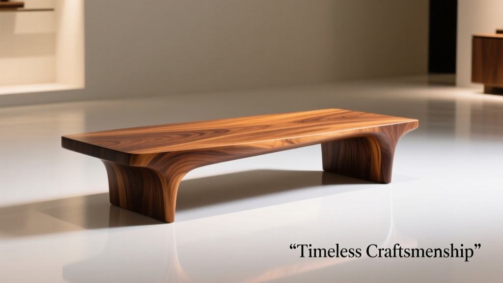 Best Furniture Wood: Strength, Sustainability, and Style Compared for Bedroom Comfort
 Style Kitchens Essentials: Functional Elegance, Ergonomic Precision, and Timeless Material Choices
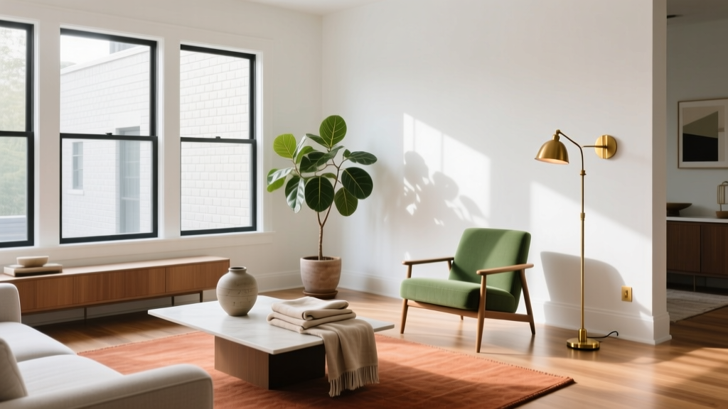 Bedroom Colors for South-Facing Rooms
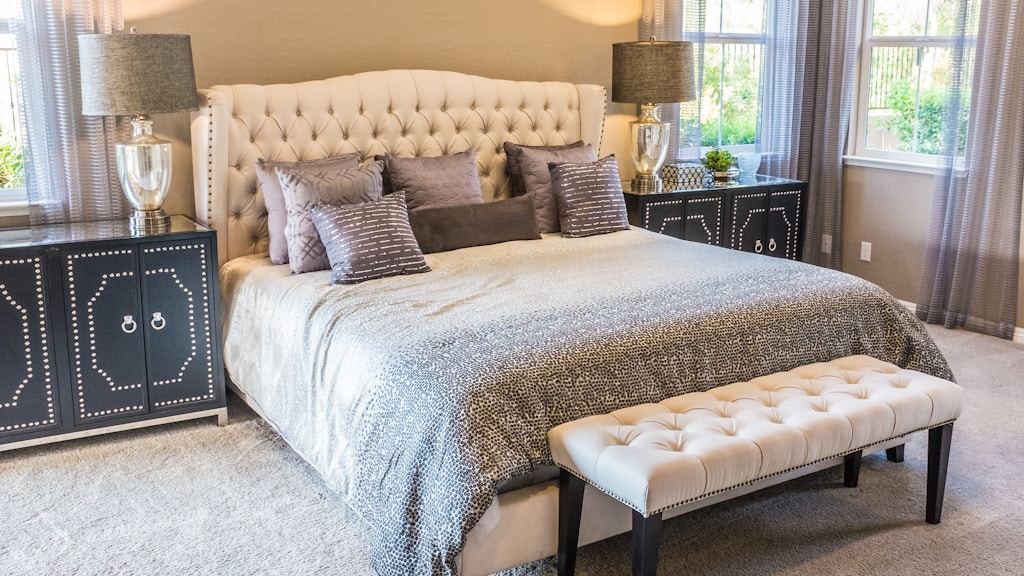 Bedroom Furniture With Rounded Edges: Safety Without Looking Institutional
 Moody Bedroom Color Schemes That Work
 How To Choose the Perfect Bedroom Comfort System: A Practical, Measurement-Driven Checklist
 Bedroom Lighting Layers That Transform the Room
 Adjustable Height Beds: Independent Sleep Solutions for Seniors and Caregivers
 Bedroom Plants for Better Sleep | The Decor Mag
 Bedroom Closet Organization: Chaos to Curated (2026)