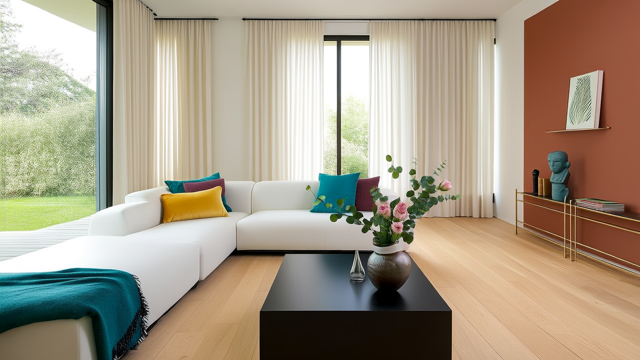
How to Mix Patterns in Your Living Room
How to Mix Patterns in Your Living Room (Without Losing Your Mind)
Let’s be honest: pattern mixing feels like walking a tightrope between “effortlessly chic” and “cluttered chaos.” But here’s the good news—interior designers don’t rely on magic. They use *rules*, refined over decades, that make bold pattern layering feel intentional, grounded, and deeply personal.Start with Scale—and Be Ruthless
The #1 mistake? Throwing together three “medium-sized” prints. Instead, aim for clear hierarchy: one **large-scale** anchor (think Schumacher’s iconic *Zuber Jungle Wallpaper* on an accent wall), one **medium-scale** (like the classic *Dedar Palazzo Toile* on a velvet sofa), and one **small-scale** (a crisp *Robert Allen Pin Dot Linen* on throw pillows). This visual rhythm gives your eye somewhere to land—and somewhere to wander.Pro tip: Hold fabric swatches side by side at arm’s length. If you can’t instantly tell which is largest, smallest, and in-between? Swap one out.
Anchor Everything in Color—Not Just Neutrals
Yes, beige and charcoal are safe—but limiting yourself to them kills energy. Choose a cohesive palette of *three core colors*, pulled from one dominant textile. Say your rug is a vintage-inspired Kaleen Kashmiri wool in sapphire, terracotta, and oat. Use those exact tones across your patterns—even if one is geometric (a Clarence House Chevron Wool ottoman) and another is organic (a Liberty London Tana Lawn botanical print on curtains). That shared DNA is what makes it sing.“Patterns don’t need to match—they need to converse.” — interior stylist Lena Chen
Texture Is Your Secret Pattern Multiplier
Don’t forget tactile contrast! A smooth silk stripe, nubby bouclé pillow, and woven jute rug introduce “pattern” through texture alone—softening the visual load while adding depth. Try pairing a Perennials Sunbrella striped performance fabric on dining chairs with a Matouk embroidered linen cushion—same color family, wildly different hand-feel.- Avoid the “matchy-matchy trap: Never repeat the same pattern across more than two surfaces (e.g., don’t do the same floral on curtains AND sofa).
- Ground with solids: At least 40% of your upholstery and large surfaces should be solid—think Fabricut’s Performance Linen in “Stone” or Calico Wallpaper’s matte-paint finish on built-ins.
- Test before you commit: Tape fabric swatches to your wall beside your rug and lamp base. Live with them for 48 hours—in morning light and evening glow.
Placement Matters More Than You Think
Your busiest pattern should live where the eye naturally rests first—the sofa or area rug. Then step down: medium on armchairs or drapery, small on pillows and lampshades. And always leave breathing room—a solid wood coffee table (CB2’s Asher Table) or uncluttered shelf breaks up visual density. There’s no “final answer” in pattern mixing—only confidence, curiosity, and the willingness to edit. Start small. Trust your gut. And remember: even the most revered designers keep a pair of sharp scissors and a well-stocked fabric remnant bin nearby. Because sometimes, the boldest design move is cutting something out—not adding it in.More Articles
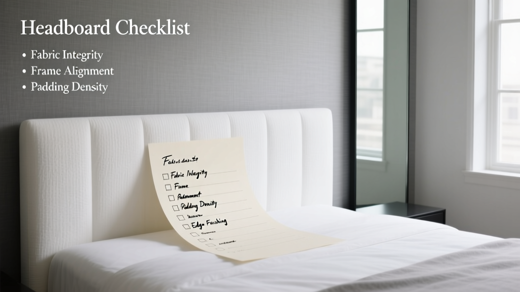 Headboard Buying Checklist: 12 Must-Check Factors for 2026
 Cozy Living Room Decor: Warmth You Can Feel (2026)
 Living Room Lighting: Designer Layered Illumination Tips
Living Room Color Blocks: Bold Pairings That Work
 Blue Home Storage Systems: Science & Power in 2026
 Kid-Proof Living Room Layouts for Active Families (2026)
 Play-Ready Living Rooms That Still Look Great
 Minimalist Gallery Wall: 1 Statement vs Many Frames (2026)
 7 Proven Ways to Mix Vintage & Modern Furniture in 2026
 Small Living Room Layouts That Actually Work