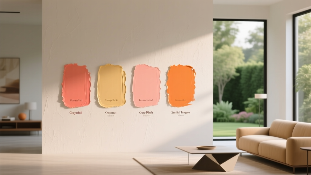
Best Grapefruit Paint Colors - The Decor Mag
Grapefruit is the rare color family that feels both energizing and livable. It sits in that sweet spot between warm coral, rosy peach, and sunlit pink—fresh enough to brighten a shadowy room, yet grounded enough to read “designed” rather than “nursery.” When homeowners search for grapefruit paint colors, they’re usually chasing a mood: optimism, warmth, and a flattering glow that makes people (and skin tones) look great.
From a color theory standpoint, grapefruit shades are typically warm, high-chroma hues with red-orange undertones softened by white or a touch of gray. That balance matters. Too orange and the room can feel loud; too pink and it can lean sugary; too muted and the “grapefruit” character disappears. The best grapefruit paint colors keep a juicy warmth while staying sophisticated across different light conditions.
Below, you’ll find standout grapefruit paint color recommendations, how to use them room by room, and the most common mistakes to avoid—plus practical tips for building modern, cohesive color schemes around this cheerful hue.
What “Grapefruit” Looks Like in Interior Design
Grapefruit paint colors live in the warm spectrum, often reading as coral-pink with orange undertones. Depending on the formula and lighting, grapefruit can shift:
- More pink: Romantic, flattering, softly modern (great with brass and creamy whites).
- More coral/orange: Sunny, playful, Mediterranean (great with natural woods and terracotta).
- More muted (with gray/brown): Grown-up, earthy, calm (great with linen, stone, and warm neutrals).
Color psychology: why grapefruit works
Warm pink-orange hues are associated with sociability, comfort, and optimism. Grapefruit tends to:
- Make rooms feel welcoming and “alive,” especially in common areas.
- Add a healthy glow in bathrooms and bedrooms (particularly with warm lighting).
- Support a creative, upbeat atmosphere in offices, studios, and playrooms—without the intensity of pure orange or red.
How to Choose the Right Grapefruit Paint Color
1) Start with your light source
- North-facing light: Cooler and flatter. Choose grapefruit shades with stronger warmth (more coral/orange) to avoid a dull or chalky look.
- South-facing light: Warm and bright. Softer, lighter grapefruit tones shine here—too much saturation can feel overpowering.
- East-facing light: Bright morning, cooler afternoon. Aim for balanced grapefruit (not too gray) so it stays pleasant all day.
- West-facing light: Neutral morning, glowing afternoon. Muted grapefruit shades can become stunning at golden hour.
2) Decide: statement wall or full-room wrap?
Grapefruit can be a feature color or a full-room experience. As a rule:
- Full room: Choose lighter or slightly muted grapefruit for an enveloping look.
- Accent wall or ceiling: You can go richer and more saturated.
- Cabinetry/trim: Use mid-tone grapefruit for personality without overwhelming.
3) Coordinate with fixed finishes
Before committing, compare your paint samples against what won’t change easily:
- Countertops (warm quartz vs. cool marble)
- Tile (creamy vs. stark white)
- Flooring (red oak, white oak, walnut, LVP)
- Hardware (brass, polished nickel, matte black)
Best Grapefruit Paint Colors (Designer-Approved Picks)
These grapefruit paint colors are widely loved because they’re complex, flattering, and versatile across different rooms. Always sample first—grapefruit hues can shift dramatically between daylight and lamplight.
Benjamin Moore Grapefruit Paint Colors
-
Benjamin Moore Coral Gables (2010-40)
A spirited coral-grapefruit that reads sunny and bold. Best for an accent wall, powder room, or playful breakfast nook. -
Benjamin Moore Salmon Peach (2171-60)
Light, airy grapefruit-peach. Great for bedrooms, nurseries with a modern twist, and small bathrooms where you want a fresh glow. -
Benjamin Moore Pink Moiré (050)
A sophisticated warm pink with grapefruit energy—more polished than candy pink. Beautiful in dining rooms and dressing areas. -
Benjamin Moore First Light (2102-70)
A gentle blush with a warm undertone that can read grapefruit-adjacent in sunny rooms. Ideal for open-plan spaces when you want subtle color.
Sherwin-Williams Grapefruit Paint Colors
-
Sherwin-Williams Intimate White (SW 6322)
A creamy pink-peach that feels soft and livable. Excellent for full-room applications, especially bedrooms and living rooms. -
Sherwin-Williams Coral Reef (SW 6606)
A classic coral with grapefruit brightness. Strong personality—use it on a single wall, built-ins, or a front door for curb appeal. -
Sherwin-Williams Mellow Coral (SW 6324)
Warm and approachable, with a muted grapefruit quality that pairs nicely with beige, terracotta, and warm whites. -
Sherwin-Williams Oleander (SW 6603)
A deeper rosy coral that can read “sunset grapefruit.” Great for dining rooms, libraries, or a moody powder room with brass accents.
Farrow & Ball Grapefruit-Adjacent Options
-
Farrow & Ball Pink Ground (No. 202)
A warm pink that can resemble a softened grapefruit flesh tone in natural light. Elegant in bedrooms and hallways. -
Farrow & Ball Setting Plaster (No. 231)
A muted plastery pink with a warm base—very livable and modern, especially with natural textures and warm woods.
Behr Grapefruit-Friendly Picks
-
Behr Coral Fountain (PPU2-02)
A cheerful coral with grapefruit brightness—excellent for DIY-friendly accent walls and creative spaces. -
Behr Flamingo Feather (PPU1-13)
A soft, warm pink that can skew grapefruit in warmer light. Works well for a gentle all-over wash.
Real Room Examples & Application Scenarios
1) Living room: grapefruit as a warm modern neutral
If you love the idea of pink but fear it will feel too sweet, pick a muted grapefruit like Sherwin-Williams Intimate White or Farrow & Ball Setting Plaster. Use it as the main wall color and let texture do the heavy lifting.
Try this scheme:
- Walls: warm grapefruit-pink
- Trim: creamy white (avoid icy bright whites)
- Furniture: oatmeal linen sofa, warm oak coffee table
- Accents: aged brass, woven rattan, terracotta ceramics
- Contrast color: olive green or deep teal in pillows/art
2) Kitchen: grapefruit on cabinets or an island
Grapefruit looks fresh and modern on lower cabinets or a kitchen island—especially when balanced with warm whites and natural materials. Mid-tone coral-grapefruit shades like Benjamin Moore Coral Gables or Sherwin-Williams Mellow Coral add personality without feeling trendy in a disposable way.
Where it works best:
- Island cabinetry with white perimeter cabinets
- Butler’s pantry or coffee station for a “jewel box” moment
- Breakfast nook bench seating (painted built-in)
Countertop + hardware pairing tip: Grapefruit sings with brushed brass, champagne bronze, and warm-veined quartz. If your counters are very cool (blue-gray marble), choose a grapefruit shade with a slightly muted or dusty base to bridge the temperature gap.
3) Bedroom: flattering and calming (yes, really)
When grapefruit is softened with white or gray, it becomes a soothing blush-coral that’s surprisingly restful. It’s also one of the most flattering bedroom paint colors under warm bedside lighting.
Easy bedroom formula:
- Choose a light grapefruit-peach (Benjamin Moore Salmon Peach or a similar pale coral).
- Keep bedding neutral: ivory, sand, or warm gray.
- Add one grounding color: cocoa brown, olive, or charcoal.
- Use matte paint on walls for a velvety look; consider eggshell if you need extra wipeability.
4) Bathroom or powder room: grapefruit + metal = instant style
Grapefruit is a go-to for powder rooms because it feels upbeat and makes skin tones look lively. For a high-impact look, pair a saturated coral-grapefruit (like Sherwin-Williams Coral Reef) with statement lighting and a bold mirror.
Design pairing ideas:
- Grapefruit walls + brass sconces + white zellige tile
- Grapefruit vanity + polished nickel + marble-look porcelain
- Grapefruit ceiling + warm white walls for a subtle surprise
5) Entryway: create a welcoming first impression
Entryways often lack natural light, so a warm grapefruit can add instant energy. If the space is small, choose a lighter tint; if it’s a larger foyer, a mid-tone grapefruit can feel intentionally bold.
- Small entry: light grapefruit + warm white trim + jute runner
- Large foyer: deeper grapefruit + dark wood console + oversized art
Color Combinations That Make Grapefruit Look Expensive
Grapefruit paint colors become more sophisticated when paired with grounded neutrals and a purposeful contrast color.
Winning grapefruit color schemes
- Grapefruit + warm white + brass: timeless, glowy, and clean
- Grapefruit + camel + chocolate brown: earthy, modern, fashion-forward
- Grapefruit + olive green: balanced complementary tension; fresh and designer-approved
- Grapefruit + deep teal: vibrant, eclectic, and bold
- Grapefruit + terracotta + clay: layered warmth (use varied textures to avoid flatness)
- Grapefruit + soft gray: modern and calming—choose a warm gray, not icy
Best trim and ceiling whites for grapefruit walls
Grapefruit usually looks best with whites that have a touch of warmth. Stark whites can make grapefruit look harsher or more neon.
- Warm white trim: creamy, slightly off-white tones
- Ceiling suggestion: use the same white as trim, or go one step “cleaner” (but not blue-white) if you want crispness
Common Grapefruit Paint Color Mistakes (and How to Avoid Them)
-
Choosing a grapefruit shade without testing in your lighting
Grapefruit can swing pink, peach, or orange. Tape large samples on multiple walls and check morning, afternoon, and nighttime light. -
Pairing grapefruit with the wrong white
Bright, cool whites can make grapefruit look too intense. Lean toward warm whites and creamy neutrals. -
Over-saturating an open floor plan
A strong coral-grapefruit throughout a connected main level can feel relentless. Use grapefruit in one zone (dining area, entry, powder room) and keep adjacent spaces neutral. -
Ignoring undertones in tile and countertops
Cool grays and blue-based whites can clash with warm grapefruit. If you have cool finishes, choose a grapefruit color with a softened, muted base. -
Forgetting about sheen
Higher sheen reflects more light and can amplify intensity. For bold grapefruit walls, matte or eggshell often looks more refined than satin.
Practical Tips for Sampling and Painting Grapefruit Colors
- Go bigger than a chip: Use peel-and-stick samples or paint 2' x 2' boards you can move around the room.
- Check next to upholstery and flooring: Grapefruit shifts more visibly when placed beside warm woods and creams.
- Decide your “anchor neutral” first: Pick your white/neutral (trim, rugs, sofa) then select the grapefruit that harmonizes.
- Use intentional repetition: Repeat grapefruit in a small way—art, pillows, a vase—so it feels integrated rather than random.
- Plan lighting temperature: Warm bulbs (2700K–3000K) flatter grapefruit; very cool bulbs can make it look flat or chalky.
FAQ: Best Grapefruit Paint Colors
Is grapefruit paint more pink or more orange?
It depends on the undertone. Some grapefruit paint colors lean rosy (pink-forward), while others lean coral (orange-forward). The same color can look different in north- vs. south-facing light, so sampling is the best way to confirm.
What rooms are best for grapefruit paint colors?
Powder rooms, bedrooms, entryways, breakfast nooks, and creative spaces are especially well-suited. In living rooms and kitchens, grapefruit works beautifully when slightly muted or used as an accent (island, built-ins, feature wall).
What colors go with grapefruit walls?
Grapefruit pairs well with warm whites, beige and camel tones, olive green, deep teal, chocolate brown, terracotta, and warm grays. Metallics like brass and champagne bronze enhance its warmth and richness.
How do I keep grapefruit from looking too bright or childish?
Choose a grapefruit shade with a muted base (a touch of gray or beige), keep trim a warm white, and add grounding elements like natural wood, woven textures, or darker contrast colors (olive, charcoal, cocoa).
Does grapefruit paint work with gray flooring?
Yes, if you choose the right undertone. With cool gray flooring, opt for a softer grapefruit with a slightly muted, dusty quality rather than a super-saturated coral. Add warm accents (wood, brass, cream textiles) to bridge the temperature.
Should I use matte or eggshell for grapefruit paint?
Matte gives grapefruit a sophisticated, velvety finish and helps reduce glare. Eggshell is a great compromise for higher-traffic areas because it’s more washable while still looking refined.
Your Next Steps: Bring Grapefruit Home with Confidence
Start by deciding whether you want a subtle blush-grapefruit wash or a bolder coral statement, then test two to three contenders on large samples in your actual lighting. Build your color scheme around a warm white and one grounding contrast color (olive, teal, or cocoa), and let texture—linen, wood, rattan, tile—add depth so the grapefruit feels elevated.
Want more help choosing paint colors and building cohesive color schemes? Explore more inspiring, room-by-room color guides on thedecormag.com.
More Articles
 Best Hydrangea Blue Paint Colors - The Decor Mag
 Color Psychology in Living Rooms: Mood & Function (2026)
 How to Choose Colors for a Sunroom - The Decor Mag
 How to Choose Colors for a Music Room - The Decor Mag
 Best Dusty Rose Paint Colors - The Decor Mag
 Living Room Colors for Entertaining (2026)
 Best Berry Red Paint Colors - The Decor Mag
 Earth Tone Color Palette Inspiration - The Decor Mag
 Best Burnt Orange Paint Colors - The Decor Mag
 How to Choose Colors for East-Facing Rooms - The Decor Mag