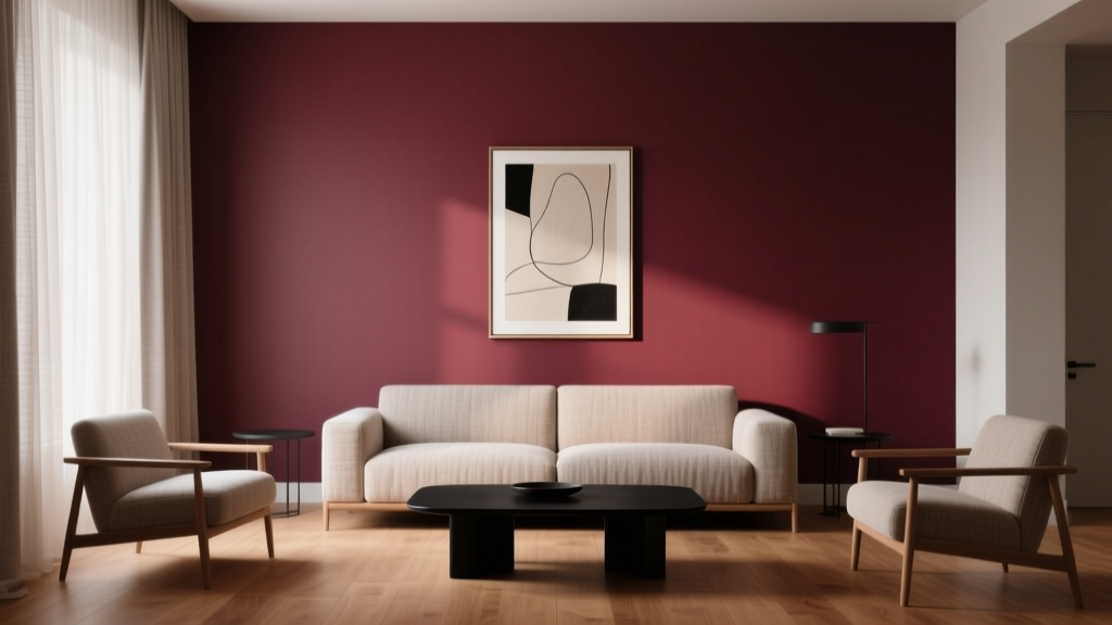
Best Burgundy Paint Colors - The Decor Mag
Burgundy is one of those rare paint colors that can feel timeless and fresh at the same time. Rooted in red but tempered by brown, purple, or a hint of black, it brings a sense of depth that few shades can match. When homeowners want drama without the harshness of true black, or warmth without the sweetness of bright red, burgundy paint colors often land in the perfect middle.
Beyond its beauty, burgundy has real design power. Color psychology links deep reds to energy, confidence, and comfort—while the darker undertones add sophistication and calm. Used well, burgundy can make a room feel more intimate, elevate basic architecture, and create a “designed” look with surprisingly simple styling. Used poorly, it can read heavy, muddy, or too formal. This guide breaks down the best burgundy paint color options, how they behave in real rooms, and how to build flattering color schemes around them.
What Counts as “Burgundy” in Interior Paint?
Burgundy is a deep red with a refined, wine-like character. In paint terms, you’ll see it appear in several closely related families:
- Wine burgundy: Rich and red-forward with a juicy tone.
- Oxblood: Darker, moodier, and slightly brown/black-leaning.
- Plum burgundy: A burgundy with noticeable purple undertones.
- Browned burgundy: Earthier, more traditional, and easier to live with.
Because burgundy is undertone-driven, the “best” choice depends on your home’s fixed finishes (flooring, countertops, tile) and lighting (directional sun and bulb temperature). Always test large samples before committing.
How Burgundy Behaves: Lighting, Undertones, and Finish
Lighting: Why burgundy can look different morning to night
- North-facing rooms: Cooler light can pull out purple or gray undertones, making burgundy feel more formal and subdued.
- South-facing rooms: Warm light intensifies the red and can make burgundy look richer and more saturated.
- East-facing rooms: Bright mornings, softer afternoons—expect a more “red wine” look early in the day.
- West-facing rooms: Golden afternoon light can make burgundy glow, sometimes reading warmer or slightly brown.
Finish selection: The difference between velvety and harsh
- Matte/flat: Best for moody burgundy walls; reduces glare and adds a velvety feel.
- Eggshell: A practical choice for living rooms and hallways where you need a bit of washability.
- Satin: Works well for trim and doors if you want a lacquered, tailored look.
- High gloss: Stunning for statement doors or built-ins, but it will highlight wall imperfections.
Best Burgundy Paint Colors (Designer-Approved Picks)
These burgundy paint colors are widely used in interior color design because they balance richness with versatility. Where possible, test them in your specific light and pair them with your home’s finishes.
1) Benjamin Moore: Caliente AF-290
Personality: A bold, red-forward burgundy with modern energy.
Best for: Dining rooms, powder rooms, and accent walls when you want a confident statement.
Color pairings:
- Crisp white trim (Benjamin Moore Chantilly Lace OC-65)
- Warm brass hardware
- Deep charcoal (Benjamin Moore Kendall Charcoal HC-166) for balance
Real room idea: Paint a dining room in Caliente with white wainscoting and a warm wood table. Add linen drapery and a brass chandelier for a classic-meets-contemporary look.
2) Sherwin-Williams: Cordovan SW 6275
Personality: A classic burgundy with a slightly browned, grounded undertone.
Best for: Libraries, offices, and living rooms where you want warmth without screaming “red.”
Color pairings:
- Creamy off-white (Sherwin-Williams Alabaster SW 7008)
- Camel leather and walnut wood
- Muted olive accents
Real room idea: Use Cordovan on built-in bookcases with a satin finish. Keep walls a warm off-white and style shelves with pottery, framed art, and a few black accents for contrast.
3) Farrow & Ball: Preference Red No. 297
Personality: A sophisticated, heritage burgundy that feels curated and architectural.
Best for: Dining rooms, entries, and formal living spaces—especially in older homes or homes with traditional millwork.
Color pairings:
- Soft, warm neutrals (think stone, taupe, and putty)
- Antique gold frames
- Dark-stained wood floors
Real room idea: In an entryway, pair Preference Red walls with a vintage runner, a dark wood console, and a large mirror. The result feels welcoming and elevated.
4) Benjamin Moore: New London Burgundy HC-61
Personality: Deep, muted, and slightly traditional—an easy “grown-up” burgundy.
Best for: Bedrooms, studies, and cozy sitting rooms.
Color pairings:
- Soft greige (Benjamin Moore Edgecomb Gray HC-173)
- Ivory bedding and textured knits
- Smoked black accents
Real room idea: Paint a bedroom feature wall in New London Burgundy behind an upholstered headboard. Add warm bedside lighting (2700K bulbs) to keep the room inviting rather than heavy.
5) Sherwin-Williams: Merlot SW 2704
Personality: A wine-inspired burgundy that reads plush and cozy.
Best for: Powder rooms, dining rooms, and dramatic accent areas.
Color pairings:
- Soft blush accents for a romantic palette
- Matte black fixtures for edge
- White marble or quartz with subtle veining
Real room idea: Try Merlot in a powder room with a simple pedestal sink, black sconce, and a framed vintage print. A small space can handle higher saturation beautifully.
6) Farrow & Ball: Brinjal No. 222
Personality: A plum-leaning burgundy—moody, artistic, and incredibly chic.
Best for: Creative studios, dining rooms, and bedrooms where you want a cocoon effect.
Color pairings:
- Warm whites and parchment tones
- Burnished brass and amber glass
- Dusty rose or mauve textiles
Real room idea: Use Brinjal on all four walls in a bedroom, then layer in linen bedding, a vintage rug with burgundy notes, and warm metallic accents for a boutique-hotel vibe.
7) Behr: Burgundy Wine (popular burgundy family pick)
Personality: A straightforward, accessible burgundy that can work in many homes.
Best for: Accent walls, dining rooms, and budget-friendly makeovers where you still want depth.
Color pairings:
- Clean white trim
- Medium oak floors
- Natural fiber rugs (jute, sisal) to keep it grounded
Real room idea: Paint a living room fireplace surround or built-in niche in this shade to add instant focus without overwhelming the entire room.
Where Burgundy Looks Best: Real Room Applications
Dining rooms: The classic burgundy win
Burgundy is a natural fit for dining rooms because it enhances appetite, conversation, and intimacy—key elements of color psychology for gathering spaces. It also pairs beautifully with wood furniture and warm lighting.
- Try full burgundy walls with crisp white trim for a tailored look.
- Or do a burgundy ceiling for unexpected depth in a room with crown molding.
Bedrooms: Cozy, cocooning, and luxe
In bedrooms, burgundy shines when it’s softened with texture: linens, wool, velvet, and layered neutrals. If full walls feel too bold, start with an accent wall behind the bed.
- Best scheme: burgundy + warm white + natural wood + soft black accents.
- Lighting tip: use 2700K warm bulbs to keep burgundy inviting.
Living rooms: Make it grounded, not heavy
Burgundy living rooms can look rich and welcoming when you balance them with light-reflective elements and clear contrast.
- Use burgundy on a single focal wall if your room lacks natural light.
- Anchor with a light rug and add black or charcoal in small doses for definition.
Powder rooms: A perfect place to go bold
Small spaces are ideal for saturated paint colors. Burgundy in a powder room feels high-end—especially paired with statement lighting and a mirror that bounces light.
- Pair with brass for warmth and elegance.
- Pair with matte black for modern contrast.
- Try burgundy with wallpaper on the ceiling or above wainscoting for layered character.
Kitchens: Use burgundy strategically
All-burgundy kitchens are a commitment, but burgundy can be stunning on lower cabinets, an island, or a pantry door—especially in homes that want a “collected” look.
- Best approach: burgundy cabinetry + warm white walls + unlacquered brass.
- Countertops: white quartz, honed marble, or dark soapstone for drama.
Burgundy Color Schemes That Always Work
These combinations help burgundy feel intentional rather than overwhelming. Use them as a starting point for your interior color design plan.
1) Burgundy + warm white + brass
- Creates a classic, welcoming palette
- Great for dining rooms, hallways, and traditional homes
2) Burgundy + charcoal + crisp white
- High-contrast and modern
- Great for contemporary spaces and graphic styling
3) Burgundy + blush + taupe
- Soft, romantic, and livable
- Ideal for bedrooms and dressing areas
4) Burgundy + forest green + antique gold
- Vintage, moody, and luxurious
- Works beautifully in studies, libraries, and formal living rooms
5) Burgundy + navy + cream
- Preppy and timeless
- Great for offices, guest rooms, and classic interiors
Common Burgundy Paint Mistakes to Avoid
Burgundy is forgiving in style, but not always forgiving in execution. Avoid these pitfalls to get a result that feels rich rather than heavy.
- Skipping undertone testing: Burgundy can pull purple, brown, or brick depending on light and surrounding materials. Test on multiple walls and view day/night.
- Choosing the wrong white trim: A stark, cool white can make burgundy look dull or muddy. In many homes, a warm white or creamy neutral looks more harmonious.
- Overdoing dark-on-dark without contrast: Burgundy walls plus dark floors plus dark furniture can feel flat. Add contrast with light upholstery, art mats, rugs, or brighter trim.
- Using high gloss on imperfect walls: Deep colors in shiny finishes magnify every bump. Save gloss for doors, trim, and furniture.
- Ignoring bulb temperature: Cool LEDs can drain warmth from burgundy. Aim for warm lighting (2700K–3000K) for most living spaces.
Practical Tips for Sampling Burgundy Like a Designer
- Sample large: Paint at least a 2’ x 2’ area or use peel-and-stick samples.
- Check reflection colors: Nearby green trees, red brick, or a bright blue rug can tint how burgundy reads.
- Compare two to three options: Put them side by side to reveal undertones quickly.
- Decide your “anchor”: Choose whether burgundy is the star (walls) or a supporting role (cabinets/door/accent).
- Plan your contrast: Identify your trim color, metals, and textiles before painting the whole room.
FAQ: Best Burgundy Paint Colors
What is the most popular burgundy paint color for interiors?
Many homeowners start with widely trusted options like Sherwin-Williams Cordovan or Benjamin Moore New London Burgundy because they read clearly as burgundy while staying livable in everyday spaces. The “most popular” depends on your lighting and whether you prefer a red-forward or brown/plum-leaning burgundy.
Does burgundy make a room look smaller?
Dark paint colors can visually bring walls inward, which can feel cozy rather than cramped when balanced with contrast. Use burgundy with lighter trim, reflective surfaces, and layered lighting to keep the room from feeling closed in.
What colors go best with burgundy walls?
Strong pairings include warm whites, cream, greige, charcoal, navy, forest green, and natural wood tones. Metals like brass and matte black both work, depending on whether you want warmth or edge.
Is burgundy a good choice for an exterior door?
Yes—burgundy is a classic front door paint color, especially with light or neutral siding. Choose a durable exterior finish and test in daylight; outdoor light can make burgundy appear brighter or more brick-toned.
How do I keep burgundy from looking too traditional?
Pair it with cleaner lines and modern elements: matte black hardware, minimal trim profiles, contemporary lighting, and a crisp neutral like a bright white or pale greige. Burgundy also looks current when used on an accent wall or cabinetry rather than everywhere.
What sheen is best for burgundy walls?
For most rooms, matte or eggshell is ideal. Matte gives burgundy a plush, sophisticated look; eggshell adds a bit more durability for family spaces and hallways.
Next Steps: Bringing Burgundy Home with Confidence
Start by choosing where burgundy will have the most impact—an accent wall, a cozy bedroom, a dining room, or a statement powder room. Narrow your choices to two or three burgundy paint colors, sample them in your lighting, and build a simple color scheme around warm whites, natural textures, and intentional contrast. Burgundy rewards thoughtful planning with a finish that feels layered, elegant, and personal.
For more paint color recommendations, color schemes, and room-by-room guidance, explore the latest color guides on thedecormag.com.
More Articles
 How to Choose Accent Wall Colors - The Decor Mag
 Best Blue Paint Colors for Every Mood - The Decor Mag
 Best Cardinal Red Paint Colors - The Decor Mag
 Best Pear Green Paint Colors - The Decor Mag
 How to Create a Modern Color Palette - The Decor Mag
 Best Eucalyptus Paint Colors - The Decor Mag
 How to Choose Colors for a Veranda - The Decor Mag
 Best Beige Paint Colors That Aren't Boring - The Decor Mag
 How to Use Color to Create Warmth - The Decor Mag
 Best Avocado Green Paint Colors - The Decor Mag