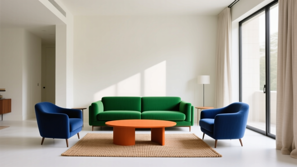
How to Create a Bold Color Story - The Decor Mag
Bold color doesn’t have to mean chaotic, loud, or short-lived. In well-designed homes, strong color choices act like a narrative thread—moving from room to room with intention, creating moments of contrast, comfort, and personality. A bold color story can make an open-plan layout feel cohesive, help awkward rooms feel more purposeful, and turn everyday surfaces into design features.
Many homeowners love color in theory but freeze when it’s time to commit. The fear is understandable: paint feels permanent, and a “wrong” color can throw off everything from furniture to lighting. The good news is that bold color becomes much easier when you treat it as a system—using a clear palette, balanced proportions, and proven color design principles like undertones, value (light vs. dark), and saturation (muted vs. vivid).
This guide breaks down how to build a bold, livable interior color scheme—from selecting a hero hue to choosing supporting paints and finishes, with real room scenarios, common mistakes to avoid, and practical tips you can use right away.
What “Bold Color Story” Means in Interior Design
A bold color story is a deliberate sequence of color decisions that feels connected throughout your home. It isn’t just “painting a room red.” It’s choosing colors with shared undertones, controlling contrast, and repeating key hues so the eye recognizes a pattern.
The three building blocks of a bold color scheme
- Hero color: Your primary statement shade (e.g., deep green, saffron, cobalt, aubergine).
- Supporting palette: Two to four companion colors that shape mood and balance (often neutrals + 1–2 accents).
- Transitions: Repeated elements—trim color, metal finishes, wood tones, textiles—that make rooms feel related.
Color psychology: why bold can feel surprisingly calm
Color psychology isn’t about rigid rules; it’s about patterns in how we tend to respond to hue and intensity:
- Deep blues and blue-greens often read as grounding and restorative—great for bedrooms, dens, libraries.
- Warm reds, terracottas, and ochres feel energizing and social—ideal for dining rooms and kitchens.
- Purples and plums can feel creative and enveloping—beautiful in offices, powder rooms, and lounges.
- Bright greens and yellow-based shades add optimism—best when balanced with quieter neutrals.
Step 1: Choose Your Hero Color (and Decide How Bold You Want It)
Start with one color you’re genuinely drawn to. If you’re unsure, look at what you already love: a rug, art print, favorite outfit, vintage tile, or even your garden. Then decide the “volume level” of boldness you want—high saturation, deep value, or both.
Hero color options (with paint recommendations)
- Moody green: Benjamin Moore Essex Green (HC-188) or Sherwin-Williams Pewter Green (SW 6208)
- Inky navy: Farrow & Ball Hague Blue (No. 30) or Sherwin-Williams Naval (SW 6244)
- Warm terracotta: Benjamin Moore Terra Cotta Tile (2090-30) or Farrow & Ball Red Earth (No. 64)
- Statement plum: Benjamin Moore Spanish Violet (1429) or Sherwin-Williams Plum Brown (SW 6272)
- Rich teal: Benjamin Moore Aegean Teal (2136-40) or Sherwin-Williams Cascade (SW 7623)
Quick test: bold by depth vs. bold by brightness
- Bold by depth: Darker, more muted shades feel sophisticated and forgiving in varied lighting.
- Bold by brightness: Clear, vivid colors feel modern and playful, but require stronger control with neutrals and repetition.
Step 2: Build a Palette That Supports (Not Competes)
The fastest way to make bold color look intentional is to limit the number of “loud” players. A classic approach for interior color design is a structured palette with controlled repetition.
A reliable formula: the 60-30-10 rule
- 60%: dominant background (walls or large surfaces)—often a warm white, greige, or soft color-wash
- 30%: secondary color (cabinets, a large rug, built-ins, drapery)
- 10%: accent (pillows, art, lampshades, an interior door, chair upholstery)
High-impact palette ideas (bold, but livable)
- Navy + creamy white + cognac leather: Try SW Naval + BM White Dove (OC-17) + warm wood tones.
- Forest green + brass + soft greige: BM Essex Green + brushed brass + BM Edgecomb Gray (HC-173).
- Terracotta + dusty pink + warm white: BM Terra Cotta Tile + F&B Setting Plaster + BM Swiss Coffee (OC-45).
- Teal + crisp white + black accents: BM Aegean Teal + BM Chantilly Lace (OC-65) + matte black hardware.
Undertones: the hidden factor that makes or breaks a color scheme
Undertones are the subtle color biases within a paint. Two “whites” can clash if one is pink-leaning and the other is yellow-leaning. For bold schemes, undertone harmony is everything.
- Pair blue-based colors (navy, cool teal) with cool whites like BM Chantilly Lace or SW Extra White.
- Pair earthy warms (terracotta, ochre, olive) with warm whites like BM White Dove or SW Alabaster (SW 7008).
Step 3: Decide Where the Bold Color Lives
Bold color feels most polished when it’s assigned to the right architectural “jobs.” Choose placements that make the home feel designed, not simply painted.
Best places to use bold paint colors
- Accent wall with purpose: the fireplace wall, the bed wall, or a built-in wall—avoid random “one wall” choices.
- Ceiling: creates a cocoon effect in bedrooms and dining rooms; try a softened version of the wall color.
- Trim and doors: high-style and unexpectedly practical (scuffs hide better on saturated shades).
- Kitchen island or lower cabinets: a bold anchor that balances lighter uppers.
- Powder room: a small space where dramatic color feels intentional and fun.
Finish matters: paint sheen as a design tool
- Matte/flat: velvety, modern; best for walls and ceilings (especially in deeper colors).
- Eggshell: durable for living areas; a safe default for most wall applications.
- Satin/semigloss: crisp and wipeable; ideal for trim, doors, and cabinetry.
Real Room Scenarios: Bold Color Stories That Work
1) Living room: deep, grounded, and welcoming
Goal: Create a cozy gathering space without making it feel heavy.
- Walls: Sherwin-Williams Pewter Green (SW 6208) in matte
- Trim: Benjamin Moore White Dove (OC-17) in satin
- Accent: warm brass lighting + cognac leather chair + rust/cream textiles
Why it works: The green reads calm and classic; warm metals and leather keep it from turning cold. White trim provides clean contrast, helping the room feel taller and brighter.
2) Kitchen: bold cabinets with a soft perimeter
Goal: Add drama while keeping the kitchen airy and resale-friendly.
- Lower cabinets or island: Benjamin Moore Hale Navy (HC-154) or SW Naval
- Walls: BM Swiss Coffee (OC-45)
- Hardware: brushed brass or polished nickel
- Countertop/backsplash: white or lightly veined stone to maintain brightness
Tip: If your kitchen gets little natural light, consider a slightly lighter navy (or a blue-green) to avoid a flat appearance.
3) Bedroom: a saturated “rest” palette
Goal: Make the room feel restful without defaulting to beige.
- Walls: Farrow & Ball Hague Blue in matte
- Ceiling: 50% diluted version (or a lighter related blue) to soften contrast
- Bedding: creamy whites + muted taupe + a small hit of ochre
Why it works: Deep blue lowers visual noise and supports sleep. Soft, warm textiles keep the palette from feeling overly cool.
4) Dining room: bold warmth that flatters skin tones
Goal: Create a social, candlelit feel.
- Walls: Farrow & Ball Red Earth (No. 64) or BM Terra Cotta Tile
- Trim: warm white like SW Alabaster
- Finishes: walnut table, warm metals, creamy linen drapery
Tip: Use dimmable lighting (2700K is a flattering default) to make warm hues glow instead of glare.
5) Bathroom/powder room: high drama, small footprint
Goal: Create a memorable moment with minimal square footage.
- Walls: Benjamin Moore Essex Green or a deep plum like SW Plum Brown
- Ceiling: match the walls for a jewel-box effect
- Mirror + lighting: choose one metal finish and repeat it (brass or black are especially striking)
How to Create Flow From Room to Room (Without Matching Everything)
Color flow is what separates “a few bold rooms” from a true whole-home color story. The secret is repetition—subtle, intentional echoes.
Ways to connect your interior color scheme
- Repeat one paint color in multiple places (e.g., the same warm white on trim throughout the home).
- Use related shades across rooms (navy in the office, softer blue in the hallway).
- Carry the same metal finish (brass, black, nickel) through adjacent spaces.
- Anchor with consistent wood tones (white oak, walnut, espresso) to ground bolder walls.
Transition strategy: the “hallway handshake”
If you’re using bold paint colors in several rooms, choose a calmer transition color in hallways and connecting spaces. A light greige or warm white helps bold rooms feel intentional rather than competing.
Common Color Mistakes to Avoid
- Choosing paint in the store aisle lighting: Always test at home. Paint shifts dramatically with exposure and bulb temperature.
- Ignoring undertones: If your sofa is warm taupe and your “white” reads icy blue, the whole room will feel off.
- Overusing equally saturated colors: Too many high-chroma hues in one sightline creates visual fatigue. Balance bold with quiet.
- Forgetting the fixed elements: Flooring, countertops, and tile have undertones that must be considered before selecting wall paint.
- Skipping large paint samples: Use 12x12 swatches or paint poster boards; move them around the room morning to night.
- Not planning sheen: A glossy dark wall can show imperfections and reflect glare; matte often looks richer for bold colors.
Practical Tips for Getting Bold Color Right the First Time
- Start with one bold room and build outward. A powder room, dining room, or office is a confident first step.
- Pick your “home white” early (trim and many ceilings). Popular options: BM White Dove, BM Chantilly Lace, SW Alabaster.
- Use a color fan deck to compare undertones side by side, not just on a screen.
- Check paint colors in three light conditions: morning, midday, and evening lamp light.
- Plan contrast intentionally: high contrast feels crisp and modern; low contrast feels soft and cozy.
FAQ: Bold Paint Colors and Color Schemes
What’s the easiest way to choose a bold color scheme that won’t feel trendy next year?
Start with a classic deep shade (navy, forest green, oxblood, warm clay) and pair it with timeless neutrals and natural materials. A color like SW Naval or BM Essex Green feels enduring when balanced with warm whites, wood, and simple patterns.
Should I use bold colors in a small room or avoid them?
Small rooms are ideal for bold color—especially powder rooms, hallways, and cozy dens. Darker shades can blur corners and make the space feel intentional. Use consistent trim color and thoughtful lighting to keep it from feeling cave-like.
How do I know if my bold paint color will look too dark?
Test a large sample and observe it at night. If it feels heavy, try the same color in a lighter value (one or two steps up on the strip) or use the bold shade on trim, doors, or an island instead of all four walls.
What neutral paint colors pair well with bold walls?
Warm, flexible neutrals are easiest to live with. Consider BM White Dove, SW Alabaster, BM Swiss Coffee, or BM Edgecomb Gray. Match the neutral’s undertone to your bold color (cool with cool, warm with warm).
How many bold colors can I use in one home?
Two to three bold hues can work beautifully if they share undertones and you repeat them strategically. Keep at least one consistent neutral (often your trim color) and let one shade be the main “hero” while the others act as supporting characters.
What’s the best approach to bold color if I have an open floor plan?
Use one cohesive wall color across the main area and bring bold color in through cabinetry, a feature wall, or built-ins. Alternatively, use related shades (same undertone family) to subtly define zones without creating harsh breaks.
Next Steps: Turn Inspiration Into a Plan
Choose one hero color, identify a dependable neutral partner, and test both in your actual lighting. Then assign roles: where the bold shade will live, which surfaces stay calm, and what repeats across rooms (trim color, metals, woods, textiles) to create flow. Bold color is easiest when it’s structured—your home reads collected, not chaotic.
If you’re ready for more paint color ideas, room-by-room color schemes, and expert guidance on undertones and finishes, explore more color guides on thedecormag.com.
More Articles
 Best Slate Blue Paint Colors - The Decor Mag
 How to Create a Minimalist Color Palette - The Decor Mag
 Best Mustard Yellow Paint Colors - The Decor Mag
 How to Create a Serene Color Palette - The Decor Mag
 How to Choose Colors for a Conservatory - The Decor Mag
 Best Prussian Blue Paint Colors - The Decor Mag
 Best Brown Paint Colors for Cozy Rooms - The Decor Mag
 How to Create a Grounded Color Palette - The Decor Mag
 Best Pear Green Paint Colors - The Decor Mag
 Cheap vs Premium: Why 'Premium' Isn’t Just Marketing—It’s Measurable Performance