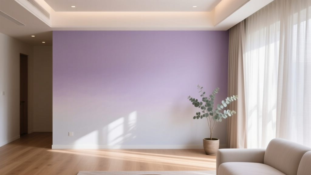
Best Lilac Paint Colors for Gentle Spaces - The Decor Mag
Lilac has a rare talent in interior color design: it feels quietly uplifting without demanding attention. Where some pastels can read as sugary or overly “theme-y,” lilac sits in a more sophisticated place—soft enough for restful rooms, nuanced enough for grown-up spaces. It carries the calm of blue, the warmth of red, and the airy quality of a tint, making it one of the most versatile paint colors for creating gentle interiors.
This topic matters because lilac is often misunderstood. Homeowners love the idea of a pale purple room, then worry it will look childish, cold, or “too purple” once it’s on the wall. The secret is choosing the right undertone (gray, pink, or blue), matching it to your light exposure, and pairing it with grounding neutrals and natural textures. With the right approach, lilac becomes a timeless backdrop for bedrooms, nurseries, reading nooks, bathrooms, and any space that needs softness and ease.
Below you’ll find designer-favorite lilac paint colors, how to use them in real rooms, color schemes that feel effortless, and the common mistakes that make lilac go sideways.
Why Lilac Works: Color Psychology and Design Principles
Lilac is typically a light-to-mid tint of purple. In color psychology, purple blends the stability of blue with the energy of red—often associated with creativity, reflection, and a sense of quiet luxury. When it’s softened into lilac, the effect becomes more soothing and approachable.
What lilac does well in a home
- Creates gentle contrast against white trim and warm wood without feeling stark.
- Softens hard finishes like tile, chrome, and glass in bathrooms and kitchens.
- Encourages calm focus in studies, nurseries, and reading corners.
- Flatters complexions in bedrooms and dressing areas when you choose a balanced undertone.
Undertones matter more than you think
- Gray-lilac: muted, modern, and easier to live with; excellent for whole rooms.
- Pink-lilac: romantic and warm; great for bedrooms, powder rooms, and vintage-leaning spaces.
- Blue-lilac: airy and cool; beautiful in north-facing light or for spa-like bathrooms.
How to Choose the Right Lilac Paint Color (Before You Commit)
Choosing paint colors is less about finding “the perfect swatch” and more about matching color to lighting, finishes, and the mood you want. Lilac is especially sensitive to light shifts—morning can read silvery, afternoon can read warmer, and evening can turn deeper or grayer.
Use this quick checklist
- Identify your light exposure: North light is cooler; south light is warmer and bright.
- Decide on your lilac lane: gray-lilac (subtle), pink-lilac (cozy), or blue-lilac (fresh).
- Match to fixed elements: flooring, tile, countertops, and upholstery should guide undertone.
- Sample correctly: paint at least two large sample boards and move them around the room.
Sampling tip that saves regrets
Paint a 2' x 2' (or larger) sample on poster board, then observe it:
- next to your brightest white trim
- beside any wood tone in the room
- under daytime light and evening lamp light
Best Lilac Paint Colors: Designer-Approved Picks
These lilac paint colors lean gentle rather than loud, making them reliable choices for bedrooms, nurseries, and calm living spaces. Availability varies by region, so treat these as strong starting points—many can be color-matched if needed.
Subtle, Gray-leaning Lilacs (Modern and Flexible)
- Benjamin Moore Violet Mist (1437)
A soft, slightly gray lilac that feels airy and clean. Ideal when you want a whisper of color that still reads neutral. - Benjamin Moore French Lilac (1403)
A gentle purple with a classic “lilac” identity—noticeable but still refined, especially with warm whites and light oak. - Sherwin-Williams Enchant (SW 6555)
A muted lavender-lilac that can feel fresh and contemporary. Great for accent walls, cabinetry, or a serene bedroom. - Farrow & Ball Calluna (No. 270)
A sophisticated mauve-lilac that reads calm and lived-in. Particularly strong in older homes and layered, textured rooms.
Warm, Pink-leaning Lilacs (Romantic and Cozy)
- Benjamin Moore Spring Purple (1388)
A sweet but tasteful lilac with warmth. Lovely in a guest room, nursery, or powder room where you want softness without stark contrast. - Farrow & Ball Peignoir (No. 286)
A gray-rose-lilac chameleon. It can read like a warm lilac in daylight and slightly smoky in the evening—excellent for bedrooms. - Sherwin-Williams Delightful (SW 6289)
A gentle lilac with a welcoming warmth. Works well with creamy whites, brass, and natural linen.
Cool, Blue-leaning Lilacs (Fresh and Spa-like)
- Sherwin-Williams Wisteria (SW 6542)
A clearer lilac that can lean cooler—best in rooms with plenty of natural light or balanced warm finishes. - Benjamin Moore Purple Heaven (2068-60)
A light, airy lilac that can feel crisp and clean. Beautiful in bathrooms with white tile and polished nickel.
Real Room Ideas: Where Lilac Looks Its Best
Lilac shines when it’s treated as a gentle neutral and supported by textures and grounded companion colors. Use these room-by-room scenarios to visualize how lilac paint colors behave in real homes.
1) Bedrooms: Soft, Restorative, and Grown-Up
For a calming bedroom color scheme, choose a gray-lilac like Benjamin Moore Violet Mist (1437) or a smoky mauve-lilac like Farrow & Ball Calluna. These shades soften edges and look especially elegant with layered bedding.
Try this bedroom palette:
- Walls: Violet Mist (or similar gray-lilac)
- Trim: warm white (avoid icy blue-whites)
- Textiles: oatmeal linen, ivory boucle, dusty rose accents
- Metals: brushed brass or aged bronze for warmth
2) Nurseries: Calm Without the “Baby Room” Look
Lilac is a smart alternative to typical pink or blue. It reads nurturing, gentle, and imaginative—perfect for a nursery that can grow with your child. Opt for a softened, warm lilac like Sherwin-Williams Delightful (SW 6289) paired with creamy whites and natural wood.
Practical nursery approach:
- Use lilac on walls and keep the ceiling bright white to lift the room.
- Add contrast with a medium-toned wood dresser and matte black picture frames.
- Choose art with muted greens, soft yellows, and warm neutrals to keep it timeless.
3) Bathrooms: Spa Serenity with a Hint of Color
Bathrooms can handle lilac beautifully because tile, mirrors, and lighting create bounce and clarity. A cool lilac like Benjamin Moore Purple Heaven (2068-60) can feel crisp and clean—especially with white subway tile and pale gray grout.
Bathroom pairing ideas:
- White tile + lilac walls + polished nickel fixtures for a classic spa look
- Lilac walls + warm wood vanity + brass faucet to keep it from feeling cold
- Add texture: waffle towels, ribbed glass, stone accessories
4) Living Rooms and Reading Nooks: Quiet Character
For a living room, lilac works best when it’s muted and complex rather than candy-bright. Think Farrow & Ball Peignoir or Benjamin Moore French Lilac (1403). These shades provide personality without overpowering art and upholstery.
Gentle living room color scheme:
- Walls: smoky lilac
- Sofa: warm gray, taupe, or cream
- Accents: olive green, muted navy, soft black, natural rattan
5) Entryways: A Friendly First Impression
An entry is a great place to try lilac because you experience it in short, pleasant moments. Choose a gray-lilac that reads elevated rather than sweet. Pair it with crisp trim and a patterned runner for instant polish.
Color Combinations That Make Lilac Look Expensive
Most “off” lilac rooms aren’t the fault of the paint color—it’s the supporting palette. Use these proven color schemes to create balance and depth.
Best neutrals with lilac
- Creamy whites (instead of icy bright white) to keep lilac from looking cold
- Greige and warm taupe for a modern, grounded feel
- Soft charcoal for definition in trims, built-ins, or accent furniture
Best accent colors with lilac
- Sage and olive green: a natural, botanical pairing that calms lilac
- Dusty blush and muted rose: tonal layering that feels plush and serene
- Deep navy: adds sophistication and makes lilac feel intentional
- Warm ochre or muted gold: a small dose adds energy and warmth
Materials that help lilac feel grounded
- white oak, walnut, or medium-tone woods
- linen, cotton, boucle, and wool
- stone, travertine, and matte ceramics
- antique brass, aged bronze, or polished nickel (depending on undertone)
Application Guidance: Sheen, Placement, and Finish
Choose the right sheen for gentle spaces
- Matte/flat: best for bedrooms and living rooms; hides wall texture and looks velvety
- Eggshell: a practical go-to for most walls; softly washable, not shiny
- Satin: good for kids’ rooms and bathrooms (if ventilation is decent)
- Semi-gloss: reserve for trim/doors; too much shine can make lilac feel sugary
Where to use lilac besides walls
- Ceilings: a pale lilac ceiling can make a room feel taller and more cocooning (especially in bedrooms)
- Built-ins: lilac on shelves or cabinetry reads custom and unexpected
- Interior doors: a lilac door paired with neutral walls adds charm without commitment
Common Lilac Paint Mistakes (and How to Avoid Them)
- Mistake: Choosing lilac under store lighting.
Fix: Sample at home and view it morning, afternoon, and nighttime under your actual bulbs. - Mistake: Pairing lilac with a harsh, blue-white trim.
Fix: Use a warmer white (or a softer off-white) to keep the room gentle and flattering. - Mistake: Overdoing purple in decor.
Fix: Treat lilac as the backdrop. Add contrast with greens, warm woods, and layered neutrals. - Mistake: Ignoring fixed finishes.
Fix: If your tile is warm (beige/cream), pick a warmer lilac. If your finishes are cool (marble/gray), a cooler lilac will look cleaner. - Mistake: Using the wrong sheen.
Fix: Choose matte/eggshell for softness. Too much shine can make lilac read juvenile or “plasticky.”
FAQ: Lilac Paint Colors and Gentle Color Schemes
Is lilac a good wall color for a whole room?
Yes—especially gray-lilacs and muted mauve-lilacs. They behave like tinted neutrals and can be used as full-room paint colors in bedrooms, nurseries, and living rooms. If you’re nervous, start with one room or use lilac on built-ins first.
What colors go with lilac paint?
Reliable companions include creamy white, greige, taupe, soft charcoal, sage green, olive, dusty rose, and navy. Warm metals (brass/bronze) often make lilac feel more elevated, while polished nickel keeps it crisp.
Will lilac look too purple on the wall?
It can, depending on light and undertones. North-facing rooms often amplify coolness, making lilac read more purple or silvery. Sampling large boards and choosing a more muted shade (with gray) helps lilac stay gentle.
What lighting works best with lilac interiors?
Warm-white bulbs (generally in the 2700K–3000K range) keep lilac from turning cold or slightly gray-green at night. Avoid very cool bulbs in bedrooms and living areas if you want a soft, flattering glow.
Can lilac work with wood tones?
Absolutely. Lilac looks especially good with light oak for an airy feel, and walnut for a richer, more sophisticated contrast. The key is balancing undertones: warmer woods often pair best with warmer lilacs.
Is lilac the same as lavender?
They overlap, but lilac often reads slightly pinker or more floral, while lavender commonly leans a bit bluer. Paint color names vary by brand, so rely on undertone and sampling more than the label.
Next Steps: Make Lilac Feel Easy in Your Home
Pick two lilac paint colors that fit your room’s lighting (one slightly grayer, one slightly warmer), sample them on large boards, and compare them next to your trim and key furnishings. Build a gentle color scheme with creamy whites, grounded wood tones, and one contrasting accent color—sage, navy, or charcoal are especially dependable.
For more paint color recommendations, color schemes, and room-by-room guidance, explore the latest color guides on thedecormag.com.
More Articles
 Best Jade Green Paint Colors - The Decor Mag
 Best Cobalt Blue Paint Colors - The Decor Mag
 Jewel Tone Color Scheme Ideas - The Decor Mag
 Best Charcoal Paint Colors for Modern Spaces - The Decor Mag
 Where to Place Outdoor Essentials: Strategic Placement for Safety, Function, and Longevity
 Best Palette Reading: Science, Standards, and Real-World Accuracy for Designers and Brand Managers
 Best Cream Paint Colors for Warm Neutrals - The Decor Mag
 How to Choose Colors for an Entryway - The Decor Mag
 Best Burnt Orange Paint Colors - The Decor Mag
 How to Use Analogous Colors in Decor - The Decor Mag