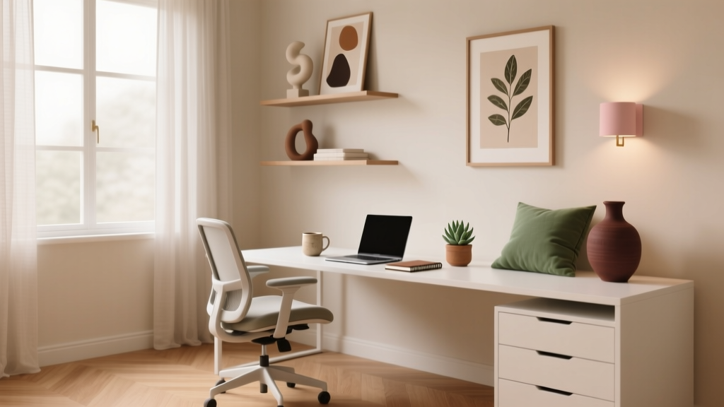
How to Choose Colors for a Home Office - The Decor Mag
A home office has to do more than look good—it has to help you think clearly, stay motivated, and feel grounded through long stretches of work. Color is one of the most powerful interior design tools for shaping that experience. The right paint colors can boost focus, soften stress, and make a small room feel more spacious. The wrong color scheme can leave you fatigued, distracted, or simply uninspired.
Unlike a living room, where you’re often designing for conversation and comfort, a home office is a performance space. You need a palette that supports your habits: deep work, video calls, creative brainstorming, or switching between tasks. Add in real-world constraints—limited daylight, screen glare, and multifunctional use—and choosing office paint colors becomes a smart design decision, not just a decorative one.
This guide breaks down how to choose a home office color scheme using color psychology and design principles, with practical paint recommendations, real room scenarios, and common mistakes to avoid. Whether you’re planning a full makeover or just repainting one wall, you’ll be able to choose colors with confidence.
Start With the Work You Do (Yes, Color Should Match Your Tasks)
Before opening paint fan decks, define what the room needs to do. The best interior color design starts with function.
Choose a color direction based on your work style
- Deep focus & analytical work: calming, low-contrast colors such as soft blues, blue-grays, and muted greens.
- Creative work & brainstorming: warm whites, terracottas, optimistic yellows, and dynamic accent colors that energize without overwhelming.
- Client meetings & video calls: balanced neutrals with gentle undertones; avoid colors that cast unflattering shadows on camera.
- High-volume tasks & admin work: clear neutrals and light mid-tones that feel tidy and structured.
Quick self-audit (2 minutes, big payoff)
- When do you use the space most: morning, afternoon, or evening?
- Do you need energy, calm, or a mix?
- Are you easily distracted by high-contrast patterns or bright colors?
- Will your office background be visible on camera?
Color Psychology for Home Offices: What Different Hues Encourage
Color psychology isn’t magic; it’s about how our brains interpret visual cues. In a home office, you’re often looking at the same surfaces for hours, so subtle shifts matter.
Blues: Focus and mental clarity
Blue is a classic choice for office paint colors because it’s associated with steadiness and concentration. Softer blue-grays help reduce visual “noise,” especially when paired with warm wood tones.
- Try: Sherwin-Williams Sea Salt (a soft blue-green), Benjamin Moore Boothbay Gray (classic blue-gray), Farrow & Ball Light Blue (gentle, historic feel).
Greens: Calm, balance, and eye comfort
Green sits in the middle of the visible spectrum, which can feel restful—helpful if you’re on screens all day. Sage and olive tones bring an organic, grounded mood that works beautifully with natural textures.
- Try: Sherwin-Williams Evergreen Fog (modern green-gray), Benjamin Moore October Mist (soft sage), Behr Back to Nature (warm, approachable green).
Neutrals: Versatility and a clean mental slate
Neutrals are popular for small home offices and multipurpose rooms because they’re flexible. The key is choosing the right undertone so the space doesn’t feel flat or gloomy.
- Warm whites: cozy and inviting, great with brass and walnut. Example: Benjamin Moore White Dove.
- Soft greiges: balanced and professional, easy for video calls. Example: Sherwin-Williams Agreeable Gray.
- Creamy neutrals: sunny without feeling yellow. Example: Sherwin-Williams Alabaster.
Yellows and warm tones: Optimism and energy (use strategically)
Yellow can be motivating, but in a home office it’s best as an accent or a softened shade. Bright, saturated yellows can create glare and fatigue under strong lighting.
- Try: Farrow & Ball Hay (muted warmth), Benjamin Moore Hawthorne Yellow (classic, cozy), Sherwin-Williams Napery (warm cream-yellow).
Dark colors: Depth, focus, and sophistication
Deep paint colors can create a cocoon-like focus zone and look striking on camera—when balanced with good lighting. A dark accent wall behind your desk can feel intentional and reduce visual distractions.
- Try: Benjamin Moore Hale Navy (timeless navy), Sherwin-Williams Iron Ore (soft charcoal), Farrow & Ball Railings (inky blue-black).
Assess Your Light First: The Rule That Prevents Most Color Regrets
Light changes color. The same paint swatch can look airy in a bright room and murky in a dim one. For office color schemes, start by identifying your main daylight direction and your nighttime lighting.
How natural light affects paint colors
- North-facing light: cooler and sometimes gray. Choose warmer whites, greiges, or muted warm greens to avoid a chilly feel.
- South-facing light: warmer and strong. You can handle cooler colors like blue-grays and crisp whites without the space feeling cold.
- East-facing light: bright in the morning, cooler later. Balanced neutrals and gentle color shifts work well.
- West-facing light: warmer in the afternoon/evening. Watch for colors that become too golden or intense late day.
Office lighting tip for true color
For a home office, aim for 2700K–3000K warm-white ambient lighting for comfort, plus a task lamp that’s 3000K–3500K for clarity. Extremely cool bulbs (4000K+) can make many warm paints look dull or slightly green.
Build a Home Office Color Scheme That Looks Designed (Not Random)
A great color scheme balances walls, trim, ceiling, furniture, and textiles. Use a simple formula to make paint colors feel cohesive.
The 60-30-10 guideline for offices
- 60% main wall color (your backdrop)
- 30% secondary tone (furniture, rug, curtains, built-ins)
- 10% accent color (art, desk accessories, a chair, a lamp base)
Undertones matter more than you think
When choosing neutrals, compare undertones:
- Pink/red undertones: cozy, flattering, can clash with orange woods if too rosy.
- Yellow undertones: warm and sunny, can look dated if too strong.
- Green undertones: organic and calming, can go “muddy” in low light.
- Blue undertones: crisp and modern, can feel cold in north light.
Specific Home Office Paint Color Recommendations (With Real Pairings)
These combinations work as complete home office color schemes—walls, trim, and accents—so you’re not guessing.
1) Calm and focused: Sage + warm white + natural oak
- Walls: Sherwin-Williams Evergreen Fog
- Trim/Ceiling: Sherwin-Williams Alabaster
- Accents: matte black hardware, woven textures, off-white linen
Best for: shared offices, wellness-oriented work, long screen days. This palette feels quiet without looking flat.
2) Professional and crisp: Blue-gray + bright white + brass
- Walls: Benjamin Moore Boothbay Gray
- Trim: Benjamin Moore Chantilly Lace
- Accents: brass desk lamp, white shelving, navy textiles
Best for: video calls and client-facing work. Blue-gray reads steady and polished, while bright trim keeps it fresh.
3) Cozy and creative: Warm neutral + terracotta accent
- Walls: Benjamin Moore White Dove or Sherwin-Williams Alabaster
- Accent wall or nook: Farrow & Ball Red Earth (rich terracotta)
- Accents: walnut wood, clay ceramics, soft black frames
Best for: writers, designers, and makers who want warmth without sacrificing calm. Keep terracotta to one wall or built-in area for balance.
4) Small office that needs to feel bigger: Soft greige + tone-on-tone trim
- Walls: Sherwin-Williams Agreeable Gray
- Trim (slightly brighter): Sherwin-Williams Pure White
- Accents: light oak desk, cream rug, soft blue art
Best for: compact rooms and converted closets. Low contrast reduces visual breaks, helping the space feel larger.
5) Dramatic and modern: Charcoal walls + warm white ceiling
- Walls: Sherwin-Williams Iron Ore
- Ceiling/Trim: Sherwin-Williams Alabaster
- Accents: cognac leather chair, oak shelving, oversized art
Best for: a dedicated office with controlled lighting. Add layered light sources to keep it from feeling heavy.
Real Room Examples and Application Scenarios
Scenario A: The dining-room-office hybrid
Goal: A color scheme that works for productivity but still feels social and welcoming after hours.
- Choose a versatile neutral like Benjamin Moore White Dove for walls.
- Add a built-in or bookcase in a muted color (Benjamin Moore Hale Navy works well for a furniture-like effect).
- Bring in the “office” feeling through structured accents: black frames, tailored curtains, a refined desk lamp.
Scenario B: A small spare bedroom with limited daylight
Goal: Avoid gloom while keeping the room calm.
- Skip cool grays that can turn flat in low light.
- Use a warm white (Sherwin-Williams Alabaster) or a light greige.
- Add a soft color through textiles: a sage chair, muted blue rug, or oatmeal drapes.
Scenario C: A background that looks great on video
Goal: A flattering, professional backdrop with depth.
- Choose a mid-tone wall color behind you: blue-gray or green-gray tends to work well.
- Avoid pure bright white behind the desk—it can blow out on camera.
- Try Benjamin Moore Boothbay Gray or Sherwin-Williams Sea Salt with warm lighting and simple art.
Scenario D: A creative studio office
Goal: Energy without chaos.
- Keep the main walls neutral (warm white or soft greige).
- Add one intentional, saturated moment: a painted pinboard wall, a color-blocked nook, or a bold bookshelf backing.
- Good accent choices: deep teal, terracotta, or a mustard-gold used in small doses.
Where to Put Color in a Home Office (Beyond “Paint Everything”)
Walls aren’t the only place for color, and sometimes they aren’t the best place. Use placement to control intensity.
- Accent wall behind the desk: adds depth on video calls and frames your workspace.
- Ceiling color: creates a cozy envelope effect, especially in a small office; try a lighter version of the wall color.
- Built-ins and cabinetry: a great way to use deeper hues without overwhelming the room.
- Trim and doors: painting interior doors in a contrasting color can make a basic room feel custom.
Paint finish tips for office durability
- Walls: eggshell or satin for cleanability.
- Trim/doors: satin or semi-gloss for crisp definition.
- Ceiling: flat to minimize glare.
Common Color Mistakes to Avoid in a Home Office
- Choosing a color from a tiny swatch: always test large samples on multiple walls. Paint changes across the room.
- Ignoring screen glare: highly saturated colors and high-contrast patterns can feel “busy” during long work sessions.
- Picking cool gray in a dark room: it can turn lifeless or bluish. Opt for warm neutrals or gentle color instead.
- Using bright white everywhere: it can feel stark and create harsh contrast with monitors. Consider warm whites or soft off-whites.
- Forgetting undertones in existing finishes: flooring, countertops, and wood furniture dictate whether a paint color feels harmonious.
- Going too dark without lighting: deep colors need layered lighting—ambient, task, and accent—to look intentional.
FAQ: Choosing Colors for a Home Office
What are the best paint colors for productivity in a home office?
Soft blues, blue-grays, and muted greens are reliable productivity colors because they feel calm and reduce visual stimulation. Popular choices include Sherwin-Williams Sea Salt, Benjamin Moore Boothbay Gray, and Benjamin Moore October Mist.
Should a home office be light or dark?
Either can work. Light colors can make small offices feel larger and brighter, while dark colors can create focus and sophistication. The deciding factor is lighting: darker paint colors need strong, layered lighting to avoid feeling heavy.
What colors look best on Zoom or video calls?
Mid-tone, muted colors usually look best—think blue-gray, green-gray, or warm neutral. Avoid pure bright white behind your chair and avoid neon or overly saturated hues that can shift on camera.
How do I choose a color if my office is part of another room?
Use a transitional color scheme: match the main wall color to the shared space, then add office-specific color through built-ins, a painted accent wall, or textiles. This keeps flow while still defining the workspace.
How many colors should I use in a home office color scheme?
Three is a sweet spot: a main wall color, a trim color, and an accent. That structure keeps the room cohesive while still adding personality.
Do warm or cool colors work better for focus?
Cool colors (like blue and green) tend to feel more calming and focus-friendly, while warm colors add energy and sociability. Many of the best home office color schemes blend both—cool walls with warm wood, brass, or creamy trim.
Next Steps: A Simple Plan to Choose Your Office Colors
- Identify your light: note window direction and bulb temperature.
- Pick one main paint color: start with a muted mid-tone or a warm neutral.
- Select trim and ceiling: choose a clean white that matches your undertones (warm with warm, cool with cool).
- Add one accent: through a wall, built-ins, art, or textiles.
- Test before committing: sample on at least two walls and observe morning, afternoon, and evening.
Your home office should feel like a place you want to show up to—clear, supportive, and personal. For more paint color ideas, curated color schemes, and room-by-room guidance, explore our color guides on thedecormag.com.
More Articles
 How to Choose Colors for a Media Room - The Decor Mag
 Cheap vs Premium: Why 'Premium' Isn’t Just Marketing—It’s Measurable Performance
 How to Choose Colors for a Patio - The Decor Mag
 Best Slate Blue Paint Colors - The Decor Mag
 Best Burgundy Paint Colors - The Decor Mag
 Best Pear Green Paint Colors - The Decor Mag
 How to Choose Bathroom Paint Colors - The Decor Mag
 How to Choose Colors for an Entryway - The Decor Mag
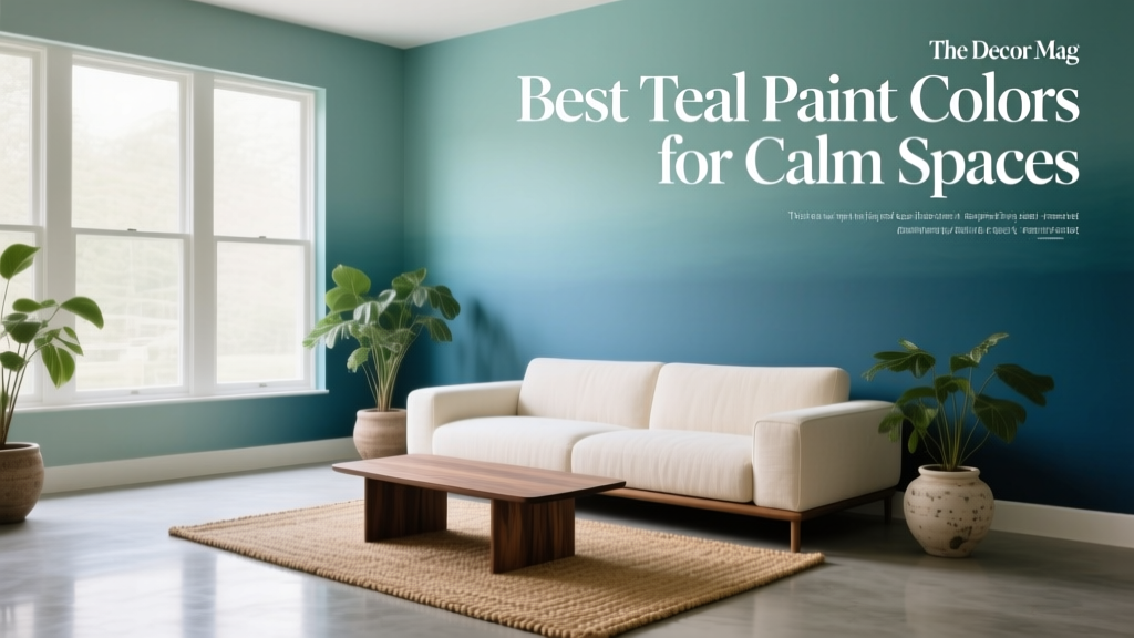 Best Teal Paint Colors for Calm Spaces - The Decor Mag
 The Ultimate Reading Guide: Science-Backed Strategies for Faster Comprehension, Retention, and Lifelong Engagement