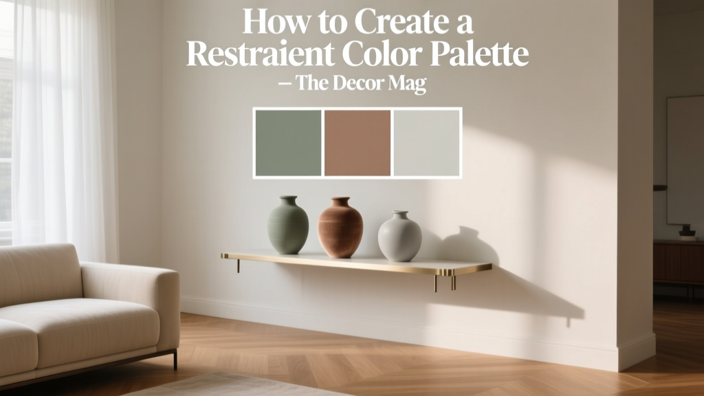
How to Create a Restraint Color Palette - The Decor Mag
A beautifully designed home rarely relies on “more color.” It relies on the right color, repeated with intention. A restraint color palette—sometimes called a restrained palette, edited palette, or quiet color scheme—uses fewer hues and tighter value shifts to create rooms that feel calm, cohesive, and elevated. It’s the difference between a space that looks decorated and one that looks designed.
This approach matters because most homeowners don’t struggle with finding colors they like—they struggle with making colors live together across rooms, lighting conditions, and materials. A restraint palette solves that by simplifying decisions, strengthening flow, and letting architectural details, texture, and furniture do more of the talking. It’s also one of the most practical ways to avoid “paint regret” when a sample that looked perfect online suddenly feels loud on four walls.
Restraint doesn’t mean bland. With the right undertones, contrast levels, and finish choices, an edited interior color design can feel warm, modern, and deeply personal—without visual clutter.
What a Restraint Color Palette Is (and What It Isn’t)
Definition: edited, repeatable, and intentionally limited
A restraint color palette is a color scheme built from a small set of coordinated hues—typically 3–6 core colors—used repeatedly throughout a home with subtle shifts in lightness (value) and saturation. The goal is unity: walls, trim, ceilings, and key surfaces harmonize, while contrast is used sparingly and on purpose.
Restraint is not “all white”
A restrained scheme can be:
- Monochromatic: variations of one hue (e.g., warm whites through camel and tobacco).
- Analogous: neighboring hues on the color wheel (e.g., blue-green + green + yellow-green).
- Neutral-forward with one accent: stone, greige, and soft black with a muted blue accent.
Why it works: color psychology and design principles
Visually, restraint reduces competing stimuli, which supports relaxation and focus—one reason it’s so effective in bedrooms, living rooms, and open-plan homes. From a design standpoint, repetition creates rhythm, limited contrast creates harmony, and a controlled accent creates emphasis. That trio—rhythm, harmony, emphasis—is the backbone of interior color design.
Start with Your “Anchor”: Fixed Elements and Lighting
The fastest way to create a restraint palette that actually works in your home is to choose color from what can’t easily change. Paint is flexible; stone counters, flooring, and upholstery aren’t.
Step 1: Identify your fixed finishes
- Wood tone (red oak, walnut, maple, painted cabinetry)
- Flooring (warm honey, cool gray, mid-tone neutral)
- Stone (marble veining, quartz undertone, granite warmth)
- Large upholstery pieces (sofa, sectional, area rug)
Step 2: Read your natural light
Light changes paint color more than most people expect. Use this quick guide:
- North-facing rooms: cooler, flatter light—warm up with creamy whites and warm greiges.
- South-facing rooms: bright, warm light—can handle cooler neutrals and deeper colors.
- East-facing rooms: crisp morning light, muted afternoons—balanced neutrals work best.
- West-facing rooms: warm late-day glow—avoid overly yellow paint if you dislike golden shifts.
Step 3: Choose an undertone direction
Restrained palettes feel “effortless” when undertones agree. Pick a lane:
- Warm: creamy whites, greige, beige, clay, olive.
- Cool: crisp whites, cool grays, blue-grays, blue-greens.
- Neutral-balanced: flexible greiges and soft taupes that don’t swing too pink or green.
Build the Palette: A Simple 5-Color Framework
If you want a restraint color palette you can apply room to room, this structure is reliable and scalable:
- Primary wall neutral (60%): the main background color.
- Secondary neutral (20%): for adjacent rooms or built-ins.
- Trim/ceiling white (10–15%): crisp or creamy depending on undertones.
- Accent color (5–10%): used in controlled moments.
- “Anchor” dark (5%): grounding shade for contrast (soft black, deep brown, charcoal, deep green).
Specific paint color recommendations (designer-tested favorites)
- Primary wall neutrals:
- Sherwin-Williams Agreeable Gray (SW 7029) – balanced greige for open plans.
- Benjamin Moore Edgecomb Gray (HC-173) – warm, soft, classic.
- Farrow & Ball Skimming Stone (No. 241) – calm, sophisticated stone neutral.
- Secondary neutrals:
- Benjamin Moore Classic Gray (OC-23) – light, warm-leaning without feeling beige.
- Sherwin-Williams Repose Gray (SW 7015) – cooler greige with clean edges.
- Farrow & Ball Ammonite (No. 274) – modern, quiet gray.
- Trim and ceiling whites:
- Benjamin Moore White Dove (OC-17) – soft white with broad compatibility.
- Sherwin-Williams Alabaster (SW 7008) – creamy, warm, welcoming.
- Benjamin Moore Chantilly Lace (OC-65) – crisp, bright white for cooler palettes.
- Accent colors (muted, restraint-friendly):
- Benjamin Moore Boothbay Gray (HC-165) – blue-gray that reads calm, not trendy.
- Sherwin-Williams Evergreen Fog (SW 9130) – softened green-gray, great for bedrooms.
- Farrow & Ball De Nimes (No. 299) – deep denim blue with elegance.
- Anchor darks (for contrast and structure):
- Benjamin Moore Wrought Iron (2124-10) – soft black with a hint of depth.
- Sherwin-Williams Iron Ore (SW 7069) – charcoal-black that feels architectural.
- Benjamin Moore Kendall Charcoal (HC-166) – classic charcoal, strong without harshness.
Three Restraint Color Palettes You Can Copy (and Why They Work)
1) Warm, Modern Neutral (welcoming and timeless)
- Walls: Benjamin Moore Edgecomb Gray (HC-173)
- Adjacent rooms/built-ins: Benjamin Moore Classic Gray (OC-23)
- Trim: Benjamin Moore White Dove (OC-17)
- Accent: Sherwin-Williams Evergreen Fog (SW 9130)
- Anchor: Sherwin-Williams Iron Ore (SW 7069)
Why it works: This palette leans warm, which supports comfort and hospitality (color psychology: warm neutrals signal ease and approachability). The green-gray accent adds a natural note without “shouting.”
2) Quiet Coastal (calm, airy, grown-up)
- Walls: Benjamin Moore Classic Gray (OC-23)
- Secondary: Sherwin-Williams Repose Gray (SW 7015)
- Trim: Benjamin Moore Chantilly Lace (OC-65)
- Accent: Benjamin Moore Boothbay Gray (HC-165)
- Anchor: Benjamin Moore Wrought Iron (2124-10)
Why it works: The blue-gray accent lowers visual “temperature,” promoting calm and mental clarity—perfect for bedrooms, baths, and serene living spaces.
3) Earthy Minimalist (textural, grounded, design-forward)
- Walls: Farrow & Ball Skimming Stone (No. 241)
- Secondary: Farrow & Ball Ammonite (No. 274)
- Trim: Sherwin-Williams Alabaster (SW 7008)
- Accent: Farrow & Ball De Nimes (No. 299) or Sherwin-Williams Evergreen Fog (SW 9130)
- Anchor: Benjamin Moore Kendall Charcoal (HC-166)
Why it works: Slightly dusty, mineral tones complement natural materials (linen, oak, stone). This palette depends on texture for richness, not high color contrast.
Real Room Application Scenarios (How Restraint Looks in Practice)
Open-plan living/dining/kitchen: create flow without monotony
Scenario: You want a cohesive paint color scheme across connected spaces but fear it will feel flat.
- Use one primary wall neutral throughout (e.g., SW Agreeable Gray).
- Shift the secondary neutral to kitchen cabinetry or an island (e.g., SW Repose Gray or a deeper greige).
- Bring in the accent color through barstools, art, and a single painted built-in.
- Add the anchor dark in lighting, hardware, or a fireplace surround (e.g., BM Wrought Iron).
Pro tip: Restraint palettes love repetition. Repeat your anchor dark 3–5 times (frames, faucet, cabinet pulls, mirror, curtain rod) to make it feel intentional.
Bedroom: calm color psychology with a tailored contrast
Scenario: You want restful but not boring.
- Paint walls a soft neutral (BM Edgecomb Gray or BM Classic Gray).
- Use a muted accent on the headboard wall only, or paint the ceiling for a cocoon effect (SW Evergreen Fog works beautifully here).
- Keep bedding largely tonal; add contrast via an anchor dark in bedside lamps or a dark wood nightstand.
Finish guidance: Matte or eggshell on walls for softness; satin on trim for gentle definition.
Small bathroom: restraint + contrast = instant polish
Scenario: The room is small, and color can overwhelm quickly.
- Choose a light neutral wall (BM Classic Gray).
- Paint vanity or lower cabinetry in a moody accent (BM Boothbay Gray or SW Iron Ore).
- Keep tile and towels in the same undertone family (warm with warm, cool with cool).
Pro tip: In small rooms, restraint doesn’t mean “no drama.” It means drama in one place.
Hallways and transitions: the secret to a whole-home palette
Hallways are where a paint color scheme either connects or clashes. A restraint palette often uses:
- The primary neutral in halls and stairways
- The trim white consistently throughout the home
- The accent reserved for rooms you want to feel distinct (office, dining room, powder room)
How to Add Interest Without Adding More Colors
Restraint palettes are elevated by texture, sheen, and pattern rather than extra paint swatches.
Use texture as your “sixth color”
- Matte plaster look walls, limewash effects, or subtle Venetian plaster
- Natural fibers: jute, sisal, linen, wool
- Wood and leather to introduce warmth and patina
- Stone, ceramic, and unlacquered brass for depth
Layer values, not hues
Instead of adding a new color, shift light-to-dark within the same family:
- Walls: light greige
- Sofa: medium taupe
- Drapery: warm ivory
- Accent chair: deep tobacco leather
Control contrast strategically
High contrast (bright white next to very dark paint) reads energetic and graphic. Low contrast reads soothing. Many homeowners prefer a middle path:
- Soft white trim + mid-tone wall color
- One dark anchor repeated in small doses
Common Color Mistakes to Avoid
- Mixing conflicting undertones: Pairing a pink-beige with a green-gray makes both look “off.” Match undertone temperature across paint colors, flooring, and tile.
- Using too many “almost neutrals”: Five different greiges in one open plan reads accidental. Choose one primary neutral and repeat it.
- Forgetting finish consistency: A flat wall beside a high-gloss trim can look stark if not intentional. Keep finishes coordinated for a calmer look.
- Testing paint the wrong way: Tiny chips lie. Use large sample swatches or peel-and-stick samples, and view them morning, afternoon, and night.
- Choosing accent colors before neutrals: In a restraint palette, the neutrals are the star. Accents support them—not the other way around.
- Ignoring the “color cast” of lighting: Warm LEDs can turn some whites creamy-yellow; cool LEDs can make warm neutrals look dull. Match bulbs across connected rooms (often 2700K–3000K for homes).
FAQ: Restraint Color Palettes
How many colors should a restraint palette include?
Most homes do well with 3–6 core colors: a primary wall neutral, a secondary neutral, a trim/ceiling white, one accent, and one anchor dark. You can add one more “special” color for a single room (like a powder room) if it still relates by undertone.
Can I use bold color in a restrained color scheme?
Yes—use it in a limited, repeatable way. A deep navy (Farrow & Ball De Nimes) or charcoal (SW Iron Ore) can be the anchor used on an island, built-in, or interior doors, then echoed in a rug or artwork.
What’s the best whole-house paint color for a restraint palette?
Great candidates include Sherwin-Williams Agreeable Gray (SW 7029), Benjamin Moore Edgecomb Gray (HC-173), and Benjamin Moore Classic Gray (OC-23). The best choice depends on your flooring and the direction of your natural light.
Should trim be the same white throughout the house?
For a restrained interior color design, consistent trim color is one of the easiest ways to create flow. Benjamin Moore White Dove (OC-17) and Sherwin-Williams Alabaster (SW 7008) are popular because they’re soft, flexible whites.
How do I keep a neutral palette from looking boring?
Increase texture and value contrast, not color count. Add depth with layered textiles, natural woods, woven shades, and an anchor dark in small elements (hardware, frames, lighting). Consider shifting one wall to a slightly deeper shade of the same hue family.
What’s the fastest way to test a restraint palette at home?
Pick your primary neutral and trim white first. Test them on two walls in the room you use most, then bring in your accent via a removable element (pillows, art) before committing to paint. This mirrors how the palette will actually live day to day.
Your Next Steps: Create Your Restraint Palette This Week
- Inventory fixed finishes (floors, counters, large upholstery).
- Choose one primary wall neutral that matches your undertone direction.
- Select one trim white and keep it consistent across the home.
- Add one muted accent and one anchor dark for structure.
- Test large samples in multiple lighting conditions before painting.
A restraint color palette makes your home feel calmer, more connected, and more intentional—while giving you far fewer decisions to second-guess. When your colors are edited, everything else (art, furniture, texture, light) gets to shine.
Want more paint color ideas and color scheme guides? Explore our latest color stories and room-by-room recommendations on thedecormag.com.
More Articles
 Living Room Colors for Entertaining (2026)
 Best Prussian Blue Paint Colors - The Decor Mag
 How to Test Paint Colors Before Committing - The Decor Mag
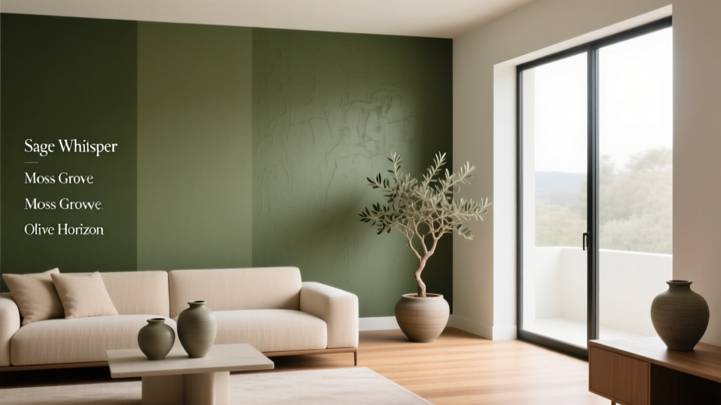 Best Olive Green Paint Colors (2026) | The Decor Mag
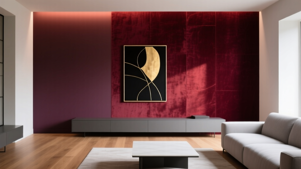 Best Wine Red Paint Colors - The Decor Mag
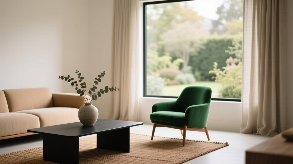 Color Psychology in Living Rooms: Why Your Space Feels Off
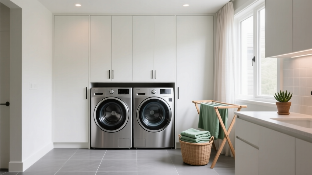 How to Choose Colors for a Laundry Room - The Decor Mag
 How to Use the 60-30-10 Color Rule - The Decor Mag
 How to Choose Colors for a Reading Room - The Decor Mag
 Best Papaya Paint Colors - The Decor Mag