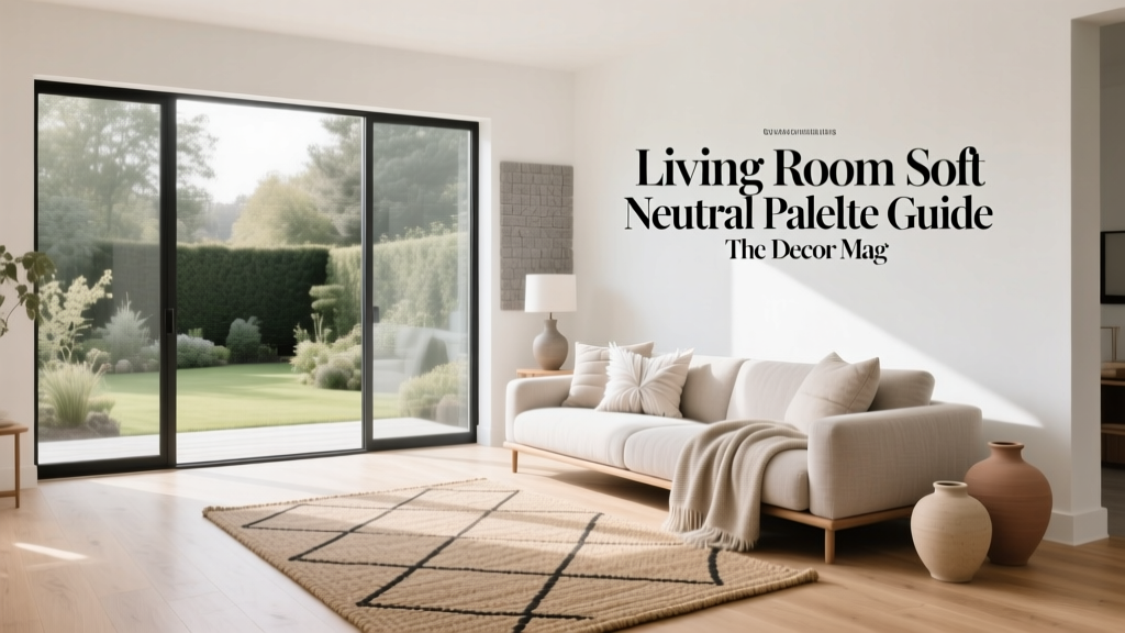
Living Room Soft Neutral Palette Guide - The Decor Mag
A soft neutral palette is one of the most reliable ways to make a living room feel calm, pulled together, and welcoming—without locking you into a single style. Whether you rent a compact apartment or you’re styling a forever home, neutrals create an easy foundation that can flex with your furniture, artwork, and changing tastes.
Done well, a neutral living room doesn’t look bland. It looks layered: creamy walls, warm wood tones, a nubby rug, linen curtains, and a few higher-contrast accents that give the eye somewhere to land. This guide breaks down exactly how to build that look—color by color, material by material—with practical measurements, budget ranges, and real-world examples you can copy.
You’ll learn how to choose the right undertones, assemble a neutral color palette that feels intentional, and avoid common mistakes like “all beige everything” or flat, under-lit rooms. You’ll also get product-style recommendations, styling formulas, and a step-by-step plan you can follow over a weekend.
What Counts as a “Soft Neutral” Living Room?
Soft neutrals sit in the gentle middle ground: not stark white, not heavy brown, not high-contrast black-and-white. Think warm whites, creamy off-whites, greige, taupe, sand, oatmeal, mushroom, pale clay, and muted stone. These shades work across modern, traditional, Scandinavian, coastal, and transitional living room design.
Soft neutral color families (with undertones)
- Warm whites: ivory, cream, antique white (yellow/red undertones)
- Greige: beige + gray blends (balanced undertones; very flexible)
- Taupe/mushroom: sophisticated, slightly deeper neutrals (often violet or brown undertones)
- Sand/oatmeal: cozy, organic neutrals (golden undertones)
- Stone/clay: slightly earthy neutrals (subtle pink/terracotta undertones)
Trend meets timeless: Current trends lean toward warmer, more natural neutrals—think “quiet luxury,” organic modern, and textured minimalism. Timeless principles still apply: varied textures, balanced contrast, and a clear focal point.
Start Here: Pick Your Anchor Neutral (Walls or Rug)
The fastest way to build a cohesive neutral palette is to choose one “anchor” element and coordinate everything else around it. In many living rooms, the best anchors are:
- Wall color (most visual real estate)
- Area rug (ties seating together and sets the tone)
- Sofa upholstery (largest furniture piece)
Wall paint guidance (undertones + sheen)
- Best sheens: matte or eggshell for walls; satin for trim if you want a clean contrast
- Warm neutral living rooms: choose creamy off-white or warm greige
- Cool daylight rooms: warmer paint balances blue light
- Low-light rooms: avoid overly gray neutrals that can turn flat; choose warmer off-whites or light taupe
Practical tip: Paint looks different on every wall. Sample at least 2–3 swatches and paint large test patches (about 12" x 12" minimum, or use peel-and-stick samples). View morning, afternoon, and evening.
Rug-first guidance (size and style)
If your walls must stay white (hello, renters), a rug is a powerful starting point. For a soft neutral palette, look for subtle pattern, mixed fibers, or tonal variation.
- 8' x 10': works for most standard living rooms; front legs of sofa and chairs should sit on the rug
- 9' x 12': ideal for open-plan living rooms or larger seating groups
- 5' x 8': best for small spaces; try to keep at least front sofa legs on it
Material recommendations:
- Wool: durable, naturally stain-resistant, plush underfoot (mid to high budget)
- Wool-blend: good performance with a lower price point (mid budget)
- Jute/sisal: great texture; best in lower-traffic zones and if you don’t mind a firmer feel (budget to mid)
- Washable rugs: ideal for pets/kids, often thinner pile (budget to mid)
The 60-30-10 Neutral Palette Formula (That Won’t Feel Flat)
Designers often use the 60-30-10 rule to distribute color. For a neutral living room, the idea stays the same—you’re just working with tones and textures instead of bold hues.
- 60%: your dominant neutral (walls + large rug or large sofa)
- 30%: secondary neutral (sofa, curtains, large chairs, or rug)
- 10%: accent neutral + contrast (pillows, art frames, lighting, styling)
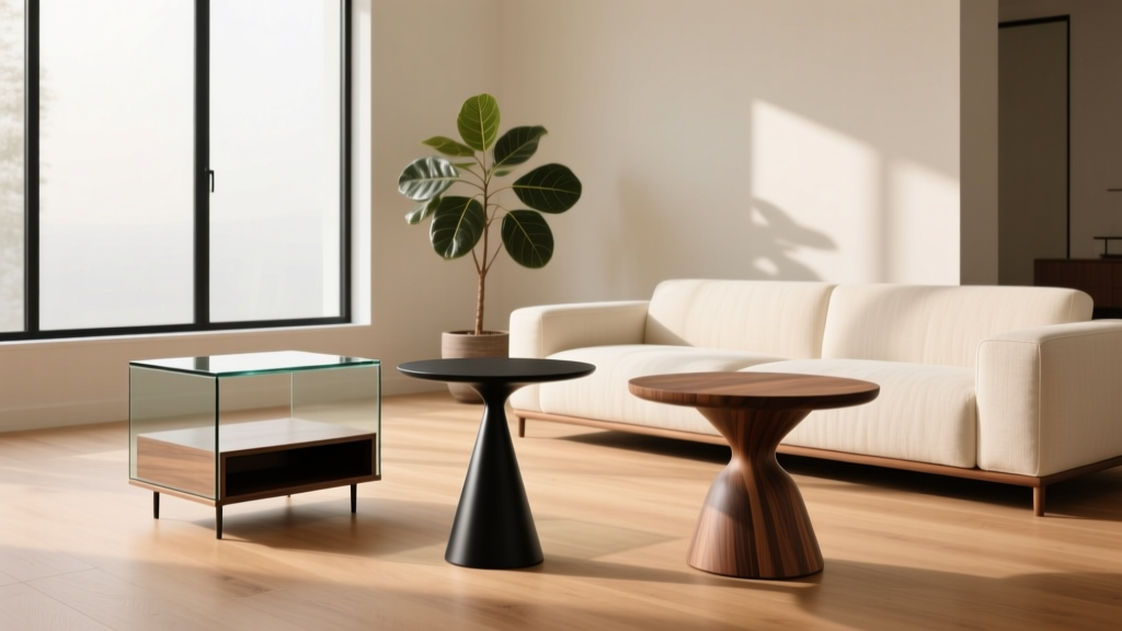
Example palette: warm white walls (60%), oatmeal sofa (30%), accents in camel leather + matte black + walnut (10%). This reads soft, warm, and intentional—never washed out.
How to add contrast without breaking the calm
- Use “soft contrast”: charcoal, espresso, or bronze rather than pure black
- Repeat contrast 2–3 times: for example, black in a floor lamp, picture frames, and a tray
- Go tonal with pattern: a beige-on-ivory rug or subtle stripe pillows
Texture Is the Secret Ingredient (Layer It Like a Pro)
If you’ve ever seen a neutral living room that felt boring, it likely lacked texture. With a soft neutral palette, texture creates depth and keeps the space from looking like a single paint chip.
Go-to texture pairings for living room decor
- Linen + boucle: relaxed and current (great for modern and Scandinavian looks)
- Wool + leather: warm, timeless, and elevated
- Wood + stone/ceramic: grounded and organic
- Velvet + aged brass: soft glam without going flashy
Quick texture checklist (use 5+ of these)
- Textured rug (loop, flatweave, or subtle pattern)
- Throw blanket (chunky knit, mohair-look, or brushed wool)
- Mixed pillows (linen, boucle, velvet, faux shearling)
- Wood grain (coffee table, side table, frames)
- Natural fiber (basket, jute pouf, woven shade)
- Ceramic vases (matte or reactive glaze)
- Metal accents (aged brass, bronze, blackened steel)
Furniture and Layout: Neutral Doesn’t Mean “One Note”
Soft neutrals shine when the shapes and proportions are right. A gorgeous greige sofa won’t help if the rug is too small or the coffee table sits awkwardly far away.
Living room spacing guidelines (easy, designer-approved)
- Rug placement: front legs of all main seating on the rug (or all legs if possible)
- Coffee table distance: keep 14–18 inches from the sofa for comfortable reach
- Walkways: aim for 30–36 inches for primary paths
- Side table height: within 1–2 inches of sofa arm height
- Curtain length: hang high and wide; panels should kiss the floor or hover 1/2 inch above
Product-style recommendations (with budget ranges)
- Sofa (performance fabric in oatmeal/ivory): $900–$3,500+ depending on size and quality
- Area rug (8' x 10' wool or blend): $250–$1,500
- Coffee table (oak, walnut, travertine-look, or boucle ottoman): $150–$900
- Lighting (floor lamp + table lamp set): $120–$600
- Window treatments (linen-look panels, 96"–108"): $40–$250 per panel depending on fabric
Material picks that wear well: performance chenille, tightly woven linen blends, top-grain leather (or high-quality faux leather for renters), solid wood or wood veneer, and metal finishes like aged brass or oil-rubbed bronze.
Lighting: The Make-or-Break Element for Soft Neutrals
Neutrals rely on light to show their undertones and texture. If your lighting is too cool, warm neutrals can look dingy; too yellow, and greige can skew beige.
A simple living room lighting plan
- Ambient: overhead fixture or flush mount (on a dimmer if possible)
- Task: floor lamp by the sofa or reading chair
- Accent: table lamp, picture light, or plug-in sconce for glow and depth
Bulb guidance: choose 2700K–3000K for a warm, inviting living room. Add dimmers or smart bulbs to shift mood from day to night.
Step-by-Step: Build a Soft Neutral Living Room in a Weekend
- Choose your anchor: rug, wall color, or sofa. Stick to one main undertone (warm, balanced, or cool).
- Lock the big three: rug + sofa + curtains. Keep them in the same neutral family, but vary depth (light/medium).
- Add 2 contrast points: e.g., a dark wood coffee table and a black/bronze floor lamp.
- Layer textiles: 2–4 pillows per sofa side + 1 throw. Mix weaves (linen + boucle + velvet).
- Style surfaces in threes: coffee table tray, a small stack of books, and a ceramic vase or sculptural object.
- Bring in greenery: one medium plant (real or faux) adds life to neutrals instantly.
Renter-friendly swaps: if you can’t paint, focus on a large rug, washable slipcovers, peel-and-stick wallpaper in a subtle linen texture, and plug-in sconces.
Real-World Scenarios You Can Copy
Scenario 1: Small apartment living room with white walls
You’re working with bright white rental paint, limited storage, and a modest budget. Keep it airy but grounded.
- Anchor: 8' x 10' ivory-and-sand patterned rug
- Sofa: compact loveseat in light greige or oatmeal (or a slipcovered sofa)
- Contrast: matte black curtain rod + warm walnut side table
- Budget range: $600–$1,800 total if you prioritize rug + curtains + lighting
Why it works: pattern and wood tone add depth, while the palette stays calm and cohesive.
Scenario 2: Open-plan family room with kids and pets
You want a neutral living room that doesn’t feel precious and can handle real life.
- Anchor: performance-fabric sectional in stone or greige
- Rug: washable low-pile rug in taupe/ivory pattern to camouflage wear
- Tables: round coffee table with softened edges; consider a large upholstered ottoman with a tray
- Budget range: $2,000–$6,500 depending on seating choice
Why it works: durable materials + subtle pattern keep the room looking styled, not stressed.
Scenario 3: Older home with warm wood floors and traditional trim
Lean into the warmth and make the neutrals feel elevated rather than dated.
- Anchor: creamy wall color that complements the floor (avoid cool gray)
- Upholstery: linen-blend sofa in ivory; add camel leather accent chair
- Metals: aged brass lighting + frames for softness
- Budget range: $1,500–$5,000
Why it works: warm neutrals harmonize with existing wood, and brass adds a classic, timeless finish.
Common Mistakes to Avoid in a Neutral Living Room
- Using the same shade everywhere: if walls, sofa, rug, and curtains match too closely, the room goes flat. Vary depth by 1–3 shades.
- Ignoring undertones: mixing pink-beige with green-gray can look “off” even if both are neutral. Keep undertones consistent.
- Choosing a too-small rug: a small rug makes furniture feel disconnected. Size up whenever possible (often 8' x 10' or 9' x 12').
- Skipping contrast entirely: even soft neutral palettes need grounding—add dark wood, bronze, or charcoal in a few places.
- Overloading on trendy textures: boucle everywhere can feel dated quickly. Balance trends with classics like linen, wool, and wood.
- Cold lighting: 4000K bulbs can make neutrals look harsh. Stick to 2700K–3000K and add dimmers.
FAQ: Soft Neutral Living Room Design
What are the best soft neutral paint colors for living rooms?
Look for warm whites, creamy off-whites, and balanced greiges. The “best” choice depends on your room’s light direction and existing finishes (floors, trim, upholstery). Test samples on multiple walls before committing.
How do I keep a neutral living room from looking boring?
Prioritize texture and contrast: mix at least 5 textures (wool rug, linen curtains, wood table, ceramic decor, cozy throw) and add 2–3 darker accents (frames, lamp, or a side table) to define the space.
Can a soft neutral palette work with gray floors?
Yes. Choose neutrals with balanced or slightly warm undertones (greige, oatmeal, warm white) and bring in warmth through wood tones, woven textures, and warmer metals like aged brass or bronze.
What accent colors pair well with soft neutrals?
Muted, nature-inspired shades work beautifully: sage, dusty blue, clay, terracotta, or deep olive. Use them in small doses—pillows, art, or a single accent chair—so the room stays calm.
What’s the most budget-friendly way to upgrade to a soft neutral living room?
Start with textiles and lighting: a larger rug (or layered rugs), linen-look curtains hung high, updated pillow covers, and warmer bulbs. These changes can reshape the entire feel without replacing furniture.
Are soft neutral living rooms still in style?
Yes—soft neutral interiors are a continuing trend because they’re flexible, calming, and compatible with popular looks like organic modern, quiet luxury, and Scandinavian-inspired decor.
Your Next Steps: A Simple Plan to Try This Week
- Pick your anchor neutral (wall, rug, or sofa) and commit to a consistent undertone.
- Upgrade one “big impact” item: a properly sized rug or curtains hung high and wide.
- Add layered texture with pillows, throws, and natural materials.
- Adjust lighting to 2700K–3000K and add a dimmer or second lamp for depth.
- Finish with contrast in 2–3 places (dark wood, bronze, charcoal, or matte black).
If you’re ready for more living room decor inspiration—from layout ideas to rug sizing and lighting plans—explore more guides and fresh trends on thedecormag.com.
More Articles
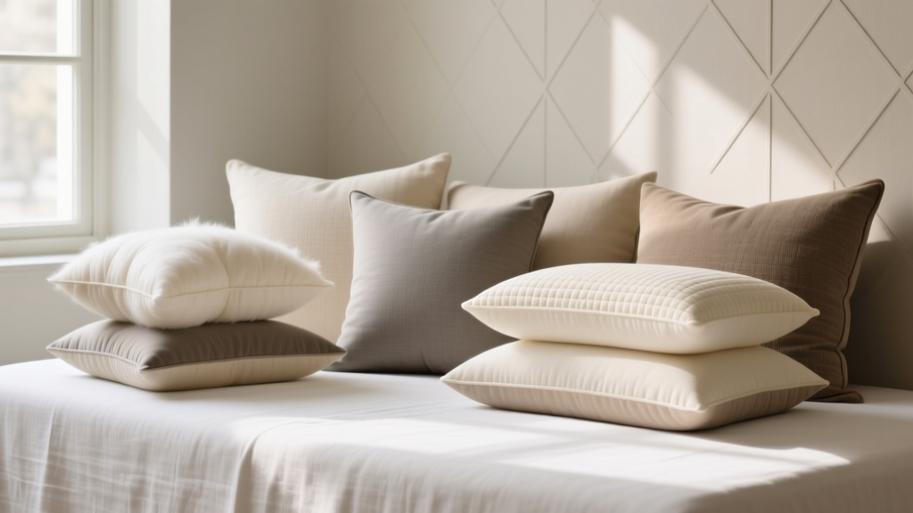 Best Accent Pillow Fill Inserts - The Decor Mag
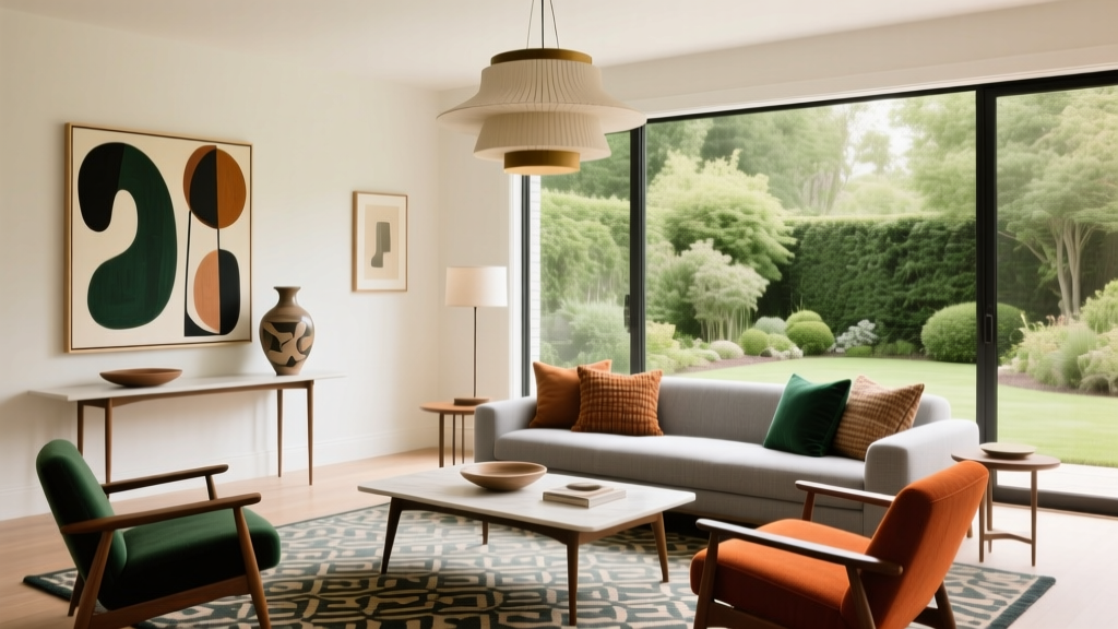 Living Room Artful Eclectic Design - The Decor Mag
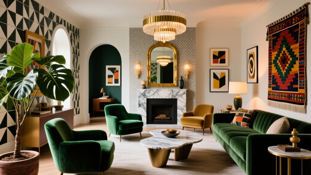 Maximalist Living Room Decor Done Right - The Decor Mag
 Human-Centered Spatial Design for Modern Living 2026
 Open Concept Living Room Furniture Arrangement
 Smart Living Spaces on a Budget in 2026
 Living Room Architectural Detail Ideas - The Decor Mag
 Living Room Refined Rustic Charm - The Decor Mag
 2026 Living Room Bathroom Ideas: Smart & Stylish Hybrids
 How to Choose the Perfect Side Table - The Decor Mag