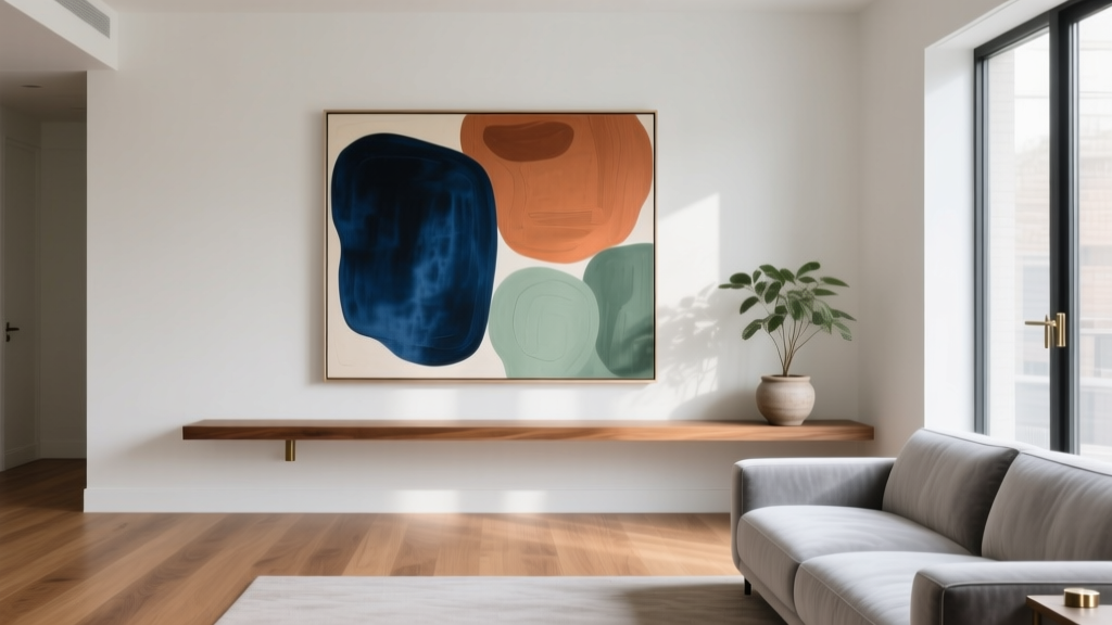
Living Room Color Scheme from Art (2026)
Your living room has a job to do: it needs to feel welcoming, look pulled-together, and reflect who lives there. Yet the moment you start thinking about paint colors, sofas, rugs, and curtains, it’s easy to get stuck in decision fatigue. One surprisingly simple way to cut through the noise is to let a piece of art lead the way.
Art already does what a great living room color scheme should do—it mixes colors with intention, sets a mood, and creates a focal point. Whether you own a large canvas, a framed print, a vintage poster, or even a textile wall hanging, you can treat it like a “color map” for the entire space. The result tends to feel cohesive and personal, not cookie-cutter.
This guide will show you how to pull a living room color palette from artwork step-by-step, how to translate those colors into paint, upholstery, and decor, and how to avoid the most common mistakes. You’ll also find real-world examples, budget ranges, and practical measurements so you can confidently bring the look to life—whether you’re a renter making small updates or a homeowner ready for a full refresh.
Why Art Is One of the Best Starting Points for a Living Room Color Scheme
Designers often begin with a “hero piece”—something that anchors the room and sets the direction. Art is ideal because it naturally contains:
- Built-in color harmony: The colors already work together.
- A mood: Calm coastal, bold modern, moody traditional, playful eclectic—your art signals the vibe.
- A focal point: Living rooms benefit from an intentional place for the eye to land.
- A personal story: A collected piece (even a budget-friendly print) makes the room feel like yours.
From a trend standpoint, this approach pairs perfectly with current favorites like color-drenching (one main hue used across walls and trim), quiet luxury neutrals (soft layers of warm whites, taupes, and stone), and art-forward interiors where statement pieces do more than just fill wall space.
Step-by-Step: How to Pull a Living Room Color Palette from Artwork
Step 1: Choose the Right Artwork to Lead the Room
Not every piece needs to be the “boss” of the living room. Pick art that checks at least two of these boxes:
- You genuinely love it and won’t tire of it quickly.
- It’s visible from key angles (entryway view, sofa view).
- It includes 3–6 distinct colors you can reuse elsewhere.
- It fits your desired mood (energizing vs. calming).
Size tip: If the art will hang above a sofa, aim for a frame width that’s about 2/3 to 3/4 the sofa’s width. For a 90-inch sofa, look for art around 60–70 inches wide (or a pair/trio that spans that width). Hang the bottom edge about 6–8 inches above the sofa.
Step 2: Identify the Dominant, Secondary, and Accent Colors
Stand back and identify:
- Dominant color (about 60% of the visual impact): often the background tone.
- Secondary color (about 30%): a main shape color or repeated hue.
- Accent color (about 10%): the “spark”—a saturated pop used sparingly.
If you’re not sure, take a photo of the art and zoom out until it blurs slightly. The colors that remain noticeable are the ones that will translate best into a room.
Step 3: Convert Those Colors into Room Materials (Not Just Paint)
A living room color scheme is more than wall color. Use this translation method:
- Dominant color: walls, large rug field color, or the sofa (if you want commitment).
- Secondary color: curtains, area rug pattern, accent chairs, or a large throw blanket.
- Accent color: pillows, pottery, a tray, lamp base, or book spines.
Material guidance: Art colors look richer when echoed in textured materials. Think:
- Linen or cotton curtains for softness and a relaxed, timeless look.
- Velvet accent pillows for deeper color saturation (especially jewel tones).
- Wool rugs for durability and better color depth than many synthetics.
- Leather (camel, cognac, or chocolate) as a warm neutral that pairs with many palettes.
Step 4: Decide Your Background “Neutral” Based on the Art’s Undertones
Neutrals aren’t all the same. Your art will usually lean warm or cool. Match that undertone to keep the room cohesive:
- Warm art undertones (cream, rust, ochre, warm greens): choose warm whites, ivory, beige, or greige.
- Cool art undertones (crisp blues, blue-grays, charcoal): choose cool whites, pale gray, or crisp neutral taupes.
Paint finish tip: Use eggshell for walls in most living rooms (durable, forgiving). Use satin or semi-gloss for trim if you want a clean contrast and easier wipeability.
Step 5: Test Paint Like a Pro
Skip the tiny paint chips alone. Get a large sample:
- Paint a sample at least 12 x 12 inches (bigger is better), or use peel-and-stick samples.
- Test on two walls if possible—one that gets the most daylight and one in shadow.
- View it morning, afternoon, and night with your lamps on.
Then hold the art up near the sample. The goal isn’t a perfect match—it’s harmony.
Design Formulas That Make Art-Led Color Schemes Feel Intentional
The 60-30-10 Rule (Classic and Reliable)
Use your art-derived palette like this:
- 60%: walls + large rug + large furniture silhouette (usually sofa)
- 30%: secondary upholstery, curtains, and mid-scale decor
- 10%: accents—pillows, throws, accessories, small art objects
This prevents the common “too many equal colors” look that feels busy.
Repeat Each Color at Least 3 Times
A designer trick: repeat every key color in three places around the room so it feels deliberate. For example, if the art has a terracotta accent:
- Terracotta pillow
- Terracotta vase on a shelf
- Terracotta book or candle on the coffee table
Use Contrast to Keep the Room From Feeling Flat
If your art is soft and muted, add contrast through:
- Dark wood (walnut, espresso) or black accents (frames, lamps)
- Metal finishes (aged brass for warmth, polished nickel for cool palettes)
- Texture shifts (nubby bouclé, woven baskets, ribbed ceramics)
Real-World Color Scheme Examples Based on Art
Scenario 1: Abstract Art with Navy, Cream, and Brass
Artwork: Navy brushstrokes on a creamy background with hints of warm metallic.
- Walls: warm off-white (keeps it airy)
- Sofa: light neutral performance fabric (cream or sand)
- Rug: cream base with navy pattern (or a solid natural wool rug)
- Accents: brass floor lamp, navy pillows, a few black frames for structure
Budget range: $250–$800 for a large framed print; $300–$1,200 for a wool-blend rug; $40–$120 per pillow depending on insert quality and fabric.
Scenario 2: Landscape Art with Sage, Clay, and Soft Sky Blue
Artwork: A calming landscape with green hills, clay earth, and a pale blue horizon.
- Walls: soft warm white or very pale sage (great for a nature-inspired living room)
- Seating: oatmeal linen or textured neutral upholstery
- Textiles: clay-toned throw, sky-blue pillow, woven natural-fiber baskets
- Wood: light oak or medium-tone wood coffee table
Rental-friendly tip: Keep walls neutral and bring sage/clay in with curtains, pillows, and an area rug for maximum impact with minimal commitment.
Scenario 3: Bold Pop Art with Hot Pink, Teal, and Yellow
Artwork: High-saturation colors with graphic shapes.
- Walls: crisp white to let the art breathe
- Anchor furniture: solid neutral sofa (charcoal, cream, or camel)
- Accents: one statement color echoed in a chair or rug detail (choose teal or pink, not all at full strength)
- Lighting: simple, modern shapes in black or chrome
Best practice: Use the art as the “loud” element and keep everything else clean-lined. This feels modern, not chaotic.
Product and Material Recommendations That Support an Art-Led Palette
- Frames: Matte black for modern contrast; light oak for airy, Scandinavian-inspired rooms; antique gold for traditional or “quiet luxury” spaces.
- Rugs: Wool or wool-blend for longevity. For high-traffic living rooms, look for low-pile or hand-tufted options.
- Sofa upholstery: Performance fabric (often labeled stain-resistant) for kids/pets; leather for a timeless, patina-friendly option.
- Curtains: Linen-look panels for softness; hang rods 4–6 inches above the window frame and extend 6–12 inches beyond the window on each side to make windows feel larger.
- Pillows: Use 20 x 20 inch inserts for most sofas; size up to 22 x 22 inserts for a fuller look (especially with covers labeled 20 x 20).
Common Mistakes to Avoid
- Matching paint to the art exactly: Perfect matches can feel forced. Aim for complementary tones and similar undertones.
- Using every color in the artwork equally: Pick 3–5 shades to repeat; let the rest stay in the art.
- Forgetting lighting: North-facing rooms skew cooler; warm bulbs can mute blues; daylight bulbs can make warm colors feel sharper. Test samples in your actual lighting.
- Choosing a rug or sofa before confirming the palette: These are big-ticket items. Let the art guide them, not the other way around.
- Ignoring scale: Tiny art over a large sofa makes the room feel unfinished. Go larger, or group multiple pieces into a gallery wall.
- Over-accessorizing: If the art is busy, keep surrounding decor simpler so the living room doesn’t feel cluttered.
FAQ: Choosing a Living Room Color Scheme from Art
How many colors should I pull from my artwork?
Three to five is the sweet spot for most living room color schemes: a dominant color, a secondary color, and one or two accents. You can add a neutral (like warm white or taupe) to keep it livable.
What if my artwork has colors I don’t like for my living room?
Use the art’s mood and undertones, not every hue. Pull the neutrals and one accent you enjoy, then treat the “unwanted” colors as tiny background notes that stay only in the artwork.
Should my sofa match the art?
Not directly. A sofa is usually best as a neutral anchor (cream, gray, greige, camel) unless you’re confident you’ll love a colored sofa long-term. If you do go bold, pick a color that’s clearly present in the art and repeat it elsewhere at least twice.
How do I do this in a rental without painting?
Keep walls as-is and build the palette with a rug, curtains, pillows, and decor. You can also use removable wallpaper behind the art to echo a secondary color without committing to paint.
What’s the most foolproof way to make it look cohesive?
Repeat key colors three times around the room, keep your largest pieces (sofa, rug, walls) more restrained, and let the art be the standout. Cohesion comes from repetition and balance, not perfect matching.
Can I base my palette on multiple artworks?
Yes—if they share an undertone (warm or cool) and at least one common color. If they clash, unify them with consistent frames and a neutral wall color, then choose one “lead” piece to set the main palette.
Your Next Steps: Turn Your Art into a Living Room Plan
To move from inspiration to a finished living room, keep it simple:
- Select the lead artwork and hang it at the right height.
- Pull 3–5 colors and label them dominant, secondary, and accent.
- Choose a wall color that matches the art’s undertone and test it in your lighting.
- Shop big pieces first (rug, sofa, curtains), then layer in accents.
- Edit and repeat colors thoughtfully for a cohesive, designer-like result.
If you’re ready for more approachable, high-impact living room design ideas—from layout tips to rug sizing, lighting plans, and trending color palettes—explore more inspiration on thedecormag.com.
More Articles
 How to Create a Warm Inviting Living Room - The Decor Mag
 Pendant Light Height Above Coffee Table (2026)
 Best Seating Options for Entertaining - The Decor Mag
 Living Room TV Stand Styling Tips - The Decor Mag
 Best Recliner Chairs That Look Stylish - The Decor Mag
 Gallery Wall Ideas for Living Rooms (2026)
 Living Room Design: Functional + Stylish Framework (2026)
 Bedroom FAQ: Science-Backed Design Advice
 How to Layer Lighting in a Living Room - The Decor Mag
 Cocktail Table vs Coffee Table: Key Differences (2026)