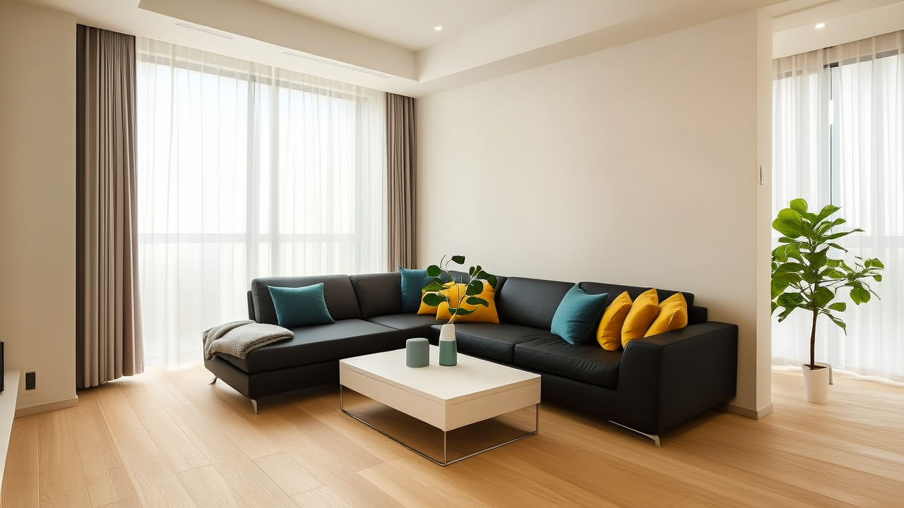
Bedroom Colors That Promote Better Sleep
Bedroom Colors That Promote Better Sleep
Let’s be honest: your bedroom isn’t just where you *sleep*—it’s your sanctuary, your reset button, your first and last conscious interaction with the day. So why do so many of us paint it in bold, energizing hues better suited to a home office or a sunroom? Turns out, color psychology isn’t just Instagram-friendly theory—it’s neurologically grounded. Research from the Lighting Research Center at Rensselaer Polytechnic Institute and sleep studies published in Behavioral Sleep Medicine confirm that certain wavelengths and chromatic intensities directly influence melatonin production, heart rate variability, and even cortisol rhythms.Why Color Matters More Than You Think
It’s not just about “feeling calm.” Blue light suppresses melatonin—but soft, muted blues (think: Benjamin Moore’s Hale Navy HC-154 at 10% strength or Farrow & Ball’s Parma Gray No. 27) reflect minimal blue-wavelength energy while evoking depth and stillness. These aren’t electric or icy—they’re atmospheric, like dusk over still water. Similarly, warm neutrals like Sherwin-Williams’ Agreeable Gray SW 7029 (a greige with barely-there violet undertones) lower visual stimulation without feeling sterile.Here’s what actually works—and why:
- Soft Blues & Blue-Greens: Try Benjamin Moore’s Quiet Moments 1563 on walls paired with organic linen duvets in undyed oat or slate. These tones reduce sympathetic nervous system activation—ideal for people who lie awake replaying emails.
- Muted Earth Tones: Behr’s Canvas Tan PPU5-12 or Dunn-Edwards’ Desert Dune DE6127 mimic natural soil and stone. They ground the space physically and psychologically—especially when layered with raw wood nightstands (like those from West Elm’s Organic Collection) and jute rugs.
- Deep, Warm Charcoals: Not black—but rich, complex darks like Farrow & Ball’s Down Pipe No. 28, applied only on one accent wall behind the bed. Paired with warm-toned LED bulbs (2700K–3000K, e.g., Philips Hue White Ambiance), they create enveloping coziness without heaviness.
Colors to Gently Step Away From—Especially Near the Bed
Avoid high-chroma reds (like Sherwin-Williams’ Royal Red SW 6310) and saturated oranges on bedroom walls—they elevate respiration and blood pressure. Even bright whites (e.g., stark titanium dioxide–heavy paints like Behr’s Ultra Pure White) can feel visually “loud” under artificial light at night, disrupting circadian cues. And yes—neon pinks, lime greens, and glossy yellows? They belong in a creative studio, not your sleep chamber.“Color doesn’t have to shout to shape behavior. In fact, the most restorative palettes whisper—and invite you to listen deeper.” — Dr. Elena Ruiz, Environmental Psychologist, MIT Design LabRemember: consistency matters. If your walls are serene but your bedding screams tropical vacation (think: fuchsia pineapple print), your brain gets mixed signals. Anchor your palette with textiles that echo your wall tone—say, a charcoal-painted wall with a matte-black ceramic lamp (Menu’s Sento Lamp) and charcoal-dyed cotton sateen sheets (Boll & Branch’s Signature Sheet Set in Slate). Small tweaks make big differences: swap cool-white LEDs for warm-dimmable ones, add blackout curtains in deep heather gray (Blindster’s Thermal Blackout Liner in Storm), and keep nightstands clutter-free. Because better sleep doesn’t start when you close your eyes—it begins the moment you cross the threshold. Sleep well, not loudly.
More Articles
 Moody Bedroom Color Schemes That Work
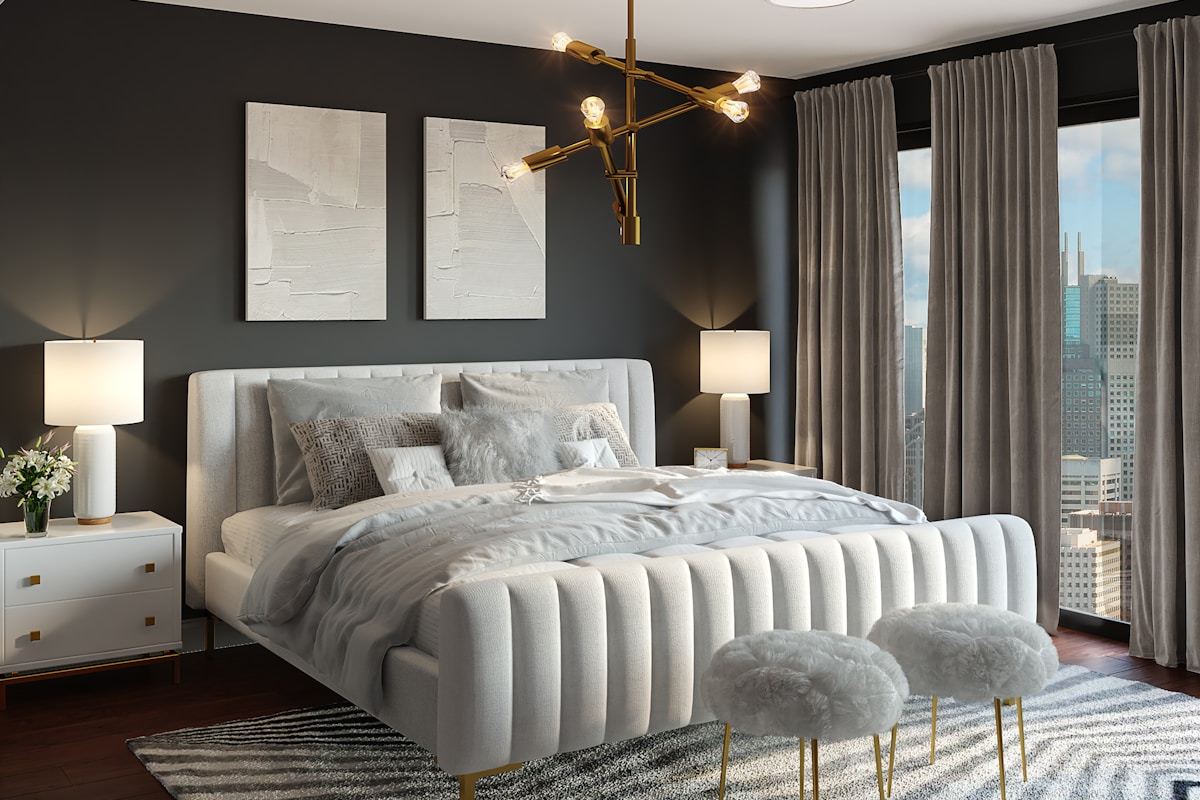 Bedroom Color Ideas: Restful Palettes (2026)
 2026 Bedroom Safety & Comfort Trends
 Senior Bedroom Lighting: Layered Comfort for Better Sleep
 Headboard Styles That Transform Bedrooms
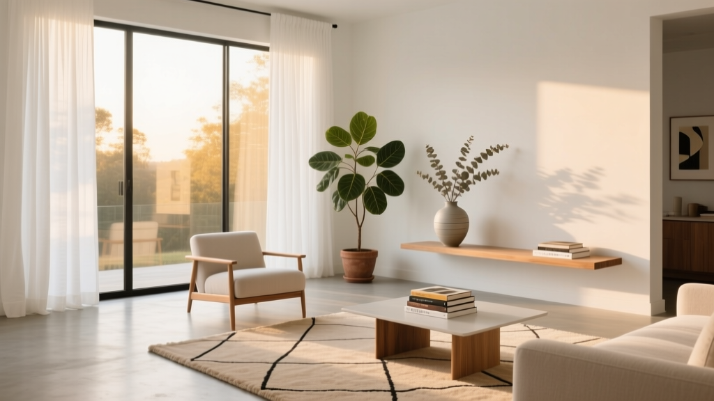 Small Bedroom Closet Organization Hacks
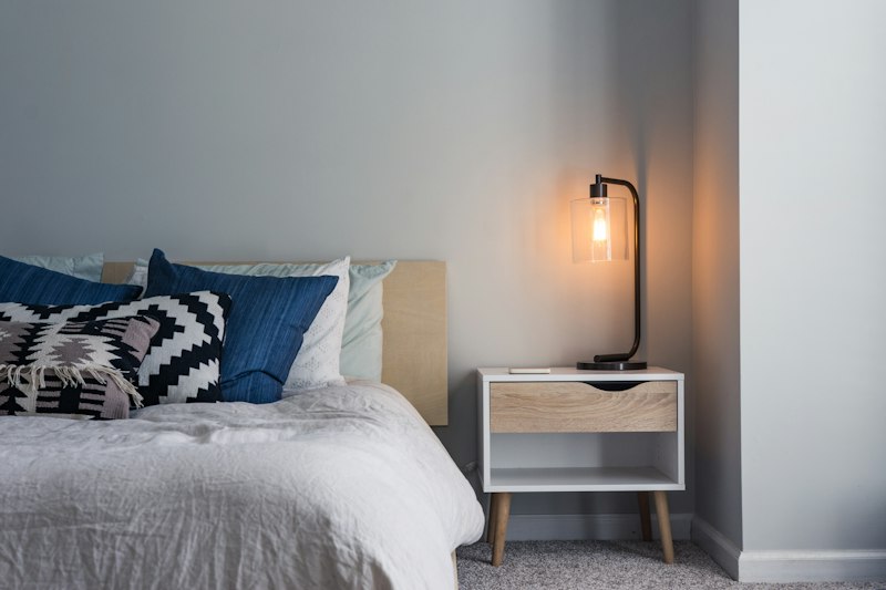 Cozy Bedroom Reading Nook Ideas for Small Spaces (2026)
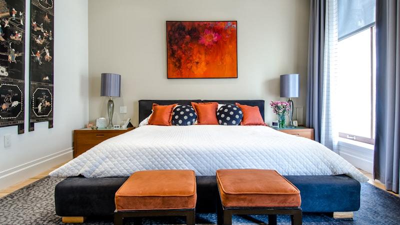 Cool Bedroom Makeover for Better Summer Sleep in 2026
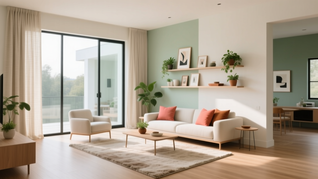 Cozy Bedroom Ideas for Better Sleep in 2026
 Bathroom Color Psychology: Smart Selection