
Best Neutral Paint Colors for Every Room - The Decor Mag
Neutral paint colors are the quiet heroes of interior color design. They create the backdrop that lets furniture, art, wood tones, and textiles look intentional—while also smoothing the visual “noise” of open floor plans and busy family life. The right neutral can make a small room feel larger, a dark room feel brighter, and a home feel more cohesive from room to room.
But “neutral” doesn’t mean “one-size-fits-all.” A soft greige that looks warm and creamy in a south-facing living room can turn muddy in a north-facing hallway. A crisp white that feels fresh in a sunny kitchen can read cold and sterile in a bedroom. Understanding undertones, lighting, and color psychology helps you choose neutral wall colors that feel calm, welcoming, and timeless—without looking flat.
This guide breaks down the best neutral paint colors for every room, with specific recommendations (including popular options from Sherwin-Williams, Benjamin Moore, and Farrow & Ball), real-life application scenarios, and common mistakes to avoid. Use it as a roadmap for building a neutral color palette that fits your home’s architecture and your lifestyle.
How to Choose a Neutral Paint Color (Without Guesswork)
Start with Undertones: Warm, Cool, or Balanced
Neutrals aren’t truly “neutral” once they’re on your walls. They carry undertones—subtle hints of yellow, red, green, pink, or blue—that become more visible in certain light. Undertone is the difference between a neutral that feels cozy and one that feels off.
- Warm neutrals (creamy whites, beiges, warm greiges) support comfort and connection—great for living rooms, bedrooms, and dining rooms.
- Cool neutrals (blue-grays, crisp whites) feel clean and airy—often ideal for modern spaces and bright kitchens.
- Balanced neutrals (true greiges, soft off-whites) are the easiest for whole-home color schemes.
Use Color Psychology to Match the Room’s Purpose
- Bedrooms: soothing, low-contrast neutrals help signal rest.
- Kitchens: clean neutrals highlight cabinetry and feel hygienic and fresh.
- Living rooms: warm neutrals feel welcoming and encourage lingering.
- Bathrooms: soft neutrals create a spa-like calm; crisper neutrals feel energizing and bright.
Consider Light Direction and “Metamerism”
Natural light changes color. North-facing rooms skew cooler and can make some neutrals feel gray or flat. South-facing rooms intensify warmth and can pull yellow from creamy whites. Metamerism (colors shifting under different light sources) also matters: a greige can look perfect by day and slightly green at night under warm LEDs.
- Test swatches on multiple walls.
- View them morning, afternoon, and evening.
- Check them next to fixed elements: flooring, countertops, tile, and upholstery.
Best Neutral Paint Colors by Room
Living Room: Warm, Flexible Neutrals That Make People Want to Stay
Living rooms benefit from neutrals that are inviting and adaptable—especially if you rotate pillows, rugs, or seasonal decor. Look for soft beiges or greiges with balanced undertones.
- Sherwin-Williams Agreeable Gray (SW 7029): A go-to greige that bridges warm and cool. Works beautifully in open-plan living spaces and pairs with both warm woods and black accents.
- Benjamin Moore Edgecomb Gray (HC-173): A warm greige with a gentle, airy feel—excellent for traditional and transitional living rooms.
- Farrow & Ball Skimming Stone (No. 241): A sophisticated warm neutral with depth—ideal if you want understated warmth without going too beige.
Real room scenario: In a living room with medium oak floors and a cream sofa, Edgecomb Gray keeps the palette cohesive while allowing contrast through charcoal curtains, matte black frames, and a textured jute rug.
Color combinations to try:
- Warm greige walls + crisp white trim (e.g., BM White Dove OC-17) + black metal lighting
- Greige walls + soft clay accents (terracotta pillow, rust-toned art) + walnut coffee table
Kitchen: Clean Neutrals That Support Cabinets and Counters
Kitchens often have multiple fixed finishes—cabinets, countertops, backsplash, appliances—so the best neutral paint colors are those that harmonize rather than compete. If your kitchen is busy visually, lean toward a simpler, cleaner neutral.
- Benjamin Moore White Dove (OC-17): A soft, warm white that reads clean—not yellow. Excellent for walls, trim, and even cabinets.
- Sherwin-Williams Alabaster (SW 7008): A creamy white that feels welcoming and classic, especially with warm wood or brass hardware.
- Sherwin-Williams Shoji White (SW 7042): A warm off-white with a touch more depth; great for open kitchens flowing into living areas.
Real room scenario: For a kitchen with white quartz counters (cool) and oak shelves (warm), White Dove creates a balanced bridge. Add a pale greige runner and aged brass pulls for warmth without making the room feel yellow.
Application guidance:
- If cabinets are bright white, use a slightly warmer wall white to soften contrast.
- If cabinets are cream, avoid stark cool whites on walls—choose a warm off-white to prevent clashing.
- Use a scrubbable finish (eggshell or satin) for kitchen walls.
Bedroom: Calming Neutrals for a Restful Mood
Bedrooms thrive on low-contrast, comforting neutrals. Think soft taupes, gentle grays, and warmer off-whites that feel cocooning. From a color psychology standpoint, these shades reduce visual stimulation and help the room feel grounded.
- Benjamin Moore Classic Gray (OC-23): A pale, barely-there greige—perfect for a serene, light-filled bedroom.
- Sherwin-Williams Accessible Beige (SW 7036): A warm neutral that reads cozy and stable—great with layered textiles and natural fibers.
- Farrow & Ball Ammonite (No. 274): A soft gray with a calm, contemporary feel that avoids icy undertones.
Real room scenario: In a north-facing bedroom (cool light), Accessible Beige counteracts the chill and makes white bedding feel softer. Pair with warm wood nightstands and oatmeal linen curtains for a calm neutral color scheme.
Designer tip: Keep trim and ceiling slightly warmer than the wall if you want a cozy envelope effect—SW Alabaster is a reliable partner for many bedroom neutrals.
Bathroom: Spa-Like Neutrals That Look Crisp and Clean
Bathrooms are small but finish-heavy: tile, stone, metal, mirrors, and lighting. The best neutral paint colors for bathrooms work with cool surfaces while still flattering skin tones.
- Benjamin Moore Balboa Mist (OC-27): A soft greige that feels polished and airy—great with marble and chrome.
- Sherwin-Williams Drift of Mist (SW 9166): A light, modern neutral that avoids heavy beige; ideal for contemporary baths.
- Benjamin Moore Simply White (OC-117): A bright, slightly warm white; excellent if your bathroom has strong natural light and you want a clean look.
Real room scenario: With white subway tile and a gray veined marble vanity top, Balboa Mist keeps the room soft and cohesive. Add contrast with matte black faucets and a warm oak mirror frame to prevent the space from feeling sterile.
Bathroom finish tip: Use a moisture-resistant paint in satin or semi-gloss (depending on the brand’s recommendations) for better durability.
Hallways and Entryways: Neutrals That Connect the Whole Home
These transitional spaces set the tone. A hallway neutral should be stable in shifting light and act as a “bridge” to nearby rooms. Balanced greiges and soft off-whites are your best bet.
- Sherwin-Williams Repose Gray (SW 7015): A timeless light gray that plays nicely with both warm and cool palettes.
- Benjamin Moore Pale Oak (OC-20): A refined greige with a gentle warmth—excellent for connecting mixed finishes.
- Sherwin-Williams Pure White (SW 7005): A versatile, clean white for trim and hallways; reads modern without harshness.
Real room scenario: In a long hallway with doors and trim, Pale Oak reduces contrast and makes the space feel wider. Pair with Pure White trim and warm brass wall sconces to create a welcoming entry sequence.
Home Office: Focus-Friendly Neutrals That Still Feel Designed
For productivity, you want a neutral that minimizes distraction while still adding enough depth to feel intentional on video calls. Soft grays and grounded greiges work well, especially with layered lighting.
- Benjamin Moore Revere Pewter (HC-172): A classic greige with presence—excellent with warm woods and leather.
- Sherwin-Williams Gossamer Veil (SW 9165): A light greige that feels modern and calm, especially in open-plan offices.
- Farrow & Ball Cornforth White (No. 228): A deeper neutral gray that looks sophisticated and tailored.
Real room scenario: In an office with white built-ins and a walnut desk, Revere Pewter adds contrast without feeling dark. Accents in navy (chair upholstery or art) create a grounded, confident color scheme.
Whole-Home Neutral Color Schemes (Easy, Cohesive Pairings)
If you want flow from room to room, choose a “core neutral” and then adjust slightly by space (lighter in low-light rooms, warmer in bedrooms, crisper in kitchens).
- Soft Warm Palette: SW Alabaster (trim) + BM Edgecomb Gray (walls) + accents in camel, olive, and aged brass
- Modern Balanced Palette: BM White Dove (trim) + SW Agreeable Gray (main walls) + accents in black, taupe, and natural oak
- Airy Cool-Leaning Palette: SW Pure White (trim) + F&B Ammonite (walls) + accents in slate blue, chrome, and light ash wood
Application Tips: How to Test Neutral Paint Colors Like a Pro
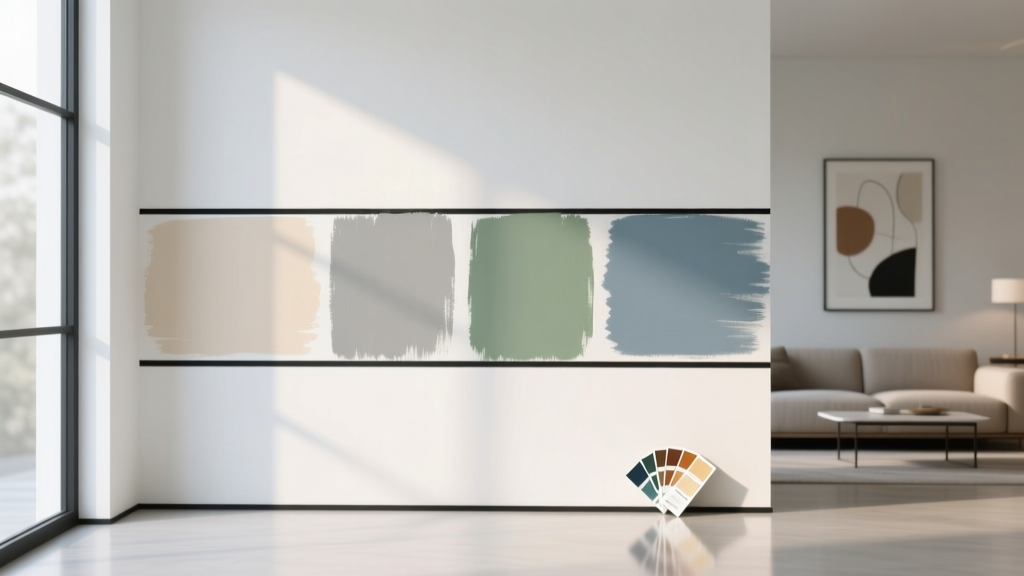
- Sample big: Use peel-and-stick samples or paint a 2' x 2' area on at least two walls.
- Check undertones against whites: Compare your neutral next to your trim color to spot unwanted pink, green, or yellow shifts.
- Match to fixed materials: Pull your neutral from the countertop veining, tile warmth, or flooring undertone.
- Pick sheen strategically:
- Flat/matte: great for ceilings and low-traffic bedrooms
- Eggshell: best all-around for living areas
- Satin: kitchens, baths, kids’ rooms for wipeability
- Use consistent lighting: Replace mismatched bulbs; aim for warm-white 2700K–3000K in cozy spaces and 3000K–3500K in task-heavy areas.
Common Neutral Paint Color Mistakes to Avoid
- Choosing a neutral in isolation: A color chip at the store can’t predict how it reacts to your flooring, stone, and lighting.
- Ignoring trim and ceiling color: A “right” wall color can look wrong next to a stark trim white. Plan your whites as part of the color scheme.
- Over-graying a warm home: Cool grays can fight warm woods and beige stone, making the home feel disjointed. Consider greige instead.
- Going too light without contrast: All-light neutrals can feel washed out. Add contrast through trim, built-ins, or a deeper adjacent room color.
- Not accounting for nighttime lighting: Many neutrals shift under LEDs. Test at night to avoid surprises like green-gray walls.
- Using one “perfect neutral” everywhere: Open plans can share a core neutral, but bathrooms, bedrooms, and dim hallways often need tailored adjustments.
FAQ: Neutral Paint Colors and Interior Color Design
What is the most popular neutral paint color right now?
Sherwin-Williams Agreeable Gray (SW 7029) remains one of the most requested neutral paint colors because it balances warm and cool undertones and works across many color schemes and home styles.
How do I choose between beige, gray, and greige?
Choose beige for warmth and softness (great with warm woods). Choose gray for a cooler, modern feel (best with cool stone and crisp finishes). Choose greige when you want flexibility and whole-home flow—especially in mixed-finish homes.
What neutral paint color works best in a north-facing room?
North-facing light can make colors look cooler. Try warmer neutrals like SW Accessible Beige, BM Edgecomb Gray, or SW Alabaster to keep the room from feeling chilly.
Which white paint is best for trim with neutral walls?
Benjamin Moore White Dove (OC-17) and Sherwin-Williams Pure White (SW 7005) are reliable trim choices because they’re clean without being overly stark, and they pair well with both warm and cool neutrals.
How can I prevent neutral walls from looking flat or boring?
Build contrast and texture. Use layered materials (linen, wool, leather), natural wood, black or bronze accents, and a slightly deeper neutral on built-ins or an adjacent room. Even within a neutral palette, varied finishes and textiles create depth.
Do neutral paint colors work with bold accent colors?
Yes—neutrals are the best support system for bold color. Pair warm neutrals with earthy accents (terracotta, olive, camel) and cool neutrals with crisp accents (navy, forest green, charcoal). Keep undertones compatible for a cohesive look.
Next Steps: Make Your Neutral Palette Feel Personal
Choose one core neutral for main living areas, then fine-tune by room based on light direction and the mood you want to create. Start with two to three contenders, test them on multiple walls, and confirm them under your daytime and evening lighting. Once your walls are set, your color scheme gets much easier—textiles, art, and accents will suddenly look more intentional.
For more paint color guides, undertone deep-dives, and room-by-room interior color design advice, explore the latest color articles on thedecormag.com.
More Articles
 Best Bathroom Floor Solutions: Performance, Safety, and Style Compared
 How to Create a Low Contrast Color Palette - The Decor Mag
 Best Cream Paint Colors for Warm Neutrals - The Decor Mag
 Best Kiwi Green Paint Colors - The Decor Mag
 Tetradic Color Scheme Guide - The Decor Mag
 Best Palette Reading: Science, Standards, and Real-World Accuracy for Designers and Brand Managers
 Whole-House Color Scheme: How to Choose (2026)
 Best Charcoal Paint Colors for Modern Spaces - The Decor Mag
 How to Choose Colors for a Playroom - The Decor Mag
 How to Test Paint Colors Before Committing - The Decor Mag