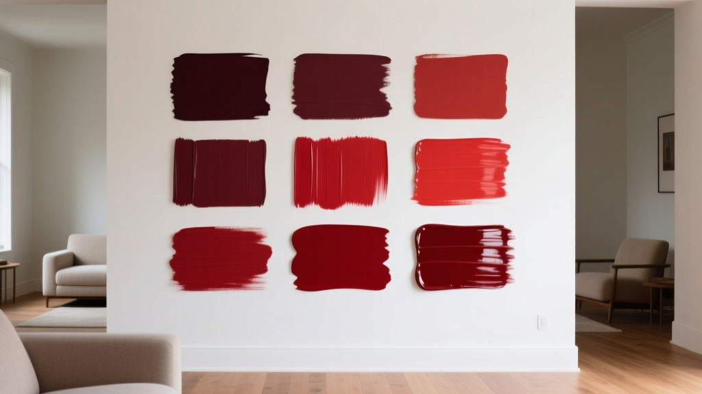
Best Crimson Paint Colors - The Decor Mag
Crimson is one of those paint colors that can shift a room’s mood the moment it goes on the wall. Richer than true red and deeper than most berries, crimson carries a sense of intention—dramatic when used as a feature wall, sophisticated in a dining room, and surprisingly cozy in a library or den. Homeowners often love crimson in theory but hesitate in practice because red paint has a reputation for being loud or hard to match. The truth: the right crimson, placed well, reads refined rather than overwhelming.
This guide breaks down the best crimson paint colors, how to choose the right undertone, and how to build balanced color schemes around them. You’ll also find room-by-room ideas, real application scenarios, and the most common mistakes people make with crimson—plus how to avoid them. If you’re looking for a red that feels elevated, tailored, and timeless, crimson is a smart place to start.
What Makes a Paint Color “Crimson”?
Crimson sits in the red family with a noticeable depth and often a subtle blue or brown influence. Unlike a fire-engine red (high-chroma, bright), crimson typically feels:
- Deeper and more complex than primary red
- More elegant and grounded than cherry or coral reds
- More versatile in interiors because it pairs beautifully with neutrals, woods, and metals
Crimson Undertones: Why They Matter
Undertone is what determines whether your crimson looks velvety and warm or jewel-toned and cool.
- Blue-based crimson: reads wine-like, tailored, slightly cooler; great with crisp whites and chrome.
- Brown-based crimson: reads earthy, heritage-inspired, cozy; great with creamy whites, brass, and walnut.
- Muted (dusty) crimson: reads sophisticated and livable; ideal for open-concept spaces.
Color Psychology: What Crimson Communicates at Home
In color psychology, red is linked to energy, confidence, appetite, and warmth. Crimson refines those associations by adding depth—less “urgent” and more “intentional.” In interior color design, crimson is often used to:
- Encourage conversation (living rooms, dining rooms)
- Create intimacy (libraries, dens, powder rooms)
- Add visual warmth to north-facing rooms or cool light
- Highlight architecture (built-ins, trim, doors)
Best Crimson Paint Colors (Designer-Approved Picks)
Below are standout crimson paint colors across popular brands. Always test samples in your lighting—reds are especially sensitive to time of day and bulb temperature.
Benjamin Moore Crimson Paint Colors
- Benjamin Moore Caliente AF-290 — A bold, modern crimson-red with striking presence. Works well for accent walls, dining rooms, and front doors when you want high impact without looking overly orange.
- Benjamin Moore New London Burgundy HC-61 — A deep crimson with heritage vibes, leaning slightly wine/burgundy. Beautiful in libraries, studies, and cabinetry.
- Benjamin Moore Classic Burgundy HC-182 — Dark, dramatic crimson-burgundy that reads elegant and grounded. Ideal for powder rooms and moody dining spaces with warm lighting.
Sherwin-Williams Crimson Paint Colors
- Sherwin-Williams Cordovan SW 6027 — A rich, brown-leaning crimson that feels traditional and cozy. Great for built-ins, offices, and statement ceilings in intimate rooms.
- Sherwin-Williams Red Bay SW 6321 — A deep red that can read crimson depending on light. Strong choice for brick fireplaces, accent walls, and craftsman-style homes.
- Sherwin-Williams Carmine SW 6874 — A saturated, jewel-like crimson-red. Works best in controlled doses (doors, niches, small powder rooms) or paired with calm, warm neutrals.
Farrow & Ball Crimson Paint Colors
- Farrow & Ball Preference Red No. 297 — A sophisticated, heritage red with depth. Especially stunning in dining rooms with paneling, or as a lacquer-like look in higher sheens on millwork.
- Farrow & Ball Eating Room Red No. 43 — A deep, earthy red that can read crimson under warm light. Excellent for traditional interiors, paired with stone, antiques, and brass.
Behr Crimson Paint Colors
- Behr Red Pepper — A bold, spicy crimson-red that brings warmth quickly. Best with creamy whites and darker woods.
- Behr Burgundy Royale — Deep and plush, great for cozy bedrooms, accent walls, and dramatic entryways.
How to Choose the Right Crimson for Your Space
1) Match Crimson to the Room’s Lighting
- North-facing rooms (cool light): choose a brown-based or slightly warmer crimson so it doesn’t feel cold or bruised.
- South-facing rooms (warm light): you can handle deeper or bluer crimson without it turning muddy.
- LED bulbs: use 2700K–3000K for most crimson walls; 3500K+ can make reds look harsh.
2) Decide Whether You Want “Statement” or “Supporting Actor”
Crimson can be the star (walls) or the supporting actor (trim, furniture, doors). Use this quick guide:
- For full walls: choose a slightly muted crimson to keep it livable.
- For accents: go more saturated—crimson shines when used decisively.
- For cabinetry: pick a deeper crimson with brown undertones for a timeless look.
3) Pair Crimson with the Right Neutral
Neutrals determine whether crimson reads modern, traditional, or romantic.
- Warm whites (ivory, cream): soften crimson and feel classic.
- Greige/taupe: makes crimson feel tailored and grounded.
- Charcoal: creates drama and a modern edge.
- True bright white: high contrast, crisp, and contemporary (best with blue-based crimson).
Room-by-Room Ideas: Where Crimson Looks Best
Dining Room: Rich, Inviting, and Elevated
Crimson is a classic dining room paint color because it enhances warmth and encourages lingering conversations. A deep crimson like BM New London Burgundy or F&B Preference Red pairs beautifully with:
- Walnut or oak dining tables
- Brass or aged-gold lighting
- White or cream trim for definition
Application scenario: Paint all four walls in a deep crimson in eggshell, use satin on trim in a warm white, and add an oversized neutral rug to keep the room balanced.
Living Room: Use Crimson as an Anchor
For an open-plan living room, consider crimson on a single architectural surface—like a fireplace wall or built-in shelving—rather than the entire space.
- Best pick: SW Cordovan on built-ins with antique brass hardware
- Color scheme: crimson + warm greige + off-white + black accents
Application scenario: A greige main wall color, crimson built-ins, and linen drapery creates a layered, designer-looking palette without visual overload.
Bedroom: Cocooning Without Feeling Heavy
Crimson can be surprisingly restful when it’s deep and slightly muted. Keep the bedding light and add texture to avoid a “boxy” feel.
- Best pick: BM Classic Burgundy as a headboard wall
- Pair with: warm white bedding, camel leather, and soft wood tones
Application scenario: Paint the headboard wall crimson, keep the other walls a warm off-white, and repeat crimson in a small dose (throw pillow, art, or a bench) to make it intentional.
Kitchen: Crimson on Cabinets or an Island
Crimson kitchens feel bespoke—especially when you keep counters and backsplash simple.
- Best pick: SW Cordovan or F&B Eating Room Red on lower cabinets
- Pair with: warm marble/quartz, unlacquered brass, and creamy walls
Application scenario: A crimson island in satin, perimeter cabinets in warm white, and a light neutral backsplash creates a balanced, high-end look.
Entryway and Front Door: A Confident First Impression
If you want to experiment with crimson paint colors without committing to a full room, a front door is ideal.
- Best pick: BM Caliente for a modern, energetic crimson
- Pair with: black hardware, white trim, and a neutral exterior
Powder Room: Small Space, Big Style
Powder rooms can handle saturated color because you’re not living in them for hours. Crimson looks incredible with moody lighting and reflective surfaces.
- Best pick: SW Carmine or BM Classic Burgundy
- Pair with: patterned wallpaper on the ceiling, brass mirror, dark stone vanity top
Winning Color Combinations with Crimson
Crimson is easiest to style when you build a supporting palette that includes one neutral, one grounding dark, and one warm metal or wood tone.
Crimson + Complementary Greens (Classic Designer Move)
- Crimson + deep olive + warm white + brass
- Crimson + sage + cream + natural oak
Why it works: Green is opposite red on the color wheel, so the contrast feels lively yet balanced when both colors are slightly muted.
Crimson + Blues (Jewel-Toned Elegance)
- Crimson + navy + crisp white + chrome
- Crimson + smoky blue + greige + black accents
Why it works: Blue-based crimson and navy create a tailored, editorial look—especially in offices and dining rooms.
Crimson + Neutrals (Timeless and Livable)
- Crimson + warm white + walnut + antique brass
- Crimson + taupe + linen + matte black
Why it works: Neutrals give your eye a place to rest, which makes crimson feel intentional rather than overpowering.
Sheen, Finish, and Placement Tips for Crimson
- Eggshell is a safe default for walls—durable with a soft glow.
- Matte can look velvety and luxe, but scuffs more easily in high-traffic areas.
- Satin or semi-gloss works well on trim, doors, and cabinetry, especially with deep crimsons.
Placement ideas that look designer-approved:
- Accent wall behind built-ins to add depth
- Color-drenched den (walls + trim the same crimson) for a cocoon effect
- Crimson ceiling in a dining room to lower the visual “height” and add intimacy
Common Crimson Paint Mistakes (and How to Avoid Them)
-
Choosing crimson without testing it in your lighting
Reds shift dramatically between daylight and evening. Paint two large samples on different walls and view them over 24 hours. -
Pairing crimson with the wrong white
A stark, blue-white can make warm crimson look overly intense. If your crimson leans brown, try creamy whites instead of bright white. -
Using too many bold colors at once
Crimson already carries weight. Balance it with quieter supporting colors: warm neutrals, soft greens, or deep charcoals. -
Ignoring fixed finishes (floors, counters, tile)
Crimson can clash with pink-beige tile or very orange wood. Choose a crimson with undertones that echo what you already have. -
Underestimating how much trim impacts the look
High-contrast trim creates a crisp outline; low-contrast trim creates a modern, enveloping feel. Decide the effect you want before painting.
FAQ: Best Crimson Paint Colors
Is crimson a warm or cool paint color?
Crimson can be warm or cool depending on undertone. Brown-leaning crimsons feel warmer and cozier; blue-leaning crimsons feel cooler and more jewel-toned. The same paint color can also read warmer at night under incandescent or warm LED bulbs.
What colors go best with crimson walls?
Great matches include warm whites, taupe/greige, charcoal, olive green, and navy. For metals, brass and aged gold complement warm crimsons; chrome and polished nickel pair well with cooler, blue-based crimsons.
Will crimson make my room look smaller?
Darker crimsons can visually “pull in” the walls, which can feel smaller—but also cozier and more intentional. If you want depth without heaviness, use crimson on one wall, built-ins, or in a matte finish with lighter trim and furnishings.
Is crimson a good choice for open-concept spaces?
Yes, but it’s usually best as an accent—an island, a fireplace wall, or a defined dining nook. In open layouts, pick a slightly muted crimson and repeat it in small touches (art, textiles) to keep the color scheme cohesive.
How do I choose between burgundy and crimson?
Burgundy typically leans more purple or wine, while crimson is more true-red at its core (often deepened with blue or brown). If you want a red that still reads clearly “red,” go crimson. If you want a moodier, wine-like tone, burgundy may be the better fit.
What sheen is best for crimson paint colors?
Eggshell is the most forgiving for walls. Matte looks luxurious in low-traffic rooms. Satin or semi-gloss is best for doors, trim, and cabinetry where you want durability and a subtle highlight.
Next Steps: How to Use Crimson with Confidence
Start by choosing two or three crimson paint colors that fit your home’s fixed finishes and lighting, then test large swatches on multiple walls. Decide whether crimson will be your statement (walls) or your accent (door, built-ins, island), and build a simple supporting palette around it: one warm neutral, one grounding dark, and one metal finish.
If you’re ready for more paint color guidance—best whites, moody neutrals, perfect greens, and designer-approved color schemes—explore more color guides on thedecormag.com.
More Articles
 Best Grapefruit Paint Colors - The Decor Mag
 How to Use Color to Define Spaces - The Decor Mag
 Living Room Colors for Entertaining (2026)
 Bathroom Trends 2026: Wellness Integration, Material Innovation, and Smart Efficiency
 Sage Green Paint: Most Versatile Neutral (2026)
 Best Lavender Paint Colors for Relaxation - The Decor Mag
 Best Pear Green Paint Colors - The Decor Mag
 Best Mustard Yellow Paint Colors - The Decor Mag
 How to Choose Colors for East-Facing Rooms - The Decor Mag
 Best Beige Paint Colors That Aren't Boring - The Decor Mag