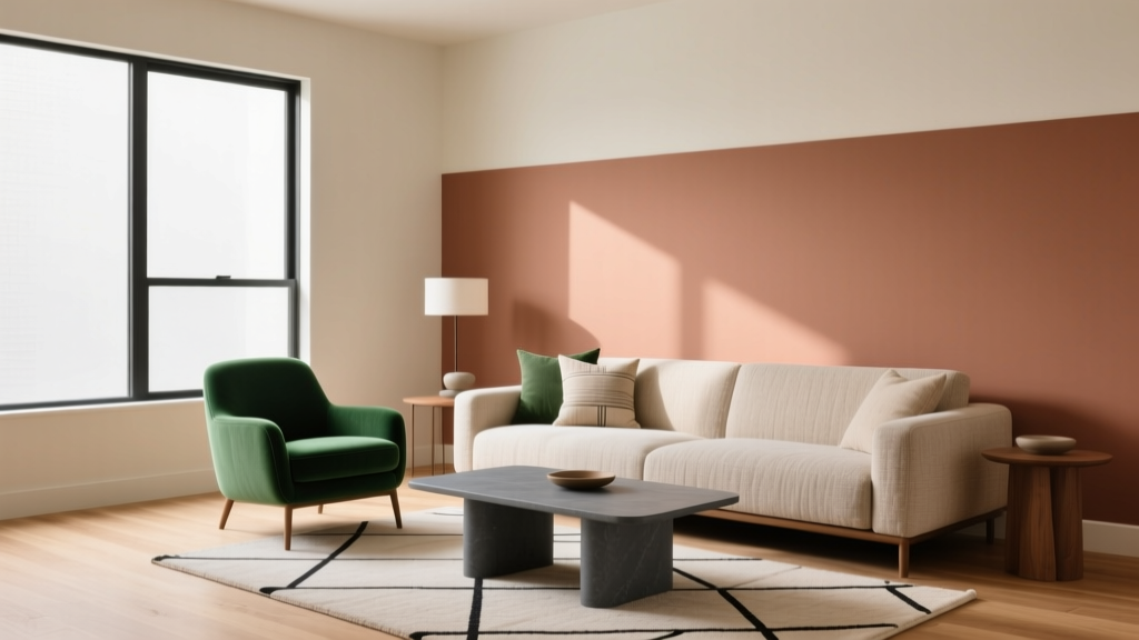
How to Use Color to Create Balance - The Decor Mag
Color is one of the fastest ways to change how a home feels—calm or energized, open or cozy, polished or playful. It also happens to be one of the most misunderstood tools in interior color design. Many homeowners choose paint colors based on a tiny swatch or a trending shade, only to realize the room feels “off” once the walls are covered. The missing ingredient is usually balance: the relationship between light and dark, warm and cool, soft and bold, and how those choices interact with your space and furnishings.
Balanced color doesn’t mean neutral or boring. It means a room has visual harmony, a clear focal point, and a comfortable sense of rhythm. When you understand a few design principles—value, undertones, proportion, and temperature—you can build color schemes that look intentional and feel good to live with. This guide breaks down practical ways to use paint colors and color combinations to create balance, along with real-room scenarios, brand-specific recommendations, and common mistakes to avoid.
What “Balance” Means in Interior Color Design
In design, balance is the distribution of visual weight. Color contributes weight through:
- Value (how light or dark a color is)
- Saturation (how intense or muted it is)
- Temperature (warm vs. cool)
- Placement (where color appears in the room)
A balanced room typically includes a mix of:
- Light and dark values (to avoid a washed-out or heavy feel)
- Warm and cool notes (to prevent the space from feeling too icy or too yellow)
- Quiet areas and accent moments (so the eye can rest)
- Repetition (so colors feel connected rather than random)
Start With the Three Pillars: Light, Undertone, and Function
1) Read the Light Before You Pick Paint Colors
Natural light changes color dramatically. Before you commit to a wall color, identify your room’s dominant light:
- North-facing rooms: cooler, grayer light—warm whites and warm neutrals often feel more balanced.
- South-facing rooms: bright, warm light—cooler whites and balanced neutrals stay crisp.
- East-facing rooms: bright morning light, cooler afternoons—mid-tone colors stay steady.
- West-facing rooms: dim mornings, warm intense evenings—muted or cooler colors can prevent an overly orange cast.
Paint tip: Sample large (at least 12" x 12") on multiple walls. Observe morning, afternoon, and evening. Balanced color choices reveal themselves over time.
2) Understand Undertones (They Decide Harmony)
Two colors can look similar on a swatch and clash on a wall because their undertones fight. Common undertones include:
- Warm: yellow, red, orange (creamy whites, warm beiges, terracottas)
- Cool: blue, green, violet (crisp whites, cool grays, blue-greens)
- Neutral-leaning: balanced undertones (more flexible, often easiest for whole-home palettes)
Quick check: Compare your paint sample against a true white sheet of paper. Undertones show themselves immediately.
3) Match Color to Function (Color Psychology, Applied)
Color psychology isn’t about strict rules—it’s about likely emotional cues:
- Blues and blue-greens: calm, steady—great for bedrooms, bathrooms, offices
- Greens: restorative, balanced—ideal for living rooms, kitchens, transitional spaces
- Warm neutrals: welcoming, cozy—excellent for family rooms and open plans
- Deep tones (navy, charcoal, forest): grounding—best as accents or in rooms with adequate light
- Soft pinks and clay tones: flattering warmth—beautiful in bedrooms, powder rooms, entryways
Use These Balance Tools to Build Reliable Color Schemes
Tool #1: Balance Value (Light + Dark)
A room that’s all light can feel flat; a room that’s all dark can feel heavy. Use value contrast to create structure.
Easy formula: choose one dominant light value, one medium supporting value, and one deeper anchor.
- Light (walls): Benjamin Moore White Dove (OC-17) or Sherwin-Williams Alabaster (SW 7008)
- Medium (rug/sofa/drapery): greige, camel, olive, denim
- Deep (anchors): Sherwin-Williams Iron Ore (SW 7069) or Benjamin Moore Hale Navy (HC-154)
Application idea: Light walls + medium upholstery + deep accents (frames, lamp bases, side tables) creates a grounded, balanced look without feeling busy.
Tool #2: Balance Color Temperature (Warm + Cool)
Most rooms feel best with a small temperature mix. Even a “cool” palette benefits from a warm wood tone or a brass accent; even a “warm” palette benefits from a cool stone or muted blue textile.
Balanced temperature pairings:
- Warm white walls + cool accents: BM Swiss Coffee (OC-45) with slate blue pillows and black metal lighting
- Cool gray walls + warm materials: SW Repose Gray (SW 7015) with oak, leather, and warm linen
- Blue-green walls + warm neutrals: BM Palladian Blue (HC-144) with creamy trim and tan textures
Tool #3: Use the 60-30-10 Rule (Proportion Creates Calm)
This classic approach keeps color schemes readable:
- 60% dominant color (usually walls + large textiles)
- 30% secondary color (upholstery, drapery, major rug tones)
- 10% accent color (art, pillows, décor, a statement chair)
Practical tip: In open-plan spaces, use the dominant color across connected rooms (or consistent trim) to create flow, then shift the 30% and 10% areas for variety.
Tool #4: Repeat Colors Across the Room (Rhythm)
Balance often fails when accents appear only once. Repeat each key color at least 2–3 times.
- Echo a navy pillow in a piece of artwork and a vase
- Repeat a warm brass tone in lighting, hardware, and a frame
- Carry a green from plants into a patterned textile
Room-by-Room Examples: Balanced Color in Real Homes
Living Room: Calm, Warm, and Grounded
Scenario: A family living room with medium natural light, beige sofa, and walnut furniture feels bland.
Balanced color scheme:
- Walls: Sherwin-Williams Accessible Beige (SW 7036) for a warm neutral base
- Trim: Sherwin-Williams Pure White (SW 7005) for clean definition
- Anchor: Benjamin Moore Hale Navy (HC-154) on built-ins or a focal wall
- Accent: muted rust (pillows/throw) + touches of brass
Why it works: The warm base supports comfort, the navy adds visual weight, and rust/brass provide warmth that keeps the palette from turning flat.
Bedroom: Restful Without Feeling Cold
Scenario: A blue bedroom feels chilly and uninviting, especially at night.
Fix with temperature balance:
- Walls: Benjamin Moore Quiet Moments (1563) or Sherwin-Williams Sea Salt (SW 6204)
- Trim: Benjamin Moore White Dove (OC-17)
- Textiles: oatmeal linen bedding + warm taupe rug
- Accents: antique brass sconces + one warm art piece (terracotta/blush)
Why it works: Blue-green walls reduce stress cues, while warm neutrals and brass restore coziness and balance.
Kitchen: Bright, Clean, and Not Sterile
Scenario: A white kitchen looks stark under cool LED lighting.
Balanced paint color approach:
- Cabinets: Benjamin Moore Simply White (OC-117) for a soft, clean white
- Walls: Sherwin-Williams Egret White (SW 7570) for gentle warmth
- Island (optional): Sherwin-Williams Iron Ore (SW 7069) for contrast
- Finishes: warm wood stools + brushed brass hardware
Lighting tip: Aim for 2700K–3000K bulbs in kitchens that lean white. It supports a balanced, welcoming tone.
Bathroom: Spa-Like Contrast That Still Feels Soft
Scenario: A small bath needs personality but can’t handle heavy color everywhere.
Balanced solution: Use a quiet wall color + high-contrast details.
- Walls: Benjamin Moore Classic Gray (OC-23) (a subtle, airy greige)
- Vanity: Benjamin Moore Boothbay Gray (HC-165) or Hale Navy (HC-154)
- Hardware: matte black for crisp definition
- Textiles: white towels + one patterned shower curtain that repeats wall and vanity tones
Open Concept: Cohesion Without Monotony
Scenario: Living/dining/kitchen combo feels visually chaotic when each zone has a different paint color.
Balanced whole-home strategy:
- Pick one main wall color for shared sightlines (e.g., SW Alabaster or BM White Dove).
- Use one consistent trim color throughout for continuity.
- Create zones with accent colors in furniture, rugs, and art.
- If you add a painted feature (island, built-ins), repeat that color elsewhere at least twice.
Specific Color Combinations That Create Balance (Steal These)
- Soft modern neutral: SW Alabaster (SW 7008) + SW Repose Gray (SW 7015) + SW Iron Ore (SW 7069)
- Classic coastal (not theme-y): BM White Dove (OC-17) + BM Palladian Blue (HC-144) + sandy beige textiles + aged brass
- Earthy and refined: BM Swiss Coffee (OC-45) + olive accents + terracotta + black details
- Moody but livable: BM Edgecomb Gray (HC-173) + BM Hale Navy (HC-154) + cognac leather + warm wood
- Fresh and calming: SW Sea Salt (SW 6204) + creamy white trim + light oak + linen + matte black accents
Common Color Mistakes That Throw Off Balance
- Choosing paint from a swatch only: Always test large samples; undertones shift on walls.
- Ignoring fixed finishes: Tile, flooring, countertops, and cabinetry determine what undertones will look harmonious.
- Using too many “main” colors: A room with five competing saturated colors rarely feels calm. Limit bold colors and repeat them.
- Forgetting contrast: If walls, sofa, and rug are the same value, the room feels flat. Add a darker anchor or stronger texture contrast.
- Overdoing cool gray everywhere: Without warm elements (wood, brass, camel, cream), cool gray schemes can feel sterile.
- Painting everything the same white: Whites have undertones. A cool white on walls with warm cabinets can look mismatched.
Practical Tips for Getting Balanced Color Right
- Build from what you can’t change: countertop stone, brick, floors, or a treasured rug.
- Pick one “quiet” hero color: a wall neutral that supports everything else.
- Use darker colors strategically: lower cabinets, built-ins, interior doors, or a powder room are great places for depth.
- Mind sheen for visual balance: matte/eggshell walls reduce glare; satin/semigloss adds crispness on trim.
- Limit high-chroma accents: bright colors feel best in small doses unless the room is designed around them.
FAQ: Color Balance at Home
How do I choose a balanced paint color scheme for the whole house?
Start with one versatile neutral wall color (like BM White Dove or SW Alabaster) and one consistent trim white. Then select 2–3 supporting colors for accents and feature areas. Keep undertones aligned and repeat each supporting color across multiple rooms.
What’s the easiest way to tell if a paint color is warm or cool?
Compare the sample to a true white paper in the same light. If it reads yellow/creamy/red, it’s warm; if it reads blue/green/violet, it’s cool. Also compare against your flooring and countertop undertones.
Can I mix warm and cool colors in the same room?
Yes—mixing temperatures often creates the most natural balance. The key is intentional proportion: let one temperature dominate (about 70–80%), then add smaller notes of the other through metals, textiles, or accents.
What paint colors help a small room feel balanced, not cramped?
Light, low-contrast schemes tend to expand space: BM Classic Gray (OC-23), SW Alabaster (SW 7008), or BM White Dove (OC-17). Add depth with a darker vanity, artwork, or textiles rather than dark walls on all sides.
How do I balance a bold wall color without repainting?
Add light contrast (cream or white textiles), repeat the bold color in smaller accents, and introduce a grounding neutral (wood, tan, black, or warm metals). If the color feels too intense, swap glossy finishes for matte textures to visually soften it.
Next Steps: Create Your Balanced Palette
If you want a room that feels pulled together, focus on balance over trends. Use value contrast to create structure, temperature mixing to keep the mood comfortable, and repetition to make color feel intentional. Start by sampling 2–3 wall colors, checking undertones against your fixed finishes, and choosing one deep anchor shade to ground the space.
For more paint color ideas, color scheme guides, and room-by-room inspiration, explore the latest color articles on thedecormag.com.
More Articles
 Best Teal Paint Colors for Calm Spaces - The Decor Mag
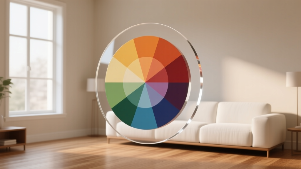 Color Wheel Basics for Home Decorating - The Decor Mag
 Whole-House Color Scheme: How to Choose (2026)
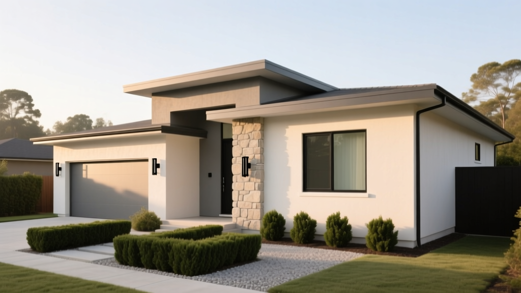 How to Choose Exterior House Colors - The Decor Mag
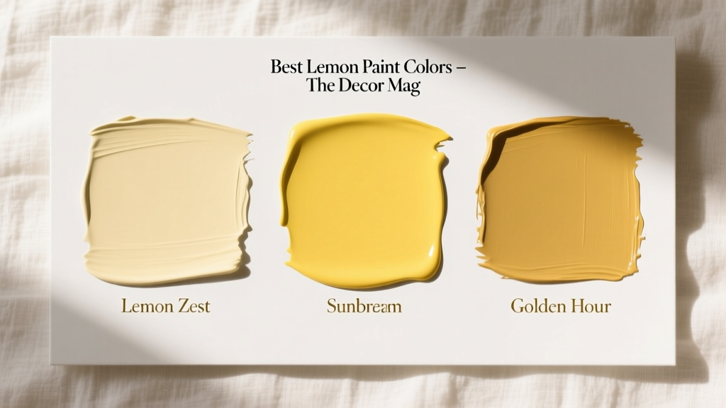 Best Lemon Paint Colors - The Decor Mag
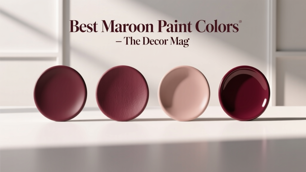 Best Maroon Paint Colors - The Decor Mag
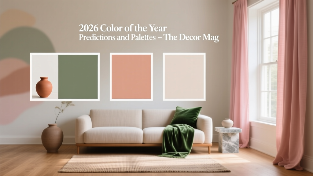 2026 Color of the Year: Predictions & Palettes
 How to Create a Soothing Color Palette - The Decor Mag
 How to Choose Colors for a Loggia - The Decor Mag
 How to Use Analogous Colors in Decor - The Decor Mag