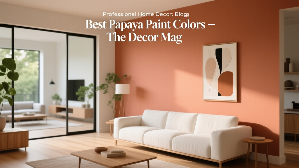
Best Papaya Paint Colors - The Decor Mag
Papaya is the kind of color that changes a room’s mood the moment it shows up. It’s warm without feeling heavy, playful without reading childish, and energetic in a way that still feels livable—especially when you choose a well-balanced papaya paint color rather than a neon orange. For homeowners who want their space to feel welcoming, sunny, and a little more designed, papaya is a smart step beyond beige and a softer alternative to red.
What makes papaya especially useful in interior color design is its versatility. Depending on undertones and light, it can lean peachy and calming, terracotta and grounded, or coral and lively. That range means papaya can work as an accent wall color, a kitchen cabinet statement, a front door refresh, or even a full-room envelope when paired with the right neutrals and trim. If you’ve been searching for orange paint colors that feel sophisticated, papaya is often the sweet spot.
This guide breaks down the best papaya paint colors, how to use them in real rooms, what to pair them with, and the most common missteps to avoid—so you can create a confident, cohesive color scheme that feels intentional from morning light to lamplight.
What “Papaya” Means in Paint (And Why It’s So Flattering Indoors)
Papaya paint sits in the warm color family between peach, coral, and orange. In color theory terms, it’s an orange hue softened by red and white—often with a hint of yellow that keeps it sunny rather than muddy. This is why papaya tends to be more forgiving than a true orange: it can brighten a room without overpowering it.
Color psychology: the feeling papaya creates
- Optimism and sociability: Warm orange-based hues encourage conversation and connection, making papaya great for dining rooms and kitchens.
- Comfort and approachability: Compared with pure orange, papaya reads softer and more “human,” especially alongside natural textures.
- Creative energy: Papaya can help spaces feel active and inspiring—ideal for studios, playrooms, and home offices.
Undertones to watch: peachy vs. coral vs. terracotta-leaning papaya
- Peachy papaya: More white, a gentler glow; flattering in bedrooms and bathrooms.
- Coral papaya: A pink-red lift; cheerful and modern for living spaces and front doors.
- Earthy papaya: A touch of brown; reads sophisticated and grounded for dining rooms, libraries, and exteriors.
How to Choose a Papaya Paint Color for Your Home
The “best” papaya depends on your lighting, fixed finishes, and how bold you want the room to feel. Use these design principles to narrow it down.
1) Start with light direction
- North-facing rooms: Cooler, grayer light can make papaya look muted or slightly brown. Choose a brighter, cleaner papaya with a bit more pink or yellow.
- South-facing rooms: Warm light amplifies papaya. Consider a softer, lighter papaya to avoid an overly intense glow.
- East-facing rooms: Morning light makes papaya radiant; later it calms down. Great for kitchens and breakfast nooks.
- West-facing rooms: Afternoon light can turn papaya fiery. Opt for a peachier version if you want it to stay gentle at golden hour.
2) Match undertones to your materials
- Warm woods (oak, walnut): Most papayas look harmonious; try earthy or coral-leaning shades.
- Cool stone (Carrara, gray tile): Choose papayas with a pink-peach undertone to keep the palette cohesive.
- Brass and gold: Papaya is a natural partner—especially for mid-century modern and eclectic interiors.
- Black accents: Adds crisp contrast and keeps papaya feeling contemporary.
3) Decide: accent or full-room color?
If you’re new to orange paint colors, papaya is easiest to love as an accent: a powder room, an entry, or a single wall. If you want full-room impact, consider a lighter papaya and a consistent trim color to keep the look polished.
Best Papaya Paint Colors (Designer-Approved Picks)
Below are standout papaya paint colors across popular brands. Always sample in your space—papaya is famously sensitive to changing light.
Benjamin Moore Papaya (2019-50)
A true “name match” that lands in the happy middle of papaya: warm, bright, and distinctly tropical without going fluorescent. This is a confident choice for an accent wall color or a playful interior door.
- Best for: Breakfast nooks, craft rooms, front doors, kid-friendly family rooms
- Looks great with: White dove-style trims, warm oak, black hardware
Benjamin Moore Soft Marigold (2147-40)
More golden than coral, Soft Marigold gives papaya energy with a sunny, slightly yellow undertone. It can read “papaya sorbet” in bright spaces.
- Best for: Kitchens, hallways, cheerful mudrooms
- Pair with: Creamy whites, olive greens, natural woven textures
Sherwin-Williams Persimmon (SW 6339)
Persimmon is a deeper, more saturated orange that can still live in the papaya family when balanced with the right neutrals. It’s striking for a dining room or a statement built-in.
- Best for: Dining rooms, bar areas, accent cabinetry
- Pair with: Warm whites, deep teal, walnut, aged brass
Sherwin-Williams Comical Coral (SW 6876)
If you want a papaya that leans coral and feels modern, Comical Coral brings a fresh, upbeat vibe. Use it where you want personality: powder rooms, laundry rooms, or a creative office.
- Best for: Small rooms, playful accents, contemporary spaces
- Pair with: Crisp white trim, light gray stone, matte black accents
Farrow & Ball Charlotte’s Locks (No. 268)
A bold, sun-drenched orange with a refined depth. While brighter than many papayas, it delivers that same fruit-forward warmth—especially in rooms with classic architectural detail.
- Best for: Statement walls, libraries, dining rooms, entryways
- Pair with: Off-black, warm whites, deep greens, antique wood
Farrow & Ball Setting Plaster (No. 231)
Setting Plaster sits on the peachy end of papaya—soft, flattering, and quietly warm. If you love the idea of papaya but want it subtle, this is an elegant bridge color.
- Best for: Bedrooms, living rooms, bathrooms, open-plan spaces
- Pair with: Creams, linen tones, pale terracotta, brushed brass
Behr Apricot Illusion (PPU2-02)
A friendly, approachable apricot-papaya that works well in family homes. It has enough warmth to feel sunny but enough softness to stay comfortable all day.
- Best for: Living rooms, nurseries, casual dining spaces
- Pair with: Warm white, sandy beige, muted blue-gray accents
Behr Spiced Apricot (M210-6)
Deeper and richer, Spiced Apricot moves toward earthy papaya—excellent when you want warmth with a slightly sophisticated, grounded edge.
- Best for: Dining rooms, accent walls, exteriors and shutters (depending on surroundings)
- Pair with: Charcoal, warm taupe, olive, terracotta pottery
Real Room Ideas: Where Papaya Paint Shines
Papaya in the living room: warm, inviting, and not too loud
For a living room color scheme, papaya works best when you let it play supporting actor to neutrals. Think papaya walls with creamy trim, a sand-colored sofa, and layered texture (linen, boucle, jute). Add contrast with black-framed art or a dark wood coffee table.
Try this recipe:
- Walls: a soft papaya (peach-leaning)
- Trim: warm white
- Accents: camel leather, black metal, ivory textiles
- Optional pop: dusty teal pillows for complementary contrast
Papaya in the kitchen: energetic and appetite-friendly
Orange-based hues are famously great for kitchens because they feel lively and welcoming. Use papaya on an island, lower cabinets, or a pantry door for a modern twist that still feels timeless with the right countertop.
- Cabinet application: Papaya lowers + warm white uppers keeps it balanced.
- Best materials: butcher block, warm quartz, zellige tile, unlacquered brass pulls.
- Pro tip: Choose a satin or enamel finish for cleanability and a subtly reflective glow.
Papaya in the bedroom: surprisingly calming when softened
A peachy papaya can be incredibly flattering and restful—especially in rooms with warm lamps and soft textiles. The key is avoiding overly saturated orange in a sleep space.
- Best approach: Use a light papaya on walls, then layer creams, blush, and warm wood.
- Great partners: oatmeal bedding, walnut nightstands, paper lantern lighting.
Papaya in the bathroom or powder room: small space, big payoff
Papaya is made for powder rooms. In a small footprint, bold color looks intentional and design-forward. Pair with warm metals and a crisp mirror for an elevated look.
- Walls: coral papaya
- Trim/vanity: warm white or soft mushroom
- Hardware: brushed brass
- Extra credit: graphic black-and-white tile to ground the warmth
Papaya on a front door: instant curb appeal
Papaya front doors feel friendly and memorable—especially against white, cream, greige, or deep charcoal exteriors. If your landscaping leans green and lush, papaya becomes even more vibrant (green is a natural foil for orange).
- Finish tip: Use a high-quality exterior semi-gloss for durability and easy wiping.
- Coordination tip: Repeat the papaya subtly in planters or a porch cushion for a cohesive exterior color scheme.
Papaya Color Schemes: What to Pair It With
Papaya is warm and lively, so pairing is about balance. Use neutrals to calm it, deep tones to sharpen it, or complementary hues for intentional energy.
Easy, homeowner-friendly pairings
- Papaya + warm white: Clean, timeless, and bright (great for trim and ceilings).
- Papaya + sand/tan: Organic and relaxed; perfect for boho or coastal interiors.
- Papaya + sage/olive: Earthy, elevated, and grounded (especially with wood and stone).
- Papaya + teal: A classic complementary contrast that feels vibrant and designer-led.
- Papaya + charcoal: Modern edge; helps papaya look more sophisticated.
Three ready-made palettes to try
- Soft & Sunlit: peachy papaya + creamy white + light oak + linen beige
- Modern Contrast: coral papaya + crisp white + matte black + brushed brass
- Earthy Warmth: spiced papaya + olive green + warm taupe + terracotta accents
Common Papaya Paint Mistakes (And How to Avoid Them)
- Choosing the wrong undertone for your fixed finishes: If your tile or countertop is cool gray, a yellow-leaning papaya can look slightly “off.” Use a peach/coral papaya instead.
- Skipping samples: Papaya shifts dramatically between daylight and evening. Sample at least two options on multiple walls.
- Going too saturated in a large room: A bold papaya can feel intense across four walls. If you love the color, consider a lighter value or use it on one focal wall.
- Pairing with stark, icy whites: Very cool bright whites can make papaya look harsher. Choose warmer whites and creamy off-whites for a smoother transition.
- Forgetting sheen: Higher sheen can make papaya appear brighter. In living spaces, eggshell is often the sweet spot; reserve semi-gloss for trim, doors, and cabinets.
Practical Tips for Sampling and Painting Papaya
- Paint large samples: Aim for at least 12x12 inches (bigger is better) on two walls.
- Check at three times: morning, mid-afternoon, and evening under lamps.
- Use consistent lighting temperature: Warm bulbs (2700K–3000K) usually flatter papaya; very cool LEDs can make it feel sharper.
- Consider color continuity: If adjacent rooms are cool gray, transition with warm neutrals (cream, greige, light taupe) to avoid a jarring shift.
FAQ: Papaya Paint Colors
Is papaya the same as peach or coral?
They’re related, but not identical. Peach is typically lighter and more muted; coral has a stronger pink-red influence; papaya sits between them with a distinctly orange warmth that still feels soft and approachable.
What trim color works best with papaya walls?
Warm whites and creamy off-whites are the most reliable. They keep papaya looking sunny rather than harsh. If you want a modern look, a soft warm white trim with matte black accents adds crisp structure.
Does papaya work in small rooms?
Yes—especially in powder rooms, laundry rooms, and entries. In small spaces, papaya reads as intentional and can feel like a “jewelry box” moment. Just mind the sheen: too glossy on walls can amplify brightness.
How do I keep papaya from looking too orange?
Choose a papaya with a peach or coral undertone, pair it with warm neutrals, and avoid pairing it with very cool whites or icy grays. Also remember that higher sheen increases perceived intensity.
What are the best complementary colors for papaya?
Teal and blue-green shades are classic complements that make papaya feel vibrant and balanced. For a quieter look, try olive or sage green, which grounds papaya with an earthy contrast.
Can papaya paint work with gray flooring?
It can, but pick the right papaya. With cool gray floors, lean into peach/coral papayas and add warm elements (wood, brass, woven textures) to bridge the temperature gap.
Next Steps: Make Papaya Feel Like “You”
Start by deciding where you want warmth and energy—an accent wall, a front door, cabinets, or a small room that can handle bold color. Then pick 2–3 papaya paint colors with slightly different undertones, sample them in your lighting, and build a simple color scheme with warm whites and grounding accents like charcoal, olive, or natural wood.
If you’re ready for your next color move, explore more paint color guides, color schemes, and interior color design advice on thedecormag.com.
More Articles
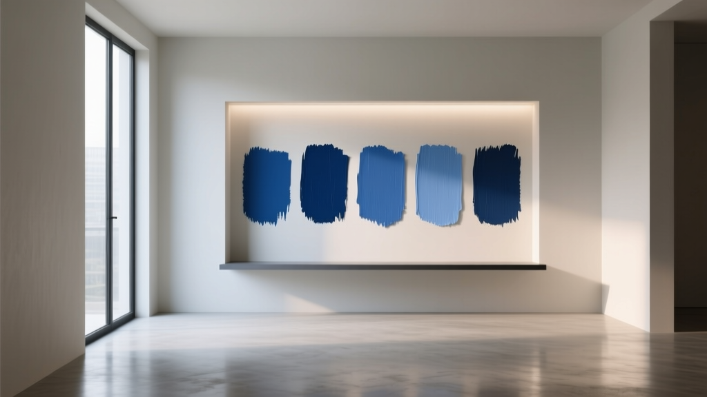 Best Cobalt Blue Paint Colors - The Decor Mag
 Monochromatic Color Scheme Design Guide - The Decor Mag
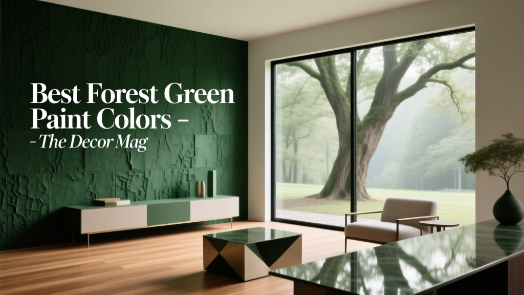 Best Forest Green Paint Colors - The Decor Mag
 How to Create a Restraint Color Palette - The Decor Mag
 Fluted vs Headboard: Understanding the Structural, Aesthetic, and Functional Differences
 Where to Place Outdoor Essentials: Strategic Placement for Safety, Function, and Longevity
 How to Create a Contemporary Color Palette - The Decor Mag
 How to Choose Colors for a Balcony - The Decor Mag
 Color Wheel Basics for Home Decorating - The Decor Mag
 Trends vs Island: How Color Forecasting and Brand Identity Diverge in Commercial Design