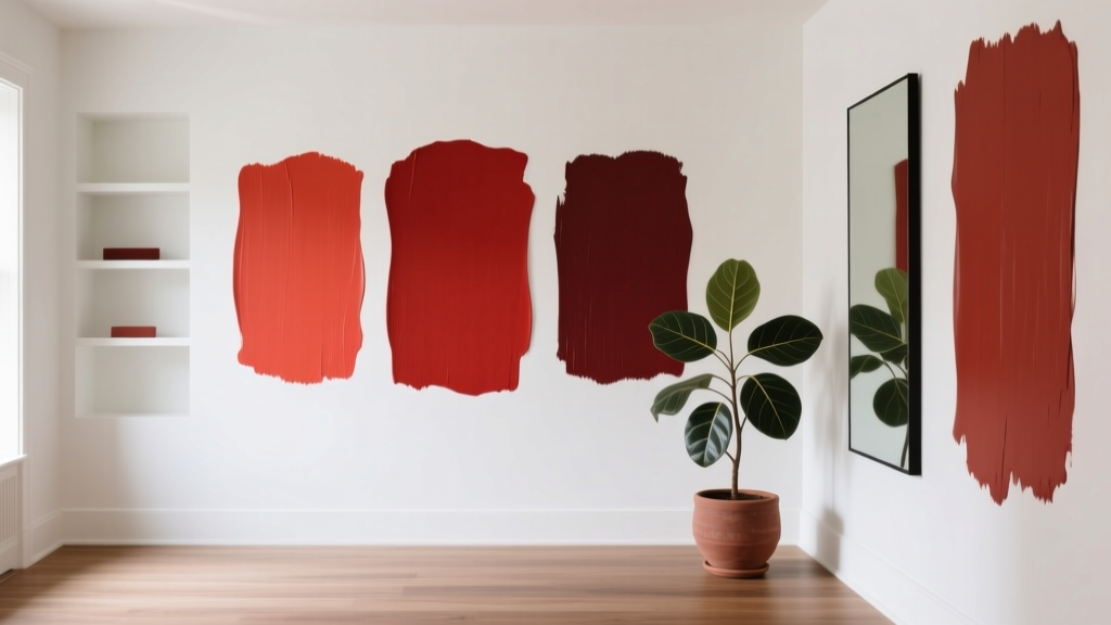
Best Poppy Red Paint Colors - The Decor Mag
Poppy red has a way of waking up a room. It’s not the deep, formal drama of burgundy, and it’s not the playful sweetness of a cherry red—poppy red sits in that energetic middle ground: vivid, warm, and instantly uplifting. Used thoughtfully, it can make a home feel more confident and curated, whether you’re styling a single accent piece or committing to a bold wall color.
For homeowners and design enthusiasts, poppy red matters because it solves a common design problem: how to add strong color without making a space feel heavy. This shade carries the visual “lift” of orange undertones while still reading clearly as red, making it especially effective for modern interiors, eclectic spaces, and homes that need a focal point.
Below, you’ll find the best poppy red paint colors (with trusted brand references), how to choose the right one for your lighting, where it shines in real rooms, and the most common mistakes that make reds look dated or overwhelming.
What “Poppy Red” Really Means in Interior Color Design
Poppy red is typically a bright, warm red with noticeable orange undertones—think of fresh poppy petals in direct sunlight. In interior design terms, it’s a high-chroma (high intensity) color that naturally becomes a focal point, even when used in small amounts.
Color psychology: why poppy red feels so alive
- Energy and motivation: Red increases perceived warmth and activity—great for social spaces like dining rooms and kitchens.
- Appetite and conversation: Warm reds are classic in dining areas because they encourage conviviality.
- Confidence and clarity: A poppy red accent can make a home feel intentional and design-forward.
Design principle to remember: red advances
Reds visually “advance” toward the eye, which means they can make a wall feel closer. That’s a benefit when you want coziness or a focal wall; it’s a challenge in tight rooms if applied without balance.
How to Choose the Right Poppy Red for Your Home
Not all poppy reds behave the same. The difference between a stunning red and a stressful red often comes down to undertones, lighting, and adjacent finishes.
1) Check your lighting (and the direction your room faces)
- North-facing rooms: Light can be cool and gray; choose a poppy red with stronger warmth (more orange) to avoid a flat, dull read.
- South-facing rooms: Warm, abundant light makes reds glow; slightly softened poppy reds can feel more sophisticated.
- East-facing rooms: Bright mornings, calmer afternoons; test swatches at multiple times of day.
- West-facing rooms: Afternoon light intensifies warm tones; vivid reds can look extra saturated at sunset.
2) Decide: statement wall, trim, or full-room color?
- Accent wall: Best for first-time red users; controls intensity while still delivering impact.
- Cabinetry or built-ins: A designer move—poppy red on lower cabinets or a built-in nook reads bold but contained.
- Front door: Instant curb appeal; poppy red looks fantastic against brick, creamy whites, and charcoal siding.
- All walls: Works in small powder rooms, dining rooms, or a cozy library when paired with grounding neutrals.
3) Balance sheen and texture
- Matte/flat: Softer, more modern; helps intense reds look less “plastic.”
- Eggshell/satin: Practical for living spaces and hallways; brings out a cleaner, punchier red.
- High-gloss: Best for doors, trim, and furniture; poppy red becomes lacquer-like and dramatic.
Best Poppy Red Paint Colors (Designer-Approved Picks)
These recommendations lean toward true poppy red—bright, warm, and clear. Always sample first; reds can shift significantly with light and nearby materials.
Benjamin Moore: standout poppy reds
- Benjamin Moore Poppy 1315 – A lively, classic poppy red that reads cheerful and bold. Great for accent walls, front doors, and modern dining rooms.
- Benjamin Moore Caliente AF-290 – A rich, vibrant red with depth; it can read slightly more sophisticated than a pure poppy. Excellent for entry doors, dining rooms, and statement cabinetry.
- Benjamin Moore Tomato Tango 2029-10 – A punchy red with a playful, orange-leaning warmth. Ideal for creative studios, breakfast nooks, or a retro-inspired kitchen island.
Sherwin-Williams: bold, high-impact reds
- Sherwin-Williams Poppy Flower SW 6591 – Bright, energetic, and true to the name. Fantastic for accent walls, kids’ spaces (in controlled doses), and a modern front door.
- Sherwin-Williams Heartthrob SW 6866 – A saturated, warm red that feels dynamic and stylish. Works beautifully on built-ins, a bar area, or a powder room vanity.
- Sherwin-Williams Red Bay SW 6321 – A softened red with warmth that still reads vibrant. A strong choice for living rooms when you want poppy energy without maximum intensity.
Farrow & Ball: artistic reds with character
- Farrow & Ball Poppy Red No. 2002 – A signature poppy red with refined pigment quality; feels both bold and curated. Beautiful for front doors, dining rooms, and statement furniture.
- Farrow & Ball Incarnadine No. 248 – Deeper and moodier than a pure poppy, but still vibrant in warm light. Great for a dramatic dining room or a color-drenched powder room.
Behr: accessible, vivid reds for everyday spaces
- Behr Poppy Seed Red (check current naming in your region) – Behr’s poppy-style reds tend to be bright and approachable, excellent for accents, doors, and DIY projects.
- Behr Firecracker or similar poppy-leaning reds – Look for “warm,” “vibrant,” and “orange undertone” in the swatch description for the most poppy-like effect.
Tip: If you’re matching an inspiration photo, compare swatches under both daylight and your evening bulbs. Warm LEDs (2700K) intensify poppy reds; cooler bulbs (4000K) can make reds look sharper or slightly magenta depending on the pigment.
Real Room Examples: Where Poppy Red Looks Best
Poppy red front door: instant curb appeal
A poppy red front door adds friendliness and confidence—especially effective when the exterior palette is neutral.
- Try it with: warm white siding, black hardware, brass house numbers, and natural wood planters.
- Color pairing ideas: creamy whites, charcoal grays, and natural stone.
- Best sheen: satin or high-gloss for durability and that classic “lacquered” look.
Dining room accent wall: warmth without heaviness
Use poppy red on one wall (often behind a sideboard or art) to create a focal point that flatters warm wood tones and makes gatherings feel lively.
- Try it with: walnut table, cane-back chairs, and a large-scale black-and-white print.
- Best supporting neutrals: soft warm whites, greige, and light mushroom taupes.
Kitchen island or lower cabinets: a designer statement
Poppy red cabinetry brings personality while keeping the room functional. It works best when the surrounding surfaces are quiet and cohesive.
- Try it with: white or off-white perimeter cabinets, pale quartz counters, and brushed brass pulls.
- Backsplash ideas: warm white zellige, matte cream subway tile, or a simple slab backsplash for a modern look.
Powder room color-drenching: small space, big payoff
A powder room is the perfect place to go bold. Poppy red creates an enveloping, boutique feel—especially paired with reflective surfaces.
- Try it with: a vintage-inspired mirror, polished nickel or brass fixtures, and crisp white ceiling paint to keep it fresh.
- Elevate it: add patterned wallpaper on the ceiling or behind the vanity for a layered look.
Bedroom accents: energize without overstimulating
Most bedrooms benefit from calmer wall colors, but poppy red works beautifully as an accent through textiles and a single painted element.
- Use poppy red on: a headboard wall (only if the room gets good natural light), a dresser, or inside a closet nook.
- Pair with: warm neutrals, oatmeal linens, and natural wood to keep it grounded.
Color Schemes That Make Poppy Red Look Expensive
Poppy red looks best when it’s clearly supported by a thoughtful palette. These combinations are reliable for interior color design and easy to build into a whole-home scheme.
1) Poppy red + warm white + natural wood
- Why it works: warm whites soften the intensity; wood adds warmth and texture.
- Where to use: kitchens, dining rooms, Scandinavian-leaning spaces with a twist.
2) Poppy red + charcoal + brass
- Why it works: charcoal grounds the brightness; brass adds polish and a hint of glamour.
- Where to use: entryways, powder rooms, modern living rooms.
3) Poppy red + blush + terracotta (warm analog palette)
- Why it works: neighboring hues create cohesion and a layered, sun-baked warmth.
- Where to use: boho, Mediterranean, eclectic homes.
4) Poppy red + teal or deep blue (bold complementary contrast)
- Why it works: red and blue-green create vibrant contrast that feels intentional and artistic.
- Where to use: creative studios, maximalist dining rooms, accent-heavy living rooms.
Quick styling formula (easy to remember)
- Choose one poppy red surface (door, wall, cabinetry, or furniture).
- Add two supporting neutrals (warm white + taupe/charcoal).
- Finish with one metallic (brass, polished nickel, or blackened steel).
- Repeat the red 2–3 times in smaller accents (pillow, art, vase) to make it feel integrated.
Common Poppy Red Paint Mistakes to Avoid
- Skipping a real sample: Reds are notorious for shifting. Use a large sample (at least 12"x12") and view it morning, afternoon, and night.
- Using a cool white next to a warm red: Bright, blue-leaning whites can make poppy red feel harsher. Choose warm whites or soft neutrals instead.
- Overloading the room with saturation: Poppy red needs breathing room. If walls are red, keep large furniture and rugs more neutral.
- Ignoring undertones in fixed finishes: Red next to pink-beige tile, orange oak floors, or a cool marble can clash. Coordinate undertones first.
- Choosing the wrong sheen: High-gloss red on a large wall can feel too reflective and show imperfections. Save gloss for doors and trim.
- Forgetting transitions: If a poppy red room opens into another space, plan a bridge color (warm neutral hallway, repeated accent color, or consistent trim color).
Practical Application Tips for Painting with Poppy Red
- Prime correctly: Many reds need a tinted primer for even coverage. Ask the paint store for the recommended primer tint.
- Expect extra coats: Plan for 2–4 coats depending on the base and sheen.
- Use clean edges: Crisp lines make bold color look intentional. Use quality painter’s tape and remove it before the final coat fully cures.
- Test next to textiles: Hold your sample next to rugs, sofas, and curtains. Poppy red can pull more orange or more pink depending on nearby hues.
- Try a “half-commitment” first: Paint the inside of a bookshelf, a closet niche, or a mudroom bench before doing a full wall.
FAQ: Best Poppy Red Paint Colors
Is poppy red a good choice for an accent wall?
Yes—poppy red is one of the best accent wall colors when you want a clear focal point. Keep the surrounding walls warm white, light greige, or soft taupe, and repeat the red in small decor pieces for cohesion.
What colors go with poppy red paint?
Reliable pairings include warm whites, charcoal, camel, natural wood tones, brass, and deep teal or navy for contrast. For a softer look, pair poppy red with blush or clay tones.
Will poppy red make a room feel smaller?
It can, because red visually advances. Use it on a single wall, in a small room like a powder room (where cozy is a benefit), or balance it with light ceilings, good lighting, and neutral large-scale furniture.
What’s the best sheen for poppy red walls?
Matte or eggshell tends to look best on walls—rich, modern, and less reflective. Use satin or high-gloss for doors, trim, and cabinets where durability and cleanability matter.
How do I keep poppy red from looking too bright or “primary”?
Ground it with a deeper neutral (charcoal, espresso wood, or black accents), choose warmer whites instead of stark cool whites, and add texture—linen, wool, natural wood, and woven materials make bold reds feel elevated.
Do red paints really need a special primer?
Often, yes. Many vivid reds cover better over a tinted primer designed for strong colors. It improves depth, reduces patchiness, and can save you a coat or two.
Next Steps: Make Poppy Red Work in Your Home
Start by choosing where poppy red will live—front door, accent wall, cabinetry, or a smaller architectural feature. Pick a supporting neutral (warm white is the easiest), then test two or three poppy red swatches in your actual lighting. Once you see which one stays vibrant without looking neon or muddy, commit with the right primer and sheen for the job.
If you want more help building a cohesive color scheme—room by room—explore more paint color guides and interior color design tips on thedecormag.com.
More Articles
 How to Choose Colors for a Playroom - The Decor Mag
 Bedroom vs. Open Concept: Functional, Psychological, and Design Realities
 Best Chartreuse Paint Colors - The Decor Mag
 Living Room Colors for Entertaining (2026)
 How to Create a Minimalist Color Palette - The Decor Mag
 How to Create a Soothing Color Palette - The Decor Mag
 Cheap vs Premium Placement: What $0.12 CPM Really Costs Your Brand
 How to Create an Energizing Color Palette - The Decor Mag
 Best Kitchen Design for Cozy: Warmth, Function, and Timeless Comfort
 Best Denim Blue Paint Colors - The Decor Mag