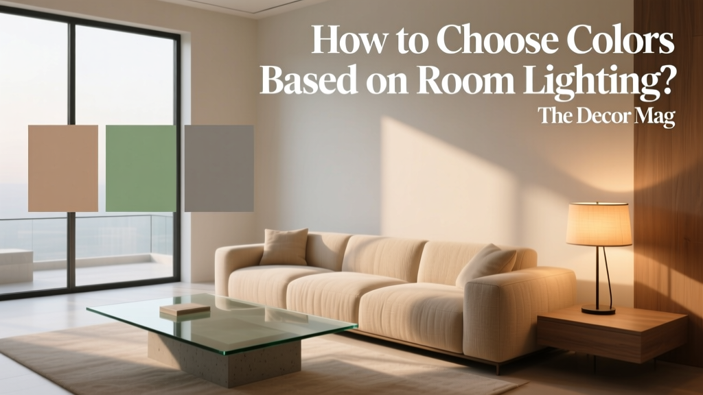
How to Choose Colors Based on Room Lighting - The Decor Mag
Color doesn’t live on a paint chip—it lives on your walls, in your shadows, and under your light bulbs. That’s why a “perfect” shade in the store can suddenly look icy, muddy, or strangely neon once it’s home. Room lighting changes how paint colors read, how contrast feels, and even how big (or cozy) a space appears.
When you choose interior paint colors with lighting in mind, you gain control over mood and function. Warm light can make crisp whites feel creamy; cool daylight can pull blue or gray undertones forward; dim rooms may swallow mid-tones and flatten a carefully planned color scheme. Understanding these interactions is one of the fastest ways to elevate your interior color design—without buying new furniture.
This guide breaks down how different lighting conditions affect color, offers specific paint color recommendations, and shows real-room scenarios so you can build color schemes that look intentional from morning to evening.
Why Lighting Changes Paint Color (The Science, Simplified)
Two key factors shape how paint looks at home: light temperature and light direction/intensity.
1) Light temperature (Kelvin) shifts undertones
- Warm bulbs (2700K–3000K) add yellow/red warmth. Whites look creamier; grays can look beige; blues can soften.
- Neutral bulbs (3500K–4000K) are balanced. Colors look closer to what you see on a sample card.
- Cool bulbs (5000K–6500K) add blue/cyan. Whites look crisper; warm colors may dull; grays may turn steely.
2) Direction, time of day, and intensity change contrast
- Direct sunlight increases contrast and can wash out pale colors.
- Indirect daylight reads softer and can emphasize undertones.
- Low light compresses contrast and can make mid-tones feel darker and less “colorful.”
Design principle to remember: Color is relative. Your flooring, trim color, and nearby fabrics will also bounce color around the room, influencing what you perceive on the wall.
Start Here: Assess Your Room’s Lighting Like a Designer
Before committing to a paint color palette, get clear on the lighting conditions you’re working with.
A quick lighting checklist
- Which direction do your windows face? North, south, east, or west.
- How big are the windows? And are there trees, porches, or buildings blocking light?
- When do you use the room most? Morning, afternoon, evening.
- What kind of artificial lighting do you have? Recessed, lamps, pendants; warm vs cool bulbs.
- What’s already in the room? Warm wood floors, cool gray tile, colorful rugs, etc.
Practical testing tip
Paint large samples (at least 12" x 12", ideally 2' x 2') on multiple walls, or use peel-and-stick samples. View them:
- In the morning, midday, and evening
- With overhead lights on and off
- Next to trim, flooring, and a key fabric (sofa, rug, drapes)
Choosing Paint Colors by Natural Light Direction
North-facing rooms: cooler, steady light
North light is consistent and often cool/blue. Many paint colors look slightly grayer or flatter here, so the goal is usually to add warmth and gentle brightness.
Best color strategies:
- Choose warm whites, creamy off-whites, and greiges with subtle warmth.
- Lean into earthy hues (warm clay, soft olive) to keep the room inviting.
- Avoid overly cool grays and icy blues unless you want a deliberately crisp, moody feel.
Paint color recommendations:
- Benjamin Moore White Dove (OC-17) — a reliable warm white that doesn’t go too yellow in cooler light.
- Sherwin-Williams Alabaster (SW 7008) — soft, creamy, flattering in north rooms.
- Farrow & Ball Skimming Stone (No. 241) — a warm, elegant neutral that prevents the “cold box” effect.
- Benjamin Moore Edgecomb Gray (HC-173) — a light greige that adds warmth without reading tan.
Real room scenario: A north-facing home office with cool daylight can make white walls look sterile. Try White Dove on walls with crisp white trim, then add a camel leather chair, brass lamp, and a muted blue rug for balanced contrast.
South-facing rooms: warm, bright light
South light is strong and warm most of the day. Colors appear clearer and more saturated, and warm tones can intensify quickly.
Best color strategies:
- Use cooler neutrals to counterbalance the warmth.
- Soft blues, blue-grays, and balanced whites stay calm and fresh.
- If you love warm colors, choose slightly muted versions to avoid an overly golden cast.
Paint color recommendations:
- Benjamin Moore Chantilly Lace (OC-65) — a crisp white that holds up in strong sun.
- Sherwin-Williams Pure White (SW 7005) — bright but not icy, great for open-plan spaces.
- Benjamin Moore Classic Gray (OC-23) — a light neutral that stays airy in bright rooms.
- Sherwin-Williams Sea Salt (SW 6204) — a soft green-blue that reads serene rather than gloomy in southern light.
Real room scenario: A south-facing living room with lots of sun can make beige walls look yellow. Switch to Classic Gray for the walls, add white trim, and layer in natural linen, black accents, and a few terracotta accessories for warmth that feels intentional—not accidental.
East-facing rooms: bright mornings, softer afternoons
East light is warm and energizing early, then becomes cooler and dimmer later. Colors can feel cheerful at breakfast and subdued by dinner.
Best color strategies:
- Choose colors that hold their character in lower afternoon light.
- Soft warm neutrals and gentle pastels work beautifully.
- For dining rooms used at night, prioritize how the color looks under bulbs.
Paint color recommendations:
- Sherwin-Williams Accessible Beige (SW 7036) — balanced, friendly, consistent.
- Benjamin Moore Pale Oak (OC-20) — a soft greige that stays refined throughout the day.
- Benjamin Moore Smoke (2122-40) — a blue-gray that glows in morning light but stays sophisticated later.
Real room scenario: An east-facing kitchen breakfast nook can feel bright in the morning and a bit flat later. Use Pale Oak on walls, white cabinetry, and add warm wood stools plus a brushed brass pendant with 2700K bulbs to keep the afternoon cozy.
West-facing rooms: dim mornings, dramatic warm evenings
West light can feel muted early and very warm at sunset. This is where colors can swing the most—especially neutrals.
Best color strategies:
- Test paint at sunset to see if it turns too orange or too intense.
- Cooler neutrals and grounded mid-tones can handle the evening glow.
- Consider richer colors (olive, navy, charcoal) for an intentional “golden hour” mood.
Paint color recommendations:
- Benjamin Moore Balboa Mist (OC-27) — a light greige that resists looking peachy in warm evening light.
- Sherwin-Williams Repose Gray (SW 7015) — a versatile gray that doesn’t go overly warm in the evening.
- Farrow & Ball Hague Blue (No. 30) — deep, dramatic, and stunning as the sun sets.
Real room scenario: A west-facing media room is used mostly at night, and afternoon sun creates glare. Paint the walls Hague Blue or a similar deep blue, add warm wood and soft cream textiles, and use dimmable lamps to build a layered, cinema-like color scheme.
How Artificial Lighting Affects Color (And How to Work With It)
Most rooms are experienced in mixed light—daylight plus lamps, pendants, and recessed lighting. Since evening is when color perception shifts dramatically, your bulb choices are part of your paint plan.
Match bulb temperature to the mood you want
- 2700K: cozy, relaxing—ideal for bedrooms, living rooms, dining rooms.
- 3000K: slightly cleaner warmth—great all-purpose for open-plan homes.
- 3500K–4000K: crisp and task-forward—good for kitchens, baths, laundry rooms.
Designer tip: color-rendering matters
Look for LEDs with CRI 90+ so your paint colors and finishes look more natural and less “off.” Poor color rendering can make a sophisticated greige look dull or greenish.
Choose Colors by Room Function (Color Psychology + Lighting)
Color psychology isn’t about strict rules—it’s about how hues tend to feel. Lighting amplifies these emotional cues.
Bedrooms: calming hues that don’t shift harshly at night
- Try: soft blue-grays, muted greens, warm off-whites.
- Paint ideas: Sherwin-Williams Comfort Gray (SW 6205), Benjamin Moore Boothbay Gray (HC-165), Sherwin-Williams Alabaster (SW 7008).
- Combo: Comfort Gray walls + creamy white trim + natural oak + linen bedding.
Kitchens: clean but not cold
- Try: bright whites or light neutrals that work under both daylight and task lighting.
- Paint ideas: Benjamin Moore Simply White (OC-117) (warm), Benjamin Moore Chantilly Lace (OC-65) (crisp), Sherwin-Williams Pearl Gray (SW 0052) (soft neutral).
- Combo: Simply White cabinets + light greige walls + matte black hardware + warm wood accents.
Bathrooms: flattering color under cooler task lighting
- Try: soft whites, pale grays, gentle blue-greens.
- Paint ideas: Benjamin Moore Classic Gray (OC-23), Sherwin-Williams Sea Salt (SW 6204).
- Combo: Classic Gray walls + bright white trim + polished nickel + warm 3000K vanity lights.
Living rooms: balanced neutrals with depth
- Try: warm greiges, soft taupes, gentle clay tones—especially if you use the room day and night.
- Paint ideas: Benjamin Moore Pale Oak (OC-20), Benjamin Moore Balboa Mist (OC-27), Sherwin-Williams Accessible Beige (SW 7036).
- Combo: Pale Oak walls + ivory trim + layered textures (bouclé, wool, wood) + one dark anchor (espresso table or charcoal drapery).
Color Schemes That Perform Well Across Different Lighting
If your home has open sightlines, you’ll want paint color schemes that transition smoothly from room to room—even when lighting changes.
Reliable whole-home palettes
- Warm white + greige + soft black accents (timeless, flexible)
- Crisp white + blue-gray + natural wood (fresh, coastal-leaning without being themed)
- Soft taupe + olive green + brass (grounded, sophisticated, inviting)
Easy combinations to try
- Walls: BM White Dove + Trim: BM Chantilly Lace + Accents: deep navy textiles
- Walls: SW Accessible Beige + Trim: SW Pure White + Accents: terracotta + olive
- Walls: BM Balboa Mist + Trim: BM Simply White + Accents: matte black + warm walnut
Common Color Mistakes to Avoid (Lighting Edition)
- Choosing paint under store lighting only. Big-box lighting is rarely similar to your home’s daylight and bulbs.
- Ignoring undertones. Two “grays” can be blue, green, violet, or beige underneath—lighting will reveal it.
- Sampling on one wall. A color can look perfect on a bright wall and totally different in shadow.
- Forgetting the trim and ceiling. A warm wall color beside a cool white trim can look dingy by comparison.
- Using ultra-saturated color in low light without intention. Dark colors can look muddy if there’s not enough layered lighting.
- Mixing bulb temperatures in the same sightline. One 2700K lamp and a 5000K overhead can make your color scheme look inconsistent.
A Simple Step-by-Step Method for Choosing Paint Colors With Confidence
- Identify the dominant light source: north/south/east/west daylight, or mostly artificial lighting.
- Pick a “reference white”: choose your trim/ceiling white first (it sets the baseline for every wall color).
- Select 2–3 wall color contenders: vary undertone (one warmer, one cooler, one in-between).
- Test large samples on multiple walls: include the darkest corner and the brightest wall.
- Check at night with your actual bulbs: dimmers on, lamps on, overheads on—see all scenarios.
- Confirm with your fixed finishes: flooring, countertops, tile, and large upholstery pieces.
FAQ: Choosing Colors Based on Room Lighting
What paint colors work best in dark rooms with little natural light?
Look for lighter colors with warm undertones to prevent a gray, gloomy cast. Try Benjamin Moore White Dove (OC-17) or Sherwin-Williams Alabaster (SW 7008). If you prefer moodier walls, go darker intentionally (navy, charcoal, olive) and add layered lighting so the color reads rich instead of flat.
Why does my gray paint look green or purple?
That’s undertone plus lighting. Cool daylight can pull blue/violet undertones forward; warm bulbs can reveal beige/green undertones. Test several grays (blue-gray vs greige) and compare them next to a true white trim to see what’s really happening.
Should I use the same white paint in every room?
You can, and it often looks cohesive—especially for trim and ceilings. For walls, the “best white” may shift depending on lighting. A crisp white like BM Chantilly Lace can look brilliant in a south-facing room but stark in a north-facing one, where BM White Dove may feel more welcoming.
How do I choose paint colors for an open floor plan with different light exposures?
Pick one neutral that stays stable across light changes (a balanced greige like BM Balboa Mist or BM Pale Oak), then vary accent colors and textiles by zone. Keep trim consistent throughout to unify the space.
Do warm light bulbs make wall colors look more yellow?
Yes. Warm bulbs (2700K) add yellow/orange warmth, which can make creams look richer and some neutrals look more beige or even slightly peachy. If your walls feel too yellow at night, move toward 3000K bulbs or choose a more balanced wall color.
How many paint samples should I test before deciding?
Three is a sweet spot: one warm-leaning, one cool-leaning, and one “middle.” Testing too many can make everything feel confusing; testing too few increases the odds of missing an undertone issue.
Next Steps: Make Lighting Your Color Superpower
Choose colors the way designers do: start with your room’s light direction, test large samples on multiple walls, and evaluate at night under your actual bulbs. Favor paint colors that either balance your light (warming up cool rooms, cooling down sunny rooms) or amplify it intentionally for mood.
If you’re ready to refine your color schemes even further, explore more paint color palettes, undertone guides, and interior color design tips on thedecormag.com.
More Articles
 Best Poppy Red Paint Colors - The Decor Mag
 How to Choose Colors for a Music Room - The Decor Mag
 12 Practical DIY Furniture Ideas You Can Build in a Weekend (With Exact Materials & Dimensions)
 The Ultimate Reading Guide: Science-Backed Strategies for Faster Comprehension, Retention, and Lifelong Engagement
 How to Create an Uplifting Color Palette - The Decor Mag
 How to Create a Restraint Color Palette - The Decor Mag
 Best Berry Red Paint Colors - The Decor Mag
 Best Lilac Paint Colors for Gentle Spaces - The Decor Mag
 Jewel Tone Color Scheme Ideas - The Decor Mag
 Best Grapefruit Paint Colors - The Decor Mag