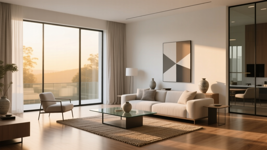
Minimalist Color Palettes That Actually Feel Warm
Minimalism Doesn't Mean Sterile
The biggest misconception about minimalist interiors is that they must be white, gray, and cold. In reality, the most compelling minimalist spaces use a restricted but warm palette — fewer colors, but each one chosen for its ability to create comfort and calm.
Palette 1: Warm White + Terracotta + Natural Wood
Start with warm white walls (Benjamin Moore Swiss Coffee or Sherwin-Williams Alabaster — both have yellow undertones). Add terracotta through textiles: a throw blanket, ceramic vases, or a single accent pillow. Natural wood furniture (oak, walnut) provides the grounding third element.
This palette works beautifully in south-facing rooms where natural light amplifies the warmth.
Palette 2: Greige + Sage + Black Accents
Greige (gray-beige) is the ultimate minimalist wall color — it reads as neutral but has enough warmth to prevent sterility. Pair with sage green in textiles or a single statement plant. Black metal accents (light fixtures, picture frames, cabinet pulls) add definition without clutter.
Palette 3: Cream + Dusty Blue + Brass
For bedrooms and bathrooms, cream walls with dusty blue textiles create a serene, spa-like atmosphere. Unlacquered brass hardware adds warmth that develops a beautiful patina over time. This palette feels coastal without being nautical.
The 60-30-10 Rule, Minimalist Edition
Apply color in this ratio: 60% dominant neutral (walls, large furniture), 30% secondary tone (textiles, rugs, curtains), 10% accent (art, ceramics, hardware). In a minimalist space, the 10% accent is where personality lives.
What to Avoid
- Pure white in north-facing rooms (it will feel cold and clinical)
- More than 4 colors in a small space (creates visual noise)
- Matching everything (slight tonal variation is more interesting than perfect coordination)
Testing Before Committing
Paint large swatches (at least 2x2 feet) on multiple walls. Observe how the color changes throughout the day — morning light, midday brightness, and evening warmth all affect perception. Live with the swatches for 3 full days before deciding.
More Articles
 How to Choose Colors Based on Room Lighting - The Decor Mag
 Best Blue Paint Colors for Every Mood - The Decor Mag
 Best Fire Engine Red Paint Colors - The Decor Mag
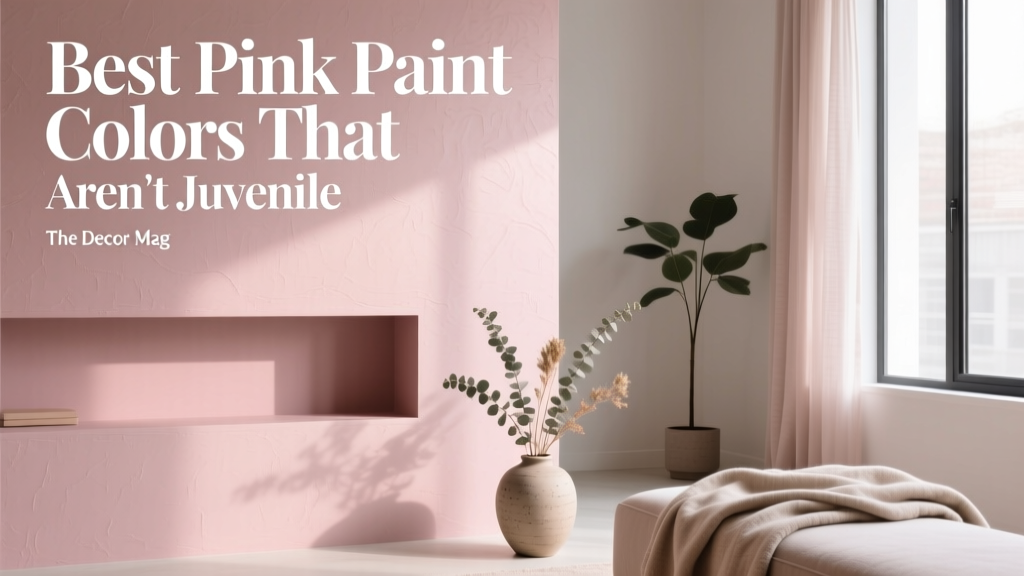 Best Pink Paint Colors That Aren't Juvenile - The Decor Mag
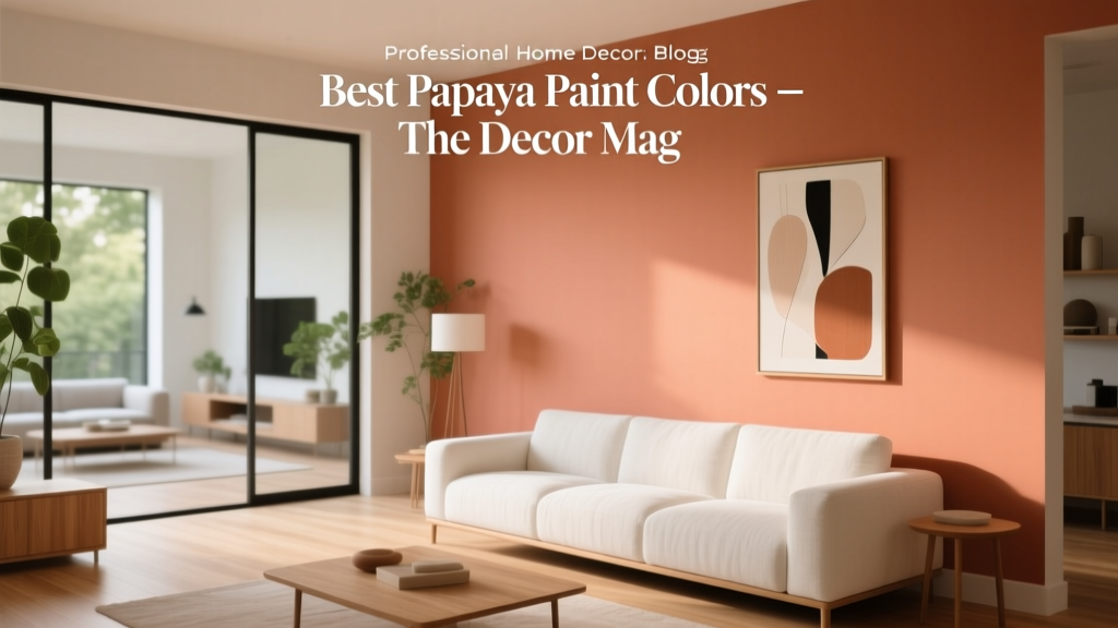 Best Papaya Paint Colors - The Decor Mag
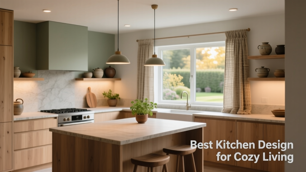 Best Kitchen Design for Cozy: Warmth, Function, and Timeless Comfort
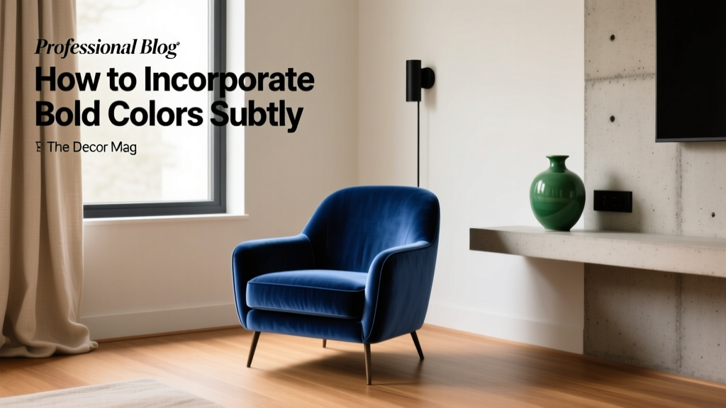 How to Incorporate Bold Colors Subtly - The Decor Mag
 How to Choose Colors for a Music Room - The Decor Mag
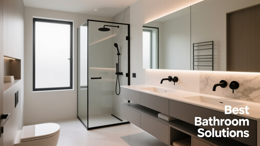 Best Bathroom Floor Solutions: Performance, Safety, and Style Compared
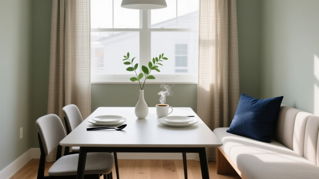 How to Choose Colors for a Breakfast Nook - The Decor Mag