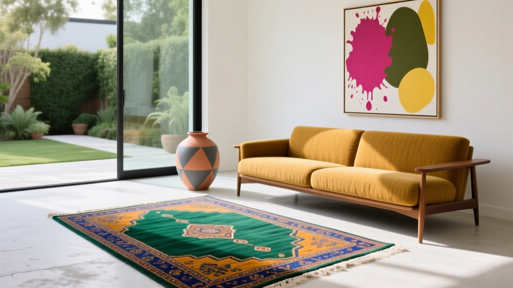
How to Create an Eclectic Color Palette - The Decor Mag
Eclectic interiors feel collected, personal, and alive—like a home that grew over time rather than being purchased in one afternoon. Color is the thread that makes this “mix” feel intentional. Without a smart color strategy, eclectic spaces can tip from layered and curated into busy and chaotic.
Creating an eclectic color palette isn’t about using every shade you love at once. It’s about combining colors with clear roles: a calm base, a few confident supporting hues, and well-placed accents that add energy. When you understand a handful of color principles—temperature, undertones, contrast, and repetition—you can blend patterns, eras, and materials while still getting a cohesive interior color design.
This guide breaks down how to build an eclectic color scheme step by step, with practical tips, paint color recommendations, real-room scenarios, and common mistakes to avoid. The goal: a home that feels expressive, balanced, and unmistakably yours.
What Makes a Color Palette “Eclectic” (and Why It Works)
An eclectic color palette combines influences—vintage with modern, global with minimalist, bold with quiet—without a single “theme” dominating the room. Color psychology plays a key role here: eclectic spaces often mix calming colors (to prevent overwhelm) with stimulating colors (to create personality and movement).
Key traits of a successful eclectic palette
- Contrast with control: You’ll see variety, but not visual noise.
- Repetition: Key colors reappear in multiple places (textiles, art, paint, accessories).
- Undertone harmony: Even different hues share warm or cool undertones.
- Clear hierarchy: Not everything is an accent; not every wall needs a bold color.
Start with a “Grounding Neutral” (Your Palette’s Anchor)
Eclectic rooms benefit from a stabilizing backdrop. A grounding neutral doesn’t have to mean plain white—it can be a soft greige, warm ivory, moody charcoal, or a muted earth tone. The right neutral lets your layered décor read as curated rather than cluttered.
How to choose the right neutral paint color
- Match the home’s fixed elements: Consider flooring, countertops, and large upholstery.
- Check undertones: Warm neutrals flatter woods and brass; cool neutrals sharpen modern finishes.
- Pick your “light level”: Light neutrals expand a room; deeper neutrals add intimacy and drama.
Reliable neutral paint recommendations (designer favorites)
- Benjamin Moore White Dove (OC-17): Soft, warm-leaning white that works with vintage and modern pieces.
- Sherwin-Williams Alabaster (SW 7008): Creamy without going yellow; great for cozy eclectic homes.
- Farrow & Ball Skimming Stone (No. 241): A sophisticated greige that reads timeless and collected.
- Benjamin Moore Classic Gray (OC-23): An airy, barely-there greige that plays well with bold accents.
- Sherwin-Williams Iron Ore (SW 7069): A soft charcoal for dramatic eclectic spaces, especially with warm woods.
Build Your Eclectic Scheme: The 60-30-10 Rule (With a Twist)
The classic 60-30-10 design principle helps you distribute color in a way that feels balanced. For eclectic interiors, keep the structure but allow more variety inside each “bucket.”
- 60% Base: Walls + large rugs + major furniture (your grounding neutral or a muted color).
- 30% Support: Secondary paint color, curtains, upholstery, or large art background tones.
- 10% Accent: Punchy colors in pillows, lampshades, vases, book spines, and small art.
The eclectic twist: Your 10% can be split into two or three accents—as long as they share a temperature (warm/cool) or repeat across the room.
Choose a “Connector Color” to Make Everything Look Intentional
A connector color is the quiet hero of eclectic color schemes. It’s the shade that appears in unexpected places—an outline in art, a stripe in a rug, a ceramic glaze—tying disparate items together.
Connector color ideas that work in most homes
- Muted terracotta: Earthy, flattering, and great with plants and wood tones.
- Dusty blue: Calming, classic, and versatile across styles.
- Olive green: Grounded, natural, and ideal for layered textures.
- Brass/gold as a “metallic color”: Counts as color; repeats easily in hardware and lighting.
Paint color options for connector hues
- Farrow & Ball Setting Plaster (No. 231): A soft terracotta-pink that feels artisanal rather than sweet.
- Benjamin Moore Saybrook Sage (HC-114): A classic sage that bridges traditional and bohemian décor.
- Sherwin-Williams Sea Salt (SW 6204): A blue-green that reads airy and calm in many light conditions.
- Benjamin Moore Hale Navy (HC-154): A deep anchor blue that makes eclectic art and textiles pop.
Pick Accent Colors Using Color Psychology (Mood First, Then Matching)
Eclectic color is most successful when it supports the feeling you want in the room. Think in terms of mood and energy, then choose accent colors that reinforce it.
Common mood goals and accent color directions
- Creative and energized: Cobalt, chartreuse, coral, saffron
- Cozy and grounded: Rust, olive, warm camel, deep ochre
- Calm and airy: Dusty blue, soft green, warm white, pale clay
- Bold and dramatic: Ink navy, aubergine, emerald, near-black
Accent paint colors worth sampling
- Benjamin Moore Caliente (AF-290): A confident red for a front door, powder room, or statement nook.
- Sherwin-Williams Tricorn Black (SW 6258): A crisp black for doors, trim, or a graphic focal wall.
- Farrow & Ball Hague Blue (No. 30): Moody blue-green that feels luxe with brass and walnut.
- Benjamin Moore Golden Straw (2152-50): Warm yellow that reads sunny, especially in kitchens and breakfast areas.
Real Room Examples: Eclectic Palettes That Feel Cohesive
1) Living Room: Vintage + Modern Mix with Warm Contrast
Scenario: Mid-century sofa, vintage Persian rug, modern art, mixed woods.
- Walls (base): Benjamin Moore White Dove (OC-17)
- Support color: Benjamin Moore Hale Navy (HC-154) on built-ins or a single library wall
- Accents: Terracotta (throw pillows), brass (lighting), olive (plants + a ceramic lamp)
Why it works: The warm white keeps the room breathable. Navy adds depth (strong contrast), while terracotta and olive repeat across textiles, art, and accessories for a collected look.
2) Bedroom: Calm Eclectic with Layered Patterns
Scenario: Linen bedding, patterned headboard, global textiles, a mix of antique and minimalist nightstands.
- Walls (base): Sherwin-Williams Alabaster (SW 7008)
- Support color: Sherwin-Williams Sea Salt (SW 6204) on a soft accent wall or ceiling
- Accents: Dusty rose, warm tan leather, matte black frames
Application tip: If you have many patterns, keep paint soft and let the textiles do the talking. Repeat black in frames and hardware to “outline” the room.
3) Kitchen/Dining: Eclectic, Bright, and Collected
Scenario: Shaker cabinets, open shelving, mismatched vintage dining chairs, colorful art.
- Walls (base): Benjamin Moore Classic Gray (OC-23)
- Cabinet option: Benjamin Moore Saybrook Sage (HC-114) for lowers or an island
- Accents: Ochre (linens), cobalt (glassware), warm wood cutting boards
Why it works: A restrained wall color allows the chair mix to shine. Sage connects to natural materials and plants while supporting bolder table styling.
4) Entryway: Small Space, Big Personality
Scenario: Gallery wall, vintage runner, eclectic mirror shapes.
- Walls: Farrow & Ball Hague Blue (No. 30) for a moody envelope effect
- Trim/door: Sherwin-Williams Tricorn Black (SW 6258) or crisp white for contrast
- Accents: Brass hooks, red/orange art detail, woven basket storage
Application tip: Use high-contrast lighting (warm bulbs) to keep dark paint inviting, not cave-like.
How to Mix “Unexpected” Colors Without Clashing
Use undertones like a filter
Two colors can be different yet harmonious if their undertones match. Example: a warm terracotta pairs better with a creamy white than a blue-white.
Try these eclectic color combinations (tested and flexible)
- Navy + terracotta + warm white: Classic contrast with earthy warmth.
- Olive + blush + brass: Soft-meets-grounded; great for bedrooms and living rooms.
- Cobalt + saffron + charcoal: High energy, best when grounded with darker neutrals.
- Teal + rust + ivory: Artisan vibe; works beautifully with vintage rugs.
- Black + cream + wood tones + one bright accent: Gallery-like and flexible as décor changes.
Repeat each accent at least three times
This is one of the simplest interior design color rules for eclectic homes. If you introduce emerald green, echo it in:
- a pillow or throw
- a piece of art
- a vase, book, or small décor item
Paint Placement Ideas for Eclectic Homes
Eclectic color doesn’t require painting every room a different bold hue. Strategic placement often looks more elevated.
- Painted ceiling (“fifth wall”): Try a muted color overhead for a cozy, collected feel.
- Color-blocked built-ins: A deep shade on shelves highlights books and objects.
- Statement trim or doors: Black, navy, or olive on trim can unify mixed furnishings.
- Two-tone walls: Use a deeper lower half (wainscot height) to ground patterned art and textiles.
Common Color Mistakes to Avoid in Eclectic Interiors
- Using too many “loud” colors at the same volume: If everything is saturated, nothing feels special. Balance brights with calmer supporting hues.
- Ignoring undertones: Cool gray walls can make warm vintage rugs look muddy. Sample paint next to your rug and sofa fabric.
- Skipping a unifying neutral: Even maximalist spaces need a resting place for the eye—walls, large upholstery, or big rugs can do this job.
- One-off accent colors: A single random teal pillow reads accidental. Repeat it or remove it.
- Choosing paint in the wrong lighting: North-facing rooms make colors feel cooler; warm colors may need extra richness, cool colors may need softening.
FAQ: Eclectic Color Palettes
How many colors should an eclectic palette have?
A dependable range is 4–7 colors: one base neutral, 1–2 supporting colors, and 2–3 accents (plus metals and wood tones acting as “quiet colors”). More can work if you repeat them consistently.
Can I mix warm and cool colors in the same room?
Yes—warm/cool contrast is often what makes eclectic rooms exciting. Keep one temperature dominant (about 70%) and use the other as an accent. Example: warm whites and terracotta with small hits of cobalt.
What’s the best paint finish for eclectic spaces?
Most walls look best in eggshell or matte (depending on the brand and durability). Use semi-gloss or satin for trim and doors to add subtle contrast and highlight architectural details.
How do I choose paint colors that work with a busy rug?
Pull one quieter color from the rug (often a background shade) for the walls, then use one bolder rug color as an accent elsewhere. If the rug is high-contrast, keep walls softer to avoid visual overload.
Do eclectic color schemes work in small rooms?
They can look incredible in small spaces when controlled. Use one strong color (like Hague Blue) and keep décor tight: fewer, larger statement pieces rather than many small colorful objects.
Should I paint open-concept spaces all one color?
Not necessarily. A single grounding neutral throughout can unify an open layout, then you can add supporting colors through built-ins, dining room walls, or furniture. The key is repeating accents so the flow feels intentional.
Next Steps: Create Your Own Eclectic Palette
Start with a neutral you’d happily live with every day, then choose one connector color and two accents that match your desired mood. Gather a small set of samples (paint swatches, fabric scraps, rug photos) and test paint on the wall in morning and evening light. Once your palette is set, repeat your accents thoughtfully—textiles, art, and accessories do the heavy lifting in eclectic design.
For more paint color ideas, color scheme guides, and room-by-room inspiration, explore the color resources at thedecormag.com.
More Articles
 Best Wine Red Paint Colors - The Decor Mag
 How to Use Color to Create Rhythm - The Decor Mag
 Best Maroon Paint Colors - The Decor Mag
 How to Choose Bathroom Paint Colors - The Decor Mag
 Best Citron Paint Colors - The Decor Mag
 Best Charcoal Paint Colors for Modern Spaces - The Decor Mag
 How to Choose Colors for a Basement - The Decor Mag
 How to Choose Colors for a Sunroom - The Decor Mag
 How to Create a Serene Color Palette - The Decor Mag
 Best Red Paint Colors for Drama and Warmth - The Decor Mag