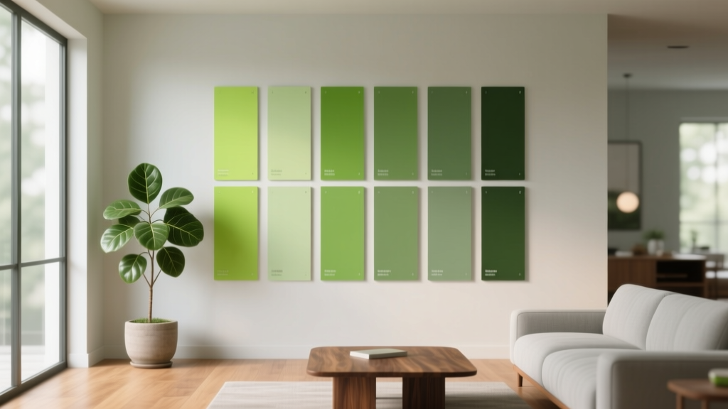
Best Apple Green Paint Colors - The Decor Mag
Apple green is one of those rare paint colors that feels both cheerful and design-forward. It’s fresh without being icy, lively without being neon, and it can read as anything from playful retro to polished modern—depending on the undertone and the materials around it. If you’ve ever wanted a room to feel more awake, more optimistic, or simply more “alive,” apple green paint is a smart place to start.
Homeowners often hesitate with green because it can swing too yellow, too gray, or too intense under different lighting. Apple green sits in a sweet spot: it’s a bright, spring-like green that pairs beautifully with natural wood, crisp whites, warm metals, and even moody charcoals. When you choose the right apple green paint color (and use it in the right spot), it becomes an instant mood-lifter and a surprisingly versatile foundation for a cohesive interior color scheme.
This guide breaks down the best apple green paint colors, how to choose the right one for your home, and how to use it with confidence—whether you’re painting a kitchen, a front door, a nursery, or a single statement wall.
What “Apple Green” Really Means in Paint
Apple green typically describes a bright, clean green with noticeable yellow energy—think Granny Smith skin rather than deep forest or muted sage. In interior color design terms, it’s usually:
- High-chroma: more saturated than most “decorator greens”
- Yellow-leaning: warmer and more energetic than blue-greens
- Light to mid value: often reads airy and open, especially in daylight
Color psychology: why apple green works
Green is strongly linked with balance, renewal, and well-being. The “apple” version adds a dose of optimism and momentum—great for rooms where you want energy without chaos. Many homeowners find apple green especially effective for:
- Kitchens and breakfast nooks: encourages a bright, social feel
- Home offices: promotes focus and “fresh start” energy
- Entryways: creates a welcoming, memorable first impression
- Kids’ rooms: playful yet not overly sweet
How to Choose the Right Apple Green for Your Space
Apple green paint colors can look dramatically different depending on light direction, surrounding finishes, and sheen. Before you commit, evaluate these key factors.
1) Check the undertone: yellow, neutral, or slightly cool
- Yellow-apple greens feel sunny and bold; best with warm whites and natural wood.
- More neutral apple greens are easier to live with; they pair well with both warm and cool palettes.
- Slightly cool apple greens feel crisp and modern; great with bright white trim and chrome.
2) Consider the room’s natural light
- North-facing rooms: can mute green and make it feel a bit dull; choose a cleaner, brighter apple green.
- South-facing rooms: intensify warmth; avoid apple greens that are extremely yellow unless you want a sun-drenched effect.
- East-facing rooms: look fresh in the morning, calmer later; mid-value apple greens are reliable.
- West-facing rooms: can turn warmer and richer in afternoon light; slightly cooler apple greens help balance.
3) Match to fixed elements (counters, flooring, tile)
Apple green looks best when it’s intentionally paired with fixed finishes:
- Oak or walnut floors: choose a slightly cooler or neutral apple green to avoid “too much warmth.”
- White quartz and marble: almost any apple green works; use undertone to set the mood (cooler = modern, warmer = cozy).
- Beige tile or travertine: avoid overly yellow apple greens; pick a more balanced green so it doesn’t look acidic.
Best Apple Green Paint Colors (Designer-Approved Picks)
Below are standout apple green paint colors across major brands. Use these as starting points, then sample in your space (large swatches, at least 12" x 12", in multiple lighting conditions).
Benjamin Moore Apple Green 2026-20
Why it works: A true, spirited apple green that reads clean and joyful without feeling fluorescent. It’s a strong choice for an accent wall, furniture refresh, or a playful powder room.
Best pairings:
- Crisp whites (Benjamin Moore Chantilly Lace OC-65)
- Warm light neutrals (Benjamin Moore White Dove OC-17)
- Charcoal accents (Benjamin Moore Kendall Charcoal HC-166)
Where to use it: breakfast nook banquette wall, kids’ reading corner, statement ceiling in a small room.
Sherwin-Williams Lime Granita SW 9041
Why it works: A punchy, modern green with a citrusy edge. It’s energetic and graphic—excellent when you want a contemporary vibe with bold contrast.
Best pairings:
- Bright white trim (Sherwin-Williams Extra White SW 7006)
- Black accents (Sherwin-Williams Tricorn Black SW 6258)
- Cool grays for balance (Sherwin-Williams Passive SW 7064)
Where to use it: modern front door, mudroom lockers, a single wall behind open shelving.
Farrow & Ball Breakfast Room Green No. 81
Why it works: A more sophisticated take on apple green—still sunny, but with an elegant, slightly softened character. It feels especially tailored in traditional homes and cottage-style interiors.
Best pairings:
- Soft whites and creams (Farrow & Ball All White No. 2005 or Pointing No. 2003)
- Warm brass or aged bronze hardware
- Natural materials like rattan, linen, and oak
Where to use it: kitchen cabinetry (especially lowers), a cheerful hallway, a breakfast room with botanical art.
Behr Jicama MQ4-05
Why it works: A lively, approachable yellow-green that’s budget-friendly and broadly appealing. It reads bright but not harsh when balanced with creamy whites.
Best pairings:
- Warm white walls/trim
- Light woods and woven textures
- Terracotta accents for an earthy, sunlit palette
Where to use it: laundry room refresh, pantry door, playroom built-ins.
Benjamin Moore Spring Meadow 486
Why it works: A fresher, slightly softer green that still hits the “apple” family. Great for homeowners who want green energy without maximum intensity.
Best pairings:
- Soft greige (Benjamin Moore Edgecomb Gray HC-173)
- Warm white trim
- Natural stone and light oak
Where to use it: whole-room color in a sunroom, a calm home office, or a guest room accent wall.
Sherwin-Williams Jardin SW 6446
Why it works: A classic, bright green that feels botanical and upbeat. It’s slightly more “garden green” than neon-lime, making it easier for larger areas.
Best pairings:
- Warm neutrals (Sherwin-Williams Alabaster SW 7008)
- Navy accents for contrast
- Natural wood and woven lighting
Where to use it: kitchen island, dining room buffet, or an entryway that needs personality.
Real Room Ideas: Where Apple Green Shines
1) Apple green kitchen cabinets (or just the island)
Apple green can make a kitchen feel custom and collected—especially when you use it strategically.
- Try it on: lower cabinets or the island only
- Keep balance with: white uppers, pale countertops, and simple backsplash tile
- Hardware tip: brushed brass warms apple green; polished nickel modernizes it
Example scenario: Paint the island Sherwin-Williams Jardin and keep perimeter cabinets warm white. Add rattan stools and a soft runner with small-scale pattern to echo the lively tone.
2) A statement front door that feels welcoming (not loud)
Apple green is one of the best front door paint color choices if you want curb appeal that reads friendly and unique.
- Pair with: white trim, black shutters, and warm porch lighting
- Finish suggestion: exterior satin or gloss for easy cleaning and a crisp look
Example scenario: A colonial-style home with a black lantern and brass house numbers gets an instant refresh with a clean apple green door and a simple wreath of mixed greenery.
3) Powder room drama with high payoff
Small rooms love bold color. Apple green can look especially intentional with the right supporting cast.
- Go bold with: apple green walls + glossy white trim
- Add: vintage-style mirror, black accents, and a playful wallpaper on the ceiling if you’re adventurous
- Lighting matters: choose warm LED (2700K–3000K) to avoid a harsh, neon effect
4) Home office clarity and focus
Green is often recommended for workspaces because it feels balanced and restorative. Apple green adds an extra “start-now” energy that’s great for creative work.
- Best approach: apple green on one wall behind your desk
- Ground it with: wood desk, matte black task lamp, and warm white trim
5) Kids’ rooms that grow with them
Apple green can be playful without leaning babyish. It works especially well with clean-lined furniture and graphic prints.
- Pair with: navy, white, and pops of coral or sunshine yellow
- Pattern tip: choose one strong pattern (rug or bedding) and keep the rest simple
Color Schemes That Make Apple Green Look Designer
Apple green is at its best when it’s part of a plan. These interior color schemes are reliable, repeatable, and easy to shop for.
Fresh Modern: Apple green + crisp white + black
- Walls: bright white
- Accent: apple green (door, island, or built-ins)
- Details: black hardware, black-framed art, simple geometric textiles
Soft Botanical: Apple green + warm white + natural wood
- Walls: warm white or creamy neutral
- Accent: softened apple green (mid-value)
- Details: oak, jute, linen, greenery in terracotta pots
Playful Retro: Apple green + teal + warm wood + brass
- Accent: apple green in a glossy or satin finish
- Secondary color: teal in art or textiles
- Details: walnut tones, brass lighting, curved silhouettes
Preppy Classic: Apple green + navy + white
- Walls: white or very pale neutral
- Accent: apple green built-ins or cabinetry
- Details: navy stripe rug, tailored drapery, polished nickel
Common Apple Green Paint Mistakes (and How to Avoid Them)
-
Choosing based on a tiny paint chip
Apple green shifts dramatically by light and sheen. Sample large swatches and view them morning, afternoon, and evening. -
Ignoring undertones in nearby finishes
If your tile or countertop is beige/yellow, an already-yellow apple green can look sharp or acidic. Choose a more balanced green to harmonize. -
Using high-chroma apple green on every wall in a low-light room
In dim spaces, bright greens can feel heavy or muddy. Use it as an accent, or choose a slightly softer apple green for full-room coverage. -
Picking the wrong sheen
Gloss and semi-gloss intensify color and highlight wall texture. For walls, matte/eggshell is usually more forgiving. Save satin or semi-gloss for trim, doors, and cabinets. -
Forgetting about trim color
A cool, bright white trim makes apple green look crisp and modern; a creamy trim makes it feel warmer and more traditional. Decide the vibe first, then choose the white.
Practical Painting Tips for Apple Green Success
- Sample smarter: paint two coats on foam board and move it around the room.
- Balance saturation: if the apple green feels too intense, use it on one focal surface (island, door, built-in) and keep walls neutral.
- Mind the lighting temperature: 2700K–3000K bulbs keep apple green warm and welcoming; 4000K can make it feel sharper.
- Create repetition: echo the green in 2–3 small accents (art, pillow, vase, plant pot) so it looks intentional.
- Use primer when needed: if you’re covering a dark wall or painting cabinetry, a quality primer helps apple green stay clean and even.
FAQ: Best Apple Green Paint Colors
Is apple green the same as lime green?
They’re related, but not always identical. Lime green often implies a brighter, more neon or highlighter feel. Apple green tends to be a touch softer and more natural—still lively, but easier to integrate into home color schemes.
What white paint pairs best with apple green?
For a crisp modern look, pair apple green with a clean bright white like Benjamin Moore Chantilly Lace or Sherwin-Williams Extra White. For a warmer, softer look, try Benjamin Moore White Dove or Sherwin-Williams Alabaster.
Can I use apple green in an open-concept space?
Yes—use it strategically. In open concept layouts, apple green often works best on a single anchor element (kitchen island, built-in, or a defined accent wall) while the surrounding walls stay in a cohesive neutral.
What colors go well with apple green for a cohesive palette?
Strong pairings include navy, charcoal, crisp white, warm cream, natural wood tones, and accents of coral or terracotta. For a calmer feel, use soft greige or muted taupe as a supporting neutral.
Will apple green look too bright on cabinets?
It can, depending on the shade and sheen. Choose a slightly softened apple green for larger cabinet runs, and consider a satin finish rather than high gloss. If you love a bold apple green, apply it to the island only.
How do I keep apple green from looking childish?
Ground it with grown-up materials and contrasts: warm wood, tailored lighting, classic hardware, and a neutral backdrop. Apple green looks especially sophisticated with black accents, brass details, and clean-lined furniture.
Next Steps: Bring Apple Green Into Your Home with Confidence
Start by deciding where apple green will have the most impact—front door, kitchen island, powder room walls, or a single accent wall—then choose an undertone that suits your home’s lighting and fixed finishes. Sample at least two to three apple green paint colors, compare them next to your trim white, and build a simple supporting palette with one neutral and one contrast color.
For more paint color ideas, foolproof color schemes, and room-by-room guidance, explore our latest color guides on thedecormag.com.
More Articles
 Earth Tone Color Palette Inspiration - The Decor Mag
 Best Orange Paint Colors for Energy & Warmth (2026)
 Best Lavender Paint Colors for Relaxation - The Decor Mag
 Best Steel Blue Paint Colors - The Decor Mag
 How to Choose Colors for a Butler Pantry - The Decor Mag
 How to Create a Low Contrast Color Palette - The Decor Mag
 How to Choose Colors for a Mudroom - The Decor Mag
 How to Choose Colors for a Home Office - The Decor Mag
 Best Banana Paint Colors - The Decor Mag
 Best Crimson Paint Colors - The Decor Mag