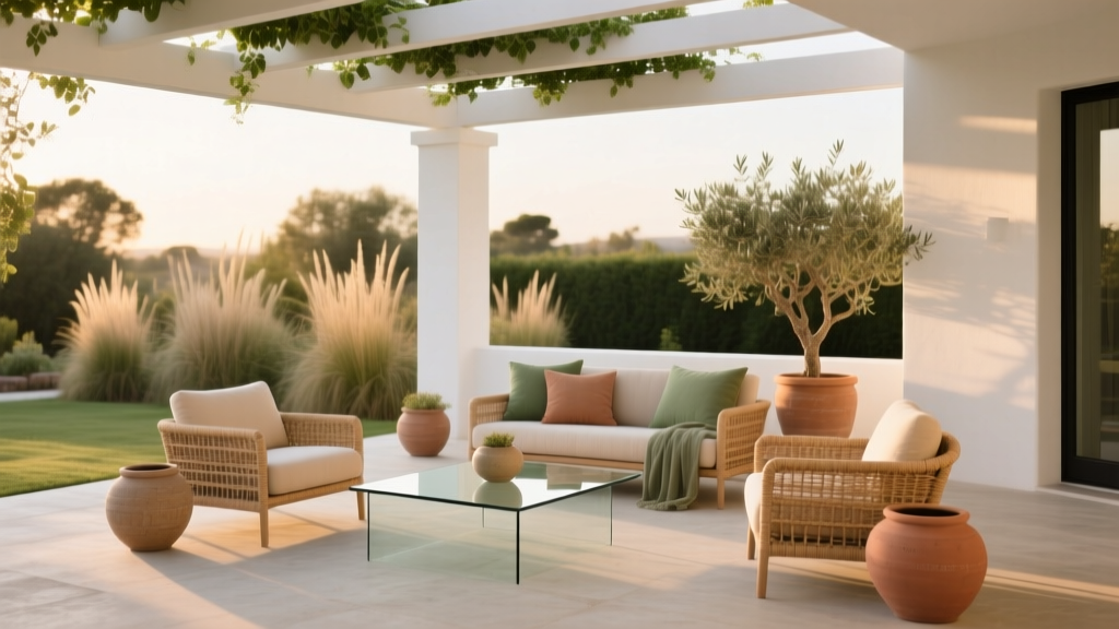
How to Choose Colors for a Patio - The Decor Mag
A patio is one of the few “rooms” in a home that has to perform in every light condition—morning glare, midday sun, golden hour warmth, and evening shadows. The right patio paint colors and outdoor color schemes can make a small space feel expansive, help furniture look intentional instead of mismatched, and create the mood you want: lively and social, quiet and restorative, or fresh and coastal.
Color choices outdoors also have higher stakes than inside. Sunlight intensifies undertones, nearby landscaping reflects green onto walls and floors, and weathering can dull finishes. When you choose patio colors with a clear plan—considering architecture, fixed materials, and color psychology—you end up with a cohesive exterior color palette that feels like a natural extension of your home’s interior design.
This guide breaks down how to pick a patio color scheme step by step, with specific paint color recommendations (including major brands), real-world application scenarios, and the most common mistakes homeowners make when selecting outdoor paint colors.
Start With What You Can’t (or Won’t) Change
The easiest way to choose patio colors is to treat your existing materials as “anchors.” These fixed elements already set the temperature (warm vs. cool) and the overall style direction.
Identify Your Fixed Color Anchors
- Pavers, concrete, or deck boards: look for dominant undertones—taupe, pink-beige, cool gray, or honey-brown.
- Exterior siding/brick/stucco: your patio should coordinate with the home’s exterior paint colors, not compete with them.
- Roofing and trim: especially visible on covered patios and pergolas.
- Metal finishes: black, bronze, stainless, or brass in railings, lighting, and furniture frames.
- Landscaping: lots of greenery can cast a cool green reflection, shifting neutrals more gray.
Quick Undertone Check
Hold a bright white sheet of paper next to your patio surface or exterior wall on a sunny day. If the surface looks pinkish, it leans warm. If it looks bluish or steely, it leans cool. This one-minute test helps you avoid a patio paint color that reads “off” outdoors.
Choose the Mood: Color Psychology for Outdoor Spaces
Patios are emotional spaces—where you unwind, host, and reset. Color psychology can guide the palette so the patio feels aligned with how you use it.
- Calm + restorative: soft greens, muted blue-grays, warm whites, and gentle taupes. These reduce visual “noise” and pair well with natural textures.
- Social + energetic: terracotta, clay pinks, warm yellows, and bold accent colors (teal, navy, or red) used in controlled doses.
- Modern + minimal: crisp whites, charcoal, matte black accents, and one natural wood tone for warmth.
- Coastal + breezy: sandy neutrals, sea glass greens, airy whites, and a navy anchor.
Think of your patio palette like a recipe: a base neutral (60%), a supporting color (30%), and accents (10%). This 60-30-10 principle is a classic design tool that keeps outdoor color schemes from feeling chaotic.
Read Your Light: How Sun Exposure Changes Paint Colors
Outdoor lighting is intense, and it can make paint colors appear 1–3 “steps” lighter than they do on a swatch. Exposure also matters.
What Different Light Conditions Do
- South-facing patios (bright, warm light): warms up colors; cool grays can read more neutral; warm whites can look creamy.
- North-facing patios (cooler, consistent shade): emphasizes blue/gray undertones; warm neutrals help prevent a chilly look.
- East-facing patios (morning sun): looks crisp early, cooler later; versatile neutrals work best.
- West-facing patios (afternoon sun): intense golden light; colors can look saturated and warm—choose softer versions of your favorites.
Sampling Rules That Save You Money
- Test at least 2–3 large samples (12" x 12" minimum) on the actual patio surface or wall.
- View samples at three times: morning, midday, and evening.
- Compare to your fixed materials (pavers, stone, furniture) rather than choosing in isolation.
Build a Patio Color Scheme: Base, Trim, Accents
Most patios look best when you keep the architecture and large surfaces calm, then use color in furniture, textiles, planters, and doors to create personality.
Step 1: Pick a Base Neutral for Large Surfaces
Base neutrals include exterior walls near the patio, covered patio ceilings, pergolas, privacy screens, and large planters. Great outdoor-friendly neutrals tend to be slightly muted (not stark) so they don’t glare in sunlight.
- Sherwin-Williams Alabaster (SW 7008): a warm, soft white that feels inviting on stucco, trim, and patio ceilings.
- Benjamin Moore White Dove (OC-17): a balanced white that plays well with stone and wood; excellent for a cohesive indoor-outdoor transition.
- Behr Swiss Coffee (12): a warm off-white with a relaxed, sunny personality.
- Farrow & Ball Skimming Stone (No. 241): an elevated greige for a sophisticated, Mediterranean-leaning patio.
Step 2: Choose a Trim or Structure Color (Pergola, Railings, Posts)
Trim and structure colors define the patio’s architecture. Darker trims add contrast and modernity; lighter trims feel airy and classic.
- Modern contrast: Sherwin-Williams Iron Ore (SW 7069) or Benjamin Moore Wrought Iron (2124-10) for railings and pergola beams.
- Soft contrast: Sherwin-Williams Accessible Beige (SW 7036) or Benjamin Moore Edgecomb Gray (HC-173) for posts and privacy screens.
- Classic crisp: a clean white trim (White Dove OC-17 or Alabaster SW 7008) against a deeper main color.
Step 3: Add Accent Colors Through Furniture and Decor
Accent colors are where your style shows up—without locking you into a bold paint commitment.
- Textiles: outdoor pillows, rugs, umbrellas, and cushions.
- Planters: glazed ceramics for saturated color, matte clay for earthy warmth.
- Front/back door near the patio: a controlled pop of color that ties into indoor design.
- Outdoor dining chairs: an easy way to introduce a stronger hue.
Specific Patio Color Combinations (With Paint Color Names)
Use these patio color palettes as starting points and adjust based on your pavers, landscaping, and the style of your home.
1) Coastal Calm: White + Sea Glass + Navy
- Base: Benjamin Moore White Dove (OC-17)
- Accent wall or door: Benjamin Moore Palladian Blue (HC-144)
- Anchor: Sherwin-Williams Naval (SW 6244) on planters, shutters, or outdoor cabinetry
Application scenario: A covered patio off a light kitchen. Paint the ceiling White Dove for brightness, use Palladian Blue on a nearby door or a vertical garden frame, and repeat navy in an outdoor rug border and lanterns for a crisp coastal feel.
2) Desert Modern: Warm White + Clay + Charcoal
- Base: Sherwin-Williams Alabaster (SW 7008)
- Accent (pots/bench/feature wall): Farrow & Ball Red Earth (No. 64) or a clay-toned outdoor paint match
- Structure/metal: Sherwin-Williams Iron Ore (SW 7069)
Application scenario: On a patio with tan pavers and drought-tolerant landscaping, keep walls Alabaster, add clay color via large terracotta planters and a painted concrete side table, then ground it with Iron Ore pergola brackets and matte black sconces.
3) Garden Classic: Soft Greige + Sage + Cream
- Base: Farrow & Ball Skimming Stone (No. 241) or Benjamin Moore Edgecomb Gray (HC-173)
- Accent green: Sherwin-Williams Clary Sage (SW 6178)
- Creamy trim: Behr Swiss Coffee (12)
Application scenario: A patio surrounded by mature greenery. Paint a privacy screen Clary Sage so it feels integrated with plants, keep surrounding walls greige, and use creamy cushions to prevent the palette from skewing too cool in shade.
4) Contemporary Contrast: Warm Neutral + Black + Natural Wood
- Base: Sherwin-Williams Accessible Beige (SW 7036)
- Trim/rails: Benjamin Moore Wrought Iron (2124-10)
- Wood tone: teak or cedar furniture; repeat with a wood pergola or slatted screen
Application scenario: A townhouse patio with limited square footage. Use Accessible Beige to keep surfaces light and forgiving, add Wrought Iron on railings for clean definition, and bring warmth with wood chairs and a slatted bench to avoid a stark black-and-white look.
Real-World Patio Scenarios and What to Paint
Covered Patio Ceiling: Make It Brighter (and Taller)
Painting a covered patio ceiling a soft white increases reflectance and makes the area feel larger. Great choices include:
- Sherwin-Williams Alabaster (SW 7008)
- Benjamin Moore White Dove (OC-17)
Tip: Use a low-sheen exterior finish recommended for ceilings (often flat or matte) to minimize glare.
Concrete Patio Floor: Two Smart Approaches
- Blend with nature: choose a warm greige that hides dirt and leaf stains better than a cool gray.
- Create contrast: go slightly deeper than the walls to visually “ground” furniture.
Application guidance: For floors, look for exterior porch and floor coatings and follow prep carefully (cleaning, etching if needed, and curing time). Color-wise, stay in mid-tones—very dark floors can feel hot in direct sun, and very light floors show every footprint.
Small Patio: Keep the Envelope Light, Add Color in Layers
In a compact space, bold wall colors can feel intense in bright sun. Try a light neutral base and introduce color through repeat accents:
- Outdoor rug (patterned)
- Two pillow colors + one accent color (repeat at least three times)
- Planters in one consistent finish (matte black, terracotta, or glazed blue)
Patio With Red Brick: Work With the Warmth
Red brick pushes many “popular grays” into purple or blue territory. A warm white or warm greige is usually safer than a cool gray.
- Pairings to try: Sherwin-Williams Alabaster (SW 7008) for trim + a warm greige like Accessible Beige (SW 7036) nearby.
Common Patio Color Mistakes to Avoid
- Choosing paint from a tiny chip: outdoors, undertones amplify. Always sample large and view across the day.
- Ignoring paver undertones: cool gray paint next to warm tan stone can look mismatched and “dirty.”
- Overusing bright, high-chroma color on large surfaces: sunlight intensifies it; what felt “fun” indoors can feel loud outdoors. Keep brights as accents.
- Forgetting glare: ultra-bright whites and high sheen finishes can be uncomfortable in direct sun.
- Mixing too many competing colors: patios already have visual activity (plants, textures, shadows). Limit the palette to 2–4 main colors.
- Not coordinating with interior color design: if your patio connects to a living room or kitchen, echo at least one interior color so the transition feels intentional.
Practical Tips for Getting the Palette Right
- Use the “repeat rule”: any accent color should appear at least three times (pillows, planters, rug detail) for a cohesive outdoor color scheme.
- Balance temperature: if your hardscape is cool (bluish gray concrete), add warmth with wood and warm whites; if it’s warm (tan stone), consider muted greens or blue-grays as accents.
- Keep nature in the palette: greens, clay tones, and stone-inspired neutrals nearly always look “right” outside.
- Choose durable finishes: exterior-rated paint, appropriate sheen, and proper prep matter as much as color selection.
- Plan for fading: highly saturated colors can fade faster in strong sun—use them on smaller elements that are easy to repaint or replace.
FAQ: Choosing Patio Paint Colors and Outdoor Color Schemes
What are the best neutral paint colors for a patio?
Warm, slightly muted neutrals tend to look the most natural outdoors. Sherwin-Williams Alabaster (SW 7008), Benjamin Moore White Dove (OC-17), and Sherwin-Williams Accessible Beige (SW 7036) are reliable starting points for patio walls, ceilings, and structures.
Should patio colors match the interior?
They don’t need to match exactly, but they should coordinate. Repeating one interior color (or a related undertone) outside helps indoor-outdoor spaces feel connected—especially when doors are open and sightlines are clear.
How do I choose an accent color for an outdoor patio?
Pull from what’s already present: a cushion stripe, a planter glaze, or the undertone in your stone. If your base is neutral, classic accent colors include navy (Sherwin-Williams Naval SW 6244), sage (Sherwin-Williams Clary Sage SW 6178), and sea-glass blue (Benjamin Moore Palladian Blue HC-144).
Do dark patio colors make the space hotter?
They can. Dark colors absorb more heat, especially on horizontal surfaces like floors and steps. If you love a darker look, consider using charcoal or black on vertical elements (railings, pergola brackets, doors) and keep floors and seating surfaces in mid-tone, lower-heat shades.
What’s the easiest way to update patio color without repainting?
Swap textiles and accessories: an outdoor rug, new cushions, umbrellas, and coordinated planters can refresh the color scheme quickly. Stick to one main accent color and one supporting accent to avoid a scattered look.
Next Steps: A Simple Plan for Choosing Your Patio Colors
- Photograph your patio in morning, midday, and evening light.
- Identify fixed materials and their undertones (stone, siding, brick, metal).
- Select a base neutral that harmonizes with those undertones.
- Choose one supporting color (often a muted green or blue) and one deeper anchor (charcoal or navy).
- Sample large and view in real outdoor conditions before committing.
- Apply accents strategically using the 60-30-10 rule and repeat your accent color at least three times.
Your patio can feel as designed as any interior room—just with better light and a better view. For more paint color ideas, outdoor color schemes, and interior color design guidance, explore the color guides at thedecormag.com.
More Articles
 How to Choose Colors for North-Facing Rooms - The Decor Mag
 How to Choose Colors for a Scullery - The Decor Mag
 Living Room Colors for Entertaining (2026)
 How to Use Color to Create Contrast - The Decor Mag
 Best Hydrangea Blue Paint Colors - The Decor Mag
 Best Fern Green Paint Colors - The Decor Mag
 Best Palette Reading: Science, Standards, and Real-World Accuracy for Designers and Brand Managers
 Best Blush Pink Paint Colors - The Decor Mag
 Best Cerulean Blue Paint Colors - The Decor Mag
 How to Choose Colors for East-Facing Rooms - The Decor Mag