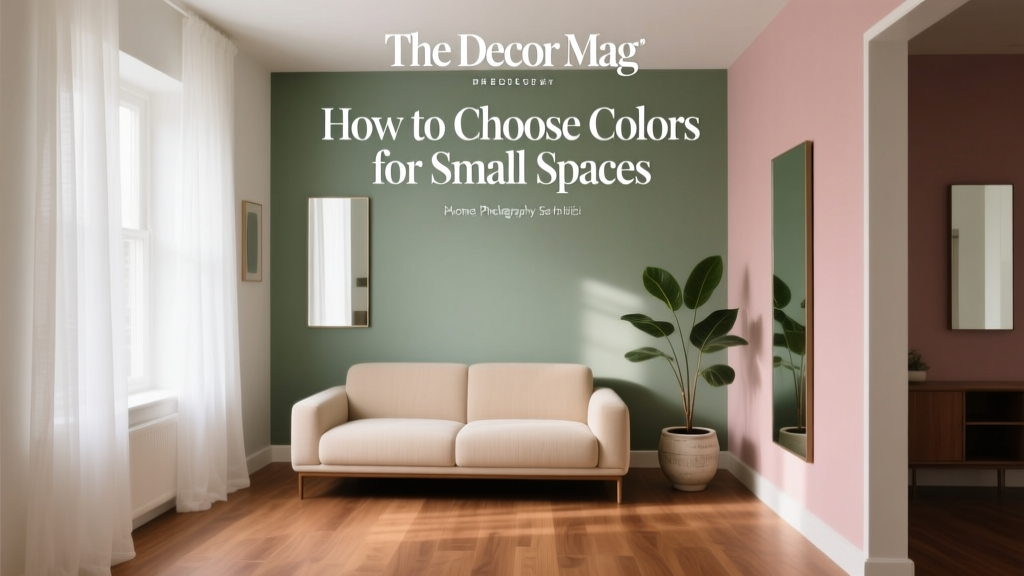
How to Choose Colors for Small Spaces - The Decor Mag
Small rooms have a reputation for being “hard to decorate,” but color is one of the fastest ways to make them feel intentional, airy, and memorable. The right paint color can expand visual boundaries, lift low ceilings, brighten shadowy corners, and even make compact layouts feel calmer and more functional. The wrong color—especially when paired with the wrong finish or lighting—can flatten the space, highlight awkward proportions, and make a room feel tighter than it is.
Color choice in small spaces matters because our eyes read contrast, reflection, and continuity as “space.” A few smart interior color design decisions—like matching trim, choosing an undertone that suits your light, or using a cohesive color scheme—can change how a room feels without moving a single wall. This guide breaks down how to choose paint colors and color schemes for small rooms with real examples, specific paint recommendations, and practical, homeowner-friendly tips.
Whether you’re refreshing a small bedroom, a narrow hallway, a tiny powder room, or an open-plan nook that needs definition, you’ll find a strategy that fits your style—and your square footage.
Start with Light: The Biggest Factor in Small-Space Color
Before you pick a color chip, study the light. Light determines whether a paint color reads crisp or muddy, warm or washed out, bright or dingy. In small spaces, even subtle shifts matter.
Identify Your Light Source (and Its Personality)
- North-facing light: Cool, consistent, can make colors look grayer. Warm neutrals and creamy whites often feel best.
- South-facing light: Bright, warm, can handle cooler paints without feeling cold. Great for soft grays and clean whites.
- East-facing light: Warm morning, cooler afternoon. Balanced colors with stable undertones perform well.
- West-facing light: Cooler morning, golden evening. Watch for overly warm paints that can turn too yellow at sunset.
Match Undertones to Avoid “Off” Color
Most paint colors have undertones (pink, green, violet, blue, yellow). In a small room, undertones become more noticeable because walls are closer together and color bounces more intensely.
- If your flooring reads orange or red (many woods), avoid overly pink beiges; consider balanced greiges.
- If you have cool gray tile, lean into crisp whites, soft blue-grays, or cool greiges rather than creamy yellows.
- If the room is dim, avoid complex muddy undertones; choose clearer, simpler hues.
Design Principles That Make Small Spaces Feel Larger
1) Use Value (Lightness/Darkness) to Control Perception
Light colors reflect more light and can make walls feel farther away. Dark colors absorb light, which can make edges recede—sometimes making a small room feel larger in a cozy, enveloping way.
- Want airy and open: Choose light to mid-light paint colors (high LRV). Examples: Benjamin Moore Chantilly Lace OC-65, Sherwin-Williams Alabaster SW 7008.
- Want intimate and elevated: Try a deep, rich hue and embrace the cocoon effect. Examples: Farrow & Ball Hague Blue, Benjamin Moore Hale Navy HC-154.
2) Reduce Visual Breaks for a Seamless Look
Small rooms benefit from fewer high-contrast transitions. When your eye isn’t stopping at stark trim lines or abrupt color changes, the space reads calmer and often larger.
- Paint trim the same color as walls for a “wrapped” look.
- Use a closely related trim color (same undertone) instead of bright white.
- Carry one color through adjacent small areas (hallway into powder room) to create continuity.
3) Use Contrast Strategically (Not Everywhere)
Contrast is powerful, but in tight spaces it should be intentional. Use contrast to guide attention where you want it.
- Highlight one architectural feature (a niche, bookcase, door) instead of contrasting every edge.
- Choose tone-on-tone pairings (same hue, different depth) to add dimension without choppiness.
Best Paint Color Families for Small Spaces (With Specific Recommendations)
Soft Whites That Don’t Feel Sterile
White paint colors are popular in small rooms for good reason: they amplify light and create a clean backdrop. The key is choosing the right temperature so white doesn’t look icy or yellow.
- Benjamin Moore: Simply White OC-117 (warm, versatile), Chantilly Lace OC-65 (clean and crisp)
- Sherwin-Williams: Alabaster SW 7008 (soft warm white), Pure White SW 7005 (balanced, great for trim + walls)
- Farrow & Ball: School House White (gentle, classic)
Application tip: In a small room with low light, choose a slightly warmer white to avoid a gray cast. Pair with satin or eggshell walls for soft reflectivity (flat can look dull in dim spaces).
Greige and Light Neutrals for Warmth Without Clutter
Greige is a small-space hero because it reads calm, hides scuffs better than white, and bridges warm and cool elements (wood, tile, metals).
- Benjamin Moore: Edgecomb Gray HC-173 (warm greige), Pale Oak OC-20 (light, elegant)
- Sherwin-Williams: Agreeable Gray SW 7029 (true neutral), Repose Gray SW 7015 (cooler, modern)
Great pairings: Greige walls + crisp white trim + black accents (hardware, frames) creates a tailored look without shrinking the room.
Light Blues and Blue-Grays for Calm, Expansive Energy
Color psychology research consistently links blues to calm and lowered visual “noise,” which is ideal in tight quarters like bedrooms, offices, and bathrooms.
- Benjamin Moore: Smoke 2122-40 (soft blue-gray), Boothbay Gray HC-165 (classic coastal)
- Sherwin-Williams: Misty SW 6232 (airy blue-gray), Sea Salt SW 6204 (blue-green, spa-like)
Application tip: In small bathrooms, blue-gray looks best when paired with clean white tile and a mirror that bounces light. Choose chrome or polished nickel for a crisp finish.
Soft Greens for Freshness and Balance
Green is associated with restoration and balance—an excellent choice for small kitchens, entryways, and reading nooks. The trick is choosing a green that won’t feel murky in limited light.
- Farrow & Ball: Mizzle (misty green-gray), Pigeon (green-blue neutral)
- Benjamin Moore: Saybrook Sage HC-114 (warm, classic), October Mist 1495 (soft, modern)
- Sherwin-Williams: Clary Sage SW 6178 (earthy), Evergreen Fog SW 9130 (balanced green-gray)
Deep, Moody Colors That Actually Work in Small Rooms
Dark paint colors can be stunning in small spaces when you lean into them instead of fighting them. This works especially well in powder rooms, dens, and tiny bedrooms where you want drama and depth.
- Benjamin Moore: Hale Navy HC-154, Kendall Charcoal HC-166
- Sherwin-Williams: Iron Ore SW 7069, Tricorn Black SW 6258
- Farrow & Ball: Hague Blue, Railings
Pro move: Paint walls, trim, and even the door in the same deep color (one finish level difference) to blur edges and create a luxe, immersive look.
Real Room Examples: Color Strategies That Solve Common Small-Space Problems
Example 1: A Narrow Hallway That Feels Like a Tunnel
Goal: Make it feel wider and brighter.
- Walls: Benjamin Moore Pale Oak OC-20
- Trim/Ceiling: Benjamin Moore Simply White OC-117
- Finish: Eggshell walls, semi-gloss trim (subtle shine helps reflect light)
Why it works: A light greige adds warmth without closing in, and the clean white trim sharpens edges without harsh contrast.
Example 2: A Small Bedroom That Needs to Feel Restful (Not Bland)
Goal: Calm and cozy without shrinking the room.
- Walls: Sherwin-Williams Misty SW 6232
- Ceiling: Sherwin-Williams Pure White SW 7005
- Accent palette: Soft oatmeal linens, warm oak nightstand, matte black reading sconces
Why it works: Blue-grays reduce visual noise and feel expansive. Warm accents keep it from feeling cold.
Example 3: A Tiny Bathroom That Feels Builder-Plain
Goal: Add personality with a designer look.
- Walls + Trim: Farrow & Ball Hague Blue
- Ceiling: Same color in a flatter finish
- Styling: Brass mirror, crisp white towels, framed art with white matting
Why it works: Deep color creates depth and sophistication, and matching trim removes visual choppiness.
Example 4: A Small Kitchen That Feels Dark
Goal: Brighten without starkness.
- Walls: Sherwin-Williams Alabaster SW 7008
- Cabinets (optional): Sherwin-Williams Pure White SW 7005 or a soft green like Evergreen Fog SW 9130 on lowers
- Backsplash: White subway tile with warm grout
Why it works: A warm white reflects light and complements wood tones and warm metals, preventing the “clinical” look.
How to Build Color Schemes That Feel Cohesive in Small Homes
Use the 60-30-10 Rule (Scaled for Small Rooms)
In compact spaces, this classic decorating rule keeps color balanced.
- 60%: Walls (main paint color)
- 30%: Upholstery/rugs/curtains (supporting color)
- 10%: Accents (art, pillows, hardware) for contrast
Go Tone-on-Tone for Instant “Bigger” Energy
Tone-on-tone means layering variations of the same hue. It reads sophisticated and reduces visual clutter—perfect for small-space decorating.
- Soft white walls + warm white trim + ivory textiles
- Blue-gray walls + deeper navy accents + pale blue art
- Sage walls + olive textiles + creamy ceramic decor
Repeat a Color Across Rooms to Create Flow
If your home has many small rooms, repeating a consistent neutral (or consistent trim color) makes the overall footprint feel larger.
- Choose one “house white” (for trim and/or ceilings).
- Choose 2–3 coordinating wall colors with shared undertones.
- Use one consistent accent metal (black, brass, or chrome) to unify.
Paint Finishes and Placement: Small Details, Big Impact
Best Finishes for Small Spaces
- Walls: Eggshell is the sweet spot for most rooms. Satin works well in busy hallways and kids’ rooms.
- Trim/doors: Semi-gloss adds durability and light bounce.
- Ceilings: Flat minimizes glare (unless you want a lacquered statement ceiling).
Where to Put Color for Maximum Effect
- Ceiling color: Painting the ceiling a softer version of the wall color can lift the room visually and feel enveloping.
- Accent wall alternative: Paint an alcove, built-in, or interior door instead of one full contrasting wall (less chopping).
- Vertical emphasis: Subtle vertical stripes (tone-on-tone) can make ceilings feel higher.
Common Color Mistakes to Avoid in Small Rooms
- Choosing paint under store lighting: Always sample at home. Paint large swatches (at least 12” x 12”) on multiple walls.
- Ignoring undertones: A “neutral” can turn pink, green, or purple depending on lighting and nearby finishes.
- Too much contrast everywhere: White trim + dark walls + bold ceiling + patterned wallpaper can feel busy fast.
- Using flat paint in high-touch small areas: Flat scuffs easily and can look chalky in dim hallways.
- Forgetting reflection: Mirrors, glossy tile, and shiny floors amplify color. Deep hues may look even deeper.
- Overcommitting to trendy color: If you love a bold color, use it on a vanity, door, or lower cabinets first.
FAQ: Choosing Paint Colors for Small Spaces
What paint colors make a small room look bigger?
Light neutrals and soft whites typically make a room feel larger because they reflect more light. Try Benjamin Moore Simply White OC-117, Sherwin-Williams Alabaster SW 7008, or a light greige like Benjamin Moore Pale Oak OC-20 for warmth.
Should I paint trim and walls the same color in a small room?
It can be a great strategy. Painting trim the same color as the walls reduces visual breaks and helps the room feel more seamless. Use a slightly different sheen (eggshell on walls, satin or semi-gloss on trim) to keep details crisp.
Are dark colors a bad idea for small spaces?
No—dark paint colors can look incredible in small rooms, especially powder rooms and cozy bedrooms. Deep hues like Benjamin Moore Hale Navy HC-154 or Sherwin-Williams Iron Ore SW 7069 can add depth and make edges recede when used confidently.
How do I choose a color scheme for a small home with many rooms?
Pick one consistent trim color (your “house white”), then choose 2–3 wall colors with related undertones. Repeating a primary neutral across hallways and adjacent rooms creates flow and makes the overall footprint feel larger.
What’s the best way to test paint colors in a small room?
Paint large samples on multiple walls, then view them morning, afternoon, and evening with lights on and off. In small spaces, color bounce from floors and nearby rooms can change the appearance dramatically.
Should ceilings be white in small rooms?
White ceilings are a safe choice, but not the only choice. A ceiling painted the same color as the walls (or one shade lighter) can make the room feel cohesive and softly expansive—especially in a small bedroom or office.
Next Steps: Choose with Confidence, Then Commit
Pick your direction first—airy and bright, calm and soft, or moody and dramatic—then let lighting and undertones guide the exact paint color. Narrow your choices to three, sample them properly, and decide based on how the color behaves throughout the day. Small spaces reward intentionality: fewer transitions, cohesive color schemes, and finishes that bounce light in all the right places.
If you’re ready for your next color move, explore more paint color roundups, color psychology tips, and interior color design guides on thedecormag.com.
More Articles
 Best Green Paint Colors for Nature Lovers - The Decor Mag
 How to Choose Colors for a Media Room - The Decor Mag
 Best Eucalyptus Paint Colors - The Decor Mag
 Whole-House Color Scheme: How to Choose (2026)
 How to Choose Colors for a Breakfast Nook - The Decor Mag
 How to Choose Colors for an Attic Room - The Decor Mag
 How to Create a Traditional Color Palette - The Decor Mag
 Best Pink Paint Colors That Aren't Juvenile - The Decor Mag
 How to Choose Colors for a Conservatory - The Decor Mag
 Best Sapphire Blue Paint Colors - The Decor Mag