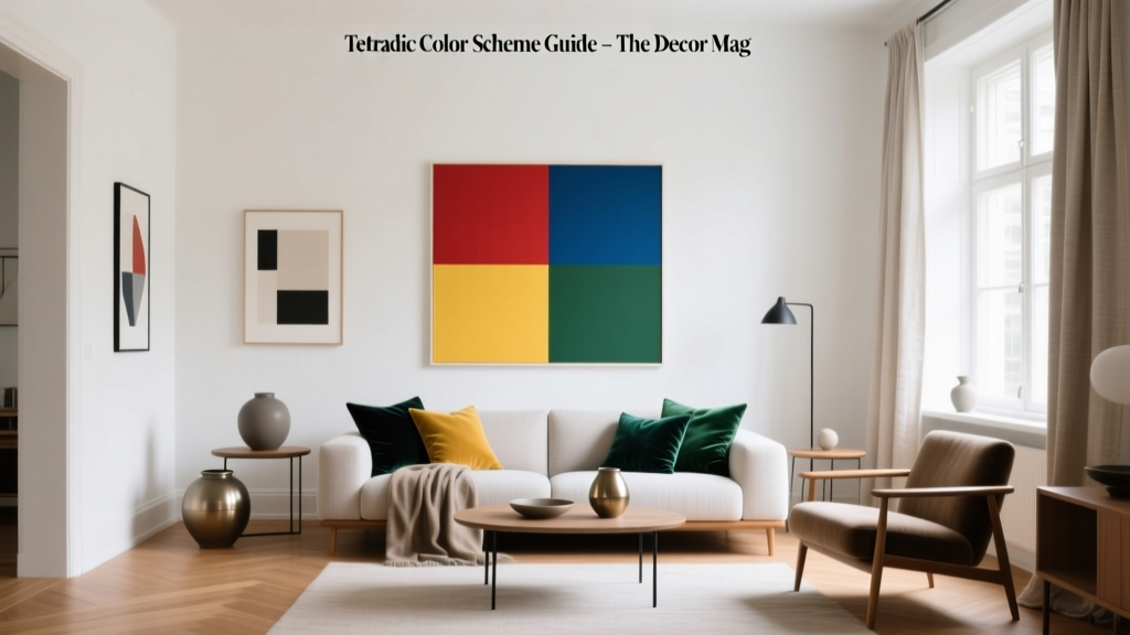
Tetradic Color Scheme Guide - The Decor Mag
A truly memorable home doesn’t rely on one “perfect” paint color—it relies on relationships between colors. When a room feels vibrant yet grounded, playful yet polished, there’s usually a smart color scheme doing the heavy lifting behind the scenes. That’s where the tetradic color scheme comes in: it’s one of the most dynamic tools in interior color design, and it can transform a space from safe to spectacular.
Tetradic palettes (also called double-complementary color schemes) are often seen in designer homes because they offer both energy and balance. You get the contrast of complementary colors—twice—plus the flexibility to lean warm, cool, muted, or saturated depending on your style. Used well, a tetradic scheme helps you coordinate paint colors, upholstery, rugs, and accents without falling into the “everything matches, nothing sings” trap.
This guide breaks down how a tetradic color scheme works, how to choose paint colors that cooperate, and how to apply the palette room by room—so you can create interiors that feel intentional, layered, and personal.
What Is a Tetradic Color Scheme?
A tetradic color scheme is made of four colors arranged as two complementary pairs on the color wheel. Think of it as “double complementary”: you pick one color, then its opposite (complement), then another color, and its opposite.
How to Spot It on the Color Wheel
- Choose two colors that sit a few steps apart (for example, blue-green and blue-violet).
- Find each color’s complement directly across the wheel (red-orange and yellow-orange in this example).
- You now have four hues that form a rectangle on the color wheel—this is a tetrad.
Why Designers Love Tetrads
- High impact, high flexibility: You can create a bold, colorful room or a soft, sophisticated one using the same structure.
- Built-in harmony: Complements bring contrast; pairing two complement sets prevents a room from feeling one-note.
- Easy to layer: Great for mixing paint colors with textiles, art, and decor.
Tetradic vs. Complementary vs. Triadic: What’s the Difference?
- Complementary color scheme: 2 colors opposite each other (e.g., blue and orange). Strong contrast, can feel intense if both are equally saturated.
- Triadic color scheme: 3 colors evenly spaced (e.g., red, yellow, blue). Energetic and balanced, often more “playful.”
- Tetradic color scheme: 4 colors in two complementary pairs. Rich, layered, and ideal for whole-room and whole-home palettes.
Color Psychology: The Emotional Power of a Tetradic Palette
Because tetradic schemes span warm and cool sides of the wheel, they naturally create emotional range—comfortable and lively at once. A good tetrad can make a room feel:
- Balanced: Cool hues (blues/greens) calm the space while warm hues (reds/oranges/yellows) energize it.
- Sociable: Warm complements encourage conversation—great for dining rooms and living rooms.
- Creative: The variety of hues stimulates visual interest (perfect for studios, playrooms, and offices).
Design principle to keep in mind: hue variety needs value control. When four hues are in play, your lightness/darkness (value) and saturation choices are what keep the room elegant rather than chaotic.
How to Build a Tetradic Color Scheme for Your Home
Step 1: Pick a Dominant Color (Your Anchor)
Start with the color you want to see the most—often a wall paint color, a large rug, or a sectional sofa. Your anchor color typically occupies the largest surface area.
Paint ideas for anchor colors:
- Benjamin Moore Hale Navy (HC-154): A classic deep navy that anchors a tetrad beautifully.
- Sherwin-Williams Evergreen Fog (SW 9130): A muted green-gray that reads calm and current.
- Farrow & Ball De Nimes (No. 299): A denim-like blue with depth and softness.
Step 2: Choose the Complement (For Contrast)
The complement adds spark. In interiors, this often shows up in smaller doses: art, pillows, an accent chair, or a painted vanity.
- Navy’s complement leans orange (terracotta, rust, cognac leather).
- Green’s complement is red (but you can use brick, berry, or muted clay for sophistication).
- Blue’s complement is orange (think amber glass, caramel wood tones, or apricot textiles).
Step 3: Add the Second Pair (To Create Depth)
Now choose a second color near your anchor, then add its complement. This second pair is what makes tetradic schemes feel layered rather than binary.
Pro tip: For a home-friendly palette, keep one pair muted (earthy, dusty, or grayed) and let one color be the “pop.”
Step 4: Control the Ratios (The 60-30-10 Rule, Expanded)
With four colors, use a ratio strategy so the room doesn’t look split into quarters.
- 60% dominant: walls, large rug, big furniture
- 25–30% secondary: drapery, upholstery, key furniture pieces
- 10% accent: pillows, art, lampshades, decor
- 5% “spark” color: the smallest, brightest note (often in accessories)
Step 5: Use Neutrals as Breathing Room
Neutrals aren’t “extra” in tetradic interior color design—they’re the secret to making it livable.
- Warm whites: Benjamin Moore White Dove (OC-17), Sherwin-Williams Alabaster (SW 7008)
- Soft greiges: Sherwin-Williams Accessible Beige (SW 7036), Benjamin Moore Edgecomb Gray (HC-173)
- Deep neutrals: Benjamin Moore Chelsea Gray (HC-168), Sherwin-Williams Iron Ore (SW 7069)
5 Designer-Approved Tetradic Color Combinations (With Paint Color Names)
1) Navy + Rust + Sage + Soft Peach (Classic, Warm-Modern)
- Anchor: Benjamin Moore Hale Navy (HC-154)
- Secondary: Sherwin-Williams Evergreen Fog (SW 9130)
- Warm complement: Sherwin-Williams Cavern Clay (SW 7701)
- Light complement/accent: Benjamin Moore First Light (2102-70) or a similar blush-peach
Best for: living rooms, studies, dining rooms with wood furniture.
2) Teal + Coral + Mustard + Eggplant (Bold, Artistic, Layered)
- Anchor: Sherwin-Williams Riverway (SW 6222) or Benjamin Moore Aegean Teal (2136-40)
- Secondary: Benjamin Moore Brassica (CC-952) (eggplant-leaning purple)
- Warm complement: Benjamin Moore Hawthorne Yellow (HC-4) (mustard-leaning)
- Accent: Sherwin-Williams Coral Reef (SW 6606)
Best for: creative spaces, eclectic living rooms, jewel-box powder rooms.
3) Forest Green + Brick Red + Indigo + Golden Tan (Timeless, Heritage-Inspired)
- Anchor: Benjamin Moore Essex Green (HC-188)
- Secondary: Farrow & Ball Inchyra Blue (No. 289) (deep blue-green that can read indigo in lower light)
- Warm complement: Benjamin Moore Dinner Party (AF-300) (brick-leaning red)
- Accent: Sherwin-Williams Honeycomb (SW 6375) (golden tan)
Best for: libraries, dining rooms, entryways with traditional millwork.
4) Sky Blue + Terracotta + Soft Violet + Olive (Relaxed, Mediterranean-Modern)
- Anchor: Benjamin Moore Woodlawn Blue (HC-147)
- Secondary: Sherwin-Williams Clary Sage (SW 6178) (sage/olive family)
- Warm complement: Sherwin-Williams Redend Point (SW 9081) (rosy terracotta)
- Accent: Benjamin Moore Approaching Storm (2106-40) (violet-gray)
Best for: bedrooms, sunrooms, open-plan living areas that get plenty of daylight.
5) Charcoal + Soft Aqua + Warm Apricot + Plum (Moody, Contemporary)
- Anchor neutral: Sherwin-Williams Iron Ore (SW 7069)
- Secondary: Benjamin Moore Palladian Blue (HC-144) (aqua-leaning)
- Warm complement: Benjamin Moore Soft Apricot (2166-70) (use as an accent, not a full-room wall color)
- Accent: Sherwin-Williams Mature Grape (SW 6286) (deep plum)
Best for: modern living rooms, primary suites, media rooms with controlled lighting.
Real Room Examples: How to Apply a Tetradic Scheme
Living Room: Layer Color Through Textiles and Art
Scenario: You want colorful interior design, but you’re not ready for four painted walls in different colors.
- Walls: warm white (BM White Dove OC-17)
- Sofa: deep blue (anchor)
- Rug: includes rust + sage tones (ties the tetrad together)
- Accent chair: muted olive or sage
- Pillows/throws: small hits of peach or coral
- Artwork: look for pieces that contain all four hues in varied values
Tip: Repeat each color at least twice around the room (for example, rust in a pillow and a vase) to make it feel intentional.
Kitchen: Keep Cabinets Calm, Let Accessories Carry the “Fourth Color”
Scenario: You’re choosing paint colors for a kitchen refresh and want a modern but welcoming palette.
- Cabinets: Sherwin-Williams Evergreen Fog (SW 9130) or a similar muted green-gray
- Walls: Sherwin-Williams Alabaster (SW 7008)
- Hardware/lighting: warm brass (acts like a yellow-gold “color” in the scheme)
- Runner + stools: small touches of clay/rust (SW Cavern Clay SW 7701 in textiles)
- “Fourth color”: a few indigo or deep navy ceramics on open shelving
Tip: In kitchens, aim for matte or satin finishes on paint to soften contrast and avoid a visually busy look.
Bedroom: Make It Restful by Muting Two Colors
Scenario: You love color, but you also want better sleep.
- Walls (anchor): Benjamin Moore Woodlawn Blue (HC-147)
- Bedding: creamy neutral base with olive accents
- Nightstands: warm wood (supports terracotta tones)
- Accent color (smallest dose): a dusty violet in art or a throw
Tip: Choose low-chroma versions of warm complements (think clay instead of bright orange) to keep the mood serene.
Bathroom or Powder Room: Go High-Drama With Confident Contrast
Scenario: A small room is the perfect place to try a bolder tetradic paint color scheme.
- Walls: Benjamin Moore Hale Navy (HC-154) in a matte or velvet finish
- Vanity: muted green (SW Clary Sage SW 6178)
- Mirror + sconces: warm brass (supports the orange/yellow side)
- Artwork/towels: a controlled pop of coral or peach
Tip: Let one surface be the star (walls or vanity), then use the other hues as repeatable accents.
Practical Tips for Making Tetradic Color Schemes Look Expensive
- Vary the values: Pair a deep anchor (navy, forest) with lighter tints (blush, sky) for depth.
- Reduce saturation: Dusty, grayed, or earthy versions of the four hues feel more refined than pure brights.
- Unify with undertones: Keep everything either warm-leaning or cool-leaning overall. Mixed undertones are where palettes fall apart.
- Repeat materials: Echo warm tones through wood, leather, and brass; echo cool tones through stone, glass, and linen.
- Test paint in your lighting: Sample boards near windows and in shadow corners. A tetrad can shift dramatically from day to night.
Common Color Mistakes to Avoid
- Using all four colors at equal strength: Four saturated hues fighting for attention creates visual noise. Choose one hero, one support, two accents.
- Skipping neutrals: Without a neutral “rest,” the room feels busy—even if the colors are technically correct on the color wheel.
- Forgetting about fixed finishes: Floors, countertops, and tile have undertones. A warm oak floor will push colors warmer; cool gray tile can make warm complements feel abrupt.
- Choosing a “random” fourth color: If it’s not part of the rectangle on the color wheel (or not a softened tint/shade of one), it can read like clutter.
- Not repeating colors: A single coral pillow with no other coral in the room looks accidental. Repeat each accent at least twice.
FAQ: Tetradic Color Schemes in Interior Design
Is a tetradic color scheme too busy for a home?
Not when you control saturation and ratios. Use one dominant paint color, one secondary, and keep the remaining two as accents. Adding warm whites or greiges helps the palette feel calm and livable.
Do I have to paint four different colors to use a tetradic scheme?
No. Many of the best tetradic interiors use one wall color and bring the other hues in through rugs, curtains, art, and decor. This approach is especially homeowner-friendly for open-plan spaces.
What’s the easiest tetradic scheme for beginners?
Start with a muted anchor like Sherwin-Williams Evergreen Fog (SW 9130) and pair it with warm clay accents like Sherwin-Williams Cavern Clay (SW 7701), then add a soft blue and a gentle blush in textiles. Muted colors are more forgiving.
How do I choose a tetradic palette that works with my wood floors?
Match the palette’s warmth to your floor undertone. Honey oak and walnut like warmer complements (rust, ochre, terracotta). Gray-washed or cool-toned floors pair more easily with cooler tetrads (teal, plum, icy blue) plus softened warm accents.
Can tetradic color schemes work in open-concept homes?
Yes—use the same tetrad across connected rooms but shift the emphasis. For example, make navy dominant in the living area, sage dominant in the kitchen, and keep rust/peach as recurring accents throughout for cohesion.
What paint sheen works best for colorful walls?
For most rooms, eggshell is a reliable choice: washable and softly reflective. Use matte for moody, high-pigment colors (navy, forest green) when wall imperfections are minimal. Reserve satin for kitchens, baths, and trim where durability matters.
Next Steps: Build Your Tetradic Palette With Confidence
Choose one anchor paint color you love, identify its complement, then build the second pair with softer, more muted versions for a designer-level result. Keep your ratios intentional, add neutrals for breathing room, and repeat each hue around the space so it feels cohesive.
If you’re ready to keep going, explore more paint color ideas, color scheme guides, and room-by-room interior color design inspiration on thedecormag.com.
More Articles
 The Science-Backed Best Sleep Textiles: Thread Count, Fiber Physics, and Real-World Performance Data
 Best Cream Paint Colors for Warm Neutrals - The Decor Mag
 Monochromatic Color Scheme Design Guide - The Decor Mag
 How to Choose Colors for a Terrace - The Decor Mag
 How to Create a Minimalist Color Palette - The Decor Mag
 Best Cobalt Blue Paint Colors - The Decor Mag
 How to Choose Colors for a Gym - The Decor Mag
 Best Pistachio Paint Colors - The Decor Mag
 Best Teal Paint Colors for Calm Spaces - The Decor Mag
 Split Complementary Color Palette Ideas - The Decor Mag