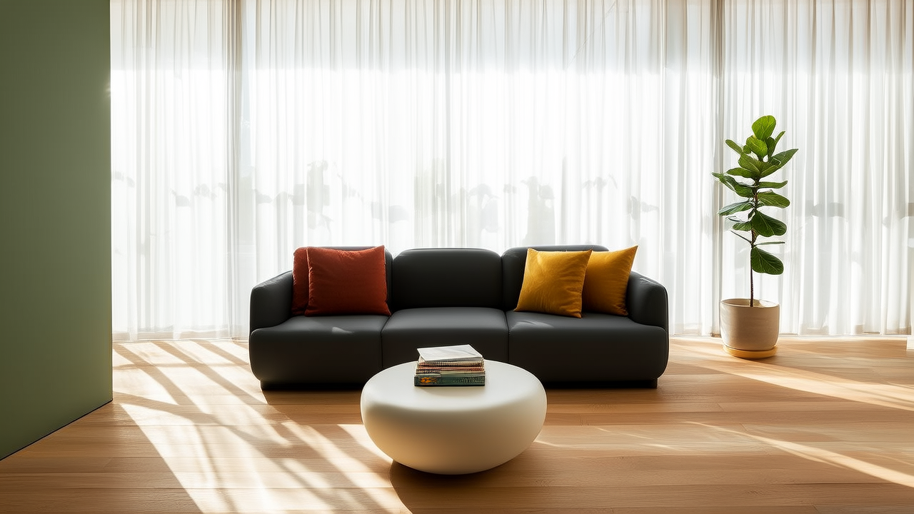
Warm Neutral Color Palettes for Every Room
Defining Warm Neutrals
Warm neutrals are colors with yellow, red, or orange undertones that read as neutral in most lighting conditions. They include cream, beige, taupe, warm gray, mushroom, and terracotta. Unlike cool grays and stark whites, warm neutrals create inviting, comfortable environments that flatter skin tones and natural wood.
Living Room Warm Neutral Palette
Start with walls in a soft cream or warm white like Benjamin Moore Swiss Coffee. Layer upholstery in mushroom and taupe tones. Add depth with throw pillows in terracotta, olive, and burnt sienna. Wood furniture in medium-toned walnut or oak bridges the warm palette. Brass or unlacquered metal accents add warmth without introducing a new color.
Bedroom Warm Neutrals
Bedrooms benefit from the most soothing end of the warm neutral spectrum. Walls in a soft putty or barely-there beige create a cocoon effect. Bedding in oatmeal linen with cream and sand-toned throws. Avoid pure white in bedrooms, as it reads as clinical rather than restful. A single accent in dusty rose or muted terracotta provides just enough color interest.
Kitchen Warm Neutrals
Warm white cabinets paired with cream or light taupe walls create a timeless kitchen foundation. Butcher block countertops in warm-toned wood add organic warmth. Open shelving displaying ceramic dishware in varying shades of cream and sand creates a collected, cohesive look. Terracotta tile or warm-toned stone on the backsplash adds character without departing from the neutral palette.
Bathroom Applications
Warm neutrals in bathrooms combat the clinical feeling that all-white bathrooms can produce. Warm gray or taupe walls soften the space. Cream-colored marble or limestone tiles on floors and shower walls bring natural warmth. Brass fixtures and hardware complement the warm undertones. Wooden vanities in teak or oak add organic texture.
Choosing the Right Warm Neutral
The specific warm neutral depends on the room natural light. North-facing rooms with cool light benefit from warmer tones like cream and beige. South-facing rooms with warm light can handle cooler warm neutrals like taupe and warm gray. Always test large samples on the wall and observe them at different times of day before committing.
Accent Colors That Complement Warm Neutrals
Warm neutrals pair beautifully with sage green, dusty blue, terracotta, and muted mustard. These accent colors appear in pillows, artwork, and small furniture pieces rather than on large surfaces. The neutral foundation allows accent colors to be changed seasonally without repainting or reupholstering.
More Articles
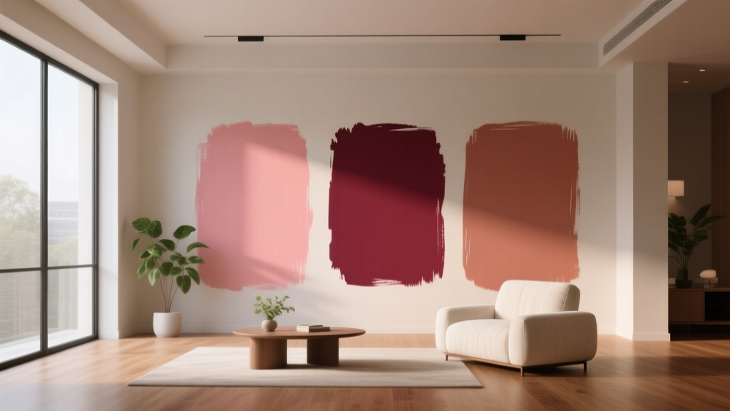 Best Rose Red Paint Colors - The Decor Mag
 How to Choose Colors for a Garage Conversion - The Decor Mag
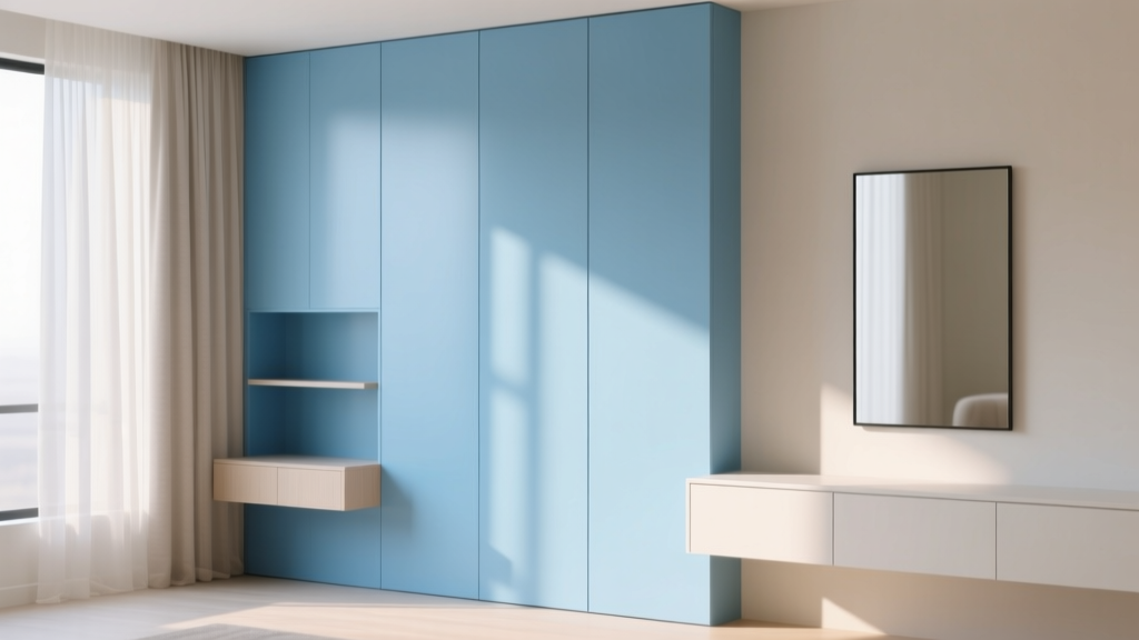 Best Sky Blue Paint Colors - The Decor Mag
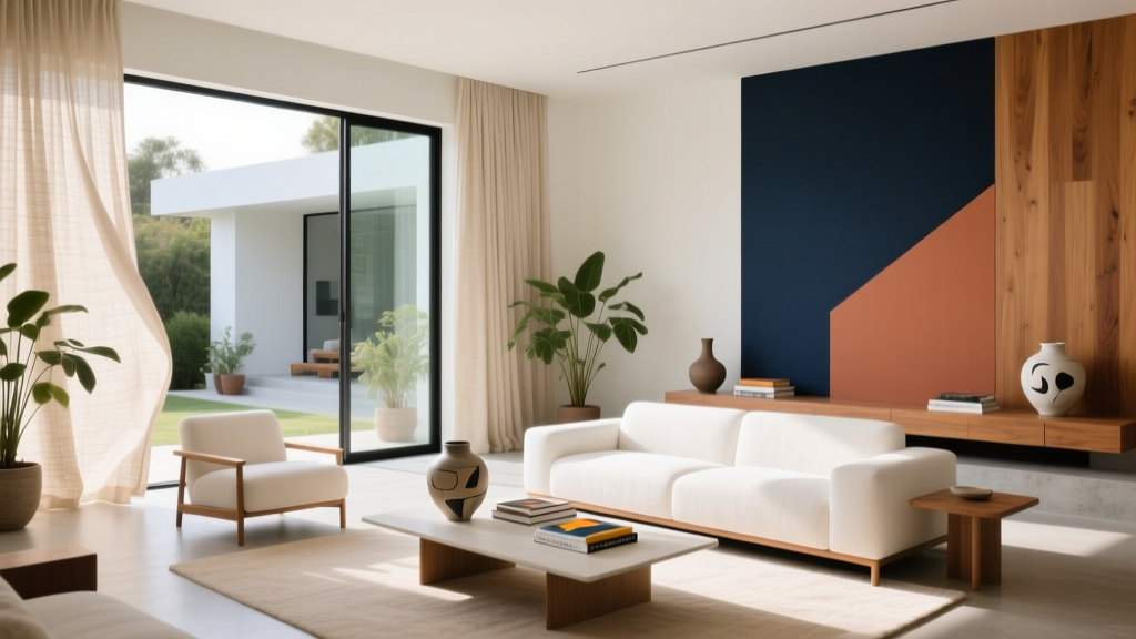 Warm Neutral Paint Colors for Every Room
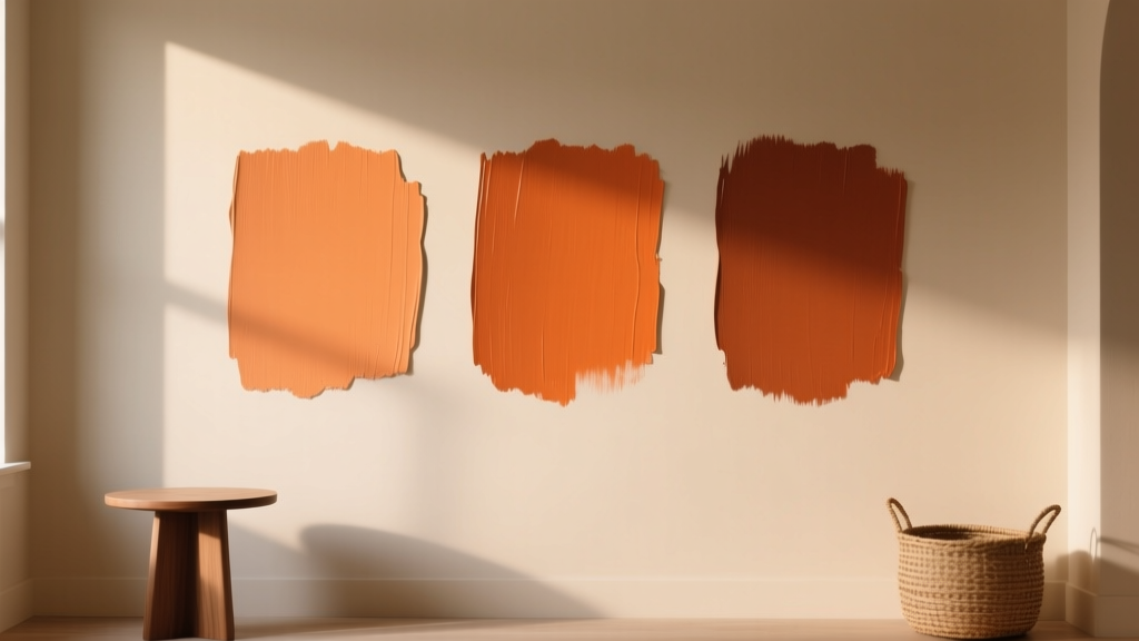 Best Burnt Orange Paint Colors - The Decor Mag
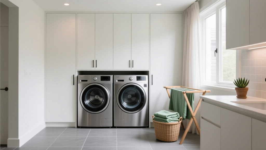 How to Choose Colors for a Laundry Room - The Decor Mag
 2026 Reading FAQ: Evidence-Based Eye Health Answers
 Palette Reading Accuracy 2026: Science & Standards
 Outdoor Essentials Placement for Safety, Function, Longevity
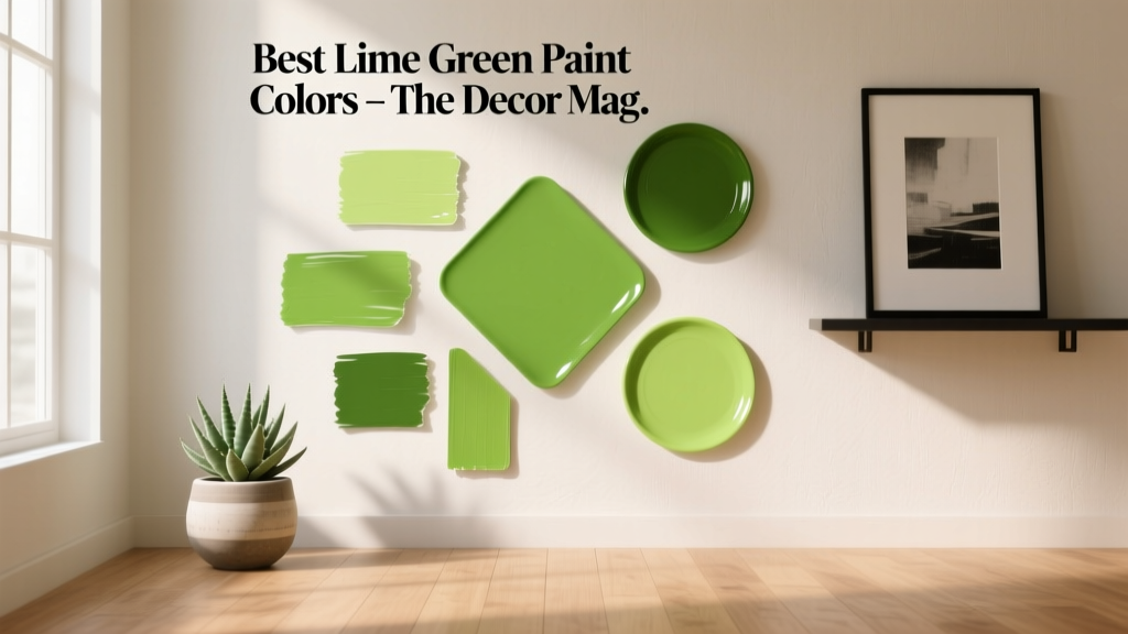 Best Lime Green Paint Colors - The Decor Mag