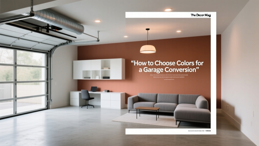
How to Choose Colors for a Garage Conversion - The Decor Mag
Converting a garage into livable space is one of the most satisfying home upgrades—you’re essentially turning “storage” into a room with purpose. But garages come with built-in challenges: limited natural light, odd ceiling heights, concrete floors, and a lingering “utility” feel. Color is the fastest way to shift that impression from makeshift to intentional, creating a space that looks and feels like it has always belonged to the house.
The right paint colors and color schemes do more than make your new room look attractive. They can visually correct proportions, brighten dark corners, reduce glare, and support how you want to use the space—whether that’s a cozy guest suite, a home office, a gym, or a playroom. This guide breaks down color psychology, design principles, and practical application strategies so you can pick colors with confidence (and avoid expensive repainting).
If you’re choosing interior paint colors for a garage conversion, think of this as both a creative project and a problem-solving one. You’re balancing light, function, and flow with the rest of your home—then using color to make the transformation unmistakable.
Start with the Big Three: Light, Function, and Flow
1) Evaluate natural and artificial light
Most garages have small windows—if any—so paint color selection must account for undertones and light reflectance. In dim spaces, cooler colors can feel flat or gloomy, while overly bright whites can read harsh under LED lighting.
- North-facing or shaded conversions: Prioritize warm whites and greige to add comfort (think creamy, not yellow).
- South-facing conversions: You can use cooler whites and balanced neutrals without the room feeling cold.
- Low natural light + LED cans: Choose bulbs intentionally (2700K–3000K for warm, welcoming light; 3500K for crisper task spaces). Paint will look dramatically different under each.
Tip: Sample paint on at least two walls and observe it morning, afternoon, and evening. Garage conversions often have “patchy” light, so a color that looks perfect in one corner may look muddy in another.
2) Match color to the room’s purpose
Color psychology matters most when the room is used daily. Pick a palette that reinforces the mood you want:
- Home office: Focused, calm colors like soft blue-grays, balanced greens, or warm neutrals.
- Guest room or ADU: Warm whites, soft greige, muted earthy tones for comfort and broad appeal.
- Gym: Energetic accents (deep teal, charcoal, terracotta) with a light neutral base.
- Playroom: Cheerful but controlled—use color in zones rather than every wall.
- Media room: Deeper, light-absorbing shades reduce screen glare and add coziness.
3) Create flow with adjacent spaces
If your garage conversion connects to a hallway, mudroom, kitchen, or laundry area, your interior color design should feel related. That doesn’t mean everything must match, but undertones should agree.
- Keep the same white trim color throughout (or at least on the same floor) for continuity.
- Use one “bridge neutral” that appears in multiple rooms (wall color, rug, cabinetry, or textiles).
- Repeat one accent color in a subtle way (pillows, art, or an interior door) to connect spaces.
Garage Conversion Color Challenges (and How to Solve Them)
Concrete floors and cool surfaces
Concrete and epoxy floors often skew cool and can make a room feel industrial. Counteract that with warm-toned paint colors, warm wood, and textured textiles.
Paint pairings that soften concrete:
- Sherwin-Williams Alabaster (SW 7008) on walls + SW Pure White (SW 7005) trim
- Benjamin Moore White Dove (OC-17) walls + BM Chantilly Lace (OC-65) trim for crisp contrast
- Farrow & Ball Skimming Stone (No. 241) walls for a warm, plaster-like greige effect
Low ceilings or exposed structure
Some garage conversions keep beams or ducting visible. Color can either hide those features or make them feel intentional.
- To visually raise the ceiling: Paint ceiling and trim the same soft white (minimal contrast).
- To make architectural elements look designed: Paint beams in a slightly deeper tone than the ceiling for subtle definition.
- To create a cozy den: Consider a “color-drenched” look—walls, trim, and ceiling in one mid-tone hue.
Mixed materials and patchwork walls
Garage conversions can include new drywall next to older surfaces. Mid-tone neutrals and matte finishes help unify inconsistencies.
- Use matte or eggshell on walls to minimize texture differences.
- Avoid extremely bright whites if the walls aren’t perfectly smooth.
- Use a slightly deeper neutral (greige or mushroom) to hide minor imperfections.
Choose a Foundation: The Best Neutral Paint Colors for Garage Conversions
Most successful garage conversion color schemes start with a flexible neutral base. Neutrals make the space feel like a real room and give you options for furniture, window treatments, and future updates.
Warm whites (bright without feeling sterile)
- Sherwin-Williams Alabaster (SW 7008): Soft, welcoming, great for low-light conversions.
- Benjamin Moore White Dove (OC-17): Versatile warm white that works with wood, black accents, and stone.
- Behr Swiss Coffee (12): Creamy and cozy; strong candidate for guest suites and family rooms.
Greige and light taupe (the “garage-proof” neutral family)
- Benjamin Moore Edgecomb Gray (HC-173): Warm greige that reads soft and airy.
- Sherwin-Williams Agreeable Gray (SW 7029): Popular for good reason—adaptable in varied lighting.
- Farrow & Ball Ammonite (No. 274): A refined, gentle neutral with a modern sensibility.
Soft grays that still feel inviting
- Benjamin Moore Classic Gray (OC-23): A barely-there gray that brightens without starkness.
- Sherwin-Williams Repose Gray (SW 7015): Cooler than greige; best with adequate light and warm furnishings.
Build a Color Scheme: 6 Ready-to-Use Palettes
Use these paint color combinations as starting points. Each includes a wall color, trim suggestion, and accent direction—ideal for anyone searching for practical interior paint color ideas.
1) Cozy Guest Suite Palette
- Walls: Benjamin Moore Edgecomb Gray (HC-173)
- Trim/Ceiling: Benjamin Moore White Dove (OC-17)
- Accents: Soft black (hardware), linen textiles, warm oak
Scenario: A garage conversion guest room with limited windows. Use Edgecomb Gray to add warmth, then layer in creamy bedding and a woven rug to keep it inviting.
2) Focused Home Office Palette
- Walls: Sherwin-Williams Sea Salt (SW 6204) or SW Comfort Gray (SW 6205)
- Trim: SW Pure White (SW 7005)
- Accents: Walnut desk, black task lamp, brass frames
Scenario: For a productive workspace, these green-blue paint colors support calm concentration. Add a high-contrast pinboard wall or shelving in matte black to ground the palette.
3) Modern Studio / Creative Space Palette
- Walls: Benjamin Moore Classic Gray (OC-23)
- Accent wall or cabinetry: BM Hale Navy (HC-154)
- Trim: BM Chantilly Lace (OC-65)
Scenario: A converted garage art studio or music room. The near-neutral wall keeps the space bright, while Hale Navy adds depth and a gallery-like backdrop for art.
4) Relaxed Family Room Palette (Warm + Durable)
- Walls: Sherwin-Williams Agreeable Gray (SW 7029)
- Trim: SW Alabaster (SW 7008)
- Accents: Terracotta, olive, textured neutrals
Scenario: If the conversion becomes the main hangout room, Agreeable Gray handles wear and style changes. Add performance fabric seating and warm accent colors for a lived-in look.
5) Media Room Palette (Low Glare, High Cozy)
- Walls: Sherwin-Williams Urbane Bronze (SW 7048) or SW Iron Ore (SW 7069)
- Ceiling: Same color in flat finish (for a cocoon effect)
- Trim: Minimal contrast—match walls or use a softened white like SW Alabaster
Scenario: A garage conversion TV room benefits from darker paint colors that reduce screen glare and add theater-like comfort. Use warm lighting (2700K) and plush fabrics to prevent the room from feeling heavy.
6) Gym / Wellness Room Palette (Fresh + Motivating)
- Walls: Behr Blank Canvas (DC-003) or BM White Dove (OC-17)
- Accent: SW Cascades (SW 7623) or BM Kendall Charcoal (HC-166)
- Accents: Natural wood, matte black, greenery
Scenario: Keep walls light to amplify brightness, then add one darker accent behind mirrors or equipment for definition. Deep green supports a restorative, spa-like mindset.
Where to Put Color: Application Strategies That Work
Use the 60-30-10 rule for balanced color schemes
- 60%: Main wall color (usually a neutral)
- 30%: Secondary color (sofa, rug, curtains, or an accent wall)
- 10%: Accent pops (pillows, art, decor, a painted door)
Try an accent wall only when it solves a problem
Accent walls work best when they:
- Anchor a bed, desk, or TV wall
- Visually shorten a long, tunnel-like room
- Create zoning in a multi-use conversion (office + guest space)
Example: Paint the far short wall in BM Hale Navy (HC-154) to visually pull it closer, making a long conversion feel more proportionate.
Don’t forget the fifth wall (ceiling)
- Brightening approach: Ceiling in a clean white like SW Pure White in flat finish
- Soft approach: Ceiling in the same color as walls, but 25–50% lighter (if your paint store can adjust)
- Design-forward approach: Color drenching with a mid-tone like F&B Pigeon (No. 25) for a snug reading room or studio
Real Room Examples: Color Choices by Garage Conversion Type
Example A: The “Bright ADU” conversion
Goal: Make a compact space feel open, clean, and welcoming to renters or guests.
- Walls: Benjamin Moore White Dove (OC-17)
- Trim: BM Chantilly Lace (OC-65)
- Kitchenette cabinets: Sherwin-Williams Evergreen Fog (SW 9130)
- Why it works: Warm white keeps it bright; muted green adds calm and sophistication without feeling trendy.
Example B: The “Dual-Purpose Office + Guest Room” conversion
Goal: Professional video-call background by day, restful guest retreat by night.
- Main walls: Sherwin-Williams Accessible Beige (SW 7036)
- Accent (behind daybed): BM Kendall Charcoal (HC-166)
- Trim: SW Alabaster (SW 7008)
- Why it works: Accessible Beige stays warm under mixed lighting; charcoal adds depth and hides scuffs in high-touch areas.
Example C: The “Teen Hangout / Game Room” conversion
Goal: Fun, durable, and not visually chaotic.
- Walls: BM Classic Gray (OC-23)
- Accent zone: SW Iron Ore (SW 7069) on built-ins or the TV wall
- Pop color: Mustard or cobalt in textiles
- Why it works: Light walls keep it spacious; deep accent hides fingerprints and adds a “designed” vibe.
Common Color Mistakes to Avoid in a Garage Conversion
- Choosing paint from a tiny swatch under store lighting. Always test large samples on multiple walls; garage conversions exaggerate undertones.
- Going too stark with bright white in a low-light room. It can feel gray, clinical, or highlight wall imperfections. Try warmer whites like SW Alabaster or BM White Dove.
- Ignoring undertones in fixed elements. Flooring, brick, stone, or cabinetry may lean pink, yellow, or green. Match your neutral’s undertone to those features.
- Overusing bold color on every surface. Saturated hues are best as accents or in controlled, intentional applications (built-ins, a single wall, or a powder room).
- Forgetting sheen and durability. Use eggshell or satin for washable walls in high-traffic conversions; reserve flat for ceilings.
- Not coordinating trim and door color. A consistent trim white simplifies the look and makes the conversion feel original to the home.
FAQ: Choosing Paint Colors for a Garage Conversion
What are the best paint colors for a garage conversion with little natural light?
Warm whites and light greige typically perform best. Consider Sherwin-Williams Alabaster (SW 7008), Benjamin Moore White Dove (OC-17), or Benjamin Moore Edgecomb Gray (HC-173). Pair with warm lighting (2700K–3000K) to avoid a dull, gray cast.
Should I use the same color as the rest of my home?
You don’t have to match exactly, but you’ll get a more seamless flow if you repeat either the trim color or a related undertone. If your home leans warm, stick with warm whites/greige; if it leans cool, choose balanced neutrals and warm the room through textiles and lighting.
Is an accent wall a good idea in a converted garage?
Yes—when it’s purposeful. Use an accent wall to anchor a bed, desk, or TV, or to correct proportions in a long room. Deep colors like BM Hale Navy or SW Iron Ore work well when balanced with light walls.
What paint finish should I use?
- Walls: Eggshell (most living spaces) or satin (kid zones, gyms, mudroom-style entries)
- Trim/doors: Satin or semi-gloss for durability
- Ceiling: Flat to reduce glare
How do I make a garage conversion feel less “garage-like” with color?
Avoid cold grays and stark whites as your main strategy. Choose a warm neutral base, keep trim consistent, and add one deeper accent for intention. Natural textures—wood tones, woven rugs, linen curtains—enhance the “real room” effect more than color alone.
What are some timeless color schemes that won’t feel dated?
Timeless palettes usually rely on warm whites, greige, muted blues/greens, and charcoal accents. Examples: BM White Dove + BM Hale Navy, SW Agreeable Gray + SW Iron Ore, or SW Alabaster + SW Evergreen Fog.
Next Steps: A Simple Plan to Choose the Right Colors
Use this quick checklist to move from ideas to a confident final choice:
- Identify the room’s purpose (work, rest, play, fitness, guests) and the mood you want.
- Assess light at different times of day and confirm your bulb temperature.
- Pick one foundation neutral (warm white, greige, or soft gray) that complements your flooring and fixed finishes.
- Select 1–2 supporting colors for accents, built-ins, or a single feature wall.
- Test large samples and view them next to your trim, flooring, and primary furniture.
- Commit with consistency—same trim color, cohesive sheen choices, and repeated accents for flow.
Your garage conversion can feel bright, welcoming, and fully integrated into your home with the right paint colors and a thoughtful color scheme. Keep the palette intentional, let the light guide your choices, and use accent color where it adds structure and personality.
Want more paint color ideas and interior color design guidance? Explore more color guides and room-by-room palettes on thedecormag.com.
More Articles
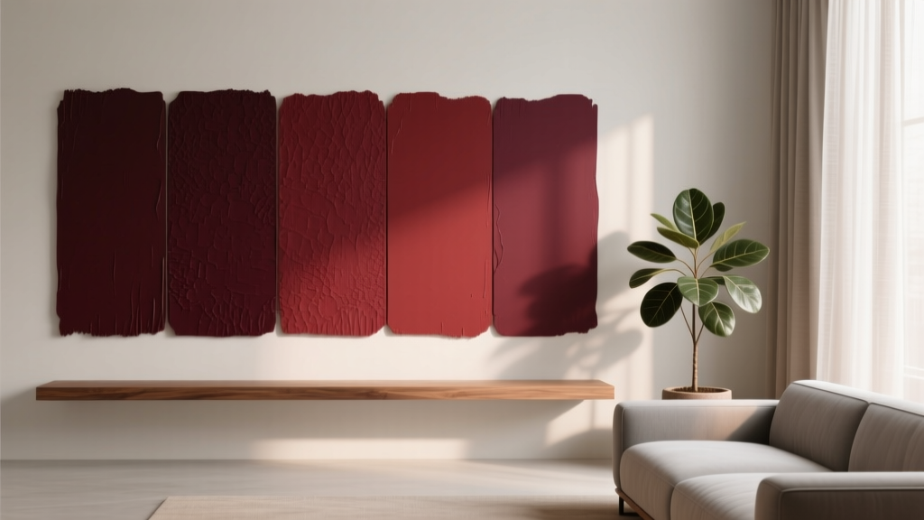 Best Oxblood Paint Colors - The Decor Mag
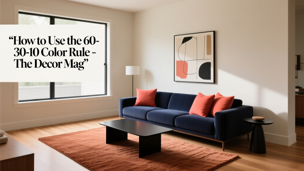 How to Use the 60-30-10 Color Rule - The Decor Mag
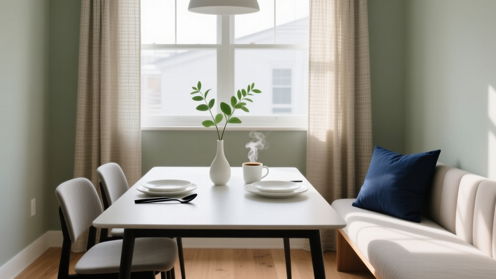 How to Choose Colors for a Breakfast Nook - The Decor Mag
 How to Create a Vibrant Color Palette - The Decor Mag
 How to Use Color to Create Unity - The Decor Mag
 Best Banana Paint Colors - The Decor Mag
 Fluted vs Headboard: Understanding the Structural, Aesthetic, and Functional Differences
 How to Create a Modern Color Palette - The Decor Mag
 How to Create an Uplifting Color Palette - The Decor Mag
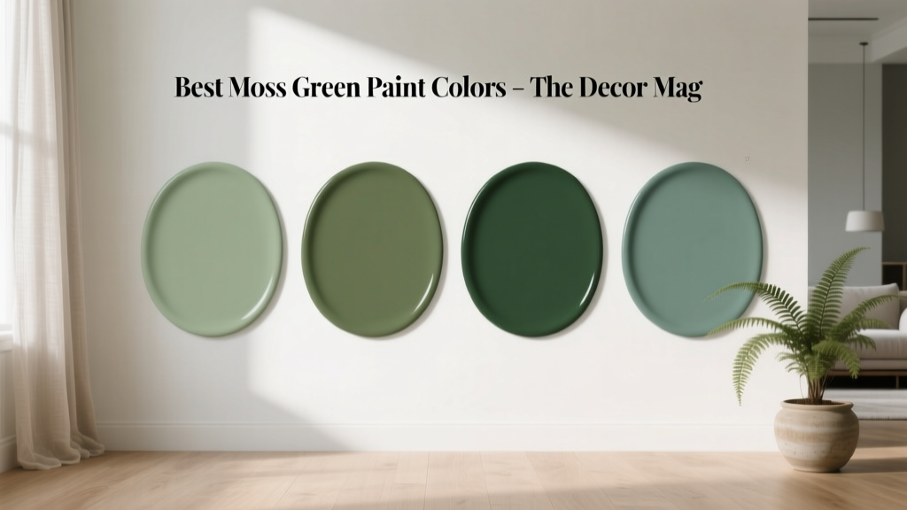 Best Moss Green Paint Colors - The Decor Mag