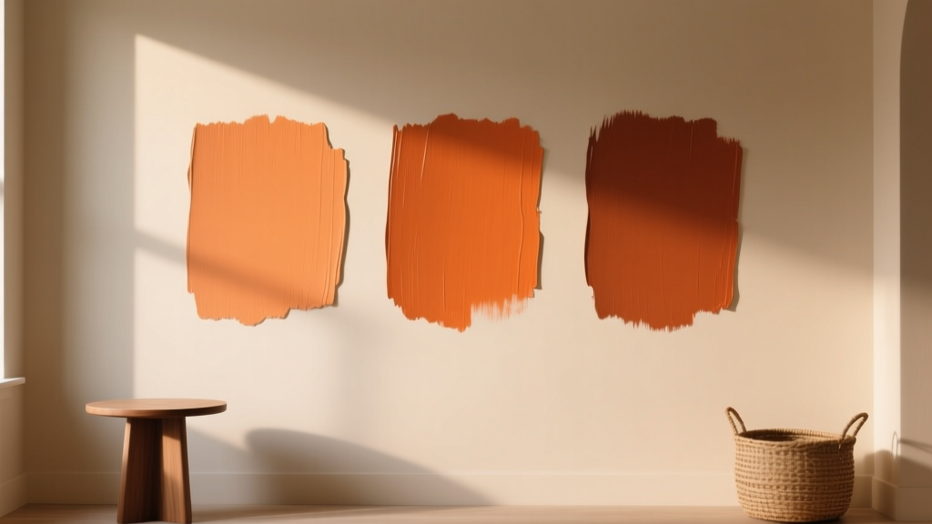
Best Burnt Orange Paint Colors - The Decor Mag
Burnt orange sits in that sweet spot between earthy and energetic. It has the warmth of terracotta, the richness of spice, and a subtle “glow” that makes rooms feel more alive—without the sugary brightness of a true orange. For homeowners and design enthusiasts, burnt orange paint colors offer a way to add personality while staying grounded in nature-inspired interior color design.
This shade also works beautifully with today’s most-loved materials: white oak, walnut, linen, clay, blackened metal, and warm stone. Whether your style leans modern desert, Mediterranean, mid-century, or updated traditional, burnt orange can act as a statement color, a cozy backdrop, or even a sophisticated neutral when balanced with the right undertones.
Below, you’ll find standout burnt orange paint color recommendations, how to use them room by room, the best color schemes to pair with them, and common mistakes to avoid—so you can bring this bold-but-wearable hue into your home with confidence.
Why Burnt Orange Works: Color Psychology and Design Principles
In color psychology, orange is associated with sociability, optimism, appetite, and creativity. Burnt orange tones down the “high energy” of bright orange by adding brown, red, or umber undertones—making it feel more mature and livable. It’s especially effective in spaces where you want warmth and connection.
- Emotional effect: Welcoming, cozy, uplifting, and grounded.
- Design role: A strong accent, a character-rich wall color, or a modern alternative to beige.
- Light behavior: Glows in afternoon light; can deepen dramatically at night (especially in north-facing rooms).
How to Choose the Right Burnt Orange Paint Color
1) Watch the Undertone: Red vs. Brown vs. Copper
“Burnt orange” can tilt in different directions, and undertone is what determines whether the color feels sophisticated or unexpectedly loud.
- Red-leaning burnt orange (cayenne, paprika): bold, cozy, dramatic.
- Brown-leaning burnt orange (clay, cinnamon): earthy, relaxed, easy to live with.
- Copper-leaning burnt orange (metallic warmth without shimmer): sunny, radiant, great with creams and woods.
2) Consider Room Orientation and Lighting
- North-facing rooms: Burnt orange can read deeper and slightly muted. Choose a warmer, clearer option if you want it to feel inviting rather than heavy.
- South-facing rooms: Colors look brighter and warmer. You can handle richer, darker burnt oranges without losing comfort.
- East-facing rooms: Warm in the morning, calmer later. A medium burnt orange works well.
- West-facing rooms: Late-day sun intensifies warmth. Pick a slightly softened, brown-leaning burnt orange to avoid a “too hot” effect at sunset.
3) Decide: Statement Wall or Full Room?
Burnt orange can absolutely cover four walls, but sheen and surrounding finishes matter.
- For full rooms: Choose a medium depth and use a matte/eggshell finish to keep it velvety.
- For accents: Go deeper and richer for impact—especially on a fireplace wall, built-ins, or a powder room.
Best Burnt Orange Paint Colors (Designer-Approved Picks)
These burnt orange paint colors are widely loved because they strike that hard-to-find balance: bold yet wearable. Always sample first—burnt orange shifts dramatically depending on light and adjacent materials.
Sherwin-Williams Burnt Orange Paint Colors
- Sherwin-Williams Cavern Clay (SW 7701): A modern classic—clay-like, earthy, and warm. Works beautifully with creamy whites and natural wood.
- Sherwin-Williams Spiced Cider (SW 5642): A deeper, autumnal burnt orange with cozy brown undertones. Great for dining rooms and libraries.
- Sherwin-Williams Persimmon (SW 6339): A brighter, more saturated take. Best as an accent wall, front door, or playful powder room color.
Benjamin Moore Burnt Orange Paint Colors
- Benjamin Moore Terra Cotta Tile (2090-30): Sunbaked, rustic, and rich—excellent for Mediterranean, boho, and Southwestern interiors.
- Benjamin Moore Autumn Cover (2162-30): A spiced, sophisticated orange-brown that feels tailored and warm, especially in lower light.
- Benjamin Moore Potters Clay (1221): Muted and earthy; a “quiet” burnt orange that can behave like a neutral in the right palette.
Farrow & Ball Burnt Orange Paint Colors
- Farrow & Ball Red Earth (No. 64): A terracotta-red with grounded warmth. Gorgeous with limewashed textures, antique rugs, and creamy trim.
- Farrow & Ball Charlotte’s Locks (No. 268): A bolder, coppery orange with high personality. Best for smaller areas or statement moments.
Behr Burnt Orange Paint Colors
- Behr Spiced Pumpkin (popular seasonal family): A friendly, classic burnt orange that pairs well with warm whites and charcoal accents. (Confirm exact code in-store, as naming can vary by collection.)
- Behr Terracotta Urn (family): Earthy and grounded—ideal for homeowners who want warmth without too much saturation.
Burnt Orange Color Schemes That Look Elevated (Not Overpowering)
Burnt orange shines when it’s given the right supporting cast. Use these combinations to build a cohesive interior color scheme.
1) Burnt Orange + Warm White (Creamy, Not Stark)
Warm whites keep burnt orange feeling soft and architectural rather than harsh.
- Trim and ceiling ideas: creamy off-white, ivory, or a soft linen white
- Material pairings: white oak, rattan, jute, travertine
2) Burnt Orange + Sage Green or Olive
Orange and green are near-complements, which creates satisfying contrast while staying natural.
- Use sage upholstery with burnt orange walls
- Try olive cabinetry with burnt orange accents (tile, textiles, art)
3) Burnt Orange + Deep Navy
Navy adds structure and sophistication, especially for more traditional spaces.
- Navy built-ins against a burnt orange backdrop
- Brass or antique gold hardware to bridge the warmth
4) Burnt Orange + Charcoal + Black Accents
Perfect for modern and industrial interiors—burnt orange adds warmth to darker, sharper elements.
- Matte black lighting and hardware
- Charcoal textiles to calm the palette
5) Tonal Terracotta Palette
Layer burnt orange with clay, rust, and cinnamon tones for a curated, desert-inspired look.
- Mix plaster-like neutrals, camel leather, and woven textures
- Add contrast with a few dark walnut or black details
Real Room Examples: Where Burnt Orange Looks Best
Living Room: A Cozy Statement Wall That Still Feels Timeless
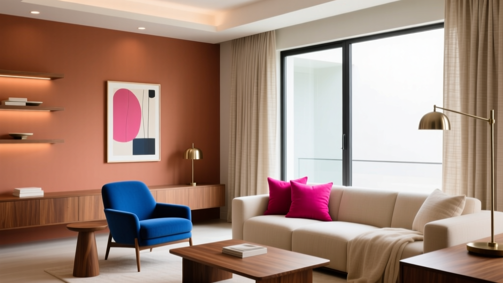
Use a burnt orange like Sherwin-Williams Cavern Clay on a fireplace wall or behind a sofa to create a focal point. Pair it with:
- Creamy trim and ceiling
- Natural linen curtains
- Walnut or oak furniture
- Accents in olive, indigo, or black
Dining Room: Warmth That Flatters People and Food
Dining rooms are a natural home for burnt orange because it enhances candlelight and makes gatherings feel intimate. Try Benjamin Moore Autumn Cover or Sherwin-Williams Spiced Cider for four walls, then add:
- Brass chandelier or aged bronze lighting
- Art with cream and black tones to create “breathing room”
- Deep green botanicals for contrast
Kitchen: Burnt Orange as an Accent (Backsplash, Island, Pantry)
If full burnt orange walls feel like too much in a kitchen, use it strategically:
- Painted island: a rich burnt orange with a satin finish
- Pantry door: burnt orange to create a designed moment
- Breakfast nook: a warm spice color with creamy beadboard
Burnt orange pairs especially well with butcher block, zellige tile (cream or soft white), and unlacquered brass.
Bedroom: A Restful, Cocooning Alternative to Beige
In bedrooms, choose a slightly muted, brown-leaning burnt orange such as Benjamin Moore Potters Clay for a calming effect. Keep the bedding light (ivory, oatmeal) and add contrast with a deep green throw or a navy rug.
Bathroom or Powder Room: High Impact in a Small Footprint
Small rooms can handle saturated color because you experience them in shorter bursts. A bolder option like Farrow & Ball Charlotte’s Locks can look incredible with:
- Warm brass fixtures
- White tile and dark grout
- Moody lighting and a vintage mirror
Exterior: Front Door and Trim Accents
Burnt orange is a standout front door color—welcoming, memorable, and great with landscaping greens. Choose a durable exterior paint in a similar family to SW Cavern Clay or a deeper spice tone, then pair with:
- Warm white or greige exterior body color
- Black hardware for crisp contrast
- Copper porch lighting to echo the warmth
Application Tips for a Professional Finish
- Sample on multiple walls: Burnt orange can look terracotta at noon and cinnamon at night.
- Choose sheen intentionally:
- Matte: best for hiding wall texture and creating a soft, modern look
- Eggshell: great for living spaces and hallways
- Satin: better for kitchens, baths, and doors (more wipeable)
- Use warm whites nearby: Stark, cool whites can make burnt orange feel brassy or overly intense.
- Repeat the color 2–3 times: Tie the room together with small echoes—pillows, art, a vase, or a patterned rug that includes the same hue.
Common Burnt Orange Paint Mistakes (and How to Avoid Them)
- Picking a color that’s too bright: If it reads like traffic cone under your lighting, shift toward a browner, clay-based burnt orange.
- Pairing with cool grays: Cool gray can clash and make burnt orange look muddy. Try warm greige, taupe, camel, or cream instead.
- Ignoring undertones in fixed finishes: Check your flooring, countertop, and tile undertones. Orange with pink undertones can fight orange with yellow undertones.
- Overloading the room with warm tones: Burnt orange loves contrast. Add black, navy, deep green, or crisp off-white to create balance.
- Using the wrong trim color: Bright white trim can look harsh. A softer warm white often makes burnt orange feel intentional and high-end.
FAQ: Burnt Orange Paint Colors
Is burnt orange a good wall color for a whole room?
Yes—especially in dining rooms, libraries, and bedrooms where warmth is a benefit. Choose a slightly muted burnt orange and balance it with warm white trim, light textiles, and a few darker accents for contrast.
What colors go best with burnt orange?
Top pairings include warm white, cream, camel, sage green, olive, navy, charcoal, and black. Natural wood tones (oak, walnut) and brass also complement burnt orange beautifully.
Will burnt orange make a room feel smaller?
Darker, saturated colors can visually “advance,” which can make walls feel closer. If you want openness, use burnt orange as an accent wall, choose a softer clay version, and keep ceilings and trim a warm off-white.
Which burnt orange paint color is the most versatile?
Sherwin-Williams Cavern Clay (SW 7701) is a go-to because it reads earthy and modern across many styles. For a quieter option, Benjamin Moore Potters Clay (1221) behaves more like a neutral.
How do I keep burnt orange from looking too “fall-themed”?
Avoid pairing it exclusively with pumpkin decor and bright yellows. Instead, style it with creamy whites, matte black accents, natural woods, and green plants. Think “sunbaked clay” rather than “holiday palette.”
Can burnt orange work in a modern home?
Absolutely. Pair burnt orange with clean-lined furniture, minimal styling, black metal details, and a restrained palette (burnt orange + warm white + charcoal, for example) for a modern, architectural feel.
Your Next Steps: Make Burnt Orange Work in Your Home
Start by identifying your room’s light exposure and the fixed finishes you can’t change (flooring, countertops, tile). Then choose 2–3 burnt orange paint color candidates, sample them on multiple walls, and evaluate them morning through evening. Build a supporting palette—warm white, a grounding dark (navy/charcoal/black), and a natural green—so the color feels designed, not accidental.
If you’re ready for more ideas on paint colors, color schemes, and interior color design, explore more color guides on thedecormag.com.
More Articles
 How to Create a Harmonious Color Palette - The Decor Mag
 Kitchen & Bedroom Inspiration Essentials: Functional Design, Proven Color Systems, and Space-Smart Layouts
 Best Peach Paint Colors for Warmth - The Decor Mag
 How to Choose Colors Based on Room Lighting - The Decor Mag
 Best Cerulean Blue Paint Colors - The Decor Mag
 How to Create an Eclectic Color Palette - The Decor Mag
 Best Bathroom Floor Solutions: Performance, Safety, and Style Compared
 Saturated Colors in Decor: Use Without Overwhelming
 How to Choose Colors for a Music Room - The Decor Mag
 Best Green Paint Colors for Nature Lovers - The Decor Mag