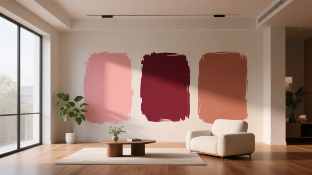
Best Rose Red Paint Colors - The Decor Mag
Rose red sits in that coveted sweet spot between classic red and romantic pink—bold enough to feel intentional, yet softened enough to live with every day. It can read fresh and modern in a bright kitchen, elegant and tailored in a dining room, or cozy and enveloping in a bedroom. For homeowners who love color but don’t want a “stop sign” red, rose red paint colors deliver warmth, depth, and a flattering glow that plays beautifully with skin tones, wood finishes, and layered textiles.
This topic matters because red is one of the most emotionally charged colors in interior design. Color psychology links red to energy, appetite, passion, and comfort—yet the wrong red can feel harsh, dated, or overwhelming. Rose red, with its subtle pink or berry undertones, is often the most approachable entry point into red walls, red cabinetry, or even a dramatic rose-red ceiling.
Below you’ll find standout rose red paint color recommendations, how to choose the right undertone for your space, real-room application scenarios, and common mistakes to avoid—so your final result feels curated rather than accidental.
What Makes a “Rose Red” Paint Color?
Rose red is a red that’s been tempered—either with pink, a touch of blue (berry), or a bit of brown (brick-rose). It’s less primary than true red and typically feels more livable, especially in homes with warm wood floors, creamy trim, and layered neutrals.
Key undertones you’ll see in rose reds
- Pink-leaning rose red: brighter, fresher, more playful; can skew “bubblegum” in high daylight.
- Berry-leaning rose red: deeper, slightly cool; reads sophisticated and dramatic.
- Browned/brick rose: earthy and grounded; excellent for traditional and rustic interiors.
Why undertones matter (and how light changes them)
- North-facing rooms: cooler light can pull berry or purple notes forward; warm your palette with creamy whites, brass, and warm woods.
- South-facing rooms: warm bright light can make pink undertones more pronounced; balance with crisp whites or charcoal accents.
- East-facing rooms: morning light can make rose reds feel cheerful; afternoons may mute them.
- West-facing rooms: late-day golden light can turn rose reds richer and more saturated—great for dining rooms and lounges.
Best Rose Red Paint Colors (Designer-Approved Picks)
These rose red paint colors are reliable, widely available, and versatile across different interior color schemes. Always sample first—reds are notorious for shifting dramatically from chip to wall.
1) Benjamin Moore Romantic Pink 2004-10
Don’t let the name fool you: in many rooms, this reads as a confident rose red rather than a pastel. It’s lively, flattering, and works well for accent walls, powder rooms, and feminine-meets-modern bedrooms.
- Best for: powder rooms, nurseries, creative studios
- Pair with: Benjamin Moore Simply White OC-117 (trim), light oak, polished nickel
- Style note: looks especially crisp with black accents and white tile
2) Benjamin Moore Raspberry Blush 2008-30
A punchy, modern rose-raspberry that feels energetic and current. Great when you want color that reads joyful rather than heavy.
- Best for: dining rooms, accent alcoves, entry doors
- Pair with: warm off-whites, pale blush, and mid-tone walnut
- Design tip: use satin or pearl finish on walls to bounce light and prevent a flat “chalky” look
3) Farrow & Ball Setting Plaster No. 231
Setting Plaster is a cult favorite because it’s a softened, grown-up pink-rose that can read rose red when deepened by shade, textiles, or evening light. It’s ideal for homeowners who want warmth without the intensity of a true red.
- Best for: bedrooms, living rooms, hallways
- Pair with: Farrow & Ball All White (trim), natural linen, warm brass
- Application idea: color-drench walls and trim for a cocooning, high-end look
4) Farrow & Ball Sulking Room Pink No. 295
Despite the name, this is a moody, sophisticated rose with a muted red-brown backbone. It reads like a historic rose red in lower light and feels beautifully architectural.
- Best for: libraries, dining rooms, primary bedrooms
- Pair with: soft greige, deep olive, or inky blue accents
- Style note: stunning with aged wood, vintage rugs, and layered art
5) Sherwin-Williams Redend Point SW 9081
A modern, earthy rose that leans toward clay and blush. It’s extremely livable and plays well with today’s popular warm neutrals.
- Best for: open-concept main floors, kitchens with warm cabinets, bedrooms
- Pair with: Sherwin-Williams Alabaster SW 7008 (trim), warm taupe, terracotta accents
- Design tip: ideal if you want a rose red “influence” without committing to a saturated red wall
6) Sherwin-Williams Fine Wine SW 6307
Fine Wine is a deeper rose red that borders on wine/berry—excellent for drama. It can feel luxurious on built-ins or a dining room enveloped in warm light.
- Best for: dining rooms, built-ins, powder rooms, front doors
- Pair with: creamy whites, antique gold, dark-stained wood
- Application idea: paint cabinetry Fine Wine with brushed brass pulls and creamy zellige backsplash
7) Behr Moroccan Ruby (MQ1-25)
A rich, saturated ruby-rose that reads warm and inviting. Behr’s options can be especially convenient for quick weekend projects and feature walls.
- Best for: accent walls, dining rooms, statement furniture pieces
- Pair with: warm white, camel leather, natural jute, black metal
- Design tip: keep surrounding finishes matte and textured to make the color feel grounded
8) Little Greene Tuscan Red (and similar heritage rose reds)
If you love traditional interiors, a heritage-inspired rose red (often slightly browned) feels timeless—especially with paneled walls and classic trim profiles.
- Best for: dining rooms, studies, stair halls
- Pair with: creamy whites, oxblood leather, aged brass, dark green accents
- Style note: perfect for period homes and classic color schemes
How to Choose the Right Rose Red for Your Home
Start with your fixed finishes
Rose red should harmonize with what isn’t changing. Use these quick match rules:
- Warm wood floors (oak, honey maple): choose an earthy or brick-rose (less blue).
- Cool marble and chrome: choose a berry-leaning rose red to avoid clashing.
- Lots of cream or beige: pick a rose red with a touch of brown for a seamless transition.
- Bright white trim and modern lines: pick a clearer, pink-leaning rose red for contrast.
Decide: statement or supporting role?
- Statement: a saturated rose red on all walls in a dining room or powder room.
- Supporting role: a muted rose on one wall, trim, or built-ins.
- Accent: rose red on a front door, ceiling, or furniture for a controlled dose of color.
Real Room Examples & Application Scenarios
Rose red dining room: intimate, flattering, and dramatic
Dining rooms are ideal for deeper rose reds because evening light warms the color and red tones stimulate appetite and conversation. Try Sherwin-Williams Fine Wine SW 6307 on walls with a warm white ceiling, then layer:
- Walnut or dark oak dining table
- Brass or bronze chandelier
- Cream linen drapery
- Art with black frames to sharpen the palette
Rose red bedroom: cozy without feeling childish
For a restful bedroom, pick a softened rose (think Farrow & Ball Setting Plaster No. 231 or Sherwin-Williams Redend Point SW 9081). Keep bedding light and tactile:
- Warm white duvet + textured quilt
- Natural wood nightstands
- Amber glass lamps for warm nighttime glow
- Optional: paint trim the same color (color-drenching) for a boutique-hotel effect
Rose red kitchen island or cabinetry: a confident focal point
Rose red cabinetry can feel surprisingly classic—especially when balanced with timeless materials. A kitchen island in Benjamin Moore Raspberry Blush 2008-30 can look modern and custom with:
- White or cream perimeter cabinets
- Warm brass hardware
- Light stone counters (warm veining helps)
- Rattan or wood bar stools to keep it approachable
Rose red powder room: small space, big payoff
Powder rooms love saturated color because you experience them in short bursts. Consider Behr Moroccan Ruby (MQ1-25) with:
- Glossy white tile or beadboard
- Statement mirror (arched or vintage)
- Brass faucet and warm lighting (2700K bulbs)
- Dark artwork to add depth
Rose red front door: curb appeal with warmth
A rose red front door reads welcoming and distinctive. Choose a shade with enough depth to stand up to sunlight. Pair with:
- Crisp white trim for contrast
- Black shutters or black hardware for structure
- Planters with deep green foliage to complement the red family
Color Schemes That Make Rose Red Look Intentional
Rose red shines when it’s part of a clear interior color design strategy. Use these proven combinations:
1) Rose red + warm white + natural wood
- Why it works: warm neutrals calm the intensity; wood adds organic balance.
- Great for: Scandinavian, modern organic, transitional homes
2) Rose red + olive green
- Why it works: red and green are complementary; olive tones make it sophisticated instead of festive.
- Try: rose red walls with olive velvet chair, botanical art, and warm brass
3) Rose red + deep navy or ink blue
- Why it works: navy anchors rose red and adds tailored contrast.
- Great for: offices, dining rooms, classic bedrooms
4) Rose red + blush + terracotta (tone-on-tone)
- Why it works: a monochromatic approach feels layered, modern, and calming.
- Best tip: vary textures (linen, wool, ceramic, wood) so it doesn’t look flat
Common Rose Red Paint Mistakes (and How to Avoid Them)
- Choosing from a tiny paint chip: reds intensify on walls. Sample large swatches (at least 12x12) in multiple areas.
- Ignoring undertones in tile and countertops: a berry rose can clash with very warm cream stone; an earthy rose can look muddy near cool gray marble.
- Using the wrong sheen: flat/matte hides wall flaws but can dull a lively rose red; eggshell is usually the safest for walls. Save satin/semigloss for trim and doors.
- Overmatching everything: rose red doesn’t need pink accessories everywhere. Add contrast with black, olive, navy, or warm neutrals.
- Forgetting lighting temperature: cool LEDs (4000K+) can make rose reds look magenta or harsh. Aim for 2700K–3000K for a warmer, truer read.
- Skipping primer: many reds need a tinted primer for even coverage. Ask your paint store to recommend the right base for your chosen color.
Practical Tips for Sampling and Painting Rose Red
- Sample on multiple walls: especially the wall that gets the most daylight and the one in shadow.
- View morning, afternoon, and night: rose reds often deepen and warm at night—exactly what you may want.
- Coordinate with trim first: decide whether you want warm white trim (softer) or bright white trim (crisper contrast).
- Use the 60-30-10 guideline: let rose red be 10% (accent) or 30% (feature) unless you’re intentionally color-drenching.
- Test with your textiles: hold rugs, curtains, and bedding next to the sample—reds are sensitive to neighboring colors.
FAQ: Rose Red Paint Colors
Is rose red a good wall color for small rooms?
Yes—especially in powder rooms, offices, and cozy bedrooms. Deeper rose reds can make small rooms feel intentional and intimate. Use warm lighting and keep the ceiling/trim either crisp white for contrast or match the wall color for a cocoon effect.
What trim color looks best with rose red walls?
Most rose reds love warm whites (think creamy, not stark) because they soften contrast. If you want a modern look, a cleaner bright white can work—just sample, since bright white can make some rose reds look more pink.
Will rose red clash with gray floors or gray tile?
It depends on undertone. Cool grays pair better with berry-leaning rose reds. Warm grays (greige) pair better with earthy rose reds. If your gray has blue undertones, avoid overly warm brick-rose shades that can look muddy next to it.
Are rose red paint colors trendy or timeless?
Both. Saturated reds cycle through trends, but rose-leaning reds have a long history in traditional interiors (think heritage dining rooms) and also feel current in modern organic homes when paired with warm neutrals and natural textures.
What’s the best way to use rose red if I’m color-shy?
Start with an accent: a front door, a powder room, a single wall, or built-in cabinetry. Pair it with warm white walls and natural wood so the rose red feels like a deliberate focal point rather than a takeover.
Do rose reds require more coats than other colors?
Often, yes. Reds and red-adjacent shades can need extra coats for even coverage. A tinted primer and high-quality paint will help you get a richer, smoother finish with fewer patchy areas.
Your Next Steps: Make Rose Red Work Beautifully
Pick three rose red paint colors that match your home’s fixed finishes, sample them in your actual lighting, then build a simple color scheme around one anchor neutral (warm white, greige, or soft taupe). Decide whether rose red will be the main character (dining room walls, cabinetry) or the accent (door, powder room, feature wall), and choose finishes—wood tones, metals, textiles—that support the undertone you’ve selected.
For more paint color ideas, room-by-room color schemes, and expert interior color design guidance, explore our latest color guides on thedecormag.com.
More Articles
 How To Match Aging With Space: Designing Environments That Support Lifelong Well-Being
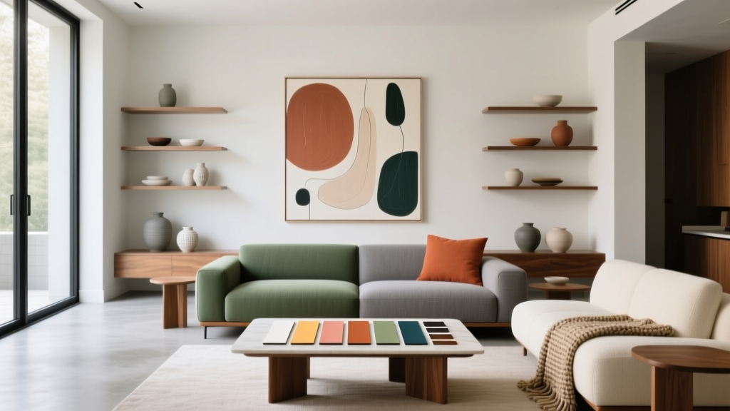 How to Create a Contemporary Color Palette - The Decor Mag
 How to Choose Colors for a Mudroom - The Decor Mag
 The Science-Backed Best Sleep Textiles: Thread Count, Fiber Physics, and Real-World Performance Data
 Color Psychology in Living Rooms: Mood & Function (2026)
 Best Rust Red Paint Colors - The Decor Mag
 Best Azure Blue Paint Colors - The Decor Mag
 How to Choose Colors for a Scullery - The Decor Mag
 How to Create a Timeless Color Palette - The Decor Mag
 How to Create a Serene Color Palette - The Decor Mag