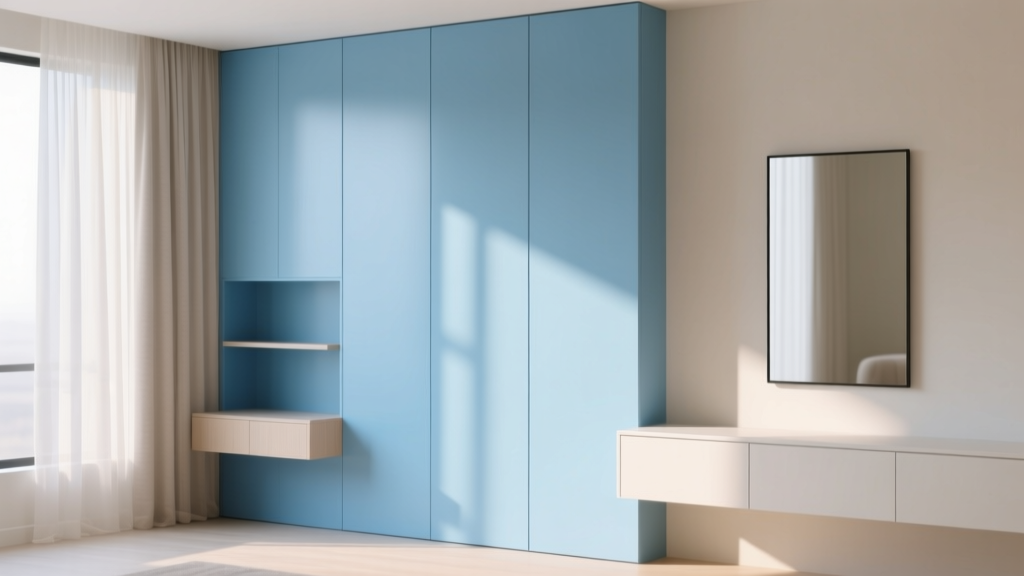
Best Sky Blue Paint Colors - The Decor Mag
Sky blue is one of those rare paint colors that feels instantly familiar and endlessly adaptable. It brings to mind open air, calm water, and the kind of natural light that makes a room feel easier to live in. For homeowners, that emotional response matters: the best sky blue paint colors can soften busy spaces, make smaller rooms feel more breathable, and create a backdrop that supports both cozy and modern design styles.
From a color psychology standpoint, blue is linked to calm, clarity, and focus—making it a smart choice for bedrooms, nurseries, home offices, and bathrooms. Sky blue, specifically, sits in the lighter end of the blue family, so it tends to feel uplifting rather than heavy. The challenge is selecting the right undertone and depth for your lighting and finishes. A sky blue that looks crisp and airy in a sunlit room can read icy or gray in a north-facing space. This guide breaks down how to choose, where to use, and which specific sky blue paint colors consistently perform well.
What Makes a Paint Color “Sky Blue”?
Sky blue is typically a light-to-mid blue with a clean, open quality—lighter than denim or navy, less green than aqua, and less saturated than bright “primary” blues. Most sky blues have one of these undertone directions:
- Clean/true blue: crisp, fresh, and classic (can feel cool in low light)
- Gray-blue: softened and sophisticated (great for modern interiors)
- Green-leaning blue: airy and beachy (pairs beautifully with warm woods)
- Violet-leaning blue: slightly periwinkle (playful, flattering in bedrooms)
Sky Blue and Light: Why Undertones Change Everything
Sky blue is especially sensitive to lighting. Use these design principles to predict what you’ll see on the wall:
- North-facing rooms: cooler, flatter light; sky blues can look grayer or icier.
- South-facing rooms: warm, strong daylight; sky blues look brighter and more cheerful.
- East-facing rooms: crisp morning light, warmer later; blues can shift throughout the day.
- West-facing rooms: golden afternoon light; blues can look warmer, sometimes slightly green.
Tip: Always test large swatches (at least 12" x 12") on multiple walls. Sky blue can look dramatically different next to a window versus a shadowy corner.
Best Sky Blue Paint Colors (Designer-Approved Picks)
These sky blue paint colors are popular for a reason: they’re versatile, widely available, and proven in real homes. Undertones and best-use notes help you match them to your space.
Benjamin Moore Sky Blue Paint Colors
-
Benjamin Moore Woodlawn Blue (HC-147)
A beloved airy blue-green that reads “coastal classic” without feeling themed. Excellent for bathrooms, bedrooms, and open-plan living spaces.
Best with: warm whites, natural oak, satin brass, and woven textures. -
Benjamin Moore Palladian Blue (HC-144)
A light blue with a soft green undertone that glows in natural light. Creates that fresh, spa-like feel many homeowners want.
Best with: creamy trims, marble, light gray tile, and airy linen curtains. -
Benjamin Moore Breath of Fresh Air (806)
True to its name—clean, optimistic, and distinctly “sky.” Great for kids’ rooms, laundry rooms, and cheerful kitchens.
Best with: crisp white trim, pale woods, and colorful art. -
Benjamin Moore Soft Sky (807)
A slightly gentler, more muted sky blue that stays calm rather than bright. Ideal for bedrooms and soothing hallways.
Best with: greige upholstery, warm whites, and soft blush accents.
Sherwin-Williams Sky Blue Paint Colors
-
Sherwin-Williams Sky High (SW 6504)
A crisp, clear blue that feels energetic and modern. Works beautifully as an accent wall or on built-ins.
Best with: bright white trim, matte black hardware, and contemporary lighting. -
Sherwin-Williams Upward (SW 6239)
A soft, airy blue with a modern sensibility—light enough to open a space, grounded enough to feel polished.
Best with: warm wood floors, off-white walls, and brushed nickel. -
Sherwin-Williams Sleepy Blue (SW 6225)
A relaxed blue-green that’s calming in bedrooms and nurseries. It plays well with warm neutrals and cozy textures.
Best with: ivory bedding, rattan, and muted terracotta accents. -
Sherwin-Williams Aleutian (SW 6241)
A sophisticated gray-blue that reads “sky after rain.” Great for homeowners who want a blue that feels tailored, not playful.
Best with: stone counters, greige rugs, and layered whites.
Farrow & Ball and Behr Options Worth Considering
-
Farrow & Ball Light Blue (No. 22)
A timeless, heritage-style sky blue that feels charming in cottages and classic homes. Beautiful in dining rooms and bedrooms with traditional trim. -
Farrow & Ball Skylight (No. 205)
A pale, clean blue that leans modern and minimal. Excellent for small rooms that need to feel open. -
Behr Adirondack Blue (S500-5)
A friendly, approachable blue that can read “sky” in bright light. A strong option for DIY projects and accent furniture.
How to Choose the Right Sky Blue for Your Home
1) Match the Undertone to Your Fixed Finishes
Sky blue will react to what’s already in the room—floors, countertops, tile, and upholstery.
- Warm woods (oak, honey pine): choose a blue-green sky blue (Woodlawn Blue, Palladian Blue).
- Cool floors (gray LVP, concrete): choose a gray-blue (Aleutian, Upward).
- White marble with gray veining: gray-blues look especially refined.
- Beige or cream tile: avoid icy blues; opt for slightly warm-leaning sky blues.
2) Decide: All-Over Color or Accent?
Sky blue can be a whole-room wall color, but it also shines as a supporting player:
- All four walls: best for bedrooms, nurseries, and offices where you want an immersive calm.
- Accent wall: great behind a bed, in a dining nook, or highlighting architectural features.
- Cabinetry and built-ins: a fresh alternative to white; looks especially crisp with brass pulls.
- Ceilings (“sky ceiling”): a designer trick for porches, sunrooms, and kids’ spaces.
3) Use the Right Paint Sheen
- Matte/flat: best for bedrooms and living rooms; soft, modern look (shows scuffs more easily).
- Eggshell: the sweet spot for most walls—washable with gentle glow.
- Satin: ideal for kitchens, baths, and kids’ rooms where durability matters.
- Semi-gloss: trim and doors; makes white trim pop against sky blue walls.
Real Room Examples: Where Sky Blue Looks Best
Sky Blue Bedrooms: Calm Without Feeling Cold
Sky blue is a natural fit for bedrooms because it supports rest and lowers visual “noise.” Try a muted sky blue (Soft Sky, Upward, Aleutian) and layer in warm textures so the room doesn’t feel chilly.
- Classic pairing: sky blue walls + crisp white bedding + warm oak nightstands
- Elevated look: sky blue walls + cream boucle headboard + antique brass sconces
- Soft contrast: add camel leather, oatmeal linen, or warm greige curtains
Bathrooms and Powder Rooms: Spa Light, Clean Energy
Blue reads clean and water-adjacent, making it a go-to for bathrooms. Blue-green sky shades (Palladian Blue, Woodlawn Blue, Sleepy Blue) feel especially “spa-like” with warm white tile and natural wood.
- Try this scheme: sky blue walls + white subway tile + warm white ceiling + brushed brass hardware
- For a modern bath: gray-blue walls + concrete-look tile + black-framed mirror
Kitchens and Built-Ins: A Fresh Alternative to White
If an all-blue kitchen feels like a leap, start with a sky blue island or pantry door. Sky blue cabinetry pairs well with white countertops and offers more personality than standard neutrals.
- Best approach: sky blue lower cabinets + white uppers for an airy, balanced look
- Hardware tip: brass warms sky blue; black sharpens it; nickel keeps it classic
Home Offices: Focused, Light, and Motivating
Because blue supports concentration, sky blue works beautifully in an office—especially when you want calm focus rather than dramatic mood. Choose a cleaner blue (Sky High, Breath of Fresh Air) if you want an energizing backdrop, or a gray-blue (Upward, Aleutian) for a quieter, professional vibe.
Kids’ Rooms and Nurseries: Cheerful and Timeless
Sky blue can grow with your child. Pair it with playful accents now and more sophisticated patterns later.
- Gender-neutral palette: sky blue + warm white + soft sage + natural wood
- Playful palette: sky blue + sunny yellow accents + crisp white trim
Color Combinations That Make Sky Blue Sing
Sky blue plays well with both warm and cool companions. These color schemes are reliable starting points for interior color design:
- Sky blue + warm white: clean and classic (great for trim and ceilings)
- Sky blue + greige: modern and calming (ideal for open floor plans)
- Sky blue + navy: layered blues add depth (perfect for textiles and accents)
- Sky blue + soft blush: gentle, romantic contrast (bedrooms and nurseries)
- Sky blue + sage green: nature-inspired and relaxed (coastal and cottage styles)
- Sky blue + terracotta: warm/cool balance with designer edge (pillows, art, rugs)
Trim and Ceiling Pairings
Most sky blues look best with a clean white trim, but the “right white” depends on your goal:
- For a crisp look: choose a bright, clean white on trim.
- For a softer look: use a warm white to avoid a cold, sterile feel.
- For a color-drenched look: paint trim a few shades lighter (or use the same color in a different sheen).
Common Sky Blue Paint Mistakes (and How to Avoid Them)
-
Picking a blue that turns icy at night
Fix: Test the paint under evening ламplight. If it chills out, try a slightly warmer or blue-green sky shade. -
Ignoring reflection from floors and furnishings
Fix: A warm wood floor can push sky blue greener; a gray carpet can make it look more steel-blue. Test near these surfaces. -
Using a bright sky blue in a low-light room
Fix: In dim spaces, choose a gray-blue that won’t look artificially vivid. -
Forgetting about white balance in adjacent rooms
Fix: Compare your trim white and nearby wall colors. A very warm white next to a cool sky blue can look yellow. -
Sampling too small
Fix: Paint a large sample and view it from the doorway. Sky blue needs space to show its true character.
FAQ: Best Sky Blue Paint Colors
What is the most popular sky blue paint color for interiors?
Benjamin Moore Woodlawn Blue (HC-147) and Benjamin Moore Palladian Blue (HC-144) are consistent favorites because they’re light, flattering, and easy to coordinate with warm woods and white trim.
Will sky blue make a room look bigger?
Often, yes. Lighter blues can visually expand a space by reflecting light and creating an airy backdrop. For the biggest effect, pair sky blue walls with a light ceiling color and minimal contrast in large surfaces (like curtains and rugs).
What colors go with sky blue walls?
Warm whites, greige, navy, sage green, soft blush, and natural wood tones are all excellent. For a more modern color scheme, add charcoal or matte black accents.
Is sky blue a good choice for a north-facing room?
It can be, but choose carefully. North light can make sky blue look cooler and grayer. Try a slightly warmer blue-green (like Woodlawn Blue) or a softened gray-blue (like Aleutian) and test it on multiple walls.
Should I use a warm white or cool white trim with sky blue?
Both can work. Cool whites make the look crisp and clean; warm whites make the room feel softer and more inviting. If your room has warm finishes (oak, brass, beige tile), warm white trim is usually the smoother match.
Can I use sky blue on kitchen cabinets?
Yes—sky blue cabinets can feel fresh and timeless, especially with white countertops and warm metal finishes. Use a durable paint in a satin or cabinet-grade finish, and balance it with neutrals so the kitchen doesn’t feel overly themed.
Next Steps: Bring Sky Blue Home with Confidence
Start by choosing 2–3 sky blue paint colors that match your room’s light and fixed finishes, then test them on large swatches. View them morning, afternoon, and evening. Once you land on the right undertone, build a simple color scheme around it—white trim, warm neutrals, and a few deeper accents for contrast.
If you’re planning a full-home refresh, keep exploring thedecormag.com for more color guides, paint color roundups, and designer-backed tips to help you create a home that feels as good as it looks.
More Articles
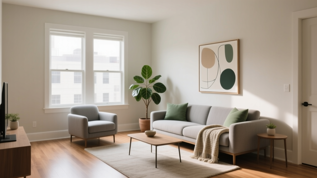 How to Choose Colors for a Rental Property - The Decor Mag
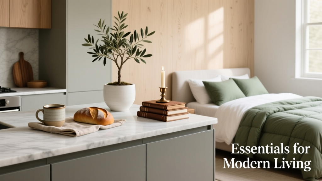 Kitchen & Bedroom Inspiration Essentials: Functional Design, Proven Color Systems, and Space-Smart Layouts
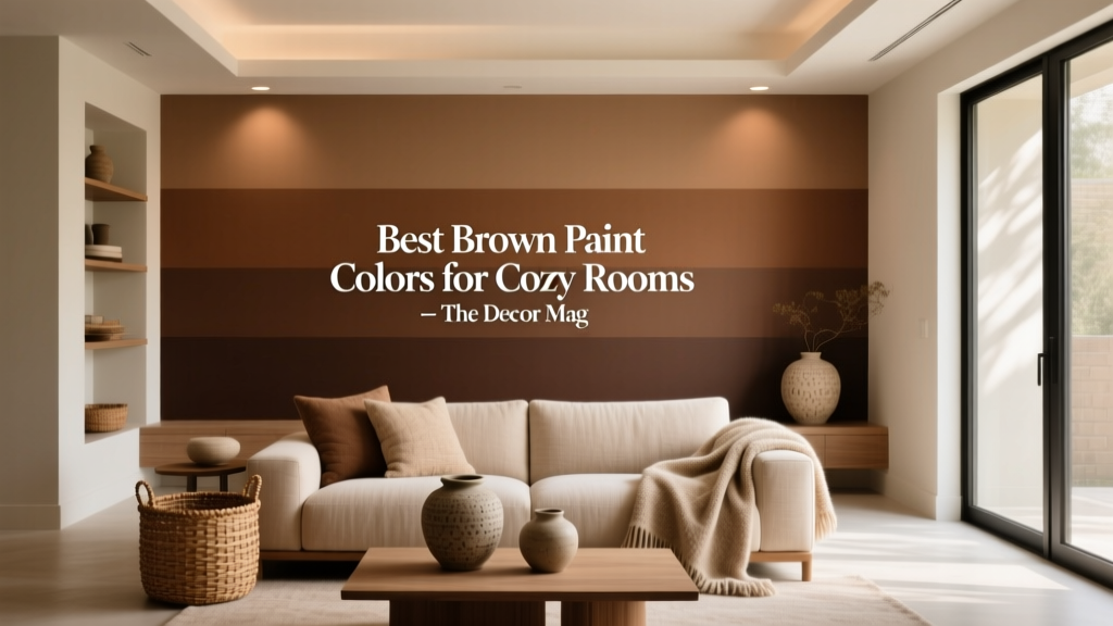 Best Brown Paint Colors for Cozy Rooms - The Decor Mag
 How to Use Color to Create Emphasis - The Decor Mag
 Best Fern Green Paint Colors - The Decor Mag
 Color Psychology in Living Rooms: Mood & Function (2026)
 How to Create a Moody Color Palette - The Decor Mag
 Step On A Budget: How to Buy High-Performance Ski Boots Without Breaking the Bank
 Complementary Color Pairing Ideas - The Decor Mag
 Paint Colors That Work With Flooring (2026)