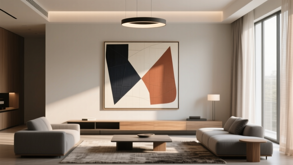
Living Room Art That Makes a Statement (2026)
The living room is where life happens: relaxed mornings, movie nights, impromptu gatherings, and those quiet moments when you finally sit down with a cup of tea. And while furniture sets the foundation, living room wall art is often what gives the space its personality. The right piece can anchor your seating area, elevate a basic layout, and make your room feel intentionally designed rather than simply furnished.
But choosing art can feel strangely high-stakes. Maybe you’re worried about picking the “wrong” style, committing to a color you’ll get tired of, or hanging something that looks too small for the wall. The good news: statement art isn’t about buying the most expensive piece or following a strict rulebook. It’s about scale, placement, and choosing something that feels right for your home—whether you rent a studio or own a forever house.
This guide will walk you through how to choose statement wall art for a living room, including practical sizing guidelines, material recommendations, budget ranges, current design trends, and real-world examples you can copy. You’ll also find common mistakes to avoid and a helpful FAQ at the end.
What “Statement Art” Really Means (and Why It Works)
A statement piece is any artwork that commands attention and helps define the room’s mood. That could mean:
- Scale: One oversized canvas that anchors the entire seating area
- Color: A bold palette that energizes an otherwise neutral living room
- Subject: A striking portrait, dramatic landscape, or graphic abstract
- Texture: A woven wall hanging, sculptural relief, or mixed-media piece
- Meaning: A photo, vintage print, or original work that tells your story
From a design perspective, statement art acts like a visual “headline.” It gives the eye a place to land, which helps the room feel cohesive—especially in open-concept spaces where the living room needs clear definition.
Start with Your Room’s “Design DNA”
1) Identify your living room style—then add a twist
Art doesn’t have to match your decor exactly, but it should relate to the room’s overall direction. Use your current pieces as clues:
- Modern / Minimal: Large-scale abstract art, monochrome photography, graphic line art
- Traditional: Landscapes, still lifes, classic portraits, gilded frames
- Scandinavian: Soft palettes, nature photography, simple wood frames
- Boho / Eclectic: Textile wall art, global-inspired prints, layered gallery walls
- Industrial: Black-and-white photography, architectural prints, metal frames
The “statement” often comes from contrast. A clean-lined modern living room can look incredible with one expressive, painterly piece. A classic room can feel fresher with contemporary photography in an unexpected frame.
2) Pull from your existing color palette (or create one)
If you already have a rug, pillows, or a standout sofa color, use those tones as anchors. A simple approach:
- Choose 2–3 core colors already in the room (for example: cream, charcoal, and olive).
- Look for art that includes at least one of those colors.
- Add a “spark” color in the art (terracotta, cobalt, saffron) to make it feel intentional.
Tip: If your living room is very neutral, statement art is a smart way to introduce color without committing to a bold sofa or repaint.
Get the Size Right: The Easiest Way to Make Art Look Expensive
Scale is the difference between art that looks impactful and art that looks like an afterthought. Use these designer-friendly guidelines for living room art size:
Art above a sofa
- Aim for artwork that’s about 2/3 to 3/4 the width of the sofa.
- Example: For an 84-inch sofa, your art (or the total width of a pair/trio) should be roughly 56–63 inches wide.
- Hang it so the bottom of the frame is 6–10 inches above the sofa back.
Art on a blank feature wall
- For a big, empty wall, choose a piece (or arrangement) that fills about 60–75% of the available wall width.
- Consider one oversized piece in the 40 x 60 to 48 x 72 inch range for maximum impact (if the wall and budget allow).
Gallery wall sizing
- Plan the overall gallery wall as one “unit” with a clear outer boundary.
- Keep spacing between frames consistent: 2–3 inches is a sweet spot.
- For a curated look, stick to 2 frame finishes max (for example: black + oak).
Hanging height (the rule designers actually use)
In most living rooms, aim for the center of the art to sit around 57–60 inches from the floor (eye level). If you have tall ceilings, you can nudge up slightly—but don’t float it too high.
Choose the Right Format: One Big Piece vs. Sets vs. Gallery Walls
Option A: One oversized statement piece
Best for: Minimalist spaces, modern living rooms, anyone who wants maximum impact with minimal effort.
- Best mediums: Large canvas, framed prints, tapestry-style textiles, oversized photography
- Pro tip: If you’re nervous about bold color, choose large art with a neutral base and one strong accent hue.
Option B: Diptych or triptych (two or three-panel art)
Best for: Long sofas, large walls, and renters who want a “big art” look without one massive frame.
- Keep panels the same size for a crisp, intentional look.
- Leave 2–4 inches between panels.
Option C: A thoughtfully curated gallery wall
Best for: Eclectic decor lovers, families who want to incorporate personal photos, and anyone who prefers layered texture.
For a statement gallery wall, mix:
- 1–2 larger anchor pieces (like 18 x 24 or 24 x 36)
- Supporting sizes (like 11 x 14, 12 x 16, 16 x 20)
- One unexpected element (a small textile, sculptural wall object, or vintage mirror)
Material & Finish Choices That Elevate Your Living Room Decor
Art isn’t just about the image—materials and finishes affect how “high-end” it feels.
Canvas
- Look: Soft, modern, gallery-like
- Best for: Abstracts, landscapes, oversized statement pieces
- Tip: Choose a thicker gallery-wrap depth (around 1.25–1.5 inches) for a more substantial look.
Framed prints (paper)
- Look: Classic, polished
- Best for: Photography, illustration, vintage-style posters
- Tip: Add a mat (around 2–4 inches) to make even budget prints feel elevated.
Glass & glazing
- Standard glass: Affordable, can reflect glare
- Non-glare / acrylic: Great for bright rooms; acrylic is lighter (helpful for renters)
- Museum glass: Premium clarity and UV protection—ideal for investment pieces
Textile and sculptural wall art
- Look: Warm, tactile, trend-forward but still timeless when chosen well
- Best for: Cozy living rooms, spaces that feel “flat,” neutral palettes that need depth
- Materials to seek: Wool, cotton, linen, natural wood, ceramic, plaster relief
Budget Ranges & Smart Product Recommendations
You can create a statement at nearly any budget. Here’s what to expect and where to spend.
Under $100: High-impact, low-commitment
- Downloadable prints (choose high-resolution files) + affordable frames
- Oversized posters with a clean, modern frame
- DIY canvas (even a single-color textured painting can look intentional)
Best splurge in this range: A larger frame with a mat—framing is what makes budget art look polished.
$100–$300: The “sweet spot” for renters and first apartments
- Framed art prints in 18 x 24 or 24 x 36
- Two-piece sets for above the sofa
- Textile wall hangings with natural fibers
Look for: Heavier frames, real wood veneer, linen-textured mats, and larger dimensions.
$300–$1,000+: Investment statement art
- Original paintings or limited edition prints
- Oversized framed photography
- Handmade textile art or ceramic wall pieces
Where to invest: One large anchor piece for the main wall (usually above the sofa or fireplace).
Current Design Trends (That Won’t Feel Dated Next Year)
Trends are most successful when they support timeless design principles like balance, proportion, and cohesion. A few living room decor trends that translate beautifully into statement art:
- Warm neutrals + earthy tones: Ochre, rust, clay, olive, espresso brown
- Organic modern: Abstracts inspired by nature, soft shapes, textured finishes
- Vintage revival: Antique-style portraits, vintage travel posters, aged frames
- Black accents: Black frames or bold black linework for crisp contrast
- Textural wall moments: Woven art, plaster reliefs, sculptural pieces that add dimension
Real-World Scenarios: Choosing Statement Art Like a Designer
Scenario 1: Small apartment living room with a neutral sofa
You have a 72-inch beige sofa, white walls, and minimal decor. The room feels clean but forgettable.
- Best move: One large piece, about 48–54 inches wide
- Style idea: Oversized abstract canvas with warm neutrals and a deep accent (like charcoal or forest green)
- Why it works: It adds focus and contrast without cluttering a small space
Scenario 2: Open-concept living room that blends into dining/kitchen
The living area feels like it’s floating—no clear boundary.
- Best move: A bold, oversized framed piece on the main living room wall
- Color strategy: Pull one kitchen tone (like black hardware or wood cabinets) into the artwork for cohesion
- Extra step: Add a picture light or directional floor lamp to “spotlight” the art and define the zone
Scenario 3: Family living room with lots of patterns already
You have a patterned rug, colorful pillows, and kids’ toys. Adding more visual noise could overwhelm the room.
- Best move: Statement art with a calmer palette
- Style idea: Large black-and-white photography or a minimalist line drawing series
- Why it works: It gives the eye a resting point while still feeling elevated
Step-by-Step: A Simple Method to Choose the Right Living Room Art
- Pick the wall that needs the most focus (usually above the sofa, fireplace, or the first wall you see when entering).
- Measure the width of the sofa or wall section you’re styling.
- Decide on format: one big piece, 2–3 panels, or a gallery wall.
- Choose a color direction based on your rug/sofa/curtains.
- Select frame finish that ties into your metals/woods (black, walnut, oak, brass).
- Mock it up before hanging: painter’s tape outlines, paper templates, or a virtual “view in room” tool.
- Hang at the right height (center at ~57–60 inches, or 6–10 inches above the sofa).
Common Mistakes to Avoid
- Going too small: Undersized art is the #1 reason a living room feels unfinished. When in doubt, size up.
- Hanging too high: Art that floats near the ceiling disconnects from the furniture. Keep it visually “anchored.”
- Matching too literally: If your pillows are blue, the art doesn’t need to be a blue painting. Look for related tones and contrast.
- Overcrowding the wall: A gallery wall needs breathing room. Don’t fill every inch.
- Ignoring lighting: Glare can ruin the impact. Consider non-glare acrylic, repositioning, or adding a picture light.
- Choosing art only because it’s trendy: If you don’t connect with it, you’ll get tired of it fast. Statement art should feel personal.
FAQ: Living Room Art That Makes a Statement
What size art should I hang over a sectional?
Aim for the art (or total arrangement) to span about 2/3 to 3/4 of the sectional’s width on the wall-facing side. For large sectionals, a 48 x 72 piece or a triptych often looks balanced.
Is it okay to mix art styles in the living room?
Yes—mixing can look designer-level when there’s a unifying element like a consistent frame color, a shared palette, or repeating shapes. Keep at least one common thread so it feels curated, not chaotic.
How do I make inexpensive art look more high-end?
Upgrade the presentation: use a larger frame, add a 2–4 inch mat, keep frames consistent, and hang at the correct height. Lighting also helps—even a nearby floor lamp can make art feel intentional.
What’s the best type of art for a dark living room?
Choose brighter pieces (lighter backgrounds, higher contrast) and consider reflective elements like glossy photography or a light frame. Add targeted lighting: a picture light, wall sconce, or adjustable spotlight can transform how the art reads.
Should living room art match the rug?
It doesn’t need to match exactly, but it should relate. Pull one or two rug colors into the artwork, then let the art introduce an accent hue to keep the room from feeling too “matched set.”
How can renters hang statement art without damaging walls?
Use damage-minimizing solutions like removable hooks rated for the piece’s weight, or lean larger framed art on a console or picture ledge. For heavy frames, check your lease and use proper anchors if allowed.
Wrap-Up: Your Next Steps for Statement-Making Living Room Art
If you want living room art that truly makes a statement, focus on three things: scale (go bigger than you think), placement (hang it at the right height and anchor it to furniture), and connection (choose something that fits your home’s mood and your personal style). Start with one wall—usually above the sofa—and build outward from there.
Measure your wall tonight, decide whether you want one oversized piece or a gallery wall, and create a short shortlist of 5–10 options that share a color thread with your living room decor. Once you see them in context (even with a quick paper template mock-up), the right choice becomes much clearer.
Want more living room design inspiration? Explore more wall art ideas, furniture layouts, and decor trends on thedecormag.com.
More Articles
 How to Create a Cozy Winter Living Room - The Decor Mag
 Living Rooms Layout Checklist: Room-by-Room Guide
 How to Style a Living Room Around a View - The Decor Mag
 Smart Studio Storage Ideas for 2026
 Best Color Palettes for Contemporary Living Rooms (2026)
 Best Accent Wall Treatments Under $500 - The Decor Mag
 How to Style a Coffee Table Like a Designer - The Decor Mag
 Best Console Table Depth for Behind Sofa - The Decor Mag
 Cheap vs Premium Living Room Setup Cost in 2026
 Living Room Tray Ceiling Design Ideas - The Decor Mag