Living Room Color Schemes That Work Every Time
The 60-30-10 Rule, Simplified
Every well-designed living room follows this ratio: 60% dominant color (walls, large furniture), 30% secondary color (curtains, accent chairs, rugs), and 10% accent color (throw pillows, art, accessories).
This formula works regardless of style — it's about proportion, not specific colors.
Scheme 1: Warm Neutrals (Cream + Terracotta + Brass)
Cream walls, a terracotta sofa or accent chair, and brass hardware create a welcoming space that photographs well and feels cozy year-round.
- Wall paint: Benjamin Moore Swiss Coffee or Sherwin-Williams Alabaster
- Textiles: linen curtains in natural oatmeal
- Accent: unlacquered brass lamp bases and picture frames
Scheme 2: Coastal Calm (White + Navy + Natural Wood)
Crisp white walls, deep navy upholstery, and light wood tones (white oak, ash) create a relaxed coastal feel without being nautical-themed.
- Avoid matching navy everywhere — one large piece (sofa) is enough
- Layer natural textures: jute rug, woven baskets, rattan light fixture
- Keep trim and ceiling pure white for contrast
Scheme 3: Earth Layered (Sage + Clay + Walnut)
Sage green walls, clay-toned textiles, and dark walnut woodwork. This scheme works in rooms with good natural light — sage can look muddy in dark spaces.
Scheme 4: Modern Monochrome (Charcoal + White + Black)
For those who prefer drama. Charcoal walls with white trim, black metal accents, and textural variety (boucle, velvet, leather) to prevent flatness.
- Add warmth through natural materials (stone, wood) to avoid a sterile feel
- Lighting is critical — plan at least 4 light sources at different heights
Scheme 5: Soft Pastels (Blush + Gray + Gold)
Dusty blush walls (not bubblegum pink), warm gray upholstery, and gold accents. Works best in north-facing rooms where warm tones counteract cool light.
How to Test Paint Before Committing
- Buy sample pots and paint 2x2 foot patches on at least two walls
- Observe at morning, noon, and evening — light changes everything
- View alongside your actual furniture and flooring, not in isolation
- Live with samples for 3 days minimum before deciding
Common Mistakes to Avoid
- Matching wall color to a pillow — walls should be lighter or darker, never identical
- Ignoring the ceiling — painting it the same color as walls makes rooms feel taller
- Using too many colors — stick to three (60-30-10) and vary through texture instead
Color is the cheapest renovation. A gallon of paint transforms a room more than any furniture purchase. Take the time to test, and trust the process.
More Articles
 Wood Care Tips for Living Rooms in 2026
 Rug Size for Living Room: How to Choose (2026)
 Best Recliner Chairs That Look Stylish - The Decor Mag
 Smart Living Spaces on a Budget in 2026
 Bedroom FAQ: Science-Backed Design Advice
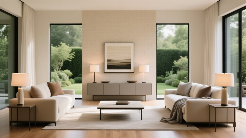 Living Room Symmetrical Design Principles - The Decor Mag
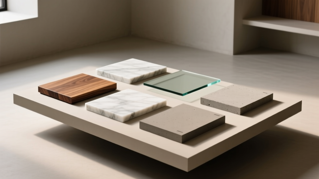 Best Coffee Table Material Comparisons - The Decor Mag
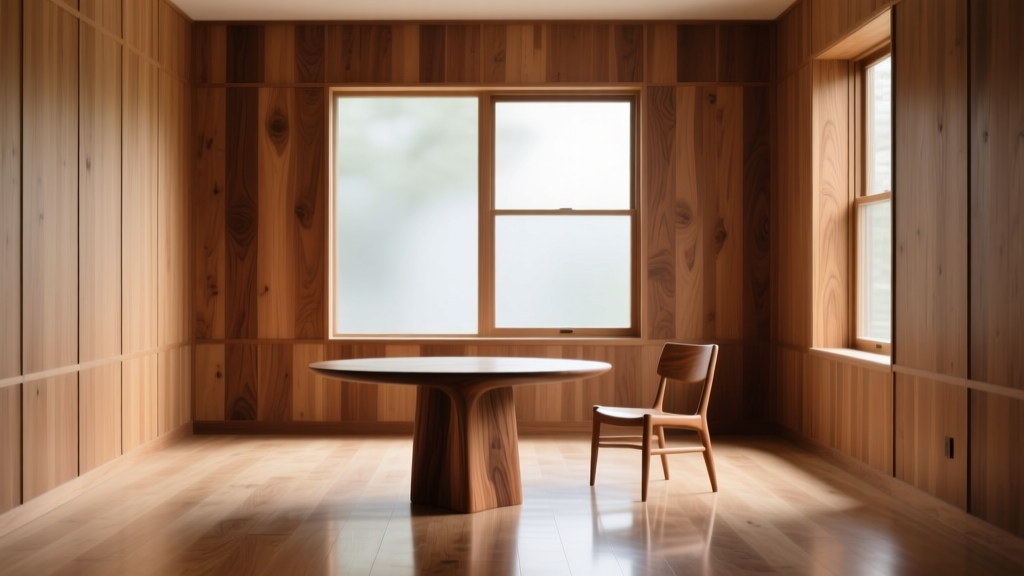 Warm, Sustainable Wood Living Spaces for 2026
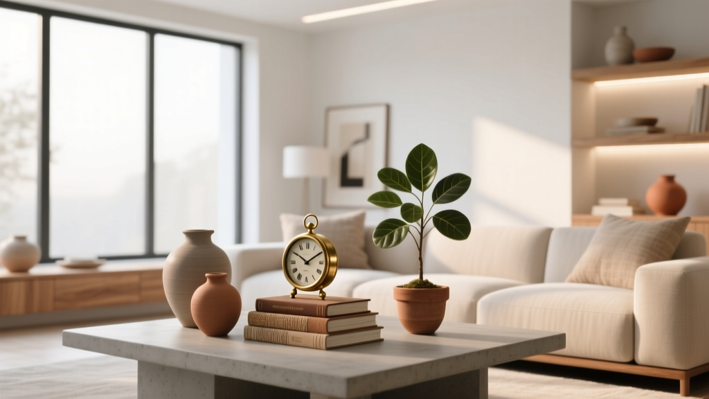 Living Room Curated Collections Display - The Decor Mag
 Living Room Sectional Sofa Configurations - The Decor Mag