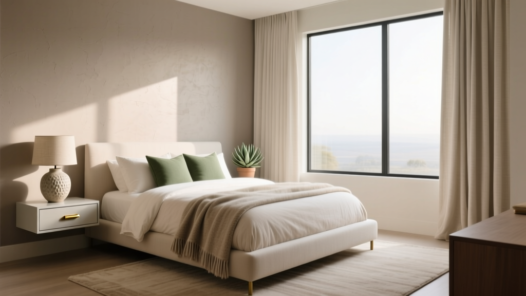
How to Create a Bedroom Color Story - The Decor Mag
A bedroom doesn’t just look a certain way—it feels a certain way. Color is often the first thing your nervous system notices, even before you register the furniture or decor. The right bedroom color story can make the space feel quieter, softer, and more supportive of rest, while a mismatched or overly stimulating palette can keep your mind “on,” even when your body is tired.
Because sleep quality is deeply connected to your sleep environment, creating a cohesive color story is one of the most practical upgrades you can make. Color influences perceived warmth, brightness, and calm; it also affects how tidy (or chaotic) a room feels. When your eye moves smoothly through the space—wall color to bedding to rug to lighting—your brain gets fewer signals to stay alert.
This guide breaks down a clear, sleep-friendly way to choose colors, layer them through furniture and textiles, and fine-tune lighting and layout so your bedroom design supports relaxation—whether you’re renting a small apartment or refreshing a primary suite.
What a “Bedroom Color Story” Means (and Why It Works)
A color story is a planned, repeating set of colors and materials used throughout a room. Instead of picking individual items you like in isolation, you decide how each piece contributes to a cohesive palette. This matters for bedroom decor because the brain prefers pattern and consistency at night—visual order is soothing.
A simple formula that rarely fails
- 1 main color (dominant): walls or large surfaces
- 1 supporting color (secondary): bedding, drapery, rug, or upholstered furniture
- 1 accent color (small doses): pillows, art, a throw, a vase
- 1–2 neutrals: whites, creams, taupes, grays, warm woods, black (used sparingly)
Sleep-friendly goal
In bedroom design for better sleep, the goal is a palette that feels low-contrast, low-glare, and predictable. You’re not eliminating personality—you’re reducing visual noise.
Step 1: Start With Your Sleep Cues—Light, Mood, and Temperature
Before choosing paint chips, look at the room the way your body experiences it at night and in the early morning. These cues help you pick colors that stay comfortable throughout the day.
Assess the natural light
- North-facing rooms often feel cooler and dimmer: warmer whites, greiges, soft taupes, muted blush, and warm woods keep the space from feeling chilly.
- South-facing rooms get bright light: you can handle cooler tones like soft blue-gray, sage, or quiet clay without it looking dull.
- East-facing rooms are bright in the morning: gentle neutrals, pale greens, and warm whites work well for a serene wake-up.
- West-facing rooms can glow intensely at sunset: avoid overly saturated warm colors; choose muted terracotta, dusty rose, or warm greige.
Choose the mood you want at bedtime
Match your palette to how you want to feel when you turn the lights down:
- Grounded and cozy: warm neutrals, clay, caramel, cinnamon-brown accents
- Fresh and quiet: soft whites, pale sage, misty blue, light oak
- Restorative and spa-like: warm white + stone + eucalyptus green
- Moody and cocooning: deep olive, ink blue, charcoal (balanced with warm lighting and light bedding)
Work with perceived temperature
Color can make a room feel warmer or cooler—helpful if your bedroom runs hot or cold at night.
- For hot sleepers: airy whites, pale blues, cool grays, light woods; breathable fabrics like cotton percale and linen.
- For cold sleepers: creamy whites, warm taupe, muted terracotta, caramel woods; cozy textures like brushed cotton, wool, and velvet accents.
Step 2: Pick a Base Color You Can Live With Every Day
Your base color is the backdrop—usually walls, sometimes a large rug or large-scale drapery if you’re renting. In a sleep-friendly bedroom, the best base colors are typically muted, complex, and low-sheen.
Best base colors for a restful bedroom
- Warm white / cream: soft, brightens small rooms, easy to decorate around
- Greige / warm taupe: calming and flattering under warm lamps
- Soft sage / muted green: nature-inspired, easy on the eyes at night
- Misty blue / blue-gray: tranquil, pairs well with white and natural wood
- Dusty blush / muted mauve: gentle warmth without feeling loud
Paint finish and why it matters for sleep
High-gloss paint reflects light and can feel visually “active” at night when lamps are on. For most bedrooms:
- Walls: matte or eggshell (matte hides wall texture, eggshell is easier to clean)
- Trim: satin for durability, but keep it subtle
Budget ranges for setting the base
- Budget: $40–$120 (paint + basic supplies for an accent wall or small room refresh)
- Mid-range: $150–$400 (premium paint, better rollers/brushes, patching supplies)
- Renter-friendly: $30–$150 (peel-and-stick wallpaper panels, large textile “headboard” wall hanging)
Step 3: Build Your Palette Using the 60–30–10 Rule
The 60–30–10 approach makes bedroom decor feel coordinated without being matchy.
- 60%: base color (walls + large furniture presence)
- 30%: secondary color (bedding, rug, curtains, upholstered headboard)
- 10%: accent color (pillows, throws, art, a small bench, ceramics)
3 calming bedroom color story examples
-
Soft sage + warm white + oat
Walls: warm white; Bedding: sage duvet or quilt; Accents: oat/tan throws, light oak nightstands -
Greige + ivory + dusty blue
Walls: greige; Bedding: ivory linen; Accents: dusty blue lumbar pillow, blue-gray art -
Misty blue + crisp white + muted terracotta
Walls: misty blue; Bedding: white cotton; Accents: terracotta vase, warm leather or camel throw
Step 4: Layer Color Through Bedding (Your Biggest Sleep Surface)
Bedding is where comfort and color story meet. If you want a bedroom that supports relaxation, choose soothing colors and breathable materials first—then add pattern and personality in small doses.
Sleep-friendly bedding materials (and when to use them)
- Cotton percale: crisp, cool, great for hot sleepers and warmer climates
- Cotton sateen: smoother, slightly warmer, cozy without heavy weight
- Linen: excellent temperature regulation, relaxed look, softens over time
- Wool duvet insert: breathable warmth; great for fluctuating temperatures
- Bamboo/rayon blends: can feel cool and silky; check for quality construction
A simple bedding color stack that looks intentional
- Sheets: neutral (warm white, ivory, light gray)
- Duvet/quilt: secondary color (sage, blue-gray, muted clay)
- Throw blanket: a deeper tone of the secondary color or a warm neutral
- Pillows: 1 solid + 1 subtle pattern + 1 accent (keep patterns low-contrast)
Budget ranges for bedding upgrades
- Budget: $60–$150 (microfiber-free cotton sheets, simple quilt, 2 pillow covers)
- Mid-range: $200–$500 (quality cotton percale/linen sheets, duvet cover, throw)
- Investment: $600–$1,200+ (premium linen set, wool insert, designer coverlets)
Step 5: Choose Furniture That Supports the Color Story (and Your Nervous System)
Furniture color and finish act like “visual weight.” In a bedroom design focused on sleep, the best choices feel steady and uncluttered.
Practical furniture recommendations
- Bed frame: upholstered in oatmeal/ivory for softness, or light-to-medium wood for warmth; avoid overly glossy lacquer in bright rooms.
- Nightstands: match in tone (not necessarily identical). Warm wood with warm whites; blackened wood with cool palettes; keep tops clear.
- Dresser: choose a finish already present (wood tone or painted neutral) to reduce visual mixing.
- Bench or accent chair: a great place for the 10% accent color.
Layout tip for better sleep
Keep the bed as the visual anchor. If possible:
- Place the bed on the most solid wall (not floating between doors)
- Use two light sources (one on each side) to create symmetry and calm
- Leave a clear pathway from bed to door to reduce the “clutter stress” feeling at night
Step 6: Lighting That Flatters Your Colors and Protects Your Sleep
Lighting can make a perfect palette feel harsh—or make a simple bedroom feel like a retreat. Because melatonin is sensitive to bright and blue-heavy light, bedroom lighting choices affect sleep quality more than most decor decisions.
Lighting guidelines for a sleep-friendly bedroom
- Use warm bulbs: 2200K–2700K in bedside lamps for a softer, candle-like glow.
- Add dimmers: dimmable lamps or wall dimmers help your brain ease into sleep mode.
- Layer lighting: overhead for cleaning, bedside for reading, and a low ambient option (sconce or floor lamp) for winding down.
- Avoid glare: choose shades that diffuse light (linen, cotton, frosted glass).
Budget ranges for lighting
- Budget: $25–$80 (warm LED bulbs + plug-in dimmer + simple lampshade swap)
- Mid-range: $150–$400 (two matching lamps, upgraded shades, smart warm-dim bulbs)
- Investment: $500–$1,500+ (hardwired dimmers, wall sconces, statement pendant)
Step 7: Tie It All Together With Textiles, Art, and Small Decor
These finishing pieces are where your color story becomes visible without overwhelming the room.
Best decor “connectors” (use 2–3)
- Rug: choose a pattern that includes your base + secondary color (low contrast is most calming).
- Curtains: linen or cotton panels in a neutral close to wall color for a taller, softer look.
- Art: pick prints that echo your accent color; keep frames consistent (light oak, matte black, or brass).
- Plants: add natural green; place away from the bed if you’re sensitive to allergens.
- Hardware/metals: limit to one main finish (brass, black, nickel) to reduce visual clutter.
Common Mistakes That Make a Bedroom Feel Busy (and Less Restful)
- Too many competing undertones: mixing cool gray, warm beige, bright white, and orange wood can feel chaotic. Choose a temperature direction (warm or cool) and stick with it.
- High-contrast everything: black-and-white patterns, sharp stripes, and bold graphic prints can energize the eye. Keep contrast low, especially near the bed.
- Relying on one overhead light: harsh ceiling lighting makes colors look flatter and can disrupt wind-down routines.
- Ignoring sheen: glossy walls, shiny bedding, and reflective mirrors facing the bed can increase glare at night.
- Over-accessorizing: too many small objects read as “unfinished tasks,” which can subtly raise stress at bedtime.
- Choosing trendy saturated colors first: bold colors can be beautiful, but they’re harder to live with long-term in a sleep space. Use them as accents unless you’re confident they soothe you.
Wellness Tips: Make Your Bedroom Color Story Support Better Sleep
- Keep the palette steady near the bed: choose calmer colors for bedding and the wall behind the headboard to reduce stimulation.
- Use blackout or room-darkening curtains: especially if streetlights or early sun disrupt your sleep. Pick a color that blends with the walls for a seamless look.
- Reduce nighttime clutter: closed storage in a matching finish helps the room feel quieter.
- Choose calming scents and textures: linen, cotton, and wool feel grounded; consider a lavender or chamomile linen spray if you enjoy fragrance (skip if you’re sensitive).
- Mind the mirror placement: if reflections bother you at night, angle mirrors away from the bed or choose a wardrobe with covered panels.
FAQ: Bedroom Color Story and Sleep-Friendly Design
What colors are best for sleep and relaxation?
Muted, low-contrast colors tend to feel most restful: warm whites, soft taupes, greige, sage green, and misty blue. The best choice also depends on your light exposure and whether you prefer a warm, cozy feel or a cool, airy feel.
How do I create a color story in a rental without painting?
Use large, removable elements: a neutral area rug, linen curtains, a duvet cover in your secondary color, and peel-and-stick wallpaper on one wall. A consistent palette in textiles can look just as cohesive as painted walls.
How many colors should I use in a bedroom?
A practical range is 3–5 total: one main color, one secondary, one accent, and one or two neutrals. More than that often starts to feel visually busy, which can affect how calming the room feels at bedtime.
Should my bedding match my walls?
It doesn’t need to match exactly. Bedding looks best when it’s in the same “family” (similar undertone and softness). If your walls are warm, choose warm whites and earthy accents; if your walls are cool, choose crisp whites and cool-toned textiles.
What lighting is best for a sleep-friendly bedroom?
Warm, dimmable lighting supports a calmer wind-down. Aim for 2200K–2700K bulbs in bedside lamps, add dimmers if possible, and avoid bright blue-white bulbs in the evening.
Can dark colors work in a bedroom meant for sleep?
Yes—deep olive, navy, or charcoal can feel cocooning and restful when balanced with warm lighting, lighter bedding, and minimal clutter. Matte finishes and soft textures keep dark palettes from feeling heavy.
Next Steps: Create Your Bedroom Color Story in a Weekend
- Choose your base: paint (or a renter-friendly backdrop) in a muted, low-sheen finish.
- Pick your secondary color: commit to it in your duvet/quilt and at least one other large item (rug or curtains).
- Add one accent: repeat it 2–3 times in small doses (pillow, art, ceramic).
- Warm up the lighting: swap bulbs to 2200K–2700K and add a dimmer or warm-dim smart bulb.
- Edit the surfaces: clear nightstands, corral essentials in a tray, and tuck away visual clutter for a calmer sleep environment.
Your bedroom color story doesn’t have to be perfect—it just has to feel steady, supportive, and peaceful when you walk in at night. For more calming bedroom ideas, sleep-friendly decor tips, and practical design guides, explore the latest inspiration on thedecormag.com.
More Articles
 Bedroom Leather Pull Nightstand Handles - The Decor Mag
 How to Style a Bedroom with Dark Walls - The Decor Mag
 How to Choose Bedroom Bedding Weight - The Decor Mag
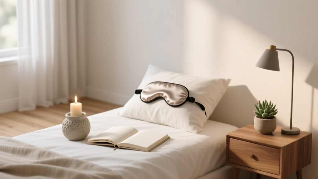 Best Bedroom Wind Down Ritual Items - The Decor Mag
 Best Bedroom Handbag Storage Solutions - The Decor Mag
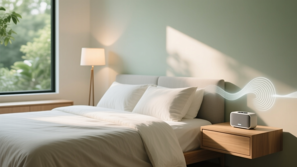 Best Bedroom Sleep Sound Playlist - The Decor Mag
 The Best Bedding Sets for Every Season - The Decor Mag
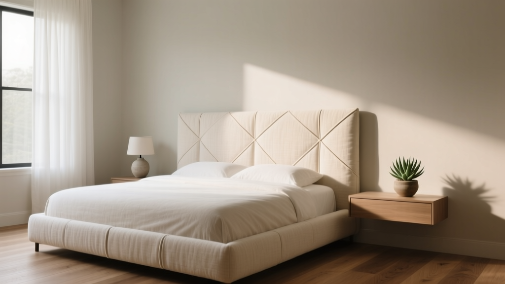 Bedroom Fabric Wrapped Headboard Ideas - The Decor Mag
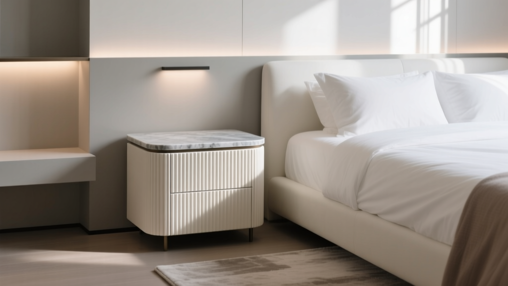 Bedroom Fluted Nightstand with Stone Top - The Decor Mag
 Bedroom Plaster Wall Treatment Ideas - The Decor Mag