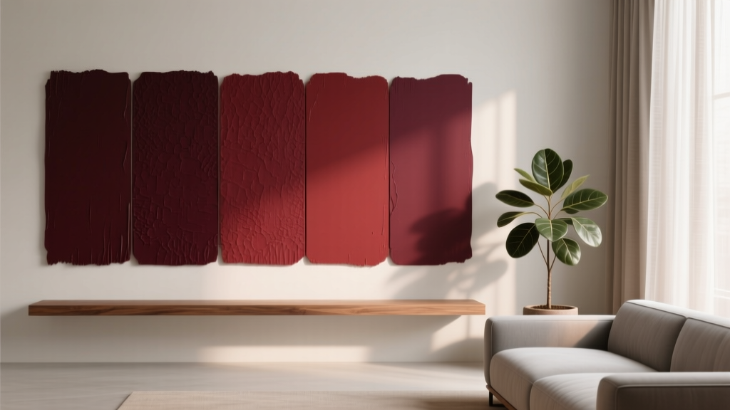
Best Oxblood Paint Colors - The Decor Mag
Oxblood is one of those rare paint colors that feels both classic and current. It’s deeper than burgundy, richer than maroon, and less purple than wine—an earthy red with brown (and sometimes a whisper of black) that reads as grounded, luxe, and architectural. Used well, oxblood paint brings instant depth and mood without the harshness that some near-black shades can create.
This color topic matters because oxblood can behave dramatically differently depending on light, finishes, and surrounding materials. On a north-facing wall it may lean more brown and shadowy; in warm afternoon sun it can glow with a refined red warmth. Understanding those shifts—plus how to pair oxblood with neutrals, woods, and metals—lets homeowners get the “tailored, magazine-worthy” look without ending up with a room that feels heavy or dated.
If you’re searching for the best oxblood paint colors, you’ll find options across brands that range from true dried-blood red to dark brick, to nearly-black garnet. The key is choosing the undertone that fits your home’s lighting and your existing finishes, then applying it with intention.
What Is Oxblood? Color Psychology and Design Impact
Oxblood sits in the deep red family, often with brown or black undertones. In interior color design, it’s considered a “high-impact, low-glare” shade: it creates a strong focal presence but can still feel soft and enveloping when used in the right finish.
Why oxblood works so well in interiors
- Psychology: Deep reds are associated with warmth, confidence, and comfort. Oxblood adds a stabilizing earthiness that can feel sophisticated rather than stimulating.
- Depth and contrast: It creates instant contrast against light walls, white trim, or pale upholstery, helping architectural details stand out.
- Material-friendly: It pairs beautifully with natural woods, aged brass, blackened steel, marble, and leather—making it ideal for modern, traditional, and vintage-inspired rooms.
How to Choose the Best Oxblood Paint Color for Your Space
Not every “oxblood” swatch reads the same once it’s on your wall. Before selecting a specific color, dial in these variables.
1) Identify the undertone: brown, purple, or black
- Brown-leaning oxblood feels earthy, heritage-inspired, and forgiving in low light. Great with warm woods and creamy whites.
- Purple-leaning oxblood reads more like wine or berry; it can feel more formal and dramatic. Best with cooler whites, polished nickel, and charcoal.
- Black-leaning oxblood is moodier and more modern—almost a red-black. Excellent for accent walls, doors, and cabinetry.
2) Check your light exposure
- North-facing rooms: Oxblood can go browner or slightly muted. Choose a shade with a touch more red to keep it from looking flat.
- South-facing rooms: Warm light can make oxblood glow. Consider a slightly deeper, more grounded oxblood to avoid a “too red” result.
- East/west light: Expect big shifts—cooler mornings, warmer evenings. Sampling is non-negotiable here.
3) Decide how much drama you want
For a full-room color drench (walls + trim), choose an oxblood with a softer, browner base. For a statement moment (built-ins, a front door, a powder room), a deeper, blacker oxblood can look stunning and intentional.
Best Oxblood Paint Colors (Designer-Approved Picks)
These are standout oxblood and oxblood-adjacent paint colors that consistently perform well in real homes. Always test with large samples, since deep reds can shift with lighting and sheen.
Benjamin Moore oxblood paint colors
- Benjamin Moore Dinner Party (AF-300): A rich, velvety red with depth that reads refined rather than bright. Works beautifully in dining rooms, libraries, and bedrooms with warm lighting.
- Benjamin Moore Rum Raisin (CC-72): A deep, brown-leaning burgundy that lands firmly in oxblood territory. Excellent for cozy living rooms and studies; pairs especially well with camel leather and walnut.
- Benjamin Moore Moroccan Red (1309): Warmer and more saturated—great if you want oxblood energy without going too dark. Ideal for entryways, powder rooms, and statement furniture pieces.
Sherwin-Williams oxblood paint colors
- Sherwin-Williams Cordovan (SW 6233): A classic deep red-brown. This is a go-to for oxblood cabinetry, built-ins, and accent walls; it reads sophisticated and traditional.
- Sherwin-Williams Burgundy (SW 6300): A fuller red with a slightly brighter presence than Cordovan. Beautiful in dining rooms or as an accent color with warm brass and creamy whites.
- Sherwin-Williams Merlot (SW 2704): Deep wine with a plush feel. Use when you want a moody, romantic red that still feels inviting.
Farrow & Ball (heritage oxblood options)
- Farrow & Ball Preference Red (No. 297): A deep, grown-up red that feels historic and tailored. Stunning on paneling, built-ins, and dining room walls, especially in lower sheen finishes.
- Farrow & Ball Eating Room Red (No. 43): Warm, earthy, and classic—perfect for rooms where you want a traditional, enveloping atmosphere.
Behr oxblood paint colors
- Behr Oxblood (varies by collection/retailer): Behr often offers a shade explicitly named “Oxblood.” It typically reads as a deep red-brown suitable for accent walls and doors. Confirm the exact code at your retailer and sample it in your room’s lighting.
- Behr Cordovan Brown (varies): A brown-red option that can lean oxblood in dimmer rooms—excellent for cozy dens and fireplaces.
Real Room Examples: Where Oxblood Looks Best
1) Dining room: elevate intimacy and glow
Oxblood is a natural fit for dining rooms because it creates warmth, flatters candlelight, and makes gatherings feel special.
- Try: Benjamin Moore Dinner Party or Farrow & Ball Preference Red
- Pair with: warm white trim, walnut dining table, brass or bronze lighting
- Pro tip: Use a matte or eggshell on walls to reduce glare and keep the color velvety.
2) Library or home office: tailored and focused
Deep reds support a grounded, focused mood—great for workspaces and reading rooms, especially when layered with wood tones and textured textiles.
- Try: Sherwin-Williams Cordovan or Benjamin Moore Rum Raisin
- Pair with: built-in shelving, warm woods, camel leather, black accents
- Pro tip: Consider painting the ceiling a slightly lighter warm neutral to prevent the room from feeling too heavy.
3) Bedroom: moody, cocooning luxury
Oxblood can be surprisingly restful when balanced with soft neutrals and warm lighting. It reads as romantic and secure rather than energetic.
- Try: Sherwin-Williams Merlot for a softer wine effect, or a brown-leaning oxblood for calm
- Pair with: creamy bedding, taupe curtains, natural oak nightstands
- Pro tip: Use oxblood on the headboard wall only if you’re cautious; it still delivers impact.
4) Kitchen cabinetry or island: a designer statement
Oxblood on cabinetry looks custom and high-end, especially when paired with stone and warm metals.
- Try: Sherwin-Williams Cordovan on the island or lower cabinets
- Pair with: off-white uppers, aged brass hardware, warm white walls, honed marble or quartz
- Pro tip: Choose a durable cabinet enamel and a satin finish for cleanability.
5) Front door: curb appeal with confidence
An oxblood front door reads welcoming and sophisticated—less expected than navy, softer than black, and richer than classic red.
- Try: a black-leaning oxblood for modern homes, or a warmer oxblood for traditional exteriors
- Pair with: crisp white trim, black lantern lights, brass house numbers
- Pro tip: Use exterior-rated paint and consider a semi-gloss for durability and easy cleaning.
Color Schemes That Make Oxblood Look Expensive
Oxblood shines when it’s part of a deliberate color palette. These combinations are reliable for interior color design and work across many styles.
Oxblood + warm white + aged brass
- Vibe: timeless, inviting, slightly vintage
- Best for: dining rooms, hallways, traditional living rooms
Oxblood + greige + black accents
- Vibe: modern and grounded
- Best for: offices, media rooms, contemporary spaces
Oxblood + blush/rose + natural oak
- Vibe: soft, romantic, elevated
- Best for: bedrooms, dressing rooms, powder rooms
Oxblood + deep green + antique gold
- Vibe: jewel-box richness
- Best for: libraries, formal dining rooms, entryways
Application Guidance: Sampling, Sheen, and Placement
Sample like a pro
- Paint two large swatches (at least 12" x 12") on different walls.
- Observe morning, afternoon, and evening—deep reds are notorious for shifting.
- Check the color next to your fixed finishes: flooring, countertops, upholstery, and trim.
Choose the right sheen
- Walls: Matte or eggshell for a plush, sophisticated look.
- Trim/doors: Satin or semi-gloss to highlight architectural lines and improve durability.
- Cabinetry: Satin is often the sweet spot—wipeable but not overly shiny.
Where oxblood is easiest to live with
- Accent wall behind a bed or sofa to create a focal point without darkening the entire room.
- Built-ins or lower cabinetry to anchor a space and hide scuffs.
- Powder room walls for a dramatic, boutique-hotel effect with minimal commitment.
Common Oxblood Color Mistakes (and How to Avoid Them)
- Skipping samples and trusting the screen: Oxblood shades vary wildly online. Always sample in your lighting.
- Ignoring undertones in nearby materials: Red-browns can clash with cool gray floors or blue-white marble. If your finishes are cool, pick an oxblood with a slightly cooler, wine-like base.
- Using high gloss on large walls: Shine can emphasize wall imperfections and make deep red look harsh. Keep gloss to trim, doors, and cabinetry.
- Forgetting balance: Too much oxblood without contrast can feel heavy. Add light elements (warm whites, soft textiles) and reflective accents (brass, mirrors).
- Choosing overly bright “burgundy” when you want oxblood: If the swatch looks cherry-leaning, it may read more festive than refined. Look for browner, smokier depth.
FAQ: Oxblood Paint Colors
Is oxblood the same as burgundy or maroon?
They’re related but not identical. Burgundy often leans more purple (wine-like), maroon can skew more red, and oxblood typically has a browner or slightly blackened base that feels earthier and more subdued.
What trim color looks best with oxblood walls?
Warm whites and creamy off-whites are the most flattering with oxblood. Crisp, blue-white trim can work, but it may sharpen the contrast and make oxblood look browner by comparison.
Can oxblood work in small rooms?
Yes—especially in powder rooms, small offices, and cozy dens. Use warm lighting, a lower sheen (matte/eggshell), and lighter accents to keep it intentional rather than cave-like.
What colors go with oxblood for a whole-home palette?
Strong companions include warm white, greige, taupe, deep green, charcoal, and soft blush. For metals, aged brass and blackened steel are especially reliable.
Does oxblood look better in warm or cool lighting?
It tends to look richer in warm lighting, but it can still be beautiful in cooler light if you choose an oxblood with enough red (not too brown) and balance it with warm textiles and wood tones.
Is oxblood a good exterior paint color?
It can be excellent for front doors, shutters, or even siding on classic architecture. Stick to exterior-rated products, and sample in full sun and shade—deep reds can deepen dramatically outdoors.
Next Steps: How to Bring Oxblood Into Your Home
Start by choosing your “role” for oxblood: a statement door, a cozy accent wall, or a full-room moment like a dining room or library. Then sample two to three candidates (for example, a brown-leaning option like Sherwin-Williams Cordovan, a richer red like Benjamin Moore Dinner Party, and a heritage-inspired shade like Farrow & Ball Preference Red). Observe them over a full day, and build a supporting color scheme with warm whites, natural woods, and brass or black accents for contrast.
For more paint color ideas, curated color schemes, and room-by-room guidance, explore the color guides at thedecormag.com.
More Articles
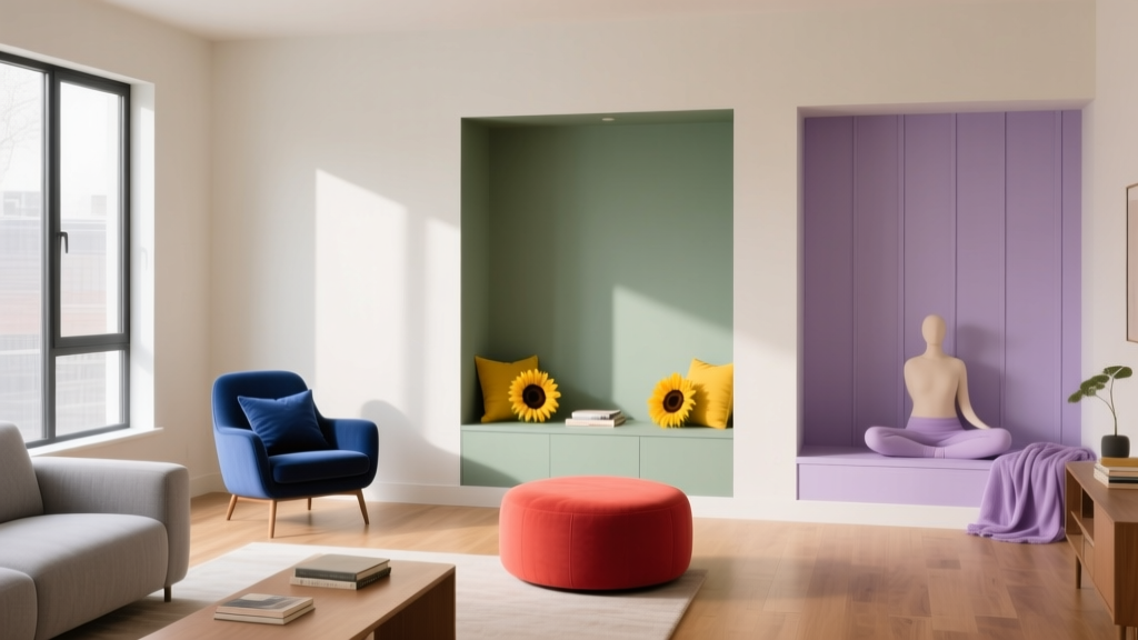 Color Psychology in Living Rooms: Mood & Function (2026)
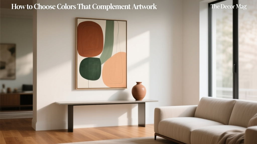 How to Choose Colors That Complement Artwork - The Decor Mag
 How to Choose Colors for a Terrace - The Decor Mag
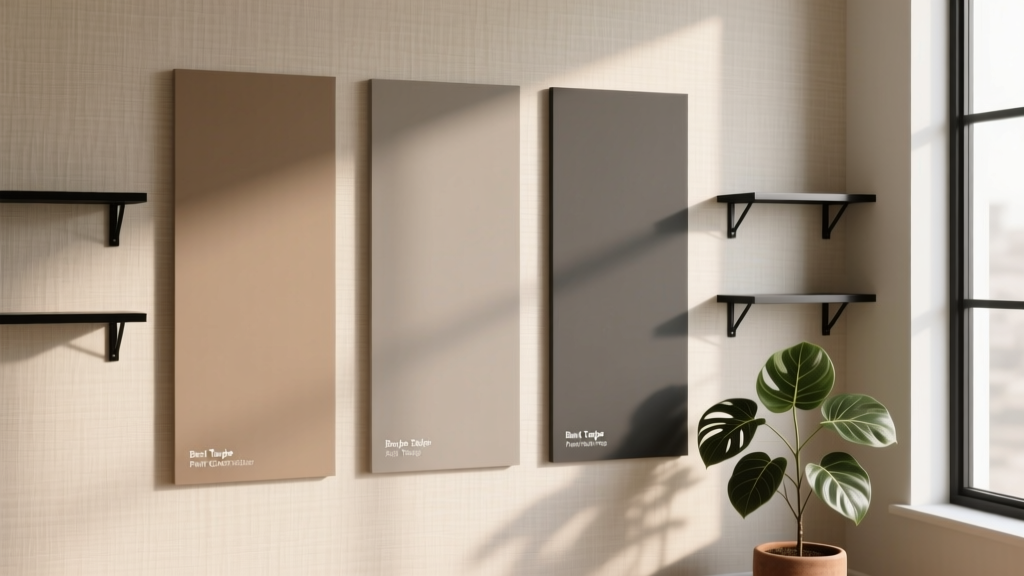 Best Taupe Paint Colors Compared - The Decor Mag
 Jewel Tone Color Scheme Ideas - The Decor Mag
 Best Mint Green Paint Colors - The Decor Mag
 Best Champagne Paint Colors - The Decor Mag
 Trends vs Island: How Color Forecasting and Brand Identity Diverge in Commercial Design
 How To Organize Island: A Practical, Space-Smart Guide for Kitchens of All Sizes
 How to Use Color to Change Room Perception - The Decor Mag