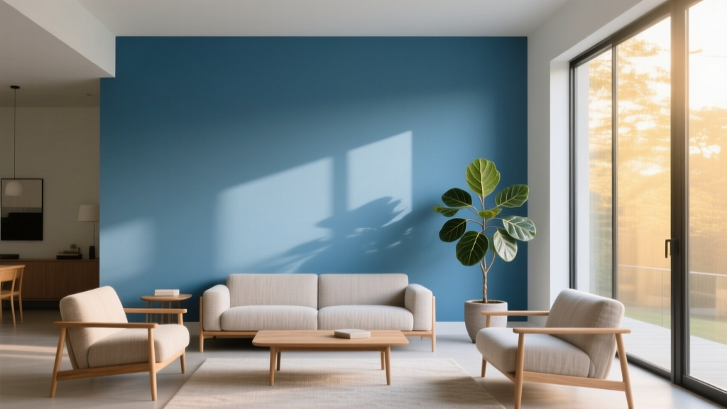
Best Azure Blue Paint Colors - The Decor Mag
Azure blue sits in that sweet spot between crisp sky blue and ocean-inspired teal—fresh, optimistic, and surprisingly versatile. When homeowners ask for a “blue that feels happy, not heavy,” or a “clean color that still has personality,” azure is often the answer. It brings clarity to a room the way natural light does, and it can read coastal, modern, classic, or playful depending on the undertones you choose and what you pair it with.
This topic matters because blue paint colors are among the most sensitive to lighting and surrounding finishes. An azure blue that looks perfect on a paint chip can swing greener next to warm wood or feel icy under cool LEDs. Understanding the best azure blue paint colors—and how to use them—helps you avoid expensive repaints and get a color scheme that feels intentional, balanced, and livable.
Below, you’ll find designer-approved azure blue paint color recommendations across major brands, plus real room scenarios, color combinations, and the most common mistakes people make when choosing and styling azure blues.
What “Azure Blue” Means in Interior Design
Azure blue is typically a medium-to-light blue that leans slightly toward cyan (a touch of green) without tipping fully into teal. It’s more saturated than a pale powder blue and cleaner than a gray-blue. In a home, azure reads:
- Airy and energizing (great for kitchens, bathrooms, and sunlit rooms)
- Clean and modern (especially with crisp whites and matte black accents)
- Coastal and relaxed (paired with sand tones, rattan, and warm whites)
- Playful and creative (excellent for kids’ rooms, offices, and accent walls)
Color Psychology: Why Azure Feels Good
Blue is associated with trust, calm, and mental clarity—one reason it’s a go-to for bedrooms and workspaces. Azure adds a brighter, more optimistic edge than navy or slate. It tends to:
- Support focus in an office without feeling somber
- Make bathrooms feel fresh and “water-clean”
- Enhance perceived daylight in moderately lit rooms
How to Choose the Right Azure Blue (Undertones + Lighting)
Know Your Undertone: Green-Leaning vs. Violet-Leaning Azure
Undertones determine whether your azure blue reads like the Caribbean or like a bright spring sky.
- Green-leaning azures: Feel coastal and slightly tropical; pair beautifully with warm woods and creamy whites.
- Violet-leaning azures: Feel cooler and slightly more refined; pair well with crisp whites, grays, and polished nickel.
Lighting Makes or Breaks Blue Paint Colors
Azure blues are especially reactive. Use these guidelines before committing:
- North-facing rooms: Light is cooler; azure can feel icier. Consider a slightly warmer azure or pair with warm whites and wood.
- South-facing rooms: Light is warmer and stronger; azure looks vibrant and cheerful—often ideal.
- East-facing rooms: Morning is bright; afternoons go cooler. Test at multiple times of day.
- West-facing rooms: Afternoon sun warms the color; some azures can shift greener or more intense.
Practical Testing Tips
- Paint a large sample (at least 2’ x 2’) on two different walls.
- View it next to permanent finishes: tile, countertops, flooring, upholstery.
- Check it under your actual bulbs at night (2700K warm vs. 3000K neutral vs. 4000K cool).
- Compare it to your trim white—blue can make whites look yellow or gray.
Best Azure Blue Paint Colors (Designer-Favorite Picks)
These azure blue paint colors are widely used, well-reviewed, and reliable in real homes. Availability varies by region; when in doubt, color-match at your local paint supplier.
Benjamin Moore Azure Blues
- Benjamin Moore Caribbean Blue (2055-30)
A vivid, tropical azure that reads joyful and bold. Best for accent walls, front doors, mudrooms, and creative spaces. - Benjamin Moore Bahama Blue (2061-40)
A saturated azure with a beachy personality—great for bathrooms and laundry rooms where you want energy and freshness. - Benjamin Moore Yarmouth Blue (HC-150)
A softer, historic-leaning blue that can feel “azure-adjacent” in many rooms. A strong choice if you want an azure effect that’s slightly calmer and more classic.
Sherwin-Williams Azure Blues
- Sherwin-Williams Bluebird Feather (SW 9062)
A bright, clean blue that stays airy rather than heavy. Beautiful in sunrooms and kitchens, especially with white cabinetry. - Sherwin-Williams Take Five (SW 6513)
A playful, energetic blue that leans youthful. Ideal for offices, kids’ rooms, and accent furniture. - Sherwin-Williams Atmospheric (SW 6505)
A slightly softened azure-blue that’s more livable for full-room coverage. Great for bedrooms when paired with warm neutrals.
Farrow & Ball Azure-Inspired Blues
- Farrow & Ball Lulworth Blue (No. 89)
A clean, coastal blue that feels timeless rather than trendy. Works beautifully with chalky whites and natural textures. - Farrow & Ball Blue Ground (No. 210)
A brighter, clearer blue with a sunny personality. Excellent for smaller rooms you want to feel open and upbeat.
Behr Azure Blues
- Behr Blueprint (S470-5)
A balanced medium blue that reads modern and composed. Great for accent walls, built-ins, and contemporary dining rooms. - Behr Adriatic Sea (570B-6)
A deeper, more dramatic ocean-blue with azure energy. Use it for powder rooms, doors, or a statement ceiling.
Where Azure Blue Works Best: Real Room Scenarios
1) Kitchens: Azure as a Clean, Cheerful Color Story
Azure blue can make a kitchen feel brighter and more inviting—especially when used on cabinets or an island.
- Best approach: Azure island + white perimeter cabinets for a timeless contrast.
- Try this scheme: Azure cabinets, warm white walls, unlacquered brass pulls, and white quartz with subtle veining.
- Real-life look: A small kitchen with limited daylight can feel larger with a medium azure on lower cabinets and reflective backsplash tile.
2) Bathrooms: The “Water-Clean” Effect
Azure blue is a natural fit for bathrooms because it reinforces a spa-like, hygienic feel without becoming cold when balanced properly.
- Best approach: Use azure on walls with warm white trim, then repeat warmth with wood or brass.
- Tile pairing: White subway tile, creamy zellige, or marble-look porcelain.
- Real-life look: A powder room with a vivid azure (like Caribbean Blue) and a white pedestal sink feels bold yet classic when grounded with black-and-white floor tile.
3) Bedrooms: Calming Without Feeling Sleepy
Azure is less moody than navy and less babyish than pale blue—ideal if you want calm plus a bit of brightness.
- Best approach: Azure feature wall behind the bed; keep remaining walls warm white or a soft greige.
- Textiles: Layer white bedding with sand, camel, and oatmeal throws for warmth.
- Real-life look: In a south-facing bedroom, a softened azure (like Atmospheric) reads serene all day and glows at golden hour.
4) Living Rooms: Azure as a Statement, Not a Theme
Many living rooms do best with azure as an accent rather than full saturation—unless the space has ample light and neutral furnishings.
- Best approach: Azure on built-ins, a fireplace surround, or a single wall with art lighting.
- Real-life look: A neutral living room (warm white walls, oak floors, linen sofa) gains personality with an azure-painted bookcase and a few repeated blue notes in pillows or art.
5) Front Doors and Exteriors: High-Impact Azure
Azure blue makes an exterior feel welcoming and confident. It’s a color that reads from the street without looking overly dark.
- Best approach: Azure front door + crisp white trim + charcoal or black hardware.
- Neighborhood-friendly tip: Choose a slightly muted azure if your home has traditional architecture or strict HOA guidelines.
Best Color Combinations for Azure Blue (Walls, Trim, and Accents)
Trim and White Paint Pairings
Because azure is clean and saturated, your trim color choice sets the whole mood.
- Crisp modern: Bright, clean whites (great with matte black accents)
- Warm coastal: Creamy whites (best with rattan, oak, and brass)
- Soft classic: Slightly muted whites (helps azure feel less “primary”)
Earthy Neutrals That Balance Azure
- Sand, oatmeal, and warm beige
- Terracotta and clay accents for a Mediterranean feel
- Warm woods: white oak, walnut, bamboo, rattan
Bold Pairings for a Designer Edge
- Azure + coral for playful, high-energy spaces (kids’ rooms, creative studios)
- Azure + mustard for a modern retro palette
- Azure + emerald for a layered jewel-tone scheme (use one as the dominant color, the other as accent)
Application Guidance: Sheen, Placement, and Flow
Choose the Right Sheen
- Walls: Matte or eggshell for most living spaces (reduces glare and keeps azure sophisticated)
- Kitchens/Baths: Satin for moisture resistance and easier cleaning
- Trim/Doors: Semi-gloss for crisp contrast and durability
Use Azure Strategically
- Color drenching: Azure on walls + matching trim for a bold, immersive look (best in small rooms like powder rooms)
- Half wall / wainscoting: Azure below, warm white above to keep brightness
- Ceilings: A pale azure ceiling can lift a room, especially in bathrooms and porches
Common Azure Blue Paint Mistakes (and How to Avoid Them)
- Choosing by swatch alone: Azure shifts dramatically with light. Paint a large sample and view it morning, afternoon, and night.
- Ignoring fixed finishes: Blue next to warm tile or honey oak can look greener. Compare samples directly against your floor and counters.
- Pairing with the wrong white: A very warm white can look yellow beside a cool azure; a stark white can make some azures feel harsh. Test trim whites together.
- Overusing the color: Too much azure in one open-plan space can feel theme-y. Create breathing room with warm neutrals and natural materials.
- Forgetting nighttime lighting: Cool LEDs can make azure feel clinical. Use warmer bulbs (often 2700K–3000K) to keep it inviting.
FAQ: Azure Blue Paint Colors
Is azure blue a good wall color for small rooms?
Yes—especially softer or slightly muted azures. In small bathrooms, offices, or nooks, azure can feel expansive and cheerful. If you choose a vivid azure, balance it with warm whites and simple finishes to prevent visual overload.
What undertones should I look for to avoid an overly green or teal look?
If you want a truer sky-leaning azure, avoid options described as “tropical,” “lagoon,” or “aqua,” which often signal green undertones. Test next to your tile and flooring; warm woods can push azure greener.
What colors go best with azure blue in a whole-home palette?
Azure pairs well with warm whites, sandy beiges, light greiges, and natural wood tones. For accents, consider navy (depth), terracotta (warmth), or soft blush (contrast without harshness).
Should I use azure blue on cabinets or walls?
Both can work. For a safer commitment, use azure on an island, lower cabinets, or built-ins. For maximum impact, use it on walls in a bathroom, laundry room, or bedroom with a warm neutral balance.
What sheen is best for azure blue walls?
Eggshell is the go-to for most rooms because it’s cleanable and forgiving. Choose satin in bathrooms and kitchens for durability, and matte if you want the most velvety, high-end look (as long as you’re comfortable with slightly less washability).
Next Steps: Make Azure Blue Look Intentional
Start by identifying the room’s exposure (north, south, east, west), then choose an azure blue with the right undertone for your finishes. Test two to three contenders on large samples, and decide whether azure will be a main wall color, a cabinet color, or an accent. Finish your plan with a supporting cast: a trim white that flatters the blue, warm neutrals to balance it, and one or two accent metals or woods to tie the palette together.
Want more help building a cohesive interior color scheme? Explore more paint color guides, color combinations, and room-by-room design advice on thedecormag.com.
More Articles
 Best Melon Paint Colors - The Decor Mag
 Color Psychology in Living Rooms: Mood & Function (2026)
 Best Banana Paint Colors - The Decor Mag
 How To Match Aging With Space: Designing Environments That Support Lifelong Well-Being
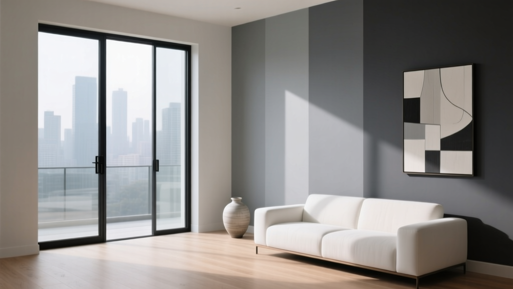 Best Gray Paint Colors for 2026 - The Decor Mag
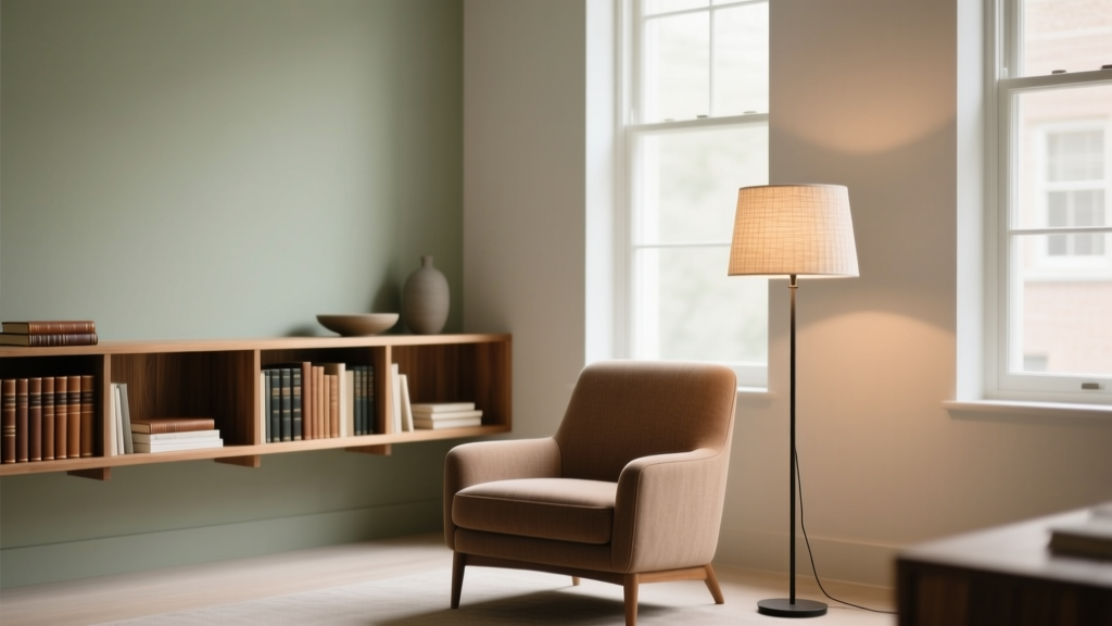 How to Choose Colors for a Reading Room - The Decor Mag
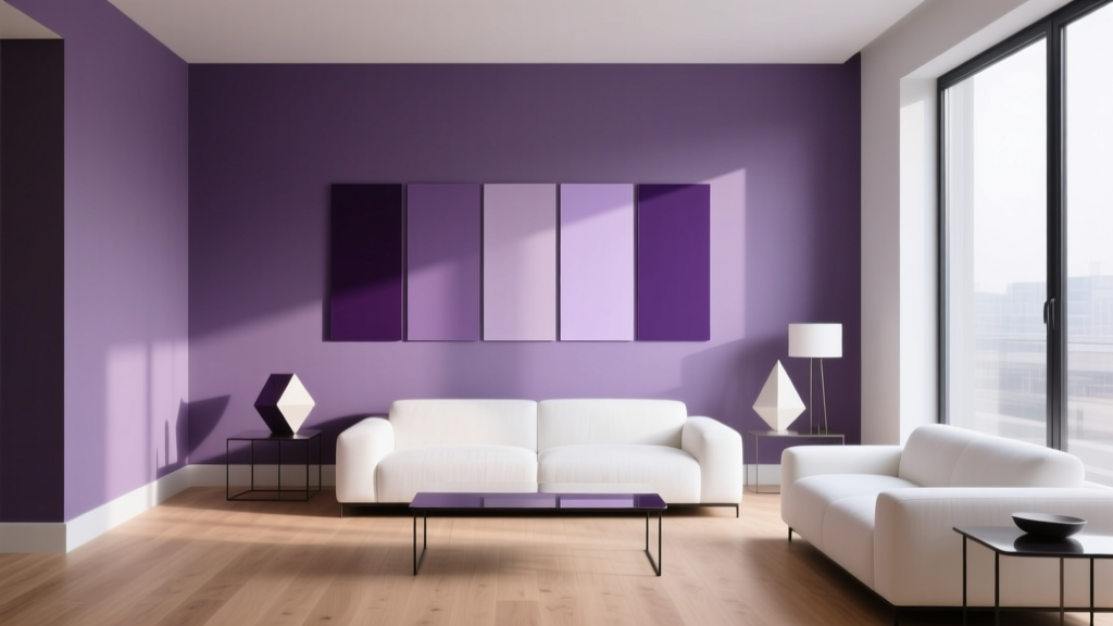 Best Purple Paint Colors for Sophistication - The Decor Mag
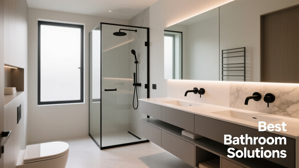 Best Bathroom Floor Solutions: Performance, Safety, and Style Compared
 Best Fire Engine Red Paint Colors - The Decor Mag
 How to Choose Colors for a Gym - The Decor Mag