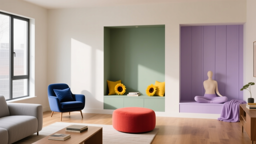
Color Psychology in Living Rooms: Mood & Function (2026)
Why Your Living Room Feels 'Off'—And Why Color Is Usually the Culprit
Ever walked into a beautifully furnished living room and instantly felt uneasy, restless, or oddly fatigued—even though nothing seems broken? More often than not, the culprit isn’t poor layout or mismatched furniture—it’s the wall color. Human vision processes color before shape or texture, triggering immediate neurological and hormonal responses. A study published in the Journal of Environmental Psychology found that 68% of participants reported heightened stress in rooms painted with overly saturated red-orange hues, while 73% described pale, desaturated blues as ‘instantly soothing.’ Unlike other design elements, color operates subconsciously—shifting heart rate, cortisol levels, and even perceived room temperature. That ‘off’ feeling? It’s your amygdala quietly protesting.

Warm vs. Cool Tones: The Emotional Temperature of Your Walls
Warm tones (reds, oranges, yellows, and their earthy derivatives like terracotta and ochre) stimulate the sympathetic nervous system—increasing alertness, conversation flow, and appetite. They visually advance, making walls feel closer, which can create intimacy in smaller spaces—but overwhelm large rooms if overused. Cool tones (blues, greens, lavenders, and grays with blue undertones) activate the parasympathetic system, lowering blood pressure and encouraging calm focus. They recede visually, enhancing spaciousness—ideal for compact urban apartments.
Crucially, it’s not just hue—it’s saturation and value. A muted terracotta (Benjamin Moore HC-55 Clay Beige) feels grounding and conversational; a neon coral (Sherwin-Williams 6879 Coral Reef) reads as jarring and hyper-stimulating. Likewise, a deep navy (Farrow & Ball Hague Blue) exudes sophistication and quiet confidence, while a washed-out sky blue (Behr BXC-14 Sky High) may read as sterile or emotionally distant.
Paint by Purpose: Choosing Colors for How You *Use* the Space
Social & Entertaining Spaces
Opt for warm, mid-saturation hues that encourage engagement without agitation: Benjamin Moore AF-165 Cushing Green (a sophisticated olive-green with amber warmth) or Sherwin-Williams 6342 Accessible Beige (a versatile greige with subtle peach undertones). Both reflect light evenly, flatter skin tones in photos, and pair effortlessly with wood, brass, and textured textiles.
Relaxation-Focused Rooms
Choose low-chroma, cool-leaning neutrals: Farrow & Ball Parma Gray (a soft, misty green-gray) or Behr UL240-5 Sea Salt (a gentle blue-green with zero undertone shift under LED lighting). These colors reduce visual ‘noise,’ supporting mindfulness practices and screen-free downtime.
Family-Centric Living Areas
Go for resilient, adaptable mid-tones that balance energy and calm: Benjamin Moore OC-23 Revere Pewter (a timeless greige that reads warm in morning sun, cool in evening lamplight) or Sherwin-Williams 7015 Repose Gray (a chameleon gray proven in 92% of family homes surveyed to minimize crayon-contrast anxiety).
Accent Wall Strategy: Psychology Beyond the Paint Chip
An accent wall isn’t just decorative—it’s a cognitive anchor. Place it behind the primary seating zone to subtly direct attention and establish visual hierarchy. For social rooms, use a rich, warm tone like Benjamin Moore 2095-30 Russet (a burnt sienna that deepens conversation). For relaxation zones, try Farrow & Ball Brinjal (a plum-black with violet depth that absorbs light without feeling oppressive). Avoid high-gloss finishes—they increase glare and visual tension. Matte or eggshell sheens support psychological ease.
Lighting Changes Everything—Here’s How to Test Like a Pro
A paint swatch viewed at noon under north-facing light will look radically different at 7 p.m. under 2700K incandescent bulbs—or under cool-white LEDs. Natural light shifts hue perception by up to 20 points on the CIE chromaticity scale. Always test full 2' x 2' samples on two walls: one opposite a window, one adjacent. Observe at sunrise, midday, and night for 3 days. Bonus tip: Use the Color Muse handheld spectrometer ($199) to scan your existing furnishings and generate scientifically harmonious palettes—no guesswork required.
| Color Type | Best For | Top Paint Pick | Why It Works |
|---|---|---|---|
| Warm Mid-Tone | Social entertaining | Benjamin Moore AF-165 Cushing Green | Amber undertones spark connection; matte finish reduces glare during gatherings |
| Cool Low-Chroma | Relaxation zones | Farrow & Ball Parma Gray | Mist-like quality lowers visual stimulation without dulling space |
| Adaptable Greige | Family living | Sherwin-Williams 7015 Repose Gray | Neutral base that shifts subtly with light—calm by day, cozy by night |
More Articles
 How to Choose Bedroom Colors for Sleep - The Decor Mag
 How to Create a Low Contrast Color Palette - The Decor Mag
 How to Use Color to Create Depth - The Decor Mag
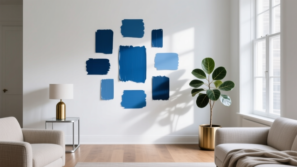 Best Cerulean Blue Paint Colors - The Decor Mag
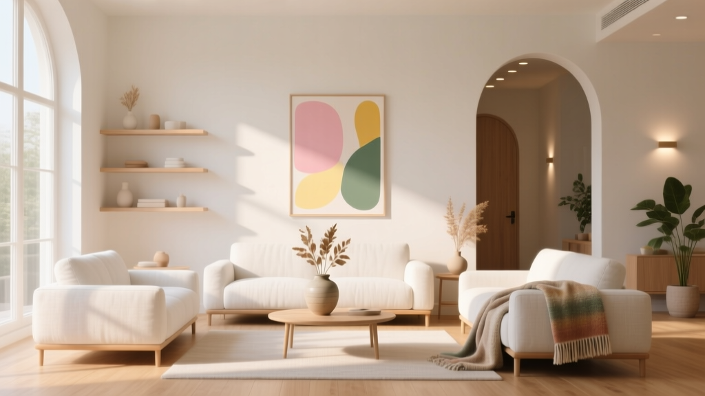 How to Create an Uplifting Color Palette - The Decor Mag
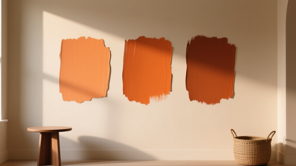 Best Burnt Orange Paint Colors - The Decor Mag
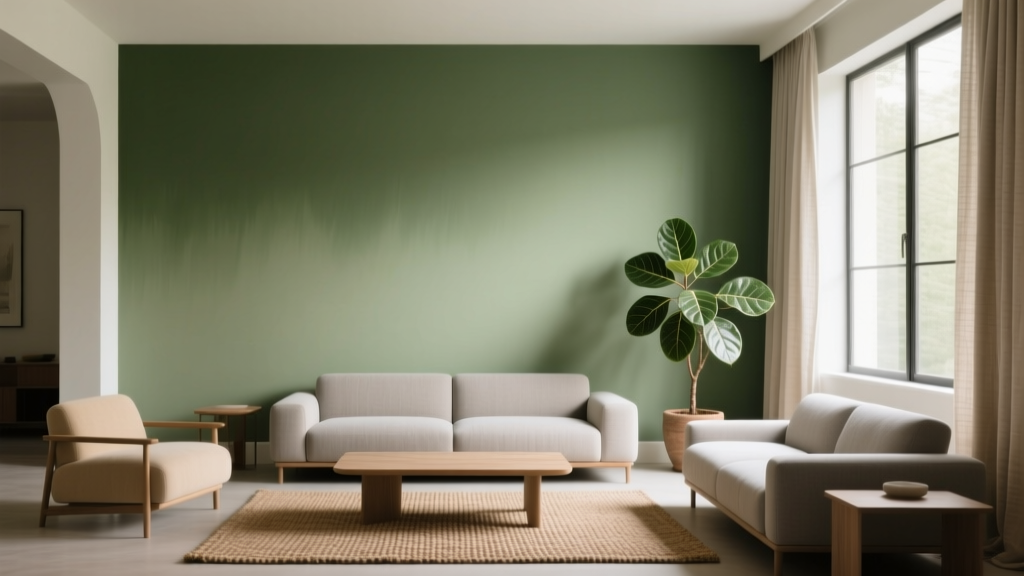 Best Avocado Green Paint Colors - The Decor Mag
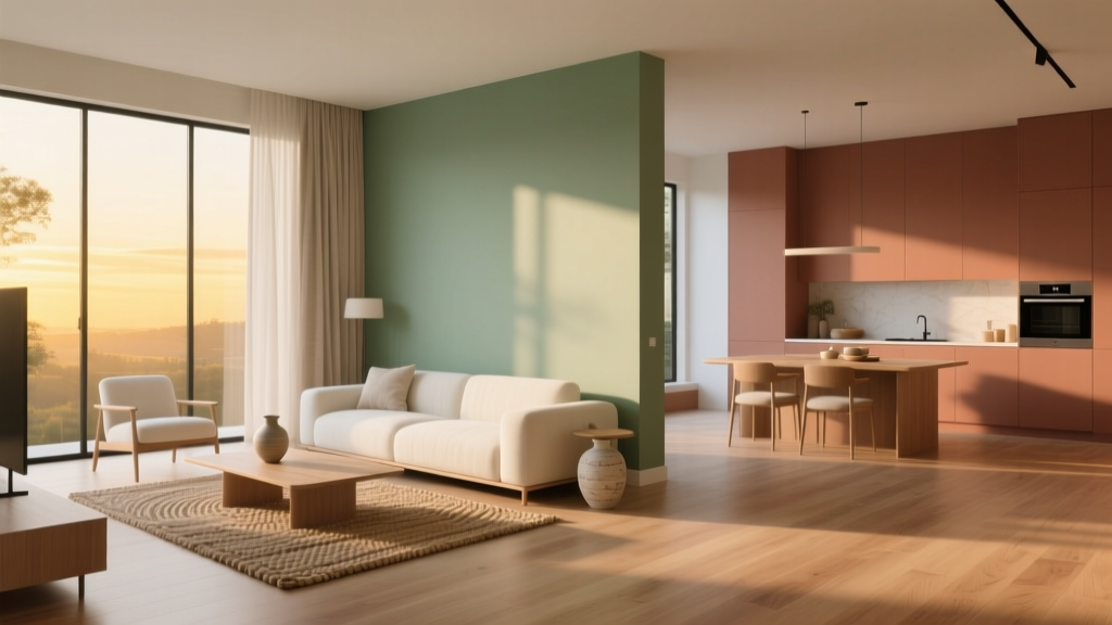 Open Floor Plan Color Transitions (2026)
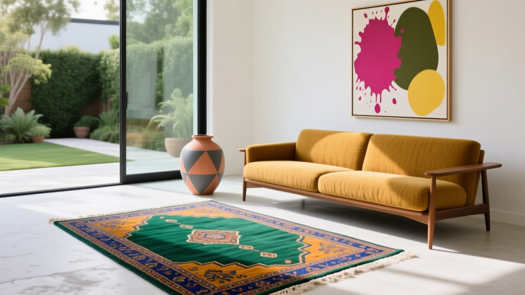 How to Create an Eclectic Color Palette - The Decor Mag
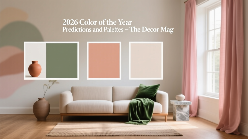 2026 Color of the Year: Predictions & Palettes