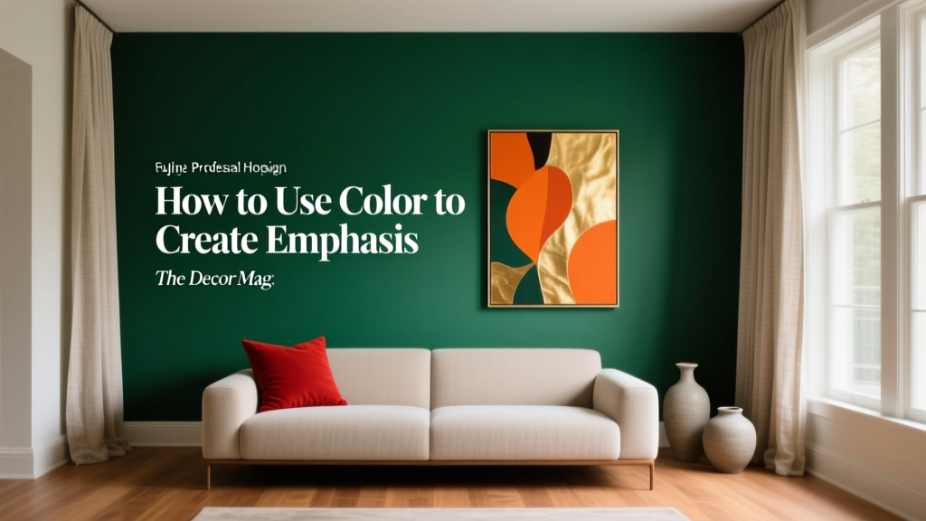
How to Use Color to Create Emphasis - The Decor Mag
Color does more than “look pretty.” In interior color design, it’s one of the fastest, most reliable tools for directing attention—toward the architectural features you love, the art you’ve collected, or the focal point a room is missing. When emphasis is done well, a space feels intentional: your eye knows where to land, and everything else supports that visual story.
Homeowners often struggle with emphasis because modern rooms tend to be open-plan, multi-purpose, and visually busy. Without a clear focal point, spaces can feel flat or scattered—even if every item is beautiful on its own. The good news: you don’t need a full remodel. A smart paint color choice, a high-contrast pairing, or a targeted application (like a ceiling wash or built-in highlight) can dramatically change how a room reads.
This guide breaks down how to use paint colors and color schemes to create emphasis with confidence—using approachable color theory, color psychology, and practical room examples you can apply this weekend.
What “Emphasis” Means in Color Theory
Emphasis is a design principle that creates a hierarchy: one element becomes the star, and the rest becomes supporting cast. In color psychology, emphasis is also emotional—warm, saturated hues can energize, while deep cool shades can create drama and focus.
Three levers that create emphasis
- Contrast (light vs. dark, warm vs. cool, saturated vs. muted)
- Placement (where the color appears and how much of it you see)
- Context (surrounding colors, materials, and lighting conditions)
When you choose an accent paint color, you’re not just choosing a hue—you’re deciding what deserves attention.
Choose the Right Focal Point Before You Choose the Color
Paint is most effective when it supports something purposeful. Start by identifying what should be emphasized in the room:
- A fireplace surround or mantel wall
- Architectural trim, beams, or ceiling details
- Built-ins, cabinetry, or a reading nook
- A statement headboard wall in a bedroom
- Artwork, a gallery wall, or a sculptural light fixture
- A view (use color to frame windows and draw the eye outward)
Quick test: where do your eyes go first?
Stand at the entry of the room and take a photo with your phone. Where does your eye land? If the answer is “everywhere,” you likely need more contrast and a clearer color hierarchy.
Use Contrast to Create Emphasis (Without Making the Room Feel Chaotic)
Contrast is the most direct way to create emphasis with paint colors. The key is controlling it so the room feels composed.
1) Light vs. dark contrast
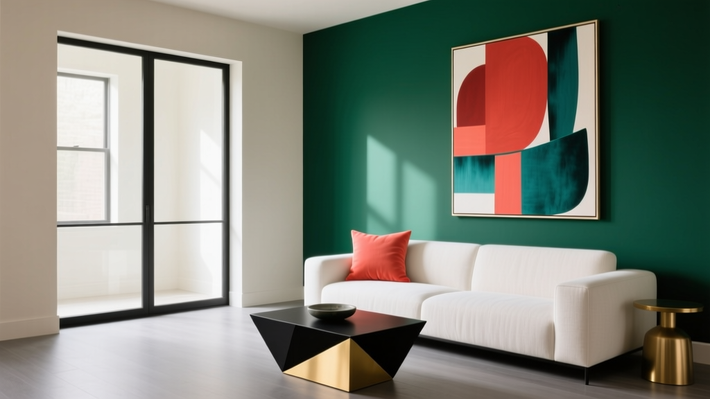
A darker feature against lighter walls instantly reads as a focal point. This works especially well in open-plan spaces where you want to define zones.
Paint color ideas:
- Sherwin-Williams Iron Ore (SW 7069) for modern drama on an accent wall or built-ins
- Benjamin Moore Hale Navy (HC-154) for a classic, tailored emphasis
- Farrow & Ball Railings (No. 31) for a deep blue-black that feels refined
Pair with: warm whites (for balance) such as Benjamin Moore White Dove (OC-17) or Sherwin-Williams Alabaster (SW 7008).
2) Warm vs. cool contrast
Warm hues (reds, terracottas, ochres) advance visually; cool hues (blues, blue-greens) recede. Use this to pull a focal point forward or push surrounding elements back.
- To make a fireplace wall feel closer and cozier: try Benjamin Moore Caliente (AF-290) or Sherwin-Williams Cavern Clay (SW 7701).
- To make a small room feel deeper while spotlighting decor: use a cool, inky wall like Benjamin Moore Gentleman’s Gray (2062-20).
3) Saturation contrast (bright vs. muted)
You don’t always need dark paint for emphasis. A saturated color used sparingly against muted neutrals can feel crisp and modern.
Example pairings:
- Sherwin-Williams Quietude (SW 6212) walls + a pop of SW Emerald Green (SW 2937) on a bar cabinet
- Benjamin Moore Classic Gray (OC-23) walls + a bold door in BM Blue Nova (825)
Scale and Placement: Where to Put Color for Maximum Impact
Emphasis depends on how much color you use and where you put it. These applications create strong focal points while keeping the overall color scheme cohesive.
Accent wall (the right way)
An accent wall works when it highlights an existing feature or anchors furniture. It’s less successful when it’s random.
- Best walls to accent: fireplace wall, headboard wall, wall behind a sofa, dining room built-in wall
- Avoid: accenting a wall with multiple doors, vents, or asymmetrical interruptions
Pro tip: In long rooms, paint the short end wall a deeper color to visually “pull it closer” and improve proportions.
Trim, doors, and architectural emphasis
Painting trim is a designer move that adds structure without adding clutter. It’s also an easy way to bring a color scheme through the house.
Try these emphasis strategies:
- Dark doors + light walls: SW Tricorn Black (SW 6258) doors with SW Alabaster walls
- Color-drenched trim (trim same color as walls in a different sheen): great for modern, quiet emphasis
- Highlight molding: use a slightly deeper tone than the wall for subtle contrast
Ceiling color for unexpected focus
A colored ceiling can be a focal point that feels custom—especially in dining rooms, powder rooms, and bedrooms.
- Soft, airy emphasis: Benjamin Moore Palladian Blue (HC-144) ceiling with warm white walls
- Moody emphasis: Farrow & Ball Hague Blue (No. 30) ceiling in a cozy library or den
Lighting note: North-facing rooms can make blues look cooler; warm up with creamy whites and brass accents.
Built-ins and cabinetry as a color anchor
Painted built-ins create emphasis without disrupting wall space. They also add “weight” and help open layouts feel organized.
Reliable cabinet colors:
- Benjamin Moore Essex Green (HC-188) for classic depth (stunning with oak and brass)
- Sherwin-Williams Pewter Green (SW 6208) for a softer, heritage feel
- Benjamin Moore Kendall Charcoal (HC-166) for a grounded neutral that still reads as a feature
Real Room Examples: Emphasis You Can Copy
Living room: Fireplace wall that feels intentional
Scenario: White walls, standard fireplace, room feels bland.
Solution: Paint the fireplace wall and built-ins (if present) a deep neutral to create a focal point.
- Walls: Benjamin Moore White Dove (OC-17)
- Fireplace wall: Sherwin-Williams Iron Ore (SW 7069)
- Supporting accents: walnut coffee table, textured linen drapes, warm metal (brass or aged bronze)
Why it works: High light-dark contrast creates clear emphasis; warm materials keep the dark paint from feeling heavy.
Bedroom: Calm emphasis behind the bed
Scenario: You want a focal point but don’t want a high-energy color.
Solution: Use a blue-green with medium depth behind the headboard for soothing color psychology and visual anchor.
- Accent wall: Sherwin-Williams Smoky Blue (SW 7604) or SW Quietude (SW 6212)
- Other walls: Sherwin-Williams Alabaster (SW 7008)
- Bedding palette: crisp white + oatmeal + a small black accent (lamp base or frame)
Why it works: Blue-greens are restorative; the single wall creates emphasis without making the room feel smaller.
Kitchen: Island color that defines the room
Scenario: Perimeter cabinets are light; kitchen feels one-note.
Solution: Paint the island a contrasting color to create a strong center point.
- Perimeter cabinets: warm white (e.g., BM White Dove)
- Island: Benjamin Moore Hale Navy (HC-154) or BM Essex Green (HC-188)
- Walls: Benjamin Moore Pale Oak (OC-20)
Why it works: The island becomes the “anchor” in the color scheme, enhancing emphasis and improving flow in open layouts.
Entryway: Front door emphasis that sets the tone
Scenario: Entry feels forgettable; you want curb appeal and a memorable first impression.
- Classic punch: Benjamin Moore Caliente (AF-290)
- Modern, optimistic: Sherwin-Williams Tranquil Aqua (SW 7611)
- Deep and timeless: Farrow & Ball Studio Green (No. 93)
Why it works: A door is a small surface with big visibility—perfect for saturated emphasis without overwhelming the home’s interior palette.
Color Combinations That Create Emphasis (Designer-Approved Pairings)
These combinations balance contrast and cohesion—ideal for homeowners building a reliable interior color design plan.
- Warm white + charcoal: SW Alabaster (SW 7008) + SW Iron Ore (SW 7069)
- Cream + navy: BM White Dove (OC-17) + BM Hale Navy (HC-154)
- Greige + forest green: BM Pale Oak (OC-20) + BM Essex Green (HC-188)
- Soft gray + terracotta: BM Classic Gray (OC-23) + SW Cavern Clay (SW 7701)
- Light taupe + black: BM Edgecomb Gray (HC-173) + SW Tricorn Black (SW 6258)
Practical Tips for Getting Emphasis Right
- Sample in the right location. Put swatches on the focal surface and adjacent surfaces. Emphasis depends on what surrounds it.
- Control sheen. Use lower sheen (matte/eggshell) on walls for depth; use satin/semi-gloss on trim or doors to catch light and increase emphasis.
- Repeat the accent color 2–3 times. A single accent can look accidental. Repeat it in pillows, art, or a rug detail for a cohesive color scheme.
- Use the 60-30-10 rule. 60% dominant (walls), 30% secondary (upholstery/rugs), 10% accent (the emphasized color).
- Mind undertones. Pair warm with warm and cool with cool for a polished look—unless you’re intentionally using undertone contrast for tension.
Common Color Mistakes to Avoid
- Choosing an accent color without a purpose. If the color doesn’t support a focal point, the room can feel disjointed.
- Using too many “emphasis” moments. If everything is bold, nothing is. Limit strong contrasts to one primary focal area per room.
- Ignoring lighting. A navy in a dim room can read nearly black; a warm white in late-day sun can turn yellow. Test morning, afternoon, and night.
- Forgetting the transition spaces. Hallways and sightlines matter. A strong accent in one room should relate to nearby rooms through shared neutrals or repeated tones.
- Overdoing bright colors on large surfaces. Highly saturated hues can feel intense when scaled up. Consider using bold color on a door, niche, or built-in instead.
FAQ: Using Color to Create Emphasis
Should my accent wall be the darkest color in the room?
Often, yes—darkness is an easy route to emphasis. But saturation and warmth can also create a focal point. A bright, saturated teal on a small built-in can draw more attention than a medium-gray wall.
How do I choose an accent color that won’t feel trendy next year?
Anchor the room with timeless neutrals (warm whites, greiges, soft taupes), then choose an accent from classic families like navy, forest green, charcoal, or muted terracotta. Colors like BM Hale Navy and SW Iron Ore stay relevant across styles.
Can I use multiple accent colors in one room?
You can, but keep one color as the primary “emphasis” and use the others as supporting accents. A good approach is one strong accent plus one quieter companion (for example: navy + warm camel).
What’s the best paint finish for an accent wall?
Matte or eggshell is usually best for an accent wall because it looks richer and hides wall texture. If you want extra punch on doors or trim, use satin or semi-gloss for light-reflective emphasis.
How do I create emphasis in a small room without making it feel smaller?
Try emphasizing a single feature (like the vanity wall or headboard wall) in a medium-depth color rather than the darkest shade. Blue-greens like SW Quietude or soft navies like BM Van Deusen Blue (HC-156) can create focus while still feeling breathable.
How do I emphasize artwork with wall color?
Choose a wall color that contrasts with the dominant tones in the art. For bright art, try a deep neutral like BM Kendall Charcoal. For moody art, use a light warm white like BM White Dove and keep frames consistent for a gallery-like effect.
Next Steps: Build Emphasis Into Your Home, One Room at a Time
Pick one room and define a single focal point you want to strengthen. Choose a contrast strategy (light/dark, warm/cool, or saturated/muted), then test two to three paint colors on the exact surface you plan to emphasize. Commit to one strong moment, repeat the color subtly around the room, and let the rest of the palette support it.
If you’re ready to refine your paint colors and color schemes even further, explore more color guides, room palettes, and interior color design tips on thedecormag.com.
More Articles
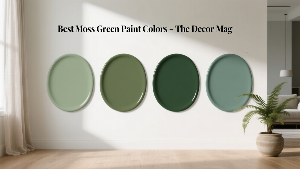 Best Moss Green Paint Colors - The Decor Mag
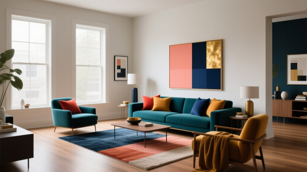 Complementary Color Pairing Ideas - The Decor Mag
 Friendly and Smart Compared: How Human-Centered Design and AI Intelligence Shape Modern Product Experiences
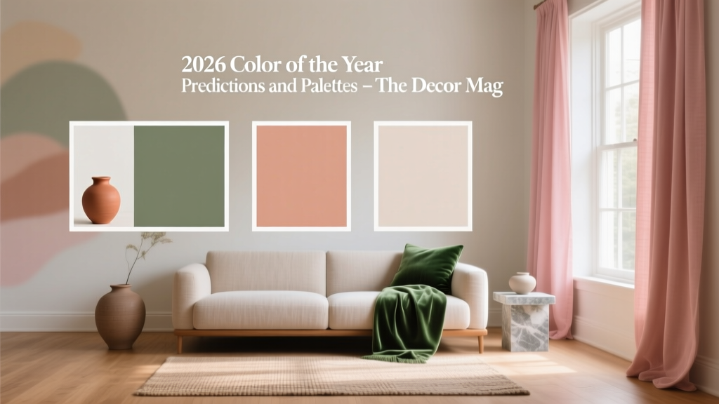 2026 Color of the Year: Predictions & Palettes
 Cheap vs Premium: Why 'Premium' Isn’t Just Marketing—It’s Measurable Performance
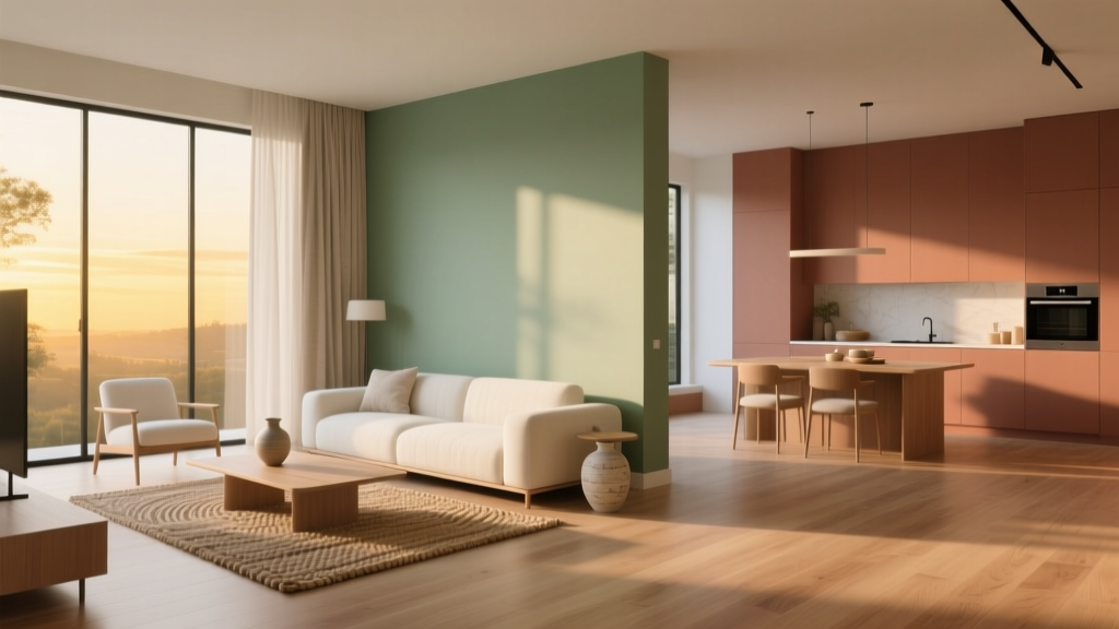 Open Floor Plan Color Transitions (2026)
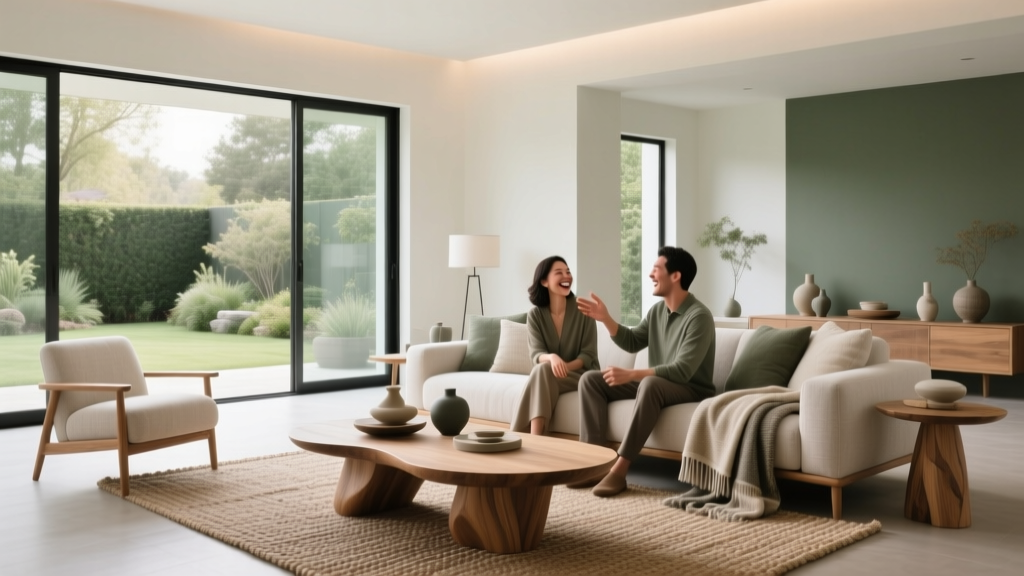 Living Room Colors for Entertaining (2026)
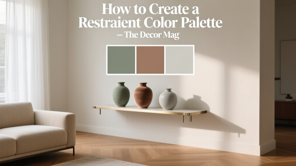 How to Create a Restraint Color Palette - The Decor Mag
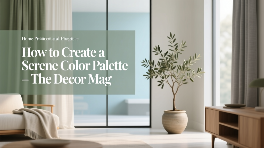 How to Create a Serene Color Palette - The Decor Mag
 How to Use Color to Create Contrast - The Decor Mag