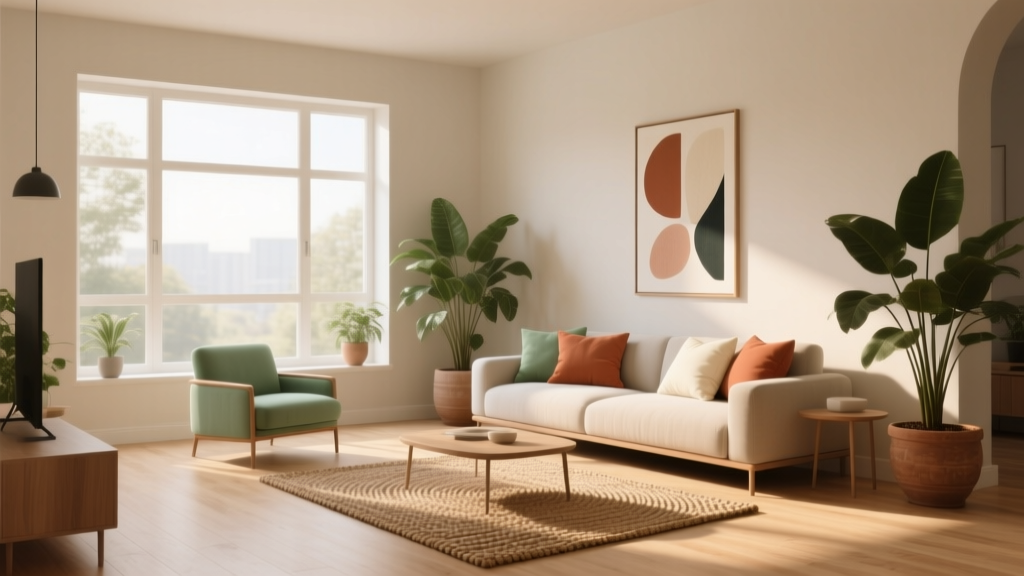
How to Choose Colors for South-Facing Rooms - The Decor Mag
South-facing rooms are the sunniest spaces in most homes—and that sunshine is both a gift and a design challenge. The light is typically strong, bright, and warm for much of the day, which means paint colors can look more intense, more golden, and sometimes surprisingly different than they did on the sample card or in a north-facing bedroom.
If you’ve ever painted a “soft white” that turned creamy yellow by noon, or chosen a calming gray that suddenly read beige, you’ve experienced the power of warm daylight. Learning how southern exposure affects undertones helps you pick paint colors, color schemes, and finishes that look beautiful morning through evening—while supporting the mood you want in the room.
This guide breaks down how to read light, choose undertones, and build interior color design palettes for south-facing living rooms, bedrooms, kitchens, and offices. You’ll find practical tips, real-room scenarios, paint color recommendations, and common mistakes to avoid—so your sunny room feels intentional, balanced, and inviting.
Why South-Facing Light Changes Paint Color
The light quality: warm, direct, and color-revealing
South-facing rooms receive strong, consistent daylight (in the Northern Hemisphere). This light tends to:
- Amplify warm undertones (yellow, red, orange) in both paint and furnishings.
- Make colors look lighter and brighter, especially mid-day.
- Increase contrast, which can make bold colors feel bolder and pale colors feel more “washed.”
Color psychology meets sunlight
Color psychology matters more in south-facing rooms because the brightness affects how you experience a space emotionally:
- Warm palettes (creams, terracotta, peach) can feel cozy and energizing—but may skew too yellow if the undertones aren’t controlled.
- Cool palettes (blue-grays, sage greens) often feel balanced and calming in warm light.
- High-chroma colors (bright teal, saturated red) can become visually loud in direct sun.
Step-by-Step: A Designer’s Process for Choosing Paint Colors
1) Identify the room’s fixed elements first
Before choosing paint colors, take inventory of what isn’t changing:
- Flooring (oak, walnut, tile with warm grout, cool stone)
- Countertops and backsplash
- Sofas, rugs, and major upholstery
- Cabinet color and hardware finish (brass reads warmer, chrome reads cooler)
2) Decide the mood and function
A south-facing room can support many moods. Pick a direction so your color scheme is coherent:
- Serene: soft blue-gray, gentle greens, quiet off-whites
- Warm and welcoming: creamy whites, clay tones, soft caramel neutrals
- Crisp and modern: clean whites with controlled undertones, charcoal accents
- Dramatic: deep navy, forest green, espresso, near-black
3) Choose undertones that work with warm daylight
In south light, most homeowners have the best results with:
- Whites: neutral whites or slightly cool whites to prevent a buttery cast
- Grays: true greige or cooler grays that won’t turn beige
- Blues/greens: muted, complex shades that read sophisticated rather than icy
4) Test paint the right way (this is where most color mistakes happen)
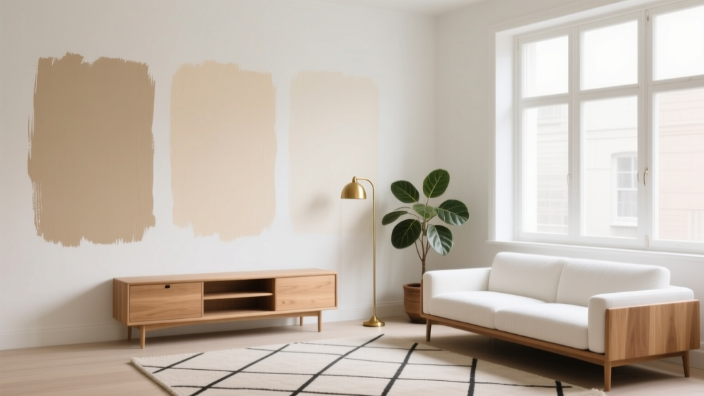
Skip tiny swatches. Use a larger sample and observe it throughout the day.
- Paint 12"x12" (or larger) sample areas on multiple walls.
- Check the color at morning, noon, late afternoon, and evening.
- Compare with your trim color and flooring nearby.
- If possible, use peel-and-stick samples (e.g., Samplize) for easy repositioning.
Best Paint Colors for South-Facing Rooms (With Brand References)
Whites and off-whites that stay balanced
South-facing rooms often make warm whites read creamier. If you want a clean, bright look, consider whites with neutral-to-slightly-cool undertones.
- Benjamin Moore Chantilly Lace (OC-65): a crisp, clean white that resists looking yellow in warm light.
- Benjamin Moore Simply White (OC-117): a popular warm white; gorgeous in south light if you want a welcoming glow (but test if you dislike warmth).
- Sherwin-Williams Pure White (SW 7005): a versatile, soft white that works for walls or trim and doesn’t skew overly creamy.
- Sherwin-Williams Alabaster (SW 7008): warm and cozy; can look extra creamy in south light—ideal for traditional spaces with warm wood.
Designer tip: If your goal is “white walls” without a yellow cast, pair them with a slightly cooler trim (or a true white trim) and consider a matte finish on walls to reduce glare.
Greige and neutral wall colors that don’t go muddy
South light can turn certain grays into beige and certain beiges into yellow. Greige (a gray-beige blend) is often the sweet spot.
- Benjamin Moore Edgecomb Gray (HC-173): a soft greige that reads warm and inviting; great with white trim and natural textures.
- Benjamin Moore Classic Gray (OC-23): a light, airy neutral that stays subtle in bright rooms.
- Sherwin-Williams Agreeable Gray (SW 7029): a crowd-pleasing greige that holds up well in sunny exposures, especially with crisp white trim.
- Farrow & Ball Ammonite (No. 274): a refined, modern neutral that feels calm rather than beige.
Cool-leaning colors that look calm (not cold) in warm light
If you love blue or green, south-facing light is your friend: it can soften cooler hues so they feel welcoming.
- Benjamin Moore Palladian Blue (HC-144): a soft blue-green that feels breezy and elegant in sunlit rooms.
- Sherwin-Williams Sea Salt (SW 6204): a muted green-gray that reads fresh and spa-like when warmed by sunshine.
- Benjamin Moore Healing Aloe (1562): a gentle green with gray undertones; great for bedrooms and bathrooms.
- Sherwin-Williams Silver Strand (SW 7057): a quiet blue-gray-green that stays sophisticated in bright light.
Bold and dark paint colors that thrive in sunshine
South-facing rooms can handle deeper colors beautifully because the light keeps them from feeling heavy. These shades add depth and drama without sacrificing brightness.
- Benjamin Moore Hale Navy (HC-154): classic, rich navy for dining rooms, offices, or built-ins.
- Sherwin-Williams Cyberspace (SW 7076): a deep charcoal-blue that looks sleek and modern in high light.
- Benjamin Moore Essex Green (HC-188): a near-black green that reads luxe and layered in sun.
- Sherwin-Williams Urbane Bronze (SW 7048): a moody brown-gray that feels grounded and warm without going orange.
Real Room Examples: What Works in South-Facing Spaces
South-facing living room: bright, welcoming, and not washed out
Scenario: Large windows, warm oak floors, lots of daytime sun, and a neutral sofa.
Great approach: Choose a light neutral that has enough depth to avoid glare and fading.
- Wall color: Sherwin-Williams Agreeable Gray (SW 7029) or Benjamin Moore Classic Gray (OC-23)
- Trim: Sherwin-Williams Pure White (SW 7005)
- Accents: linen drapes, black metal details, a rug with soft blue/gray to cool the warmth
Application guidance: Use a matte or eggshell finish on walls to reduce shine in direct sun. Add layered textiles (rugs, curtains) to soften contrast.
South-facing kitchen: keeping whites from turning too creamy
Scenario: White cabinets, warm brass hardware, and sunlight bouncing off glossy surfaces.
Great approach: Balance warmth with a cleaner white or a subtle cool-leaning wall color.
- Wall color: Benjamin Moore Chantilly Lace (OC-65) for a crisp backdrop, or Sherwin-Williams Sea Salt (SW 6204) for a hint of color
- Cabinets: keep current white; avoid adding another very warm white on walls
- Counter styling: light wood boards, pale stoneware, touches of soft black
Application guidance: If the room is extremely bright, consider slightly lower sheen on walls (eggshell) and reserve semi-gloss for trim/cabinetry.
South-facing bedroom: calm, restorative color psychology
Scenario: You want a relaxing retreat, but the room is bright and warm most of the day.
Great approach: Use muted greens or blue-grays to create a soothing, sleep-friendly atmosphere. Cool hues can reduce the “heat” of south light visually.
- Wall color: Benjamin Moore Healing Aloe (1562) or Sherwin-Williams Silver Strand (SW 7057)
- Bedding palette: warm white + taupe + a deeper green/blue accent
- Wood tones: walnut or medium oak to keep the room grounded
South-facing home office: focused but not sterile
Scenario: You need concentration and low visual fatigue, and your screens already add cool light.
Great approach: A mid-tone neutral or a deep, sophisticated color behind the desk to reduce glare and add definition.
- Wall color (mid-tone): Farrow & Ball Ammonite (No. 274)
- Wall color (dramatic): Benjamin Moore Hale Navy (HC-154) on the wall behind the monitor
- Trim: clean white for contrast
Easy Color Schemes for South-Facing Rooms
Use these designer-approved combinations as a starting point for interior color design:
- Fresh and airy: Chantilly Lace (walls) + pale oak + matte black accents + soft blue textiles
- Warm modern: Edgecomb Gray (walls) + Pure White (trim) + camel leather + aged brass
- Calm coastal: Palladian Blue (walls) + warm white trim + natural woven textures + sandy neutrals
- Moody elegant: Essex Green (feature wall or cabinetry) + creamy off-white + walnut + antique brass
Common Color Mistakes to Avoid in South-Facing Rooms
- Choosing a warm white without testing: Many “soft whites” shift buttery in southern light. Test on multiple walls before committing.
- Going too pale with no contrast: Ultra-light neutrals can look washed out. Add contrast with trim, built-ins, or a deeper adjacent color.
- Ignoring sheen: Higher sheen reflects more sunlight and can create glare. Matte/eggshell typically looks best on walls in bright rooms.
- Overloading warm undertones: Warm paint + warm floors + warm lighting can tip a room into yellow/orange territory. Balance with cooler textiles or a neutral wall color.
- Forgetting evening lighting: South-facing rooms still need good artificial light. A paint color that feels perfect at noon may feel dull at night if bulbs are too warm.
Practical Tips for Getting the Best Paint Results
- Match your bulbs to your goal: For balanced color, look for 2700K–3000K LEDs. If your room already reads warm, 3000K can feel cleaner.
- Use large samples: Paint at least two big swatches or use peel-and-stick samples to see how undertones shift.
- Consider a deeper “step-down”: If a color looks too bright, choose the same hue one step deeper on the fan deck for more stability in sun.
- Pair warm light with cooler accents: Blue/green pillows, gray-veined marble, or black accents can visually “cool” a room without repainting.
- Don’t forget the ceiling: Bright rooms can benefit from a ceiling color that’s not stark white—try the wall color at 50% strength or a soft white like SW Pure White.
FAQ: Choosing Paint Colors for South-Facing Rooms
What undertones look best in a south-facing room?
Neutral or slightly cool undertones are the easiest to live with because south light adds warmth on its own. Cool-leaning grays, blue-grays, and muted greens often look especially balanced.
Will gray paint look beige in a south-facing room?
Many grays do shift warmer in strong sunlight, especially those with brown or green undertones. If you want a true gray look, test cooler grays or gray-blue options and view them at mid-day.
Are warm paint colors a bad idea for south-facing rooms?
No—warm colors can be gorgeous. The key is choosing warm shades with controlled undertones and enough depth. Creamy whites, soft terracottas, and warm greiges can feel inviting without turning overly yellow.
What are the best white paint colors for south-facing rooms?
Popular choices include Benjamin Moore Chantilly Lace (OC-65) for a crisp white, Sherwin-Williams Pure White (SW 7005) for a softer clean white, and Benjamin Moore Simply White (OC-117) if you want a warmer, sun-friendly glow.
Should I use matte or eggshell in bright south-facing spaces?
Matte reduces glare and hides minor wall imperfections, making it a strong choice for sunny rooms. Eggshell is slightly more washable and still controls shine well—great for living rooms and hallways.
How do I keep a south-facing room from feeling too bright?
Add visual weight and contrast: choose a slightly deeper wall color, incorporate darker accent furniture, hang textured window treatments, and layer rugs and upholstery to absorb light.
Next Steps: Choose With Confidence
Start by observing your room’s light for a full day, then narrow your options to a small set of paint colors with undertones that balance warmth. Sample generously, evaluate next to your fixed finishes, and build a simple color scheme with contrast—trim, textiles, and accents do a lot of the heavy lifting in sun-filled spaces.
For more paint color ideas, color schemes, and interior color design how-tos, explore the latest color guides on thedecormag.com.
More Articles
 How to Use Color to Create Warmth - The Decor Mag
 How to Use Color to Create Coolness - The Decor Mag
 Earth Tone Color Palette Inspiration - The Decor Mag
 Cheap vs Premium Placement: What $0.12 CPM Really Costs Your Brand
 How to Use Color to Create Flow - The Decor Mag
 How to Choose Colors for a Deck - The Decor Mag
 How to Choose Colors for a Courtyard - The Decor Mag
 Best Brown Paint Colors for Cozy Rooms - The Decor Mag
 Best Olive Green Paint Colors (2026) | The Decor Mag
 Best Beige Paint Colors That Aren't Boring - The Decor Mag