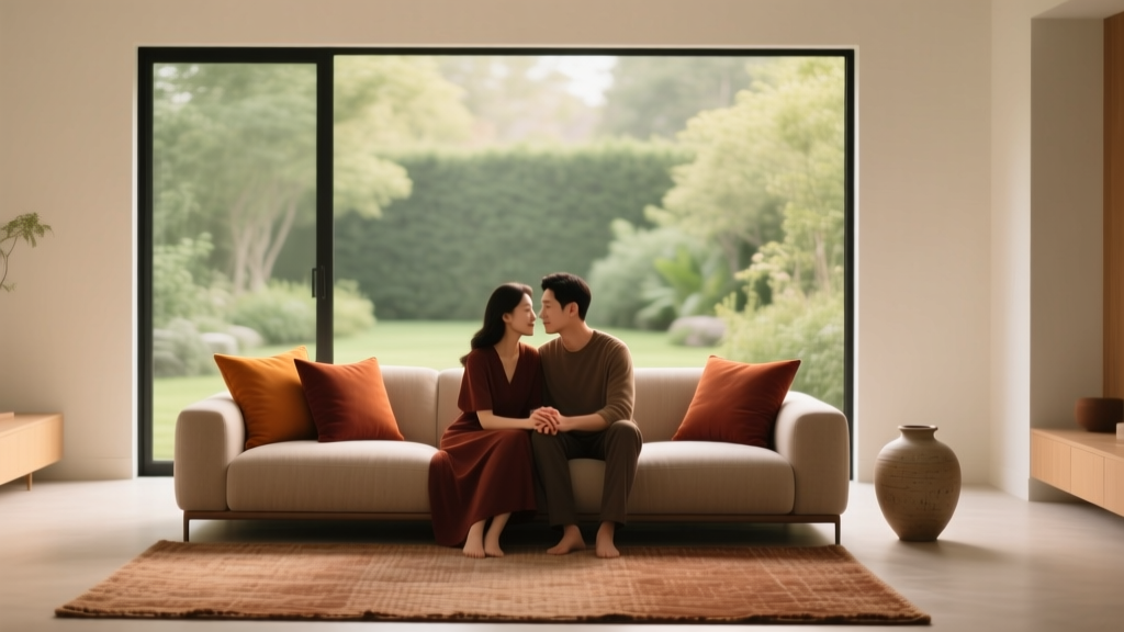
How to Use Color to Create Intimacy - The Decor Mag
Intimacy at home isn’t only about candlelight and soft throws. It’s the feeling that a room “holds” you—welcomes you, quiets your nervous system, and invites closeness. Color is one of the fastest ways to shape that feeling because it affects how we perceive space, temperature, and mood before we even process furniture or décor.
When a room feels too bright, too sharp, or too exposed, we tend to keep moving—scrolling, tidying, switching rooms—rather than settling in. The right interior paint colors and color schemes can gently lower visual noise, warm the atmosphere, and create a sense of shelter. With a few smart color choices (and the right sheen), you can make a living room feel more conversational, a bedroom more restful, and even a kitchen more connected.
This guide breaks down color psychology and practical design principles so you can use paint colors and color combinations to create intimacy—no major renovation required.
What “Intimate Color” Really Means (Color Psychology + Design Principles)
Intimate rooms tend to share a few visual traits. They feel warmer, slightly darker or more muted than average, and cohesive rather than high-contrast. From a color psychology perspective, intimacy is supported by hues that reduce alertness (soft, warm, deep, or muted tones) and by palettes that avoid harsh transitions.
The three levers that create intimacy
- Value (lightness/darkness): Mid-to-deep values create visual enclosure. Light, high-value walls can feel airy—but also exposed if not balanced.
- Chroma (saturation): Muted colors read as calmer and more sophisticated. Highly saturated colors can feel energetic rather than intimate unless used strategically.
- Temperature (warm vs. cool): Warm undertones (red, orange, yellow, warm beige) tend to advance and feel nearer; cool undertones often recede and feel more spacious.
How intimacy shows up in a home
- A living room where conversation flows because the palette feels grounded and not overly bright.
- A bedroom that feels like a retreat because the color absorbs glare and softens edges.
- A dining space that encourages lingering because the walls feel warm and flattering in evening light.
Choose Colors That “Hold” a Room: Best Paint Color Families for Intimacy
These families are reliable for cozy, intimate interior color design—especially when you lean into midtones, warm undertones, and low-to-medium saturation.
1) Warm whites and creamy off-whites (cozy, not sterile)
If you love light walls but want intimacy, look for warm whites with a creamy base rather than stark, blue-leaning whites. Pair with layered textures (linen, wool, wood) so the room doesn’t feel flat.
- Benjamin Moore White Dove (OC-17): A soft, warm white that reads inviting in most rooms.
- Sherwin-Williams Alabaster (SW 7008): Creamy and gentle, ideal for open-plan spaces that still need warmth.
- Farrow & Ball Wimborne White (No. 239): A classic off-white that feels traditional and calm.
Best for: North-facing rooms (to counter cool light), open-concept living areas, hallways you want to feel welcoming rather than stark.
2) Greige, taupe, and warm neutrals (soft enclosure without “dark paint” fear)
Warm neutrals are intimacy workhorses. They create a calm envelope while letting art and textiles shine.
- Benjamin Moore Edgecomb Gray (HC-173): A warm greige that reads cozy without feeling heavy.
- Sherwin-Williams Accessible Beige (SW 7036): A balanced neutral that plays well with warm woods.
- Farrow & Ball Skimming Stone (No. 241): A refined warm neutral that feels quietly luxurious.
Best for: Living rooms, family rooms, and bedrooms where you want warmth and flexibility.
3) Dusty blush, clay, and terracotta (skin-flattering and intimate)
Reds and pinks don’t have to be loud to be romantic. When softened into dusty rose or clay, they create warmth and a flattering glow—especially in lamplight.
- Farrow & Ball Setting Plaster (No. 231): A cult-favorite blush neutral that reads elegant, not sweet.
- Benjamin Moore Proposal (AF-260): A sophisticated mauve-rose that can feel dramatic in dining rooms.
- Sherwin-Williams Redend Point (SW 9081): A grounded clay tone with modern warmth.
Best for: Dining rooms, powder rooms, bedrooms, and reading nooks.
4) Deep, moody hues (instant cocoon effect)
Deep colors absorb light and soften edges, which makes spaces feel protective and intimate. They also reduce the “floaty” feeling you can get with bright white walls.
- Benjamin Moore Hale Navy (HC-154): A classic deep navy that feels tailored and cozy.
- Sherwin-Williams Iron Ore (SW 7069): A soft charcoal that reads intimate without going pitch-black.
- Benjamin Moore Essex Green (HC-188): A deep green that feels heritage and enveloping.
- Farrow & Ball Hague Blue (No. 30): A rich blue-green that feels dramatic and inviting.
Best for: Bedrooms, dens, libraries, dining rooms, and any space used mostly in the evening.
Color Strategies That Create Intimacy (Even in Bright or Open Homes)
Use a “lower contrast” color scheme
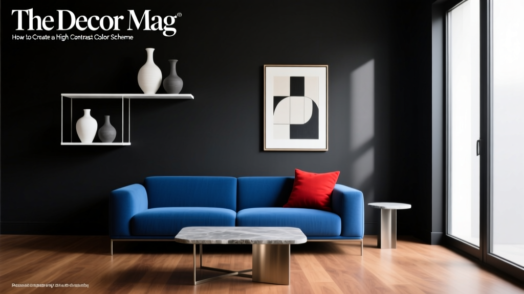
High-contrast rooms (bright white trim against dark walls, black-and-white everything) can feel graphic and energetic. For intimacy, aim for a softer transition between surfaces.
- Try tone-on-tone: walls, trim, and ceiling in related shades.
- Choose trim a few steps lighter (or darker) than the wall instead of bright white.
- Repeat the same undertone across the room (all warm or all cool) to avoid visual friction.
Example combination: Benjamin Moore Edgecomb Gray walls + Benjamin Moore White Dove trim + natural oak + warm brass.
Color drenching: walls + trim + ceiling for a wrapped feeling
Color drenching is one of the most effective intimacy tools in interior color design. Painting the walls, trim, and sometimes the ceiling the same color reduces hard edges and makes the room feel like a cohesive “envelope.”
- Best colors for drenching: muted greens, deep blues, smoky charcoals, warm taupes.
- Best finishes: matte or eggshell on walls; satin on trim if you want subtle definition.
Room scenario: A small den painted in Sherwin-Williams Iron Ore on walls and trim, with a slightly flatter finish on the ceiling. Add a camel leather chair, warm wood side table, and a textured rug for a cozy, intimate retreat.
Create intimacy with a “visual hearth” (accent wall done right)
Accent walls can feel disjointed if the color is too loud or unrelated to the rest of the palette. For intimacy, use an accent wall to anchor where people gather—behind a sofa, bed, or dining banquette.
- Choose a deeper version of your main wall color (same undertone).
- Echo that color in at least three places: pillows, art, rug, curtains, or upholstery.
- Keep the rest of the palette quiet so the room feels gathered, not chopped up.
Example: Warm neutral walls (SW Accessible Beige) with a deep green accent (BM Essex Green) behind a banquette, paired with warm wood, creamy upholstery, and brass lighting.
Shift the mood with lighting-aware color choices
Intimacy is often experienced at night, under warm bulbs. A color that feels “fine” in daylight can turn flat or harsh after sunset. Test paint colors in both daylight and lamplight.
- Use 2700K to 3000K bulbs for a warm, flattering glow.
- If your room has cool north light, avoid icy whites; use warm off-whites or greige.
- If your room gets strong southern sun, muted midtones help prevent glare and washout.
Real Room Examples: Intimate Color Schemes You Can Copy
1) Bedroom: Soft cocoon with a moody twist
Goal: Calm, private, and restorative.
- Walls: Farrow & Ball Setting Plaster for a warm, skin-friendly blush neutral
- Ceiling: A warmed white like Benjamin Moore White Dove
- Trim: Same as ceiling, or consider a slightly deeper off-white for softness
- Accents: Walnut nightstands, cream bedding, and deep olive textiles
Why it works: Warm undertones + low contrast makes the room feel gentle and intimate, while darker textiles add depth without needing dark walls.
2) Living room: Conversation-friendly neutral that still feels cozy
Goal: Welcoming in daytime, intimate in evening.
- Walls: Benjamin Moore Edgecomb Gray
- Trim: Benjamin Moore White Dove (not bright white)
- Accent color: Benjamin Moore Hale Navy on built-ins or a media cabinet
- Materials: Warm oak, boucle or linen upholstery, aged brass
Why it works: Greige lowers glare, navy anchors the room, and warm metals keep it from feeling cool.
3) Dining room: Romantic, lingering energy
Goal: People stay at the table longer.
- Walls: Sherwin-Williams Redend Point (or Benjamin Moore Proposal for more drama)
- Ceiling: Same color, 50% strength, or a warm off-white if you prefer
- Trim: Paint to match walls for a drenching effect
- Finishes: Matte walls + warm wood table + dimmable lighting
Why it works: Warm clay tones are flattering and cozy under evening light, creating a naturally intimate atmosphere.
4) Bathroom/powder room: Tiny room, big intimacy
Goal: Jewel-box warmth without clutter.
- Walls: Farrow & Ball Hague Blue or Benjamin Moore Essex Green
- Trim: Match the wall color for a seamless envelope
- Pair with: Antique brass mirror, warm white sconces, marble or creamy tile
Why it works: Small rooms handle deep color beautifully and feel purposefully intimate—like a designed moment.
How to Pick the Right Intimate Color for Your Space
- Identify the room’s job: Is it for sleeping, talking, dining, reading, or winding down? The more restorative the goal, the more muted and lower-contrast the palette should be.
- Check fixed elements: Flooring, stone, and upholstery have undertones. Match paint undertones (warm with warm, cool with cool) for cohesion.
- Sample correctly: Paint large swatches (at least 12x12) or use peel-and-stick samples. View morning, afternoon, and night.
- Choose sheen intentionally: Matte/eggshell reduces glare and feels softer; satin/semi-gloss bounces more light and can feel less intimate.
- Plan color repetition: Repeat your main color (or undertone) in at least 3–5 elements: rug, art, pillows, drapery, ceramics.
Common Color Mistakes That Block Intimacy
- Going too bright, too fast: Stark white walls with cool LEDs can feel clinical. Warm the white or lower the sheen.
- Over-contrasting trim and ceilings: Bright white trim against midtone walls can create harsh outlines. Consider softer trim (like BM White Dove) or color drenching.
- Ignoring undertones: A “neutral” can lean pink, green, or yellow depending on light. Undertone clashes make rooms feel unsettled.
- Using saturated colors everywhere: Bold color can be fun, but too much high-chroma paint reads energetic rather than intimate. Anchor with muted walls and add saturated accents in textiles.
- Not testing at night: Many paint colors shift under lamplight. A gray can turn flat; a beige can turn yellow. Always check evening conditions.
- Forgetting the ceiling: A bright ceiling can visually “lift” a room when you actually want it to feel held. Try a warmed white or a subtle tint of the wall color.
FAQ: Using Color to Create Intimacy
What paint colors make a room feel cozy and intimate?
Mid-to-deep, muted colors tend to feel most intimate: warm greige (BM Edgecomb Gray), deep navy (BM Hale Navy), charcoal (SW Iron Ore), and clay/blush neutrals (SW Redend Point, F&B Setting Plaster).
Will dark paint make my room feel smaller?
Dark paint can make a room feel more enclosed, which is often the point for intimacy. It doesn’t always feel “smaller” if you keep the palette cohesive, use layered lighting, and avoid stark contrast. Color drenching is especially effective for making dark rooms feel intentional rather than tight.
How do I make a white room feel more intimate?
Choose a warmer white (SW Alabaster or BM White Dove), reduce contrast (softer trim), add warm wood and tactile textiles, and use warm lighting (2700K–3000K). Consider a tinted ceiling or a deeper accent on built-ins.
What’s the best color scheme for an intimate bedroom?
Try warm, low-contrast palettes: blush + cream + walnut; deep green + warm white + brass; or smoky navy + taupe + natural linen. Keep saturation moderate and repeat tones across bedding, curtains, and rugs.
Should trim be white in an intimate room?
Not always. Bright white trim can look crisp, but it can also add sharp outlines. For a softer, more intimate look, use a warm off-white (BM White Dove) or paint trim the same color as the walls for a wrapped effect.
What paint sheen looks most cozy?
Matte or eggshell is typically the coziest because it reduces glare and softens imperfections. Use satin on trim if you want a gentle contrast without the shine of semi-gloss.
Next Steps: A Simple Plan to Bring Intimacy Home with Color
- Pick one room where you want more connection—bedroom, dining room, den, or living room.
- Choose one intimacy strategy: warm neutral envelope, color drenching, or a deep anchor wall.
- Test 2–3 paint colors in large samples and view them in both daylight and evening lamplight.
- Commit to a cohesive color scheme by repeating undertones across textiles, art, and décor.
- Adjust lighting with warm bulbs and dimmers to support the mood your paint color is designed to create.
When color, lighting, and undertones work together, intimacy becomes a design feature—not a happy accident. Explore more paint color guides, color schemes, and interior color design inspiration at thedecormag.com.
More Articles
 Best Wisteria Paint Colors - The Decor Mag
 How to Choose Bedroom Colors for Sleep - The Decor Mag
 How to Choose Colors for a Terrace - The Decor Mag
 Best Tomato Red Paint Colors - The Decor Mag
 Best Pistachio Paint Colors - The Decor Mag
 Best Candy Apple Red Paint Colors - The Decor Mag
 How to Choose Colors for North-Facing Rooms - The Decor Mag
 Best Champagne Paint Colors - The Decor Mag
 How to Create a High Contrast Color Scheme - The Decor Mag
 Best Indigo Paint Colors - The Decor Mag