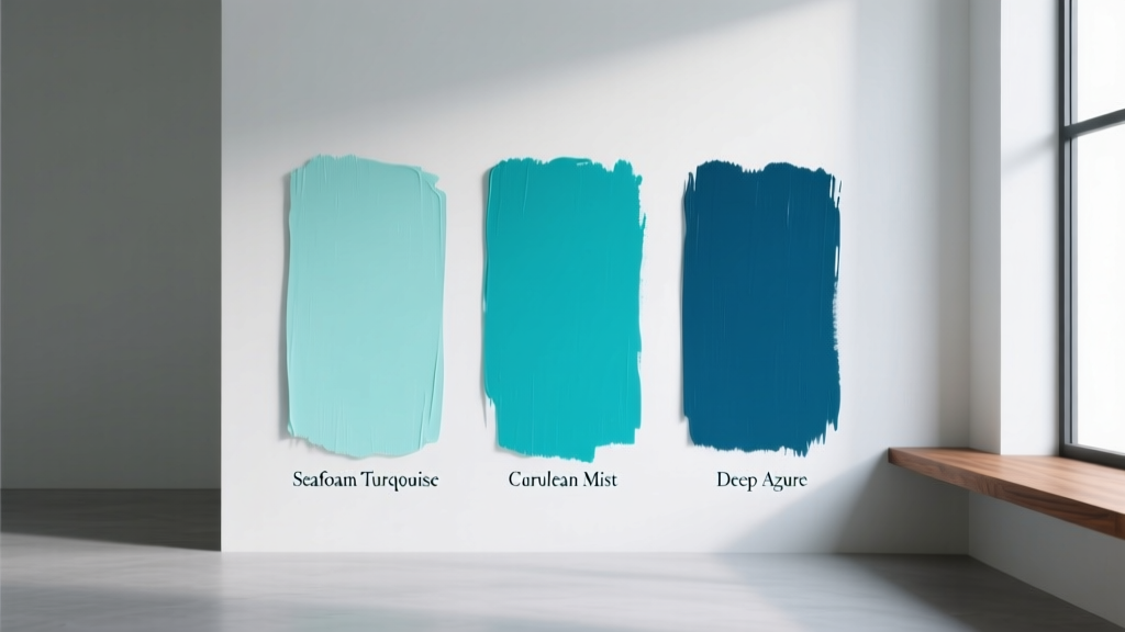
Best Turquoise Paint Colors - The Decor Mag
Turquoise sits in that sweet spot between blue and green where a room can feel calm, clean, and quietly energized all at once. It’s coastal without being theme-y, playful without feeling juvenile, and sophisticated when paired with the right undertones and finishes. For homeowners who love color but still want something livable day-to-day, turquoise paint colors offer a rare mix of personality and versatility.
From airy sea-glass walls in a sunlit kitchen to a deeper blue-green accent in a moody powder room, turquoise works because it responds beautifully to light and surrounding materials. It can brighten dark corners, cool down overly warm spaces, and create an instant focal point. The key is choosing the right turquoise—one that supports your home’s fixed elements (flooring, stone, cabinets) and the mood you’re after.
This guide breaks down the best turquoise paint colors, how to use them room by room, what to pair them with for balanced color schemes, and the common mistakes that make turquoise feel too loud or too flat.
Why Turquoise Works: Color Psychology and Design Benefits
Turquoise is often associated with clear water, open skies, and natural minerals—visual cues that many people read as restorative. In color psychology terms, blue leans calming and focused, green leans balancing and renewing. Turquoise blends both, which is why it can feel relaxing while still lively.
- Mood boost without chaos: Turquoise adds energy more gently than saturated yellow or red.
- Perceived freshness: In bathrooms, kitchens, and laundry rooms, turquoise reads “clean” and crisp.
- Great for color flow: Turquoise bridges cool and warm palettes when you choose the right undertone.
- Flattering backdrop: It highlights warm woods, white trim, brass, and natural textures.
How to Choose the Right Turquoise Paint Color
1) Understand Undertones: Blue-Leaning vs. Green-Leaning Turquoise
Two turquoise paints can look wildly different once they’re on your wall. The deciding factor is undertone.
- Blue-leaning turquoise feels breezier and more coastal; it pairs well with crisp whites and cool grays.
- Green-leaning turquoise feels earthier and more vintage; it pairs well with warm neutrals, wood tones, and creams.
2) Check the Room’s Light (and Your Bulbs)
Light is the real “paint color.” Turquoise is especially sensitive to shifts in daylight and bulbs.
- North-facing rooms: Cooler light can pull turquoise bluer and slightly grayer. Consider a greener turquoise to keep it from feeling icy.
- South-facing rooms: Warm sunlight can bring out green undertones and make turquoise look brighter. Choose a slightly muted turquoise if you want sophistication.
- Warm bulbs (2700K–3000K): Enhance green; can make turquoise feel more tropical.
- Neutral bulbs (3500K–4000K): Often best for true color read and balanced turquoise.
3) Decide Where Turquoise Belongs: Walls, Cabinets, Trim, or Accent
- All-over walls: Choose a softer, slightly grayed turquoise for everyday comfort.
- Accent wall or built-ins: You can go deeper and more saturated for drama.
- Kitchen or bathroom cabinetry: Mid-tone turquoise reads custom and designer, especially with the right hardware.
- Front door: Turquoise is welcoming and standout without being aggressive.
Best Turquoise Paint Colors (With Brand Recommendations)
These turquoise paint colors are popular for a reason: they’re balanced, versatile, and consistently beautiful across different interiors. Always test with large swatches (or peel-and-stick samples) before committing.
Soft, Airy Turquoise Paint Colors (Sea-Glass & Spa Tones)
- Sherwin-Williams Rainwashed (SW 6211): A serene blue-green that often reads spa-like. Lovely in bedrooms, bathrooms, and open-plan living areas with white trim and pale wood floors.
- Benjamin Moore Woodlawn Blue (HC-147): A classic soft blue-green with a timeless, slightly historical feel. Works beautifully with warm whites, brass, and natural linen textures.
- Farrow & Ball Pale Powder (No. 204): A delicate blue-green that feels refined and quiet. Great for spaces where you want color without commitment—hallways, dressing rooms, and guest baths.
- Behr Palais Blue (710C-1): A light, friendly aqua-leaning turquoise that can brighten smaller rooms, especially when paired with crisp white tile.
True Turquoise & Balanced Blue-Greens (Classic Turquoise Read)
- Benjamin Moore Caribbean Teal (2055-20): A rich, joyful blue-green that still feels polished. Ideal for a dining room accent wall, a statement powder room, or cabinetry.
- Sherwin-Williams Peacock Plume (SW 0020): A confident turquoise that can skew greener in warm light. Try it on built-ins or as a dramatic bedroom wall behind the headboard.
- Benjamin Moore Wythe Blue (HC-143): A versatile “in-between” blue-green that adapts well. If you’re torn between aqua and green, this one often lands just right in living spaces.
- Farrow & Ball Blue Ground (No. 210): A clean, classic aqua-turquoise with an uplifting quality. Strong choice for a cheerful kitchen or breakfast nook.
Deep Turquoise & Moody Teals (Statement-Making, Cozy, Sophisticated)
- Benjamin Moore Aegean Teal (2136-40): A modern, muted teal with enough gray to feel grounded. Excellent for offices, libraries, and family rooms with warm woods.
- Sherwin-Williams Still Water (SW 6223): A deeper blue-green that feels restful and dramatic. Beautiful with creamy whites, leather, and walnut furniture.
- Farrow & Ball Vardo (No. 288): A bold blue-green with punch—best for cabinetry, islands, or a standout powder room when you want high design impact.
- Benjamin Moore Tropical Teal (2057-10): Saturated, jewel-like teal-turquoise. Use strategically (built-ins, bar area, front door) to avoid overwhelming a whole room.
Real Room Examples: Where Turquoise Paint Looks Best
1) A Spa Bathroom with Rainwashed or Pale Powder
For a bathroom that feels like a retreat, light turquoise on walls pairs beautifully with white tile and soft, warm metals.
- Try: Sherwin-Williams Rainwashed on walls
- Pair with: warm white trim (not stark), brushed brass fixtures, white marble-look tile
- Styling tip: Add texture—waffle towels, woven baskets, matte ceramics—so the palette doesn’t feel flat.
2) A Classic Kitchen Island in Caribbean Teal
Turquoise on lower cabinets or an island is a designer move that still feels welcoming. It’s especially effective when the perimeter cabinets stay neutral.
- Try: Benjamin Moore Caribbean Teal on the island
- Pair with: warm white perimeter cabinets, light quartz counters, unlacquered brass pulls
- Finish tip: Use a durable cabinet enamel in a satin or semi-gloss for wipeable performance.
3) A Living Room Accent Wall in Aegean Teal
If your living room feels bland, a moody turquoise-teal accent wall can anchor the space and make neutral furniture feel intentional.
- Try: Benjamin Moore Aegean Teal behind the sofa or fireplace wall
- Pair with: creamy ivory textiles, camel leather, oak coffee tables
- Design principle: Repeat the color 2–3 times (pillows, art, a vase) so it feels integrated.
4) A High-Impact Powder Room in Vardo or Tropical Teal
Powder rooms can handle bold color because you experience them in short bursts. Turquoise here reads confident and memorable.
- Try: Farrow & Ball Vardo or Benjamin Moore Tropical Teal
- Pair with: patterned wallpaper on the ceiling or a textured mirror, brass sconces, dark marble vanity top
- Pro tip: Choose a warmer white for trim to prevent harsh contrast with saturated walls.
Turquoise Color Schemes That Always Look Intentional
The most beautiful turquoise rooms don’t rely on turquoise alone. They balance it with supportive neutrals, complementary accents, and grounding materials.
Winning Pairings (Use These as a Shortcut)
- Turquoise + warm white + natural oak: bright, modern, approachable
- Turquoise + cream + brass: classic, elegant, slightly vintage
- Turquoise + charcoal + crisp white: graphic, contemporary, high contrast
- Turquoise + terracotta + sand: earthy, global, warm-meets-cool balance
- Turquoise + blush + soft gray: gentle, romantic, great for bedrooms
Accent Colors That Complement Turquoise
- Coral and peach: lively contrast; use in art and pillows
- Mustard and ochre: sophisticated warmth; great in rugs and textiles
- Navy: anchors turquoise; ideal for adjoining rooms or upholstery
- Emerald: bold layered look; best when one shade is muted
Practical Application Tips for Turquoise Paint
- Sample large and move it: Paint a 2' x 2' area (or use two large sample sheets) and check it morning, midday, and night.
- Match your white: Bright, stark whites can make turquoise feel louder. Creamy whites soften it; crisp whites sharpen it.
- Choose the right sheen:
- Matte: best for living rooms/bedrooms; hides wall flaws
- Eggshell: great all-around wall finish; more washable
- Satin/semi-gloss: ideal for trim, doors, cabinets, and bathrooms
- Balance with natural materials: Turquoise loves wood, rattan, stone, and linen—these keep it from feeling “synthetic.”
- Repeat the color: Use turquoise in at least two places (paint + textiles, or paint + art) for a cohesive interior color design.
Common Turquoise Paint Mistakes to Avoid
- Choosing a turquoise that fights your fixed finishes: If your tile leans warm (beige, cream), a very icy aqua can look off. Match undertones first.
- Going too saturated on all four walls in a low-light room: Deep turquoise can turn heavy or murky without enough natural light. Consider an accent wall or a lighter shade.
- Forgetting about adjacent rooms: Turquoise can look amazing alone, then clash in the hallway view. Make sure your color scheme flows room to room.
- Pairing with the wrong gray: Cool blue-grays can make turquoise feel harsh; warm greige often looks more natural alongside it.
- Skipping contrast: All mid-tones (turquoise walls, mid-tone floors, mid-tone furniture) can feel flat. Add contrast with white trim, dark accents, or light upholstery.
FAQ: Turquoise Paint Colors
Is turquoise paint better in warm or cool rooms?
It can work in either, but the undertone matters. In north-facing (cool) rooms, a slightly greener turquoise often feels more balanced. In south-facing (warm) rooms, a softer or grayer turquoise prevents the color from looking overly bright.
What’s the difference between turquoise, aqua, and teal?
Aqua usually reads lighter and bluer (more “pool water”). Turquoise sits in the middle with a clearer blue-green balance. Teal is typically deeper and moodier with more green and/or gray.
What trim color looks best with turquoise walls?
Warm whites and soft whites are the safest choice for most homes. If you want a crisp, modern contrast, a clean bright white works best with blue-leaning turquoise (not green-leaning).
Can turquoise work in a traditional home?
Yes—choose a slightly muted turquoise like Benjamin Moore Woodlawn Blue or Wythe Blue, pair it with cream trim, antiques or warm woods, and classic patterns (stripes, botanicals, small-scale geometrics).
What are the best turquoise paint colors for kitchen cabinets?
Mid-tone and slightly muted shades tend to look most “custom.” Benjamin Moore Caribbean Teal, Sherwin-Williams Peacock Plume, and Farrow & Ball Vardo are strong choices depending on how bold you want to go.
How do I keep turquoise from looking too bright?
Pick a turquoise with a touch of gray, use a softer white, add grounding elements (wood, black accents, natural stone), and keep large reflective surfaces (high-gloss tile, mirrors) balanced with matte textures.
Next Steps: Bring Turquoise Home with Confidence
Start by deciding the role turquoise should play—calming backdrop, statement moment, or colorful cabinetry—and then choose a shade based on undertone and light. Sample generously, coordinate your whites, and build a supporting palette with warm neutrals, natural textures, and a few intentional accents for a pulled-together color scheme.
If you’re ready for more help choosing paint colors and creating cohesive interior color design, explore more color guides and curated palettes on thedecormag.com.
More Articles
 How to Create a Transitional Color Palette - The Decor Mag
 Best Seaweed Green Paint Colors - The Decor Mag
 How to Create a Serene Color Palette - The Decor Mag
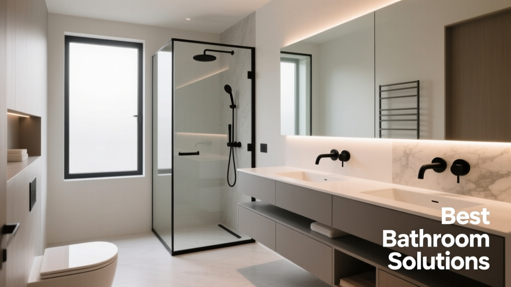 Best Bathroom Floor Solutions: Performance, Safety, and Style Compared
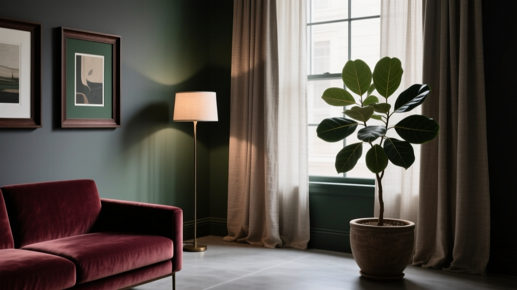 How to Create a Moody Color Palette - The Decor Mag
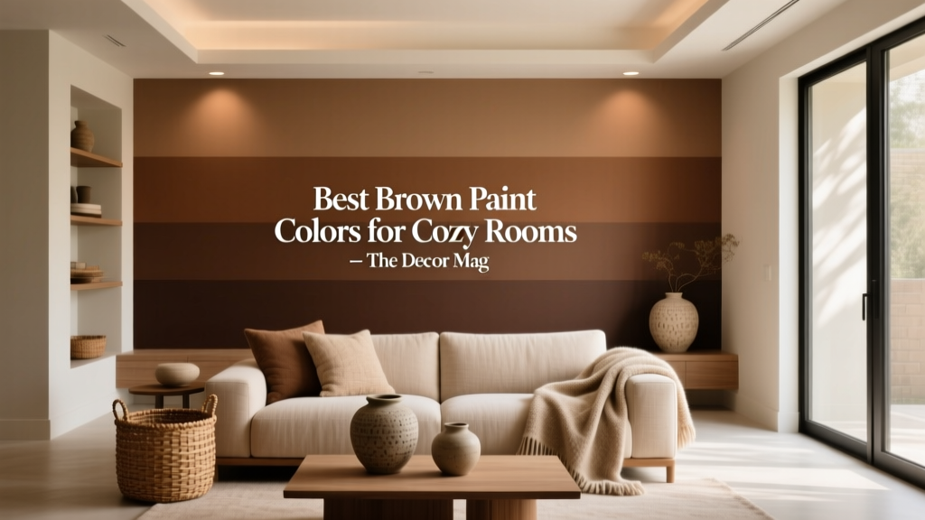 Best Brown Paint Colors for Cozy Rooms - The Decor Mag
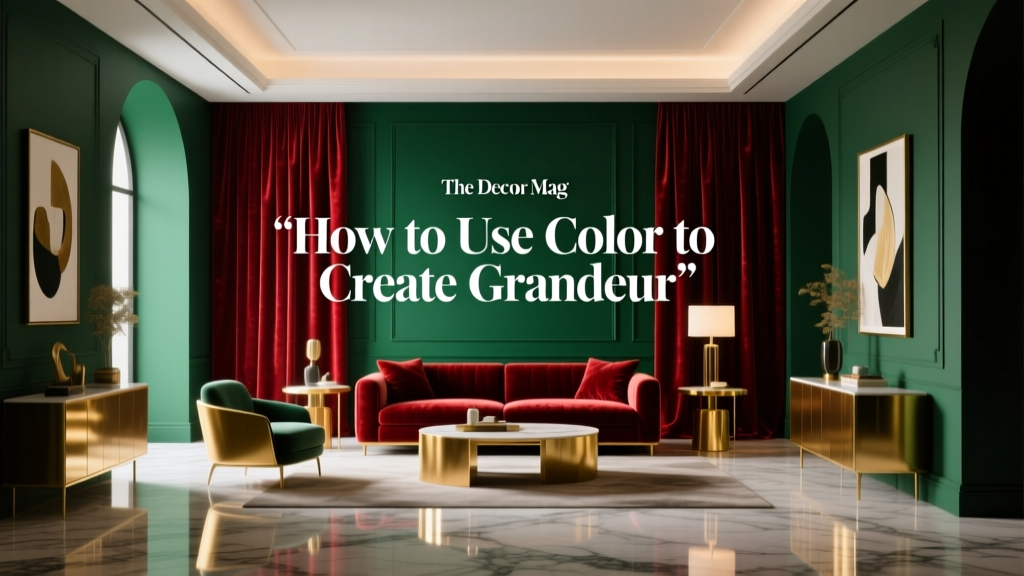 How to Use Color to Create Grandeur - The Decor Mag
 Best Black Paint Colors for Dramatic Spaces - The Decor Mag
 How to Use Muted Colors for Sophistication - The Decor Mag
 How to Choose Colors for a Dining Room - The Decor Mag