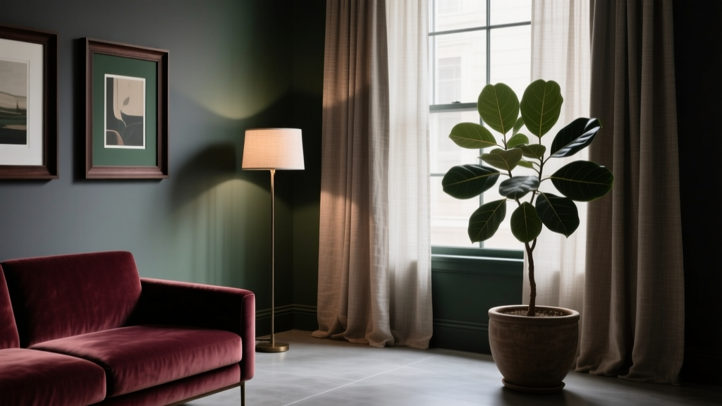
How to Create a Moody Color Palette - The Decor Mag
Moody interiors have a way of making a home feel more cinematic, grounded, and personal. Unlike bright, airy color schemes that aim to “disappear” into the background, a moody color palette creates atmosphere. It invites you to slow down, notice texture, and feel the emotional tone of a room—whether that’s calm and cocooning, dramatic and glamorous, or earthy and restorative.
This matters because paint color isn’t just decoration; it’s perception. Darker values can visually tighten a space (in a good way), soften harsh architecture, and make furnishings look more intentional. When homeowners say they want a room to feel “cozy,” “elevated,” or “like a boutique hotel,” they’re often describing mood. The right interior color design choices—undertones, contrast, and lighting—are what transform that desire into an actual, livable color scheme.
If you’re ready to try deeper paint colors but worry about making your home feel gloomy, you’re in the right place. A moody palette is less about painting everything black and more about building a rich spectrum of mid-to-deep tones, controlled contrast, and layered finishes that flatter your space.
What “Moody” Means in Color Theory (and Why It Works)
A moody color palette typically relies on:
- Lower value colors (darker shades) that absorb more light than they reflect
- Muted chroma (less saturated hues) that feel sophisticated rather than loud
- Warm or complex undertones that prevent a space from feeling flat
- Strategic contrast through trim, ceilings, textiles, metals, and artwork
From a color psychology perspective, moody schemes often feel:
- Secure and calming (deep greens, charcoals, inky blues)
- Romantic and enveloping (oxblood, aubergine, warm browns)
- Grounded and restorative (clay, olive, mushroom, deep taupe)
Design principle to remember: contrast creates clarity. The goal isn’t darkness everywhere; it’s a balanced interior color scheme where depth and highlights work together.
Start With the Three Building Blocks: Light, Undertones, and Finish
1) Read Your Light Before Choosing Paint Colors
Lighting determines whether a moody paint color looks velvety and rich—or dull and muddy.
- North-facing rooms: Cooler, consistent light. Choose moody colors with warmth or complexity (olive, warm charcoal, brown-based burgundy).
- South-facing rooms: Strong warm light. You can handle cooler moody colors (ink blue, blue-green, graphite) without them feeling icy.
- East-facing rooms: Bright in the morning, shadowy later. Mid-tone moody colors (deep teal, smoky green) tend to look best all day.
- West-facing rooms: Warm, intense afternoon light. Try deeper, muted shades that won’t turn overly orange (wine, deep taupe, green-black).
2) Undertones: The Difference Between “Rich” and “Off”
Most “dark” paint colors have a hidden bias: blue, green, violet, red, or brown. Undertones decide whether your walls harmonize with floors, stone, and upholstery.
- If you have warm wood floors: look for brown-based charcoals, olives, and warm navies.
- If you have cool gray flooring or marble: choose blue-based charcoals, blue-greens, and crisp inky blues.
- If your room has lots of creamy trim: avoid ultra-blue blacks; opt for softer blackened greens or warm graphite.
3) Finish Matters More in Dark Colors
Deep paint colors highlight surface imperfections and reflect light differently.
- Matte: absorbs light, feels modern and velvety (great for ceilings and moody bedrooms).
- Eggshell/satin: easier to wipe down; slight glow can enhance depth (ideal for living rooms, hallways).
- High-gloss: dramatic and reflective; best as an accent (trim, built-ins, doors).
Moody Color Palette Foundations: Tried-and-True Paint Color Families
Use these as your starting point, then adjust based on your light and finishes.
Inky Blues (Elegant, Quiet, Timeless)
- Benjamin Moore Hale Navy (HC-154): a classic deep navy with versatility for cabinets, dining rooms, and studies.
- Farrow & Ball Hague Blue No. 30: blue-green depth; reads luxe in lower light.
- Sherwin-Williams Naval (SW 6244): a strong navy that looks sharp with brass and crisp whites.
Best pairings: creamy off-white trim, walnut wood, cognac leather, antique brass, crisp linen.
Deep Greens (Restorative, Historic, Nature-Driven)
- Benjamin Moore Essex Green (HC-188): near-black green, perfect for library energy.
- Sherwin-Williams Evergreen Fog (SW 9130): softer and smoky; a great gateway to moody.
- Farrow & Ball Studio Green No. 93: richly pigmented, iconic for dining rooms and cabinetry.
Best pairings: warm whites, natural oak, blackened steel, terracotta accents, patterned vintage rugs.
Charcoal, Graphite, and Soft Black (Architectural, Cocooning)
- Benjamin Moore Wrought Iron (2124-10): a favorite “soft black” that shifts between charcoal and deep navy.
- Sherwin-Williams Tricorn Black (SW 6258): a clean, true black for modern contrast.
- Farrow & Ball Railings No. 31: deep navy-black that feels slightly softer than pure black.
Best pairings: warm wood, creamy whites, textured bouclé, marble, oversized art with light negative space.
Earthy Browns, Taupes, and Oxbloods (Warm, Intimate, Vintage-Luxe)
- Benjamin Moore Kendall Charcoal (HC-166): charcoal with warmth; forgiving and sophisticated.
- Sherwin-Williams Urbane Bronze (SW 7048): iconic for its brown-gray depth; excellent for exteriors and interiors.
- Farrow & Ball Preference Red No. 297: a historic deep red that glows in lamplight.
Best pairings: aged brass, warm oak, camel upholstery, cream travertine, woven textures.
5 Moody Color Schemes You Can Copy (With Real-World Scenarios)
1) Moody Living Room: Deep Green + Warm Neutrals
Palette idea: Benjamin Moore Essex Green walls + creamy trim + camel leather sofa + walnut coffee table.
Why it works: green supports relaxation (color psychology), while warm neutrals keep it welcoming.
- Trim: Benjamin Moore Simply White (OC-117) or White Dove (OC-17)
- Metals: antique brass floor lamp, blackened iron curtain rod
- Textiles: oatmeal linen curtains, patterned rug with terracotta and ivory
2) Dramatic Dining Room: Inky Blue + Brass + Art
Palette idea: Sherwin-Williams Naval walls + brass chandelier + deep wood table.
Application tip: Use a satin finish on walls for candlelit glow, and keep ceiling slightly lighter to avoid a “lid” effect.
- Ceiling: a softer white like Benjamin Moore Chantilly Lace (OC-65) if you want crisp contrast
- Accent: velvet seat cushions in rust or ochre
- Art: oversized pieces with white matting to create breathing room
3) Cozy Bedroom: Smoky Taupe + Layered Textures
Palette idea: Sherwin-Williams Urbane Bronze on the walls + cream bedding + woven headboard.
Why it works: warm browns and bronzes feel secure and grounding—ideal for sleep spaces.
- Lighting: bedside lamps with warm bulbs (2700K) to prevent the paint from looking flat
- Textiles: bouclé throw, linen drapery, wool rug
- Accent color: muted blush or clay in pillows for softness
4) Moody Bathroom: Charcoal + Stone + Warm Metals
Palette idea: Benjamin Moore Wrought Iron on vanity or walls + honed stone counters + unlacquered brass.
High-impact approach: Paint the vanity in Wrought Iron (satin or semi-gloss) and keep walls a mid-tone greige if the bathroom lacks natural light.
- Mirror: thin brass frame for contrast
- Tile: creamy zellige or warm white subway for balance
- Floor: black-and-white pattern or warm limestone look
5) Moody Home Office/Library: Near-Black Green + Built-Ins
Palette idea: Farrow & Ball Studio Green on built-ins + soft black accents + warm wood desk.
Why it works: deep greens support focus and calm while feeling classic and collected.
- Backdrop: paint built-ins and walls the same color for a seamless, immersive look
- Contrast: add lighter book spines, ceramic decor, and framed prints with white borders
- Rug: vintage-inspired pattern to break up large dark areas
How to Build a Moody Palette Step-by-Step
- Choose your anchor color (one deep shade for walls, cabinetry, or both).
- Select a supporting neutral that matches undertones (warm cream, greige, mushroom, soft taupe).
- Add a highlight color for contrast (warm white trim, pale stone, light oak, brushed metal).
- Pick one “spark” accent for energy (rust, ochre, dusty rose, or cobalt in small doses).
- Layer texture so the palette feels rich, not heavy: linen, velvet, leather, woven shades, matte ceramics.
Quick guideline for balance: aim for a 60/30/10 distribution—60% dominant moody color, 30% supporting neutral, 10% accent.
Moody Paint Application Tips That Make the Color Look Intentional
- Sample correctly: paint large swatches (at least 12" x 12") on multiple walls, or use peel-and-stick samples. View in daylight and lamplight.
- Consider color-drenching: painting walls, trim, and even the ceiling the same moody paint color can look editorial and reduce visual choppiness.
- Use trim strategically:
- For crisp contrast: warm white trim with deep walls.
- For a modern cocoon: match trim to wall color in a higher sheen.
- Mind your bulbs: 2700K–3000K keeps deep colors warm and flattering; cooler bulbs can make them feel stark.
- Keep sightlines in mind: if one room is very bright, transition with a mid-tone hallway color before going fully dark in the next space.
Common Mistakes to Avoid With Moody Color Schemes
- Choosing a dark paint color without checking undertones: a “black” can read blue, green, or purple and clash with floors or tile.
- Using too many saturated jewel tones at once: moody works best when at least one or two elements are muted to prevent visual chaos.
- Ignoring finish: flat paint can scuff in high-traffic areas; high-gloss on imperfect walls can highlight flaws.
- Forgetting contrast: an all-dark room without light trim, art, textiles, or metal accents can feel heavy rather than refined.
- Going too dark in a low-light room without strategy: if the room has tiny windows, bring in reflective elements (mirrors, metallics) and lighter upholstery to keep it energized.
- Skipping the ceiling plan: a bright white ceiling isn’t always wrong, but sometimes a softer white or a matched ceiling gives moody colors a more cohesive look.
FAQ: Moody Color Palettes
What are the best moody paint colors for beginners?
Start with deep, forgiving shades that aren’t overly saturated. Great options include Sherwin-Williams Evergreen Fog (SW 9130), Benjamin Moore Kendall Charcoal (HC-166), and Benjamin Moore Wrought Iron (2124-10). They read moody without feeling harsh.
Will dark paint make my room look smaller?
Darker values can visually bring walls closer, but the result often feels cozy and designed rather than cramped—especially when you keep contrast intentional (lighter upholstery, good lighting, and a clear focal point). Color-drenching can also make edges disappear, which can feel surprisingly expansive.
What trim color works best with moody walls?
For classic contrast, choose warm whites like Benjamin Moore White Dove (OC-17) or Simply White (OC-117). For a more modern look, match the trim to the wall color in a higher sheen to add subtle definition.
How do I choose a moody color that won’t look muddy?
Check undertones in your room’s lighting and avoid pairing a cool, blue-based charcoal with warm orange-toned wood (or vice versa). Also use layered lighting—overhead plus lamps—so the color has dimension throughout the day.
Can I use moody colors in an open concept space?
Yes. Anchor moody color in one zone (like a dining area or built-ins), then bridge to adjacent spaces with a supporting neutral that shares undertones. Repeat the moody color in smaller accents (pillows, art frames, rugs) to keep the color scheme cohesive.
What accent colors look best with moody palettes?
Reliable accents include rust, terracotta, ochre, dusty rose, warm metals (brass), and light stone tones. Use accents sparingly so the moody wall color remains the star.
Next Steps: Bring Mood Into Your Home With Confidence
Choose one room and one anchor paint color, then test it properly in your lighting. Build the rest of your interior color design around undertones: a supporting neutral, a crisp or soft trim plan, and a few high-contrast accents. Add texture and layered lighting, and your moody color palette will feel intentional, comfortable, and elevated—day and night.
For more paint color ideas, color scheme formulas, and room-by-room guidance, explore our latest color guides on thedecormag.com.
More Articles
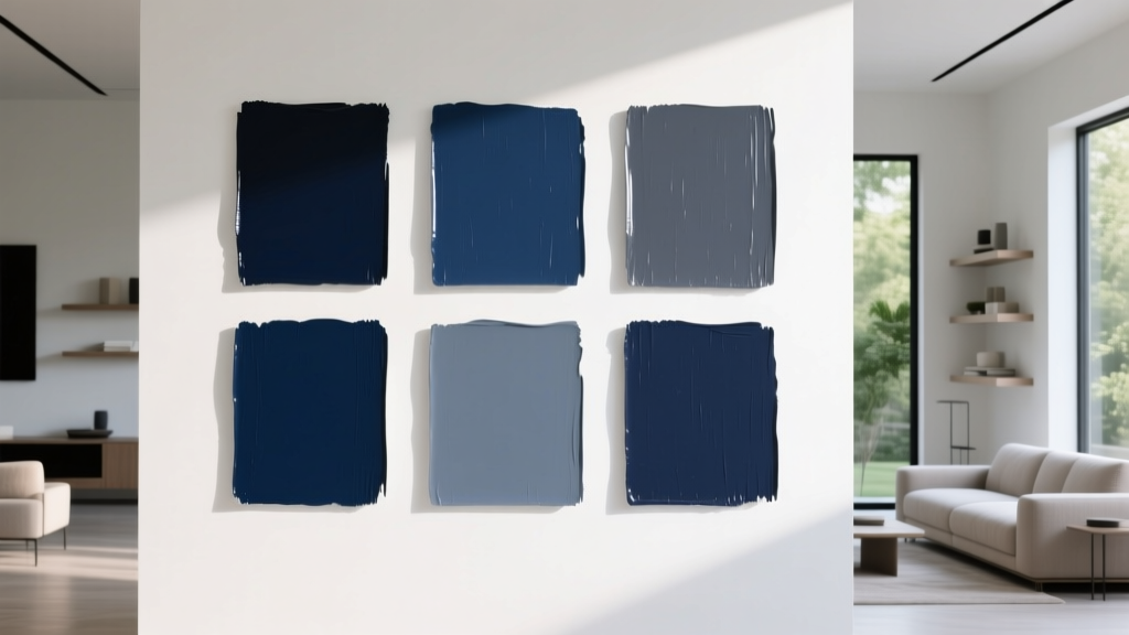 Best Navy Paint Colors for Every Style - The Decor Mag
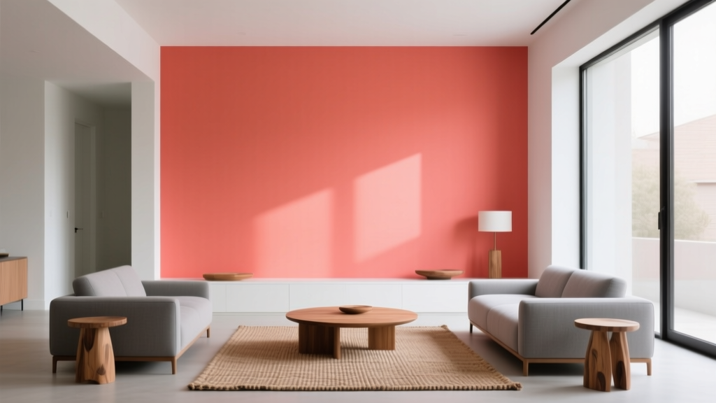 Best Coral Paint Colors for Vibrant Spaces - The Decor Mag
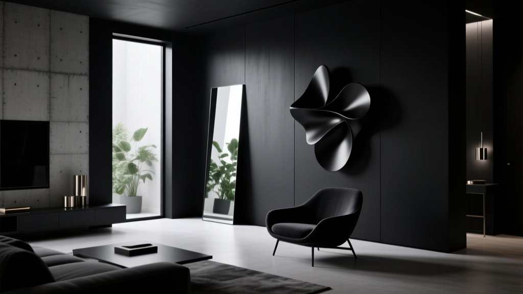 Best Black Paint Colors for Dramatic Spaces - The Decor Mag
 Best Terracotta Paint Colors for Warmth - The Decor Mag
 Best Turquoise Paint Colors - The Decor Mag
 Best Indigo Paint Colors - The Decor Mag
 Fluted vs Headboard: Understanding the Structural, Aesthetic, and Functional Differences
 How to Choose Colors That Complement Artwork - The Decor Mag
 Best Dusty Rose Paint Colors - The Decor Mag
 The Science-Backed Best Sleep Textiles: Thread Count, Fiber Physics, and Real-World Performance Data