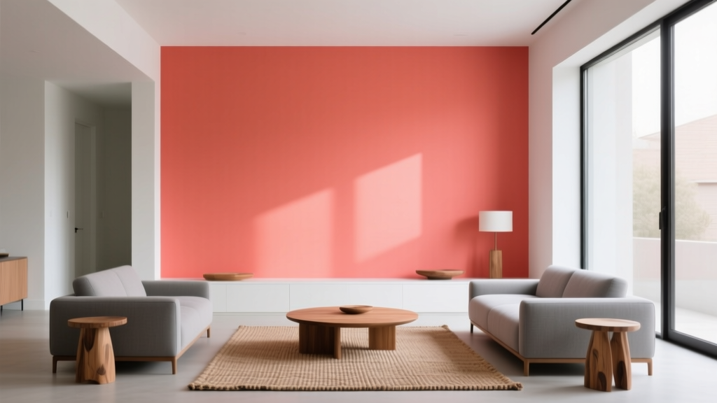
Best Coral Paint Colors for Vibrant Spaces - The Decor Mag
Coral is one of those rare paint colors that can read as playful or polished, retro or modern, soft or electric—depending on the undertone, the light, and what you pair it with. It sits between pink, orange, and a touch of red, which is exactly why it brings warmth and energy to a room without feeling as intense as a true red or as sweet as a bubblegum pink.
Homeowners love coral because it solves common design problems: it can brighten north-facing rooms, flatter skin tones in bathrooms, make open-plan living spaces feel welcoming, and add personality to neutral-heavy homes. If you’ve ever wanted a “happy” interior color that still looks designer-approved, coral is a strong contender.
This guide breaks down how to choose the right coral paint color, where it works best, what to pair it with, and the most common mistakes that make coral look too loud or too dull. You’ll also find specific paint color recommendations from trusted brands to help you sample with confidence.
Why Coral Works: Color Psychology Meets Interior Design
Coral blends the optimism of orange with the softness of pink, which makes it feel both energizing and nurturing. In color psychology terms, coral often reads as:
- Warm and social: Great for living rooms, dining rooms, and entryways where you want conversation to flow.
- Uplifting: A helpful mood-boost in darker climates or rooms with limited daylight.
- Flattering and approachable: A favorite for powder rooms and vanity areas because it can make the space (and your reflection) feel warmer.
From a design principle perspective, coral acts as a “bridge color”—it can connect warm neutrals (beige, camel, terracotta) with crisp accents (white, navy, emerald) in a way that looks intentional rather than busy.
How to Choose the Right Coral Paint Color
Step 1: Identify the Undertone
Coral isn’t one color; it’s a family. The undertone determines whether it feels modern, tropical, muted, or punchy.
- Pink-leaning coral: Softer, more romantic, great for bedrooms and nurseries.
- Orange-leaning coral: More energetic, ideal for kitchens, dining rooms, and sunrooms.
- Red-leaning coral: Bolder, dramatic, best as an accent wall or on cabinetry.
- Muted/dusty coral: Earthy, sophisticated, works well in whole-room applications.
Step 2: Match Coral to Your Lighting
Lighting can make coral look peachy, neon, or unexpectedly beige.
- North-facing rooms: Cooler light can make coral feel muted. Choose a warmer, orange-leaning coral to keep it lively.
- South-facing rooms: Bright warm light amplifies coral. Consider a softer, dustier coral for balance.
- East-facing rooms: Morning light makes coral glow; it may look calmer later. Test in multiple times of day.
- West-facing rooms: Afternoon light can intensify coral. Avoid very saturated options unless you want bold.
Step 3: Decide How Much Coral You Want
Coral can be a main wall color, an accent, or a color-story thread through decor. A useful rule: the more saturated the coral, the smaller the area it typically needs to look intentional.
- Whole room: Choose softer, muted corals.
- Accent wall or ceiling: Mid-tone corals shine.
- Front door, cabinets, furniture: Saturated corals look crisp and curated.
Best Coral Paint Colors (With Brand References)
Use these as starting points, then sample in your space. Paint colors can shift dramatically with exposure, trim color, and flooring.
1) Sherwin-Williams Coral Reef (SW 6606)
A cheerful, classic coral with a lively presence. This is a great “signature coral” for anyone who wants a vibrant space without going neon.
- Best for: Accent walls, playrooms, breakfast nooks, creative studios
- Pairs well with: Warm whites, light oak, rattan, brushed brass, denim blues
2) Sherwin-Williams Intimate White (SW 6322)
A soft blush-coral that reads airy and sophisticated. Ideal when you want coral’s warmth but prefer subtle color on the walls.
- Best for: Bedrooms, nurseries, living rooms, open-plan spaces
- Pairs well with: Creamy trim, linen textiles, pale greige, matte black accents
3) Benjamin Moore Coral Gables (2010-40)
A bold, tropical coral with strong personality. Use it when you want impact—this one loves sunlight and confident styling.
- Best for: Front doors, powder rooms, statement alcoves, bar areas
- Pairs well with: Crisp white tile, glossy black, palm greens, turquoise accents
4) Benjamin Moore Soft Shell (2101-60)
A gentle peachy-coral neutral that feels calm rather than bright. It’s a smart pick if you’re coral-curious and want something livable.
- Best for: Hallways, living rooms, guest rooms, kitchens with warm cabinetry
- Pairs well with: Warm whites, natural stone, oak floors, muted terracotta decor
5) Farrow & Ball Calamine (No. 230)
While often described as a delicate pink, Calamine can read coral-adjacent in warm light—think “powdery coral veil.” It’s elegant, timeless, and especially pretty with traditional details.
- Best for: Bedrooms, dressing rooms, dining rooms, homes with classic trim
- Pairs well with: Soft white paneling, aged brass, warm gray upholstery
6) Farrow & Ball Charlotte’s Locks (No. 268)
A saturated orange-coral that feels sunny and bold. Stunning for smaller, high-impact moments where you want a confident color statement.
- Best for: Front doors, kitchen islands, mudrooms, furniture makeovers
- Pairs well with: Deep navy, off-white, checkerboard floors, walnut wood
7) Behr Coral Fountain (M180-3)
A friendly, mid-tone coral that’s versatile and accessible. It works well in family homes where you want warmth without fussy styling.
- Best for: Bedrooms, craft rooms, laundry rooms, accent walls
- Pairs well with: White trim, soft gray, light wood, brushed nickel
8) Behr Creamy Peach (M230-2)
A pale peach-coral that functions like a warm neutral. Great for homeowners who want the glow of coral without strong color contrast.
- Best for: Whole-house wall color in warm palettes, open layouts, low-ceiling rooms
- Pairs well with: Warm white, sandy beige, caramel leather, woven textures
Color Schemes That Make Coral Look Intentional
Coral shines when it’s supported by a clear color scheme. These combinations keep coral from feeling random and help it look “designed.”
Coral + Warm White + Natural Wood
This is the easiest coral palette to live with. Think creamy trim, white oak floors, cane chairs, and linen drapery.
- Best rooms: Living rooms, bedrooms, entryways
- Try accents: Jute rug, light oak frames, ivory boucle pillows
Coral + Navy + Brass
Navy anchors coral, making it feel crisp rather than sweet. Brass adds warmth and polish.
- Best rooms: Dining rooms, offices, powder rooms
- Try accents: Navy velvet chairs, brass sconces, white marble
Coral + Sage Green + Cream
This combination feels fresh and botanical, perfect for relaxed homes and transitional interiors.
- Best rooms: Kitchens, sunrooms, guest rooms
- Try accents: Sage cabinetry, cream tile, terracotta planters
Coral + Charcoal + Soft Blush
For a modern, slightly moody approach, pair coral with charcoal and a paler pink-coral in textiles.
- Best rooms: Primary bedrooms, living rooms, studios
- Try accents: Charcoal sofa, blush throw, matte black hardware
Real Room Examples and Application Scenarios
1) Coral in a Living Room: Warmth Without Heavy Color
Look: Muted coral walls + warm white trim + natural textures.
Paint idea: Benjamin Moore Soft Shell on walls, creamy white on trim, light oak coffee table.
Style tips:
- Layer textiles in cream, sand, and caramel to keep the palette calm.
- Add contrast with a few black accents (frames, lamp base) to sharpen the look.
- Repeat coral subtly in art or pillows so it feels cohesive.
2) Coral in a Powder Room: High Impact, Small Footprint
Look: Bold coral walls + glossy tile + statement mirror.
Paint idea: Benjamin Moore Coral Gables with bright white trim and brass fixtures.
Style tips:
- Choose a crisp white ceiling to keep the room feeling taller.
- Try a patterned wallpaper on the ceiling if you want a designer twist (keep it in the same warm family).
- Use warm bulbs (2700K–3000K) to avoid a harsh, pink cast.
3) Coral in a Kitchen: Energizing but Not Overpowering
Look: Coral island or lower cabinets + warm white uppers + natural stone.
Paint idea: Farrow & Ball Charlotte’s Locks on an island, paired with creamy perimeter cabinets.
Style tips:
- Balance coral with quiet materials: off-white zellige tile, honed countertops, light wood stools.
- Keep hardware cohesive (brass or bronze) to elevate the color.
- Repeat coral in small doses (dish towels, art) rather than additional large blocks.
4) Coral in a Bedroom: Cozy, Flattering, and Grown-Up
Look: Soft coral walls + layered neutrals + one deep contrast color.
Paint idea: Sherwin-Williams Intimate White with camel bedding and a deep olive or navy throw.
Style tips:
- Use warm white bedding to keep coral from feeling too “theme-y.”
- Add depth with wood tones (walnut nightstands, oak bench).
- Consider a matte finish for a velvety, restful feel.
5) Coral Front Door: Instant Curb Appeal
Look: Coral door + clean trim + updated lighting.
Paint idea: Sherwin-Williams Coral Reef or Benjamin Moore Coral Gables depending on how bold you want to go.
Style tips:
- Pair with a soft white exterior and black hardware for a classic look.
- If your exterior is brick, coral can echo warm undertones beautifully—test first to avoid clashing.
- Use a durable exterior enamel in satin or semi-gloss for easy cleaning.
Common Coral Paint Mistakes to Avoid
- Skipping samples: Coral shifts dramatically. Test at least two options on multiple walls.
- Pairing coral with the wrong white: A stark, cool white can make coral look fluorescent. Choose a warm white or soft cream for trim and ceilings.
- Overloading the room with warm colors: Too much orange/red nearby (floors, rugs, wood stains) can make coral feel chaotic. Add a grounding neutral or a cool counterbalance (navy, sage, charcoal).
- Using a saturated coral on every wall in a large room: Bright coral is often best as an accent, cabinetry color, or in smaller rooms.
- Ignoring finish: Higher sheen reflects more light and can intensify coral. Matte or eggshell is usually more forgiving on walls.
Practical Tips for Sampling and Applying Coral Paint
- Start with two corals: One softer (muted) and one bolder. Compare them side by side.
- Test with your fixed finishes: Flooring, countertops, tile, and large upholstery pieces should guide your undertone choice.
- Check day and night: View samples in morning light, afternoon light, and with lamps on.
- Consider the “color echo”: Add at least 2–3 supporting elements (art, pillows, a vase) that repeat coral so it looks intentional.
- Use painter’s tape boundaries: Sample a large block (at least 12" x 12", bigger is better) and leave a white border to judge contrast.
FAQ: Coral Paint Colors and Color Schemes
Is coral a good paint color for small rooms?
Yes—especially in a powder room, small bathroom, or cozy entry. If you want the room to feel larger, choose a softer, lighter coral and pair it with warm white trim and good lighting.
What colors go best with coral paint?
Reliable pairings include warm whites, creamy neutrals, natural wood, navy, sage green, charcoal, and brass/bronze metals. For a brighter look, add turquoise or teal in small doses.
How do I keep coral from looking too pink or too orange?
Control the undertone with your surrounding materials. Pink-leaning coral looks more balanced with warm neutrals and brass; orange-leaning coral calms down with navy, charcoal, or cooler greens. Also, avoid overly cool whites that can exaggerate the “neon” effect.
Can coral work in a modern or minimalist home?
Absolutely. Use coral as a controlled accent—an entry door, a single wall, or lower kitchen cabinets—then keep the rest of the palette clean: warm white, light wood, black accents, and simple shapes.
What sheen is best for coral walls?
Matte or eggshell is typically best for coral wall paint because it softens the color and reduces glare. Use satin or semi-gloss for doors, trim, and cabinetry where durability matters.
Next Steps: Bring Coral Into Your Home With Confidence
Pick your coral direction first (soft and dusty vs. bold and tropical), then build a supporting color scheme around warm whites, grounding neutrals, and one strong contrast color like navy or sage. Sample on multiple walls, check it under your real lighting, and choose a finish that flatters the space.
When you’re ready for more guidance on paint colors, color schemes, and interior color design, explore more color guides on thedecormag.com—your next favorite shade is waiting.
More Articles
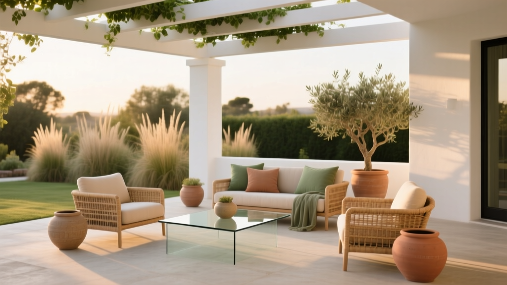 How to Choose Colors for a Patio - The Decor Mag
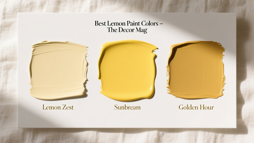 Best Lemon Paint Colors - The Decor Mag
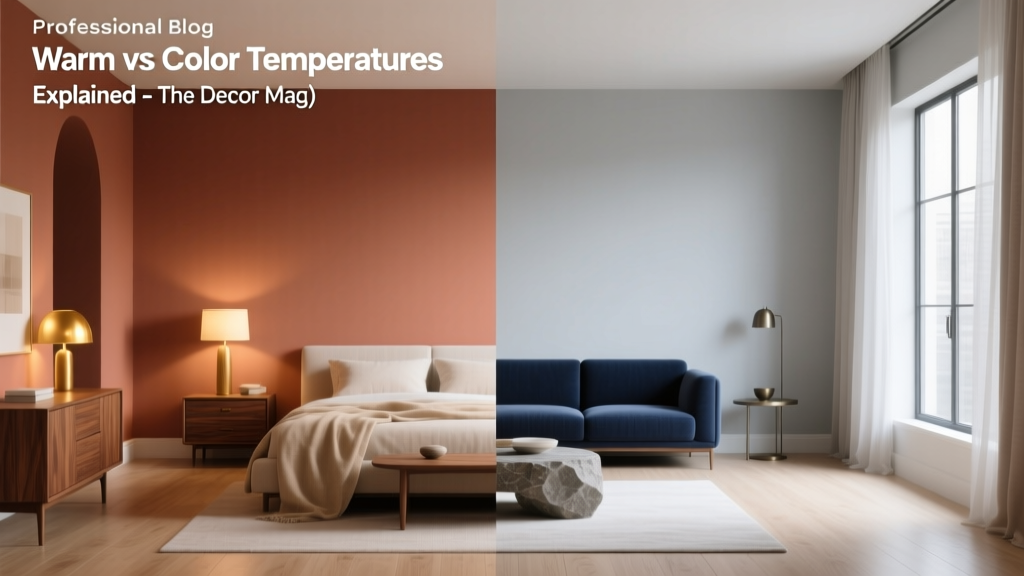 Warm vs Cool Color Temperatures Explained - The Decor Mag
 Living Room Colors for Entertaining (2026)
 Best Denim Blue Paint Colors - The Decor Mag
 How to Match Colors to Furniture and Fabrics - The Decor Mag
 Best Banana Paint Colors - The Decor Mag
 How to Create a Sophisticated Color Palette - The Decor Mag
 How to Choose Colors for a Balcony - The Decor Mag
 Best Green Paint Colors for Nature Lovers - The Decor Mag