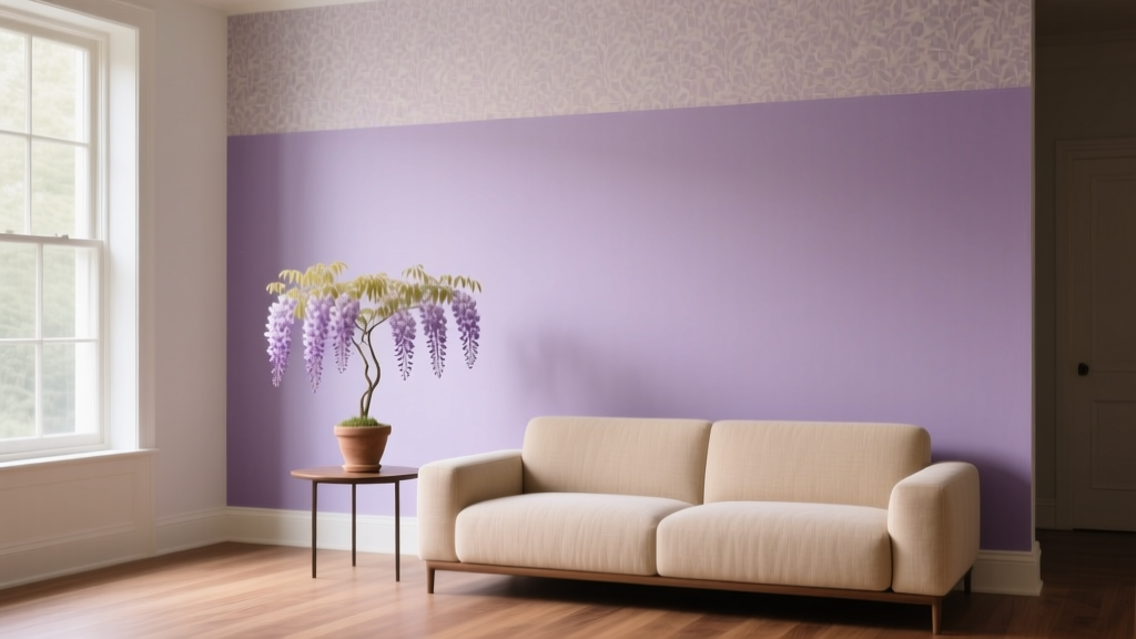
Best Wisteria Paint Colors - The Decor Mag
Wisteria is one of those rare shades that feels both romantic and grounded. It lives in the space between lavender and soft violet, often with a gentle gray undertone that makes it easier to decorate with than brighter purples. Homeowners love wisteria paint colors because they bring personality without dominating the room—especially in spaces that need calm, creativity, or a subtle sense of luxury.
From a color psychology perspective, wisteria is associated with reflection, imagination, and ease. It can read restorative in bedrooms, inviting in living rooms, and quietly elevated in powder rooms. The key is choosing the right wisteria: some versions lean bluer and cooler, while others feel warmer, rosier, or more muted. This guide breaks down the best wisteria paint colors across popular brands, plus how to pair them into cohesive interior color schemes.
What Makes a Paint Color “Wisteria”?
Wisteria isn’t a single color chip—it’s a family. In interior design, wisteria typically means a light-to-mid purple with enough softness (often from gray) to feel livable on walls. It may appear:
- Cool and airy (blue-violet, spa-like, crisp)
- Muted and dusty (gray-violet, sophisticated, modern)
- Warm and romantic (pink-violet, vintage, cozy)
Undertones: Why Your Wisteria May Shift
Wisteria paint colors are sensitive to lighting and nearby finishes. Common undertones include:
- Blue undertone: cooler, fresher; can feel slightly icy in north-facing rooms
- Gray undertone: calmer, more neutral; easiest to coordinate with
- Pink undertone: warmer, more romantic; pairs beautifully with creamy whites and brass
Best Wisteria Paint Colors (By Brand)
Below are standout wisteria paint colors that work across a range of interior styles—modern, transitional, cottage, traditional, and even minimalist when used thoughtfully. Always test samples in your room’s lighting before committing.
Sherwin-Williams Wisteria Paint Colors
- Sherwin-Williams Wisteria (SW 6542): A direct, soft wisteria with a gentle blue-violet cast. Great for bedrooms and nurseries where you want a calm, dreamy mood.
- Sherwin-Williams Potentially Purple (SW 6821): Brighter and more playful than classic wisteria, but still approachable in small doses or as an accent wall.
- Sherwin-Williams Lite Lavender (SW 6554): A pale lavender that reads “wisteria-inspired” when paired with gray or greige furnishings.
Benjamin Moore Wisteria Paint Colors
- Benjamin Moore Spring Lilac (1388): A fresh, cheerful lavender that can read wisteria in daylight. Works well in sunny rooms and creative spaces.
- Benjamin Moore Lavender Mist (2068-60): Airy and delicate, ideal when you want the softest whisper of wisteria on walls.
- Benjamin Moore Mauve Desert (2113-50): A muted, grayish mauve that feels modern and sophisticated—excellent for living rooms and offices.
Farrow & Ball Wisteria-Like Purples
- Farrow & Ball Calluna (No. 270): A heathered, gray-purple that reads grown-up and architectural. Beautiful with stone, oak, and linen textures.
- Farrow & Ball Brassica (No. 271): Deeper and moodier; best as an accent or in a dining room with warm lighting and brass details.
Behr Wisteria Paint Colors
- Behr Wisteria Purple (varies by collection/line): Behr frequently uses “Wisteria” in color naming. Look for a muted lavender-violet option and compare it to your flooring and countertops before choosing.
- Behr Purple Potion / similar soft lavenders: Many Behr mid-tone lavenders become “wisteria” once you soften the room with gray textiles and warm whites.
Tip: If you can’t find a perfect “Wisteria” label in a brand’s lineup, shop by undertone. A gray-lavender or dusty violet chip is often the most flexible wisteria paint color for whole-room application.
How to Choose the Right Wisteria for Your Room
1) Match the Wisteria to Your Light Direction
- North-facing rooms: Choose a wisteria with a slightly warmer or rosier undertone to prevent it from looking cold or flat.
- South-facing rooms: You can handle cooler wisterias; sunlight will keep them lively.
- East-facing rooms: Morning light may amplify pink tones; select a more neutral, gray-leaning wisteria.
- West-facing rooms: Late-day golden light warms purples; a blue-violet can balance the warmth.
2) Consider Fixed Elements (Flooring, Tile, Countertops)
Wisteria looks best when it echoes or complements existing undertones:
- Warm wood floors: choose a wisteria with a touch of gray or pink to harmonize
- Cool gray tile: choose a cooler wisteria (blue-violet) for a clean, cohesive palette
- Beige/cream stone: choose a muted mauve-wisteria to avoid clashing undertones
3) Pick a Finish That Flatters the Space
- Matte/flat: best for low-traffic bedrooms and ceilings; softens wisteria’s color shift
- Eggshell: the go-to for most walls; easy to clean and still elegant
- Satin/pearl: great for kids’ rooms or hallways; can make wisteria look slightly brighter
- Semi-gloss: best for trim/doors; use sparingly to keep the look refined
Color Schemes That Make Wisteria Shine
Wisteria plays well with both warm and cool palettes. The trick is to commit to a “temperature story” and repeat it across materials and accents.
1) Wisteria + Warm White + Brass (Soft Glam)
- Wall: Sherwin-Williams Wisteria (SW 6542)
- Trim: a creamy warm white (e.g., Sherwin-Williams Alabaster SW 7008)
- Accents: brass, antique gold, warm oak
- Textiles: ivory boucle, linen, velvet in blush or taupe
2) Wisteria + Greige + Charcoal (Modern Quiet Luxury)
- Wall: Benjamin Moore Mauve Desert (2113-50)
- Supporting neutral: a greige (look for balanced beige-gray)
- Contrast: charcoal or soft black in lighting, frames, or furniture
- Finishes: matte black metal, smoked glass, light walnut
3) Wisteria + Sage Green + Natural Textures (Botanical Calm)
- Wall: a muted wisteria like Farrow & Ball Calluna (No. 270)
- Secondary color: sage or olive accents (pillows, art, pottery)
- Materials: rattan, seagrass, jute, raw oak
- Effect: spa-like, restorative, nature-inspired
4) Wisteria + Navy + Crisp White (Classic with a Twist)
- Wall: Benjamin Moore Spring Lilac (1388) as the soft counterpoint
- Anchor: navy upholstery or built-ins
- Trim: clean white for a tailored look
- Ideal rooms: guest rooms, offices, hallways
Real Room Examples & Application Scenarios
Bedroom: A Restful Wisteria Envelope
Wisteria is a natural fit for bedrooms because it lowers visual noise while still feeling special. For a serene look, pair a muted wisteria wall color with warm white bedding and layered neutrals.
- Try: Sherwin-Williams Wisteria (SW 6542) in eggshell
- Style it with: oatmeal linen drapes, a warm wood headboard, brass reading lights
- Pro tip: Paint the ceiling a half-step lighter (or use a soft warm white) to keep the room airy
Living Room: Wisteria as a Sophisticated Neutral
If you’ve avoided purple in main spaces, wisteria is the entry point. Dusty, gray-leaning options read as a “colored neutral,” especially with greige upholstery and natural textures.
- Try: Benjamin Moore Mauve Desert (2113-50)
- Pair with: creamy rug, oak coffee table, charcoal accents, large-scale art with soft mauves and warm whites
- Pro tip: Keep saturation low in the rest of the room so the wall color feels intentional, not loud
Nursery or Kids’ Room: Sweet Without Being Sugary
Wisteria can replace traditional pink while still feeling gentle. Choose a lighter tint and use playful contrast through textiles and art.
- Try: Benjamin Moore Lavender Mist (2068-60)
- Pair with: white furniture, light maple, accents in soft teal, butter yellow, or warm gray
- Pro tip: Use washable eggshell or satin for durability
Powder Room: A Bold, Memorable Moment
Small spaces are perfect for richer wisteria-leaning purples. With the right lighting, the result feels boutique-hotel polished.
- Try: Farrow & Ball Brassica (No. 271) or a deeper lavender-violet
- Pair with: brass mirror, warm white trim, patterned wallpaper on the ceiling or one wall
- Pro tip: Warm bulbs (2700K) keep purple tones inviting
Home Office: Creative, Calm Focus
Wisteria supports creativity while staying calmer than brighter color trends. The best office wisterias are slightly gray to reduce visual stimulation.
- Try: Farrow & Ball Calluna (No. 270)
- Pair with: walnut desk, linen Roman shades, charcoal task chair, off-white shelves
- Pro tip: Add one “crisp” element (white trim or black accents) to keep the palette sharp and professional
Practical Tips for Sampling and Painting Wisteria
- Sample large: Paint at least a 2’x2’ area (or use peel-and-stick samples) on multiple walls.
- Check it morning/noon/night: Wisteria shifts dramatically under warm lamps versus daylight.
- Compare next to trim: Your white trim choice can make wisteria look cleaner, grayer, or more pink.
- Repeat the color elsewhere: Tie the room together with one or two accents (pillow, art, vase) that echo the wall tone.
Common Wisteria Color Mistakes to Avoid
- Choosing too saturated for a whole room: A bright purple can feel juvenile or overpowering. If you love the color, use it on a single wall, built-ins, or as décor accents instead.
- Ignoring undertones in fixed finishes: Wisteria that leans blue can clash with warm beige tile or golden stone. Match undertones, not just “lightness.”
- Pairing with the wrong white: A stark, icy white can make wisteria look harsher; an overly creamy white can make it feel muddy. Test your trim color beside your wall sample.
- Over-accessorizing with competing pastels: Too many sweet shades can turn the room into a candy palette. Keep one or two supporting colors and ground with neutrals.
- Forgetting lighting temperature: Cool LEDs (4000K+) can make purple feel flat. Warm lighting (2700K–3000K) tends to flatter wisteria in most homes.
FAQ: Best Wisteria Paint Colors
Is wisteria a good whole-house color?
Wisteria can work beyond a single room, but it’s best as a “feature neutral” in a few connected spaces (bedroom, hallway, powder room). For an entire open-concept main level, choose a very muted, gray-leaning wisteria and balance it with warm whites and grounded neutrals.
What colors go with wisteria paint?
Designer-favorite pairings include warm whites, greige, soft charcoal, sage green, navy, and natural wood tones. For a cohesive color scheme, repeat your undertone story: cool wisteria with cool grays; warm wisteria with creamy whites and brass.
Does wisteria paint make a room look bigger or smaller?
Lighter wisterias (with plenty of white or gray) can make a room feel airy—similar to pale blue or soft gray. Deeper wisterias create intimacy and can visually “wrap” a room, which feels smaller but often more luxurious and cozy.
What trim color looks best with wisteria walls?
Most homeowners get the best results with a soft warm white (for a welcoming look) or a clean neutral white (for a fresher look). The “best” trim depends on whether your wisteria leans pink/warm or blue/cool—test trim samples next to your wall color.
Can wisteria work with gray floors?
Yes. Choose a wisteria that has a gray undertone or leans slightly cooler so it harmonizes with the flooring. Add warmth through textiles (ivory rugs, oatmeal linen) and wood accents to keep the space from feeling chilly.
Is wisteria paint too trendy?
Wisteria has staying power because it behaves like a soft neutral when muted. Stick to dusty, gray-leaning wisterias for longevity, and bring trend-forward energy through easily changeable décor like pillows, art, and accessories.
Your Next Steps: How to Use Wisteria with Confidence
Start by picking two or three wisteria paint colors that match your room’s light and fixed finishes, then sample them on multiple walls. Decide whether you want wisteria as a full-room wall color, a single accent wall, or a statement moment in a powder room. Build your interior color design around supportive neutrals—warm white, greige, natural wood—and add one contrast color (navy, charcoal, or sage) for structure.
For more paint color ideas, coordinating color schemes, and room-by-room guidance, explore our color guides at thedecormag.com.
More Articles
 Saturated Colors in Decor: Use Without Overwhelming
 Best Sage Green Paint Colors for Serenity - The Decor Mag
 Best Mango Paint Colors - The Decor Mag
 How To Match Aging With Space: Designing Environments That Support Lifelong Well-Being
 Best Green Paint Colors for Nature Lovers - The Decor Mag
 How to Choose Colors for a Dining Room - The Decor Mag
 Color Psychology in Living Rooms: Mood & Function (2026)
 The Science-Backed Best Sleep Textiles: Thread Count, Fiber Physics, and Real-World Performance Data
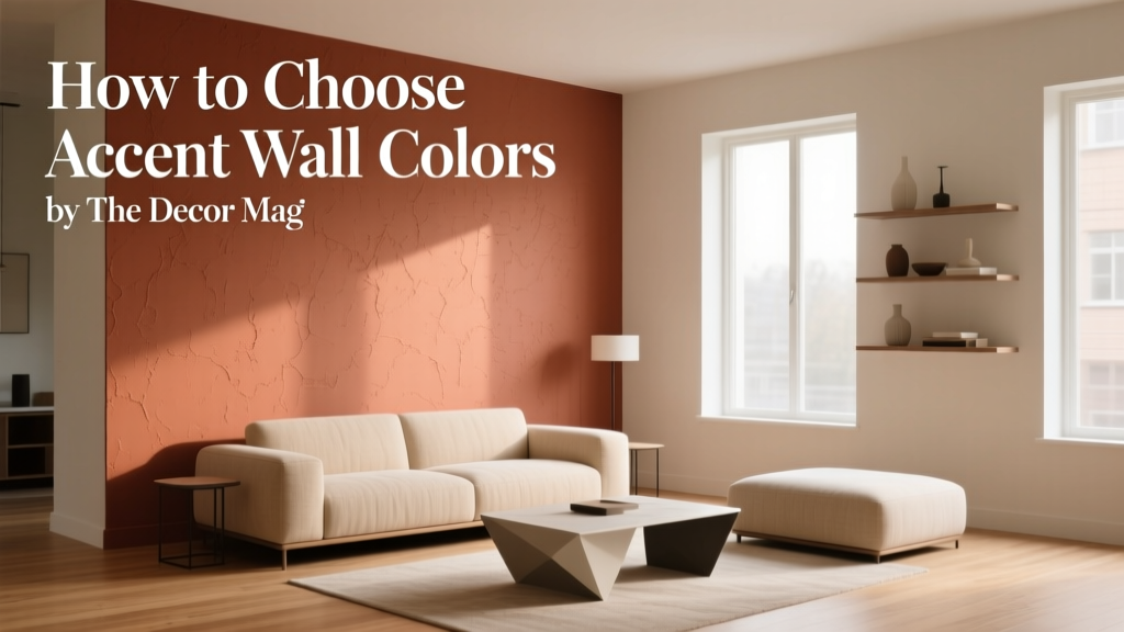 How to Choose Accent Wall Colors - The Decor Mag
 Cheap vs Premium Placement: What $0.12 CPM Really Costs Your Brand