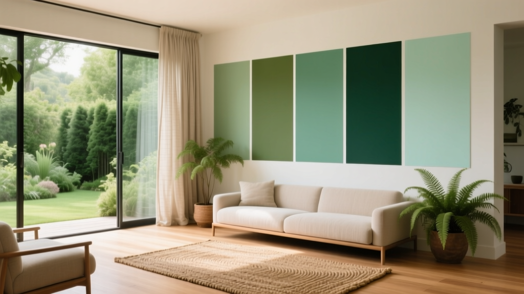
Best Green Paint Colors for Nature Lovers - The Decor Mag
Green is the color of leaves after rain, shaded forest paths, herb gardens, and mossy stone. Bringing it indoors is one of the most reliable ways to make a home feel calmer, fresher, and more connected to the natural world—without changing your architecture or buying all new furniture. If you’re a nature lover, green paint colors can recreate that grounded feeling you get outside, while still supporting a polished, design-forward interior.
From a color psychology standpoint, green sits at the center of the visible spectrum, which is part of why it reads as balanced and restorative. In interior color design, it can act like a “visual exhale”—softening busy spaces, cooling down sun-drenched rooms, or adding depth where you want a cocoon-like vibe. The trick is choosing the right green undertone and pairing it with finishes and color schemes that make it look intentional, not muddy or overly loud.
This guide breaks down the best green paint colors across styles—sage, olive, forest, and modern blue-greens—plus real room scenarios, smart pairings, and common mistakes to avoid so you can use green with confidence.
How to Choose the Right Green Paint Color (Undertones, Light, and Mood)
“Green” isn’t one color—it’s a family with dramatically different undertones. Your perfect green depends on three factors: undertone, light exposure, and the mood you want the room to convey.
1) Understand Green Undertones
- Yellow-leaning greens (olive, moss, chartreuse-tinged): earthy, cozy, traditional; can look warmer and more muted.
- Blue-leaning greens (teal-leaning, sea glass): crisp, clean, modern; can feel cooler and more “spa-like.”
- Gray-leaning greens (sage, eucalyptus): subtle, versatile, easy to live with; a favorite for whole-home palettes.
- Brown-leaning greens (deep olive, army green): sophisticated, grounding; excellent for libraries, dining rooms, and cabinetry.
2) Read the Room’s Natural Light
- North-facing rooms: cooler, flatter light can make some greens feel more gray or slightly stern. Consider warmer sages or olives.
- South-facing rooms: abundant warm light makes greens glow. Most greens work here, including deeper forest tones.
- East-facing rooms: crisp morning light, softer later. Choose balanced greens that won’t feel dull in the afternoon.
- West-facing rooms: warm, intense evening light can amplify yellow undertones. If you dislike “muddy” greens, consider a cooler green.
3) Match Green to the Feeling You Want
- Relaxed and airy: soft sage, silvery eucalyptus, pale sea glass.
- Grounded and cozy: olive, moss, deep khaki greens.
- Elegant and dramatic: forest green, blackened green, deep emerald-leaning greens.
- Fresh and energetic: brighter botanical greens used in small doses (doors, mudrooms, cabinets).
Best Green Paint Colors (Designer Favorites for Nature-Inspired Homes)
Below are specific green paint color recommendations, with widely available brand references. Always sample—greens can shift more than many colors depending on undertones, flooring, and adjacent materials.
Soft Sage & Eucalyptus Greens (Calm, Timeless, Easy to Decorate)
These are the “living neutrals” of the green family. They work beautifully in open floor plans, bedrooms, hallways, and anywhere you want a gentle nature-inspired backdrop.
- Sherwin-Williams Sea Salt (SW 6204): A beloved blue-green with a gray wash. Great for bathrooms, bedrooms, and coastal-inspired color schemes. Pairs well with white tile, light oak, and brushed nickel.
- Sherwin-Williams Clary Sage (SW 6178): A muted, earthy sage that feels organic and grown-up. Excellent for kitchens, mudrooms, and living rooms with warm woods.
- Benjamin Moore Saybrook Sage (HC-114): Warm, classic sage that complements traditional architecture and historic homes. Beautiful with creamy trim and brass accents.
- Benjamin Moore Healing Aloe (1562): A pale, spa-like green with a soft blue undertone. Ideal for low-stress zones like bathrooms and guest rooms.
- Farrow & Ball Mizzle (No. 266): A sophisticated gray-green that reads subtle and elevated. Gorgeous with natural linen, stone, and soft black hardware.
Room scenario: In a bedroom with medium-toned wood floors and off-white bedding, paint walls in Sea Salt or Healing Aloe, add warm woven textures (jute, rattan), and finish with matte black bedside lamps for contrast.
Olive & Moss Greens (Earthy, Cozy, Nature-Forward)
Olive and moss tones feel like hiking trails and garden herbs. They’re especially flattering with leather, walnut, terracotta, and aged brass—perfect for nature lovers who want warmth and depth.
- Sherwin-Williams Evergreen Fog (SW 9130): A modern gray-green that bridges warm and cool. Works in living rooms, offices, and kitchens where you want a calm but current look.
- Benjamin Moore October Mist (1495): A gentle, softly earthy green that feels airy yet grounded. Great for open concept spaces and walls that connect multiple rooms.
- Benjamin Moore Essex Green (HC-188): A deep, nearly black-green with a classic heritage vibe. Best for accent walls, built-ins, or exterior doors.
- Farrow & Ball Lichen (No. 19): A muted, traditional green that reads like moss on stone. Lovely in dining rooms and entryways.
Room scenario: In a living room with cream upholstery and oak floors, use Evergreen Fog on the walls, add rust/terracotta pillows, and incorporate plants with varied leaf shapes to amplify the natural palette without feeling themed.
Forest & Deep Botanical Greens (Dramatic, Luxurious, Cocooning)
Deep greens are the indoor equivalent of stepping into the woods. They’re excellent for creating intimacy—especially in dining rooms, libraries, powder rooms, and media rooms.
- Benjamin Moore Backwoods (469): Rich and woodsy. Strong enough for an all-over application with the right lighting.
- Sherwin-Williams Ripe Olive (SW 6209): Dark, grounded, and elegant. Pairs beautifully with warm whites and natural stone.
- Farrow & Ball Studio Green (No. 93): A classic deep green that can read almost black in low light. Stunning with brass picture lights and traditional millwork.
- Benjamin Moore Essex Green (HC-188) (repeated here intentionally): Exceptional for drama on cabinetry, built-ins, and statement doors.
Room scenario: In a dining room, use Studio Green on walls with a satin or matte finish, hang a warm chandelier (2700K bulbs), and pair with a walnut table, ivory linen drapes, and antique brass candlesticks. The result feels like a dinner party in a woodland lodge—refined, not rustic.
Modern Blue-Greens & Teal-Leaning Greens (Fresh, Clean, Architectural)
If you love the idea of green but want something crisp and contemporary, consider blue-greens. They pair well with clean-lined furniture, marble, and modern metal finishes.
- Benjamin Moore Aegean Teal (2136-40): A blue-green with depth that still feels approachable. Great for offices, built-ins, and accent walls.
- Sherwin-Williams Rainwashed (SW 6211): Light and breezy, ideal for bathrooms, laundry rooms, and sunlit kitchens.
- Farrow & Ball Green Smoke (No. 47): A moody blue-green that feels historic and artistic at once—excellent for studies and cozy sitting rooms.
Room scenario: In a small bathroom with white subway tile, paint upper walls Rainwashed and add natural oak accessories, white towels, and a soft black-framed mirror for a clean, spa-meets-modern look.
Nature-Inspired Green Color Schemes (What to Pair with Green Paint)
Green is adaptable, but it looks best when it’s supported by a thoughtful color scheme. Use these combinations to create a cohesive interior color design.
Best Neutrals with Green
- Warm whites (creamy, not stark): help olive and sage feel cozy and natural.
- Soft greiges: keep gray-leaning greens sophisticated and modern.
- Charcoal and soft black: add definition and make greens look richer.
Best Accent Colors with Green
- Terracotta / clay / rust: complements green on the color wheel’s warm side for an earthy, botanical palette.
- Blush and muted pink: creates a gentle, garden-inspired contrast (think roses + foliage).
- Ochre / mustard: energizes muted greens, especially in vintage or eclectic rooms.
- Navy: a crisp, tailored pairing for offices and libraries.
Materials That Make Green Look Expensive
- Natural wood (oak, walnut, rift-sawn white oak)
- Stone (soapstone, slate, travertine)
- Metals: aged brass, antique bronze, matte black
- Textiles: linen, wool, leather, bouclé
Where Green Paint Works Best: Real-World Applications
Living Rooms
For a living room that feels welcoming day and night, choose mid-tone muted greens like Evergreen Fog or October Mist. They act like a soft backdrop for art, plants, and mixed wood tones.
- Pro tip: If your sofa is gray, pick a green with warmth (olive/sage) to avoid a cold overall cast.
Kitchens (Walls vs. Cabinets)
Green kitchens read fresh and timeless—especially when the green is slightly muted.
- For cabinets: Consider deeper tones like Essex Green or Ripe Olive for lowers or an island.
- For walls: Use lighter sages like Clary Sage to keep the space bright.
- Countertop pairing: White quartz looks crisp; soapstone and honed black stone look moody and natural.
Bedrooms
Bedrooms love soft greens because they support rest. Think Sea Salt or Healing Aloe with layered whites, warm woods, and low-gloss finishes.
- Pro tip: Choose matte paint for walls to enhance the velvety, quiet feel—especially with deeper greens.
Bathrooms and Powder Rooms
In bathrooms, green can go spa-soft or jewel-box dramatic.
- Airy spa: Rainwashed + white tile + light wood.
- Moody powder room: Studio Green or Essex Green + brass mirror + warm sconce lighting.
Home Offices
Green supports focus without feeling sterile. Mid to deep greens like Aegean Teal or Evergreen Fog create a calm, intelligent backdrop for video calls and long work sessions.
Paint Finish and Sampling Tips (So Your Green Doesn’t Surprise You)
- Sample on multiple walls: Green shifts dramatically between shade and sun. Paint at least two large swatches or use peel-and-stick samples.
- Check at three times of day: morning, midday, evening. Use the lighting you actually live with.
- Coordinate with fixed finishes: flooring, countertops, tile, and large upholstery pieces should guide your undertone choice.
- Pick the right sheen:
- Matte: best for bedrooms, living rooms, and deep greens (hides imperfections, looks rich).
- Eggshell: durable and soft for hallways and family rooms.
- Satin: good for kitchens, baths, and trim when you want wipeability.
Common Green Paint Mistakes (and How to Avoid Them)
- Choosing green without checking undertones: A “sage” that turns minty or muddy usually clashes with your flooring or tile undertones. Compare samples next to your fixed materials.
- Ignoring lighting temperature: Cool LEDs (4000K+) can make greens look harsh or gray. For cozy rooms, use warm bulbs (2700K–3000K).
- Pairing green with the wrong white: Bright, icy whites can make warm olive look dingy. Use warm whites with warm greens; cleaner whites with blue-greens.
- Overusing bright greens: Highly saturated greens are powerful. If you love them, use them on a door, built-in, or vanity rather than every wall.
- Forgetting contrast: Green needs grounding. Add contrast with black accents, dark wood, or crisp trim so the room doesn’t feel flat.
FAQ: Green Paint Colors for Nature-Loving Homes
What is the most versatile green paint color for a whole home?
Look for a muted gray-green like Sherwin-Williams Evergreen Fog (SW 9130) or a soft, earthy green like Benjamin Moore October Mist (1495). They behave almost like neutrals and transition well between rooms.
Do green walls make a room feel darker?
Deeper greens (forest, blackened greens) can make a room feel more intimate, especially in low natural light. If you want brightness, choose a lighter sage or blue-green and use a matte or eggshell finish to keep it soft.
What trim color looks best with green paint?
Warm whites pair beautifully with olive and sage greens, while cleaner whites work best with blue-greens. If you want a modern look, consider a slightly softened white rather than a stark, icy trim.
What colors go with green for a balanced color scheme?
Reliable pairings include warm white, greige, charcoal, terracotta, blush, navy, and natural wood tones. The best combination depends on whether your green leans warm (olive) or cool (blue-green).
Is green a good choice for kitchens and cabinets?
Yes—green kitchen cabinets are a classic. Deep shades like Benjamin Moore Essex Green and Sherwin-Williams Ripe Olive look especially refined on cabinetry, paired with brass or matte black hardware and warm wood accents.
How do I keep green paint from looking “too minty” or “too yellow”?
Sample first and compare against a true neutral (white or gray) plus your flooring. If it turns minty, choose a greener shade with more gray or a touch of warmth. If it turns too yellow, shift toward a cooler, blue-leaning green.
Next Steps: Bring the Outdoors In with the Right Green
Start by picking the mood you want—airy sage, earthy olive, or dramatic forest—then test two to three options in your actual light. Build a nature-inspired color scheme around warm whites, natural wood, and a few contrasting accents (matte black, brass, or charcoal) to make your green feel intentional and elevated. With the right undertone and finish, green paint colors can transform your home into a daily retreat.
For more paint color ideas, color psychology insights, and room-by-room color schemes, explore more color guides on thedecormag.com.
More Articles
 Best Aqua Paint Colors - The Decor Mag
 Best Fire Engine Red Paint Colors - The Decor Mag
 Best Moss Green Paint Colors - The Decor Mag
 Best Prussian Blue Paint Colors - The Decor Mag
 Best Chartreuse Paint Colors - The Decor Mag
 Reading FAQ Answered: Evidence-Based Answers to 27 Common Questions About Vision, Eye Health, and Reading Performance
 Best Pistachio Paint Colors - The Decor Mag
 How to Choose Bathroom Paint Colors - The Decor Mag
 How to Use Color to Change Room Perception - The Decor Mag
 Earth Tone Color Palette Inspiration - The Decor Mag