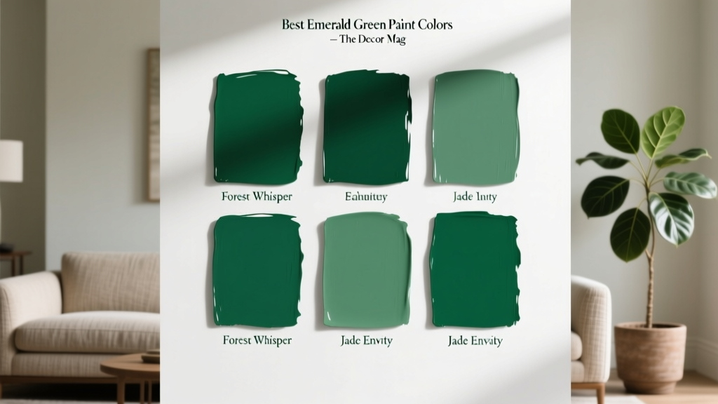
Best Emerald Green Paint Colors - The Decor Mag
Emerald green has a rare design superpower: it reads both timeless and fresh. One day it feels like a jewel-toned heritage color pulled from an old library; the next it looks crisp and modern against pale woods and warm whites. That versatility is exactly why homeowners keep searching for the best emerald green paint colors—because the right green can instantly elevate a room without feeling trendy or fleeting.
Emerald sits in that sweet spot between cool and warm, saturated yet sophisticated. Psychologically, green is tied to balance, restoration, and calm—qualities we often want more of at home. But emerald adds a layer of confidence and drama, making it a strong choice for feature walls, cabinetry, dining rooms, powder rooms, and even ceilings when you want an enveloping, designer look.
This guide breaks down how emerald green behaves in real interiors, the best paint color picks across major brands, and how to build emerald green color schemes that feel intentional—plus the common mistakes that cause emerald to skew too dark, too neon, or too “holiday.”
What “Emerald Green” Really Means in Paint
In gemstones, emerald is vivid and clear. In paint, “emerald green” can range from deep blue-green to slightly yellow-leaning green, depending on undertones and lighting. That’s why one person’s “perfect emerald” can look teal in another home, or turn forest-dark in a north-facing room.
Emerald Green Undertones: Blue vs. Yellow
- Blue-leaning emeralds feel cooler, moodier, and more contemporary. They pair beautifully with crisp whites, chrome, and cool marbles.
- Yellow-leaning emeralds feel warmer and more traditional. They pair well with brass, creamy whites, and warm woods.
- Neutral emeralds (balanced undertones) are the easiest to live with across changing daylight.
Why Lighting Changes Emerald Green So Much
- North-facing light is cooler and can deepen emerald into a shadowy, blue-leaning green.
- South-facing light intensifies saturation; emerald can look brighter and more jewel-like.
- East-facing rooms glow in the morning; emerald may look warmer early and cooler later.
- West-facing rooms can make emerald look rich and dramatic in late afternoon, sometimes slightly murky at midday.
Pro tip: Always test swatches in multiple spots and observe them at three times: morning, midday, and evening with lights on.
How to Choose the Best Emerald Green Paint Color for Your Space
Step-by-Step Selection Checklist
- Decide the role: statement wall, full-room color-drench, cabinetry, trim, or exterior accent.
- Match your fixed finishes: countertops, flooring, tile, brick, and metal finishes (brass, nickel, black).
- Pick your depth: mid-tone emerald (lively) vs. deep emerald (moody, luxurious).
- Choose a white/neutral partner: warm white vs. cool white dramatically changes emerald’s read.
- Select sheen wisely: matte/eggshell for walls, satin for cabinets/trim, semi-gloss for doors.
Best Sheens for Emerald Green
- Walls: matte or eggshell for a velvety, high-end look that softens saturation.
- Cabinetry: satin or specialty cabinet enamel for durability and wipeability.
- Trim/doors: satin or semi-gloss to highlight architectural detail (especially in a monochrome scheme).
- Ceilings: matte for an immersive “jewel box” effect in dining rooms and powder rooms.
Best Emerald Green Paint Colors (Designer-Approved Picks)
These emerald green paint colors are popular for a reason: they tend to stay rich without turning too neon, too gray, or too black—assuming you test in your lighting.
Benjamin Moore Emerald Green Paint Colors
- Benjamin Moore Essex Green (HC-188): A deep, classic green that can read nearly black in low light. Stunning for front doors, built-ins, or a moody library.
- Benjamin Moore Hunter Green (2041-10): Bold and traditional with a jewel-like depth. Great for dining rooms, cabinetry, and accent walls.
- Benjamin Moore Narragansett Green (HC-157): A sophisticated blue-green that feels tailored and historic. Ideal when you want emerald energy with a slightly muted, stately vibe.
- Benjamin Moore Vintage Vogue (462): A popular deep green with a soft, earthy cast—more complex than a straight emerald. Excellent for color-drenched rooms and kitchens.
Sherwin-Williams Emerald Green Paint Colors
- Sherwin-Williams Emerald Green (SW 2932): Vibrant and saturated—closest to a true gemstone emerald. Best in well-lit spaces or as an accent where you want high drama.
- Sherwin-Williams Rookwood Dark Green (SW 2816): A historic, grounded deep green that feels refined rather than flashy. Great for studies, stair halls, and traditional exteriors.
- Sherwin-Williams Cascades (SW 7623): A deep blue-green that pairs beautifully with white oak and black accents for a modern organic look.
- Sherwin-Williams Hunt Club (SW 6468): Deep and classic, with a slightly warm pull. A strong choice for built-ins and dining rooms.
Farrow & Ball (Iconic Deep Greens)
- Farrow & Ball Emerald Green (No. W53): A rich, saturated emerald with a playful jewel quality. Gorgeous for lacquer-like cabinetry or a statement powder room.
- Farrow & Ball Green Smoke (No. 47): A softer, more muted green with blue-gray complexity. Choose this when you love emerald but want something easier and quieter on large walls.
- Farrow & Ball Studio Green (No. 93): Very deep and sophisticated—reads nearly black-green in dimmer light. Perfect for dramatic doors, trim, or a cocooning bedroom.
Behr & Accessible Retail Picks
- Behr Dynasty “Green Agate” (N410-3): A lively, jewel-inspired green that feels cheerful without going neon (best with warm whites and natural textures).
- Behr “Emerald Isle” (PPU11-02): A richer, deeper green that works well for accent walls and cabinetry; pair with brass for a classic look.
Tip for brand matching: If you’re committed to a specific brand for performance (like cabinet enamel), bring your favorite emerald sample to have it color-matched—but always test first. Undertones can shift slightly between paint bases.
Real Room Examples: Where Emerald Green Looks Best
1) Emerald Green Living Room: Cozy, Elevated, and Collected
Scenario: A living room with warm wood floors and medium natural light.
- Paint idea: Benjamin Moore Vintage Vogue on walls (eggshell).
- Trim: warm white (think creamy, not icy) to keep the room inviting.
- Accents: camel leather sofa, vintage brass lamp, linen drapery, and a rug with cream + rust + hints of green.
Why it works: Emerald green color schemes feel most livable when balanced by warm neutrals and tactile materials (wool, linen, leather, aged metals).
2) Emerald Green Kitchen Cabinets: Modern Classic with Personality
Scenario: Shaker cabinets, white quartz counters, and brushed brass hardware.
- Paint idea: Sherwin-Williams Hunt Club (satin) on lower cabinets or island.
- Walls: soft warm white to prevent the space from feeling heavy.
- Backsplash: off-white zellige or classic subway tile with warm grout.
Designer move: Keep uppers light (wood or white) and go emerald on lowers/island for depth without closing in the room.
3) Emerald Green Bedroom: Calm, Restorative, and Luxe
Scenario: A bedroom that needs more coziness and better sleep vibes.
- Paint idea: Farrow & Ball Green Smoke for a softened emerald feel.
- Bedding: crisp white sheets + a textured duvet in oatmeal or warm gray.
- Metals: antique brass or blackened bronze for a grounded, boutique-hotel mood.
Color psychology angle: Green supports relaxation, and deeper greens can feel protective and cocooning—ideal for bedrooms when paired with warm lighting.
4) Emerald Green Dining Room: The Jewel Box Effect
Scenario: A dining room used mostly at night.
- Paint idea: Benjamin Moore Essex Green for walls and even trim (matte on walls, satin on trim).
- Lighting: warm bulbs (2700K) to bring out richness and prevent harshness.
- Table: dark wood or marble; add velvet dining chairs in camel, cream, or deep aubergine.
Why it works: Dining rooms thrive with saturated color. Emerald makes candlelight and warm metals glow.
5) Emerald Green Bathroom or Powder Room: Small Space, Big Impact
Scenario: A compact powder room craving personality.
- Paint idea: Sherwin-Williams Emerald Green (SW 2932) for a bold jewel-tone moment.
- Pair with: white porcelain, unlacquered brass, and a framed mirror with warm metallic tones.
- Optional: add wallpaper on the ceiling or one wall for a layered, designer feel.
Emerald Green Color Schemes That Always Look Intentional
Emerald can act like a neutral when you pair it with the right supporting cast. Use these combinations to build a cohesive interior color design plan.
Go-To Pairings
- Emerald + Warm White: creamy whites keep emerald approachable (great for traditional and transitional homes).
- Emerald + Black: crisp, graphic contrast for modern spaces (use black sparingly to avoid heaviness).
- Emerald + Brass: classic and flattering; brass amplifies emerald’s jewel quality.
- Emerald + Natural Wood: especially white oak, walnut, and rattan for a modern organic look.
- Emerald + Blush or Dusty Rose: a sophisticated complementary contrast that feels fresh, not sweet.
- Emerald + Navy: layered, moody, and elegant—best when one color is dominant and the other is an accent.
Quick Palette Formulas (Pick One)
- Classic: Emerald + warm white + brass + walnut
- Modern: Emerald + crisp white + black + light oak
- Earthy: Emerald + clay/terracotta + cream + aged bronze
- Glam: Emerald + marble white + gold + velvet neutrals
Common Emerald Green Paint Mistakes (and How to Avoid Them)
- Choosing emerald without testing undertones: A green that looks perfect online may shift teal or muddy on your wall. Paint large samples and view them next to your flooring and countertops.
- Pairing emerald with the wrong white: Cool, icy whites can make some emeralds feel harsh. If your emerald leans warm, choose a warm white; if it leans cool, a cleaner white can work.
- Underestimating depth in low light: Many deep emerald greens read almost black at night. If your room is dim, consider a slightly lighter emerald or improve lighting layers.
- Too many competing jewel tones: Emerald loves company, but not a crowded room. If you add ruby, sapphire, and amethyst all at once, the space can feel theatrical. Choose one secondary accent color and keep the rest neutral.
- Ignoring sheen: High gloss on large walls can highlight imperfections and make emerald feel overly intense. Use matte/eggshell on walls for a more refined result.
Practical Tips for Painting Emerald Green Successfully
- Plan for coverage: Saturated greens often need excellent primer and two coats (sometimes three), especially over white or patchy walls.
- Use a tinted primer: Ask your paint store for a gray or green-tinted primer to improve depth and evenness.
- Warm your lighting: Aim for 2700K–3000K bulbs in living spaces to keep emerald rich and welcoming.
- Balance with texture: Emerald looks best with natural materials—linen, wool, jute, wood, leather—so the color feels layered, not flat.
- Repeat the color: Add small echoes (art, pillows, a vase) to make the emerald choice feel integrated.
FAQ: Emerald Green Paint Colors
What is the most popular emerald green paint color?
Among designers, deep greens like Benjamin Moore Essex Green and Benjamin Moore Vintage Vogue are perennial favorites for their richness and versatility. For a brighter gemstone look, Sherwin-Williams Emerald Green (SW 2932) is a bold option.
Does emerald green make a room look smaller?
Darker emerald greens can feel more enveloping, which some people interpret as “smaller.” In practice, emerald often makes a room feel more intentional and cozy. Use good lighting, lighter trim, and reflective accents (mirrors, metal finishes) if you want to keep the space feeling open.
What trim color looks best with emerald green walls?
Most emerald green walls look best with either:
- Warm white trim for a classic, inviting look, or
- Crisp white trim for a modern, high-contrast look.
Match the trim temperature to the emerald’s undertone and your fixed finishes.
Is emerald green a good color for kitchen cabinets?
Yes—emerald green kitchen cabinets are a standout choice that still feels timeless. Choose a durable cabinet paint in satin, pair with brass or black hardware, and keep counters/backsplashes simple so the green remains the star.
How do I keep emerald green from looking too “Christmas”?
Avoid pairing emerald with bright true red. Instead, use:
- soft blush, camel, or rust accents,
- brass and warm woods,
- creamy whites rather than stark, icy whites.
Can I use emerald green in an open-concept home?
Yes—treat emerald as an anchor color. Use it on one focal zone (like built-ins, an island, or a dining area) and repeat it subtly in accessories elsewhere. Keep adjoining spaces in warm neutrals to maintain flow.
Next Steps: Make Emerald Green Work in Your Home
Start by choosing 2–3 emerald green paint colors that match the mood you want—bright jewel, classic deep, or softly muted—then test large samples in your actual lighting. Build a simple color scheme around emerald using a supportive white, a metal finish, and one accent color (like blush, terracotta, or navy). From there, decide whether emerald belongs on walls, cabinetry, or a statement moment like a door or ceiling.
For more paint color ideas, color scheme formulas, and room-by-room guidance, explore our latest color guides on thedecormag.com.
More Articles
 Best Crimson Paint Colors - The Decor Mag
 Best Rust Red Paint Colors - The Decor Mag
 Best Blush Pink Paint Colors - The Decor Mag
 How to Mix Warm and Cool Tones Successfully - The Decor Mag
 Best Cardinal Red Paint Colors - The Decor Mag
 Best Gray Paint Colors for 2026 - The Decor Mag
 Best Burgundy Paint Colors - The Decor Mag
 Best Lavender Paint Colors for Relaxation - The Decor Mag
 How to Choose Colors for a Conservatory - The Decor Mag
 How to Choose Bedroom Colors for Sleep - The Decor Mag