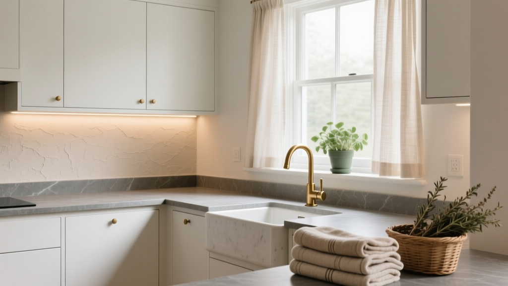
How to Choose Colors for a Scullery - The Decor Mag
A scullery is one of the hardest-working rooms in the home, yet it’s often treated as an afterthought—painted whatever is left over from the kitchen or kept “safe” with stark white. Color changes that. The right scullery paint color scheme can make a small utility space feel calm and intentional, boost perceived cleanliness, and even make chores feel less like chores.
Because sculleries live in the practical zone—between cooking, entertaining, storage, and cleanup—color has to do more than look pretty. It needs to handle humidity, fluctuating light, and visual clutter from appliances and supplies. With a smart palette, you can create a space that feels polished, supports organization, and connects seamlessly to the kitchen and adjacent rooms.
This guide walks you through how to choose colors for a scullery using color psychology and core design principles, with specific paint color recommendations, real-room scenarios, and common mistakes to avoid.
What Makes Scullery Color Selection Different?
Unlike a formal dining room or bedroom, a scullery is typically:
- Smaller and more enclosed (often no windows or limited natural light)
- Task-focused (washing up, prep, laundry, storage)
- Visually busy (open shelves, appliances, baskets, cleaning supplies)
- Moisture-prone (steam, splashes, wet hands, damp towels)
That means your scullery color scheme should prioritize:
- Light management: choosing undertones that behave well in low or artificial light
- Stress reduction: colors that feel calm and controlled
- Durability: scrubbable finishes and colors that don’t show every smudge
- Continuity: a palette that relates to the kitchen without matching it exactly
Start with the Fixed Elements (They Set the Rules)
Before choosing paint colors, inventory what won’t change—or won’t change soon. These fixed finishes control undertones and keep your palette from feeling “off.”
Key fixed elements to consider
- Cabinet finish: white, cream, wood tone, painted color
- Worktop: quartz, laminate, stone (look for warm vs cool veining)
- Backsplash: tile color, grout tone, pattern
- Flooring: tile, wood, LVT (and the undertone of the floor)
- Hardware: brass, chrome, black, nickel
- Appliances: stainless, white, black
Quick undertone check: hold a bright white sheet of paper next to your cabinet or tile. If the finish looks yellowish, you’re in warm territory. If it looks bluish/gray, you’re in cool territory.
Understand the Light: The #1 Factor in Scullery Paint Colors
Many sculleries rely on artificial lighting, and light temperature changes everything about how paint reads.
How lighting affects color (and how to respond)
- Warm bulbs (2700K–3000K): amplify creams, yellow undertones, and warm beiges. Cool grays can turn muddy.
- Neutral bulbs (3500K): most forgiving; paint colors look closer to how they appear in stores.
- Cool bulbs (4000K+): sharpen blues and grays; warm paints can look dull or slightly greenish.
Practical tip: If you can, upgrade to high-CRI bulbs (90+). In utility spaces, high color rendering makes whites feel cleaner and paint colors more accurate—especially important in a scullery where you’re judging food, stains, and cleanliness.
Choose Your Scullery Color Strategy
Use one of these proven approaches depending on your goals and your home’s style. Each can create a cohesive interior color design while serving the scullery’s practical needs.
1) The “Calm Continuity” Palette (Connect to the Kitchen)
Best for open-plan homes or when your scullery is visible from the kitchen. You’ll echo the kitchen’s undertone but shift the value (lighter/darker) or saturation (muted/richer).
Example scenario: A kitchen with warm white cabinets and brass hardware. In the scullery, use a muted green-gray to support a “quiet utility” mood without clashing.
Paint ideas:
- Farrow & Ball Mizzle (soft green-gray; reads serene in warm light)
- Benjamin Moore Saybrook Sage HC-114 (classic sage; works with woods and brass)
- Sherwin-Williams Sea Salt SW 6204 (blue-green gray; airy, adaptable)
2) The “Bright and Clean” Palette (Maximize Light)
Perfect for windowless sculleries. Crisp off-whites and pale neutrals bounce light and make the space feel hygienic and spacious.
Real room application: White cabinetry, stainless appliances, and a busy countertop. A soft white wall color reduces contrast, so visual clutter feels calmer.
Paint ideas (soft whites that avoid harshness):
- Benjamin Moore White Dove OC-17 (balanced, slightly warm; forgiving)
- Sherwin-Williams Alabaster SW 7008 (creamy but not yellow; cozy-clean)
- Dulux White Mist 1 (gentle neutral white; good for UK readers)
Pro tip: Pair soft white walls with a slightly deeper cabinet or island color so the room doesn’t feel flat. Even a pale greige base cabinet can add structure.
3) The “Moody Utility” Palette (Hide Wear and Add Drama)
Dark colors can be incredibly practical: they hide scuffs, ground the space, and feel tailored—especially with good lighting. This works best when you commit to layered lighting (ceiling + under-cabinet + a wall sconce if possible).
Example scenario: A scullery used for entertaining overflow with open shelving for glassware. Deep navy or charcoal walls make glass sparkle and look intentional.
Paint ideas:
- Farrow & Ball Hague Blue (deep blue-green; sophisticated)
- Benjamin Moore Hale Navy HC-154 (rich navy; timeless with brass)
- Sherwin-Williams Iron Ore SW 7069 (soft charcoal; modern and forgiving)
Design principle: Darker hues visually recede, but they also increase perceived contrast. Keep counters and trim lighter if you want definition without heaviness.
4) The “Color Pop” Palette (A Small Room Is a Safe Place to Play)
Sculleries are ideal for braver color schemes because they’re transitional spaces. A punchy color can feel energizing and joyful—great if the scullery doubles as a coffee station or pantry.
Example scenario: A classic white kitchen, but you want personality. Paint the scullery cabinetry in a punchy hue, keep walls neutral, and add a patterned tile.
Paint ideas for a controlled pop:
- Farrow & Ball Setting Plaster (muted blush; warm and modern)
- Benjamin Moore Wrought Iron 2124-10 (inky near-black; dramatic “pop” through depth)
- Sherwin-Williams Evergreen Fog SW 9130 (muted green; trendy but soft)
Color Psychology: What You Want the Scullery to Feel Like
Color psychology isn’t about rules—it’s about perception and mood. Ask yourself what you want to feel when you walk into the space.
- Calm and organized: sage greens, green-grays, soft greiges
- Fresh and clean: soft whites, pale blue-grays, light taupes
- Cozy and welcoming: warm off-whites, clay tones, muted terracotta
- Polished and high-end: navy, charcoal, deep forest green
Tip: If your scullery is where you start the day (coffee, lunch prep), choose colors that energize gently (warm whites, muted greens). If it’s a “hide the mess” space during entertaining, go deeper (navy, charcoal) and focus on good lighting.
Ready-Made Scullery Color Combinations (Walls + Cabinets + Trim)
These color schemes are designed to be practical and cohesive, using paint colors that designers commonly specify.
Scheme A: Soft White + Sage + Brass
- Walls: Benjamin Moore White Dove OC-17
- Cabinets: Sherwin-Williams Evergreen Fog SW 9130
- Trim/Ceiling: Sherwin-Williams Pure White SW 7005
- Best with: warm wood shelves, brass pulls, creamy stone
Scheme B: Greige + Charcoal Accents (Modern Workhorse)
- Walls: Sherwin-Williams Agreeable Gray SW 7029
- Cabinets: Sherwin-Williams Iron Ore SW 7069
- Trim: Benjamin Moore Simply White OC-117
- Best with: black hardware, stainless appliances, concrete-look floors
Scheme C: Pale Blue-Gray + Crisp White (Fresh Utility)
- Walls: Benjamin Moore Boothbay Gray HC-165
- Cabinets: Benjamin Moore Chantilly Lace OC-65
- Trim: match cabinetry for a seamless feel
- Best with: white subway tile, chrome/nickel hardware
Scheme D: Deep Navy + Warm White (Classic and Tailored)
- Walls: Benjamin Moore Hale Navy HC-154 (or use on cabinets)
- Cabinets: warm white like Sherwin-Williams Alabaster SW 7008
- Trim: Sherwin-Williams Extra White SW 7006 for crispness
- Best with: brass or polished nickel, marble-look quartz
Where to Put Color in a Scullery (So It Looks Designed)
Sculleries can feel choppy if color is scattered. Use one of these placement strategies:
Option 1: Color on cabinets, neutral walls
Best if you have lots of uppers or open shelves. The cabinetry becomes the “feature,” while walls stay quiet.
Option 2: Color on walls, light cabinets
Best if cabinetry is minimal or you want the room to feel larger. Muted mid-tone wall colors can also disguise splashes better than bright white.
Option 3: Two-tone (lower cabinets darker)
Best for family homes. Dark lowers hide kicks and scuffs; lighter uppers keep the room bright.
Easy rule for balance: Aim for 60% dominant color (usually walls), 30% secondary (cabinets), 10% accent (hardware, shelving, accessories).
Finish Matters: The Most Practical Paint Sheens for Sculleries
The best scullery paint color can still fail if the finish can’t handle moisture and wiping.
- Walls: eggshell or satin (wipeable, less glare than semi-gloss)
- Trim: satin or semi-gloss (durable, crisp edges)
- Cabinets: satin or specialized cabinet enamel (hard-wearing)
Product tip: Look for scrubbable formulas (e.g., Benjamin Moore Regal Select, Sherwin-Williams Emerald, Dulux Easycare) for high-traffic utility spaces.
Real Room Examples: Scullery Color Choices in Action
Example 1: Windowless Scullery That Feels Bright
- Problem: no natural light, feels cramped
- Solution: soft white walls + reflective surfaces + consistent trim color
- Palette: Sherwin-Williams Alabaster on walls, Pure White trim, brushed nickel hardware
- Why it works: warm off-white avoids the gray cast that can happen in artificial light
Example 2: Family Scullery That Hides Wear
- Problem: scuffs near the sink and bins, constant traffic
- Solution: darker lower cabinetry + mid-tone walls
- Palette: Benjamin Moore Hale Navy lowers, White Dove uppers/walls
- Why it works: navy conceals wear, while soft white keeps the room from feeling heavy
Example 3: Entertainer’s Scullery With Open Shelving
- Problem: open shelves look cluttered
- Solution: moody wall color to visually unify objects
- Palette: Farrow & Ball Hague Blue on walls, warm white ceiling, brass picture lights
- Why it works: deeper hues reduce contrast between items, making shelves look curated
Common Color Mistakes to Avoid
- Choosing a gray that turns green or purple: scullery lighting can exaggerate undertones. Always test.
- Using a stark, icy white in warm light: it can look dingy or fluorescent. Opt for softer whites.
- Ignoring the countertop undertone: warm stone + cool paint often reads “off” even if both are beautiful alone.
- Too many competing colors: sculleries already contain visual variety. Limit to 2–3 main colors.
- Going dark without enough lighting: deep paint colors need layered light to feel intentional, not cave-like.
- Choosing flat/matte in splash zones: it marks easily. Use scrubbable eggshell/satin.
How to Test Scullery Paint Colors (So You Don’t Regret It)
- Test at least three samples in the same color family (one lighter, one mid, one deeper).
- Paint large swatches (at least 12x12 inches) or use peel-and-stick samples.
- View them at real times: morning, evening, and with all task lighting on.
- Check next to fixed elements: countertop, tile, floor, and cabinet finish.
- Stand at the doorway: ensure your scullery color scheme relates to the kitchen palette.
FAQ: Choosing Colors for a Scullery
What are the best paint colors for a small scullery?
Soft whites and light neutrals tend to work best because they bounce light and reduce visual clutter. Good options include Benjamin Moore White Dove and Sherwin-Williams Alabaster. If you want color, try a muted green-gray like Farrow & Ball Mizzle.
Should the scullery match the kitchen color scheme?
It should relate, not necessarily match. Keep the same undertone family (warm with warm, cool with cool), then shift either the depth (lighter/darker) or saturation (more muted/richer) for subtle contrast.
Are dark colors a good idea in a scullery?
Yes—when paired with enough lighting. Dark navy, charcoal, and deep green can hide scuffs and look high-end. Consider Benjamin Moore Hale Navy or Sherwin-Williams Iron Ore, plus under-cabinet lights for function.
What paint sheen is best for scullery walls?
Eggshell or satin is ideal for most scullery walls because it’s more washable than matte and less shiny than semi-gloss. In heavy splash areas, choose a durable, scrubbable line from your preferred brand.
How do I stop my scullery from looking cluttered with open shelves?
Choose a unifying wall color (often a mid-tone or deeper hue) to reduce contrast between objects. Keep shelf contents within a tight palette—clear glass, white ceramics, and a couple of wood tones look intentional against moody colors like Farrow & Ball Hague Blue.
What’s a timeless scullery color scheme that won’t date quickly?
Warm off-white walls, subtle greige or sage cabinets, and classic metal finishes (brushed nickel or brass) are consistently resilient. A combination like Sherwin-Williams Alabaster with a muted green cabinet color (such as Evergreen Fog) feels current and enduring.
Next Steps: Build Your Scullery Color Plan
Use this simple checklist to turn ideas into a finished palette:
- Choose your mood: bright-clean, calm-continuous, moody-utility, or color-pop
- Confirm undertones: match paint to counters, floors, and backsplash
- Pick 2–3 main colors: walls, cabinets, trim (keep accents minimal)
- Select durable finishes: eggshell/satin walls, tougher enamel for cabinetry
- Test in real light: especially if your scullery is windowless
Once your scullery paint colors are set, the room often “clicks” into place—organization feels easier, the kitchen feels more cohesive, and the everyday moments feel more considered.
Looking for more paint color ideas and color scheme guidance? Explore additional color guides and room-by-room palettes on thedecormag.com.
More Articles
 How to Create a Harmonious Color Palette - The Decor Mag
 Best Kitchen Design for Studio Apartments: Smart, Stylish & Space-Saving Solutions
 Best Indigo Paint Colors - The Decor Mag
 Best Apricot Paint Colors - The Decor Mag
 How to Choose Colors for a Terrace - The Decor Mag
 Best Mint Green Paint Colors - The Decor Mag
 Best Cerulean Blue Paint Colors - The Decor Mag
 Best Lilac Paint Colors for Gentle Spaces - The Decor Mag
 How to Choose Colors for a Veranda - The Decor Mag
 How To Match Aging With Space: Designing Environments That Support Lifelong Well-Being