How to Create a Harmonious Color Palette - The Decor Mag
Color is one of the fastest ways to change how a home feels. It can calm a busy household, make a small room look bigger, warm up a north-facing space, or bring cohesion to an open-concept layout where everything is visible at once. Yet color is also where many homeowners get stuck—staring at hundreds of paint swatches and wondering how designers make it look effortless.
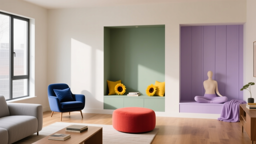
A harmonious color palette isn’t about playing it “safe” with beige. It’s about choosing colors that relate to each other through undertone, value (lightness/darkness), and saturation (intensity). When those elements align, your paint colors, furniture, textiles, and finishes work together—even if you mix styles or change decor seasonally.
This guide breaks down the design principles behind cohesive color schemes, offers specific paint color recommendations, and shows how to apply them room by room. You’ll also find common color mistakes to avoid, plus a practical checklist to help you choose with confidence.
What Makes a Color Palette Feel Harmonious?
In interior color design, “harmonious” means the colors share a clear relationship. That relationship can be subtle (soft neutrals that differ by a shade) or bold (contrasting hues that are balanced through tone and proportion). Harmony comes from controlling a few key variables:
- Undertone: The hidden temperature in a color (warm, cool, or neutral). A “white” can read creamy (warm) or icy (cool).
- Value: How light or dark a color is. A palette with multiple values creates depth.
- Saturation: How muted or vivid a color feels. Most sophisticated palettes mix neutrals with one or two clearer colors.
- Repeat + rhythm: Colors feel intentional when repeated across rooms (through paint, textiles, art, or accessories).
Color Psychology: Mood Is Part of the Design
Color psychology influences how a space supports daily life:
- Blues and blue-greens: Calm, steady, great for bedrooms and offices.
- Greens: Restorative and balanced; works nearly everywhere because it relates to nature.
- Warm neutrals (creams, greiges, soft tans): Welcoming and flattering to skin tones—ideal for living areas.
- Reds and terracottas: Energizing and social; best as accents or in dining rooms.
- Deep charcoals and navies: Grounding and cozy; strong for libraries, powder rooms, and media spaces.
Start with a Framework: 3 Reliable Color Scheme Types
Choosing a color scheme gives you guardrails. These three approaches create consistent results in real homes.
1) Monochromatic: One Hue, Many Shades
Monochromatic palettes use one main color in multiple values and saturations. They’re naturally cohesive and excellent for open layouts.
Example palette (soft blue):
- Walls: Benjamin Moore Palladian Blue (HC-144)
- Trim: Benjamin Moore Chantilly Lace (OC-65)
- Accent: Benjamin Moore Hale Navy (HC-154) (pillows, built-ins, or a single door)
2) Analogous: Neighboring Colors on the Color Wheel
Analogous color schemes (like blue + blue-green + green) feel serene and “designed” without high contrast.
Example palette (green family):
- Walls: Sherwin-Williams Sea Salt (SW 6204) (blue-green)
- Cabinetry or built-ins: Sherwin-Williams Evergreen Fog (SW 9130) (soft green)
- Accent: Sherwin-Williams Rainwashed (SW 6211) (spa-like blue-green)
3) Complementary (or Split-Complementary): Balanced Contrast
Complementary colors sit opposite each other on the color wheel (blue/orange, green/red). In homes, the most livable version is split-complementary—one main hue plus two neighbors of its complement—because it softens the contrast.
Example palette (navy + warm accents):
- Main neutral: Farrow & Ball Skimming Stone (No. 241) (warm greige)
- Anchor color: Benjamin Moore Hale Navy (HC-154) (island, built-ins, or accent wall)
- Warm accent: clay/terracotta textiles or art (think rust, cinnamon, cognac leather)
The 60-30-10 Rule (and When to Break It)
The 60-30-10 rule is a classic interior design principle that helps distribute color in a way that feels balanced:
- 60% = dominant color (usually wall paint or a large rug)
- 30% = secondary color (upholstery, curtains, cabinetry)
- 10% = accent color (pillows, art, decor, a painted piece)
When to break it: If you’re using a bold paint color on walls, you may prefer 50-30-20 to give neutrals more breathing room. In very small rooms (powder rooms, entryways), a dramatic 80/15/5 can feel intentional rather than overwhelming.
How to Choose Paint Colors That Work Together
Step 1: Identify Your Home’s Fixed Elements
Before choosing wall paint, list what isn’t changing soon. These “fixed finishes” should guide your palette’s undertone.
- Flooring (warm oak vs. cool gray tile)
- Countertops (marble, quartz with veining, granite)
- Cabinet color
- Large upholstery pieces
- Brick/stone fireplaces
Practical tip: Pull a paint fan deck next to your countertop and flooring in daylight. If the surfaces read warm, avoid icy whites and steely grays that can clash.
Step 2: Choose a “Connector Neutral”
A connector neutral is the paint color you can repeat in hallways, open living areas, or adjoining rooms to create flow. Great connector neutrals tend to be balanced and undertone-friendly.
Trusted connector neutrals (designer favorites):
- Benjamin Moore White Dove (OC-17) – soft white; warm-leaning but versatile
- Sherwin-Williams Alabaster (SW 7008) – creamy, inviting white for most homes
- Benjamin Moore Classic Gray (OC-23) – light greige that reads airy, not beige
- Sherwin-Williams Agreeable Gray (SW 7029) – popular greige; test carefully in cool light
Step 3: Build a Palette Using Value (Light, Mid, Dark)
Harmonious color schemes usually include at least three values:
- Light (trim, ceilings, or light walls)
- Mid-tone (main wall color or cabinetry)
- Dark (accent wall, built-ins, doors, or furniture)
Easy value trio example:
- Light: Benjamin Moore Chantilly Lace (OC-65)
- Mid: Benjamin Moore Edgecomb Gray (HC-173)
- Dark: Sherwin-Williams Iron Ore (SW 7069)
Step 4: Test Paint the Right Way
Sampling is where homeowners win (or avoid expensive repainting). For accurate paint testing:
- Paint a large sample (at least 12" x 12", ideally 24" x 24") on multiple walls.
- View it in morning, afternoon, and evening light.
- Compare next to trim, flooring, and a key fabric (sofa, drapery, rug).
- If possible, test on poster boards you can move around the room.
Real Room Examples: Harmonious Palettes That Work
Example 1: Open-Concept Living + Kitchen (Warm, Cohesive, Not Beige-Heavy)
Goal: Create flow across connected spaces while keeping the kitchen fresh and the living area cozy.
- Main walls: Benjamin Moore Classic Gray (OC-23)
- Trim/ceiling: Benjamin Moore White Dove (OC-17)
- Kitchen island or lower cabinets: Sherwin-Williams Urbane Bronze (SW 7048)
- Accents: brass hardware, cognac leather stools, black metal lighting
Why it works: Classic Gray bridges warm wood tones and modern finishes. Urbane Bronze provides depth without the harshness of pure black. Brass adds warmth and visual continuity.
Example 2: Calm Bedroom Palette (Soft Contrast, Hotel Feel)
Goal: A soothing bedroom color scheme that still has structure and sophistication.
- Walls: Sherwin-Williams Sea Salt (SW 6204)
- Trim: Sherwin-Williams Alabaster (SW 7008)
- Accent (headboard wall or dresser): Benjamin Moore Boothbay Gray (HC-165)
- Textiles: layered whites, oatmeal linens, muted navy details
Application scenario: Paint walls Sea Salt, keep bedding mostly white/cream, add a darker blue-gray through a headboard, nightstands, or a wool throw to keep the palette from feeling washed out.
Example 3: Small Powder Room (Bold but Harmonious)
Goal: Embrace drama in a small space without making it feel chaotic.
- Walls: Farrow & Ball Railings (No. 31) or Benjamin Moore Kendall Charcoal (HC-166)
- Trim: Benjamin Moore Chantilly Lace (OC-65)
- Accent: warm brass mirror + sconce, cream marble or white porcelain
Why it works: Deep charcoal creates a cocoon effect; crisp trim provides definition. Warm metals keep it inviting rather than severe.
Example 4: Family-Friendly Living Room (Greens That Hide Wear and Stay Timeless)
Goal: A durable, nature-inspired palette that feels current and classic.
- Walls: Sherwin-Williams Evergreen Fog (SW 9130)
- Trim: Sherwin-Williams Alabaster (SW 7008)
- Accent: Sherwin-Williams Iron Ore (SW 7069) (fireplace surround, built-ins, or interior doors)
- Soft goods: oatmeal upholstery, patterned rug with green + rust + ivory
Practical Tips for Pulling the Whole Home Together
- Repeat one color in every major space (even subtly). Example: black accents in lighting, frames, or hardware.
- Use one consistent trim color throughout the home for instant cohesion (White Dove and Alabaster are popular choices).
- Limit “hero colors” to 1–2 and let neutrals do the heavy lifting.
- Match undertones across rooms: warm with warm, cool with cool, or choose truly balanced neutrals to bridge.
- Connect rooms with textiles: a rug that includes your wall color and accent color makes the palette feel planned.
Common Color Mistakes to Avoid
- Choosing paint first, then shopping for everything else. If you already own a rug or sofa you love, let it lead the palette.
- Ignoring undertones. Two “grays” can clash if one is blue-based and the other is taupe-based.
- Overusing strong saturation. Too many vivid colors compete; pair bold hues with quieter neutrals.
- Picking whites without testing. Whites shift dramatically by exposure (north vs. south light) and surrounding finishes.
- Forgetting sheen. Flat/matte hides wall imperfections, eggshell is practical for living spaces, satin is common for trim, and semi-gloss adds shine (and highlights flaws).
- Making every room a different “statement.” Variety is great, but a whole-house color scheme needs repetition and shared undertones.
FAQ: Harmonious Color Palettes at Home
How many colors should a whole-house palette include?
A strong whole-house color palette often includes 3–5 core colors: one connector neutral, one white (trim/ceiling), one deeper anchor, and 1–2 accent hues. You can add variations through shades and materials without adding new paint colors everywhere.
What’s the easiest way to choose an accent color?
Look at your room’s most visible fabric item (rug, artwork, or sofa pillows). Pull one secondary color from it as your accent. This creates an interior color scheme that already feels coordinated.
Should trim always be white?
No, but white trim is the most forgiving for resale and cohesion. If you want a designer look, consider a softer trim like Benjamin Moore White Dove (OC-17) or color-drenching (walls and trim in the same color) in a small room for a tailored feel.
How do I choose paint colors for north-facing rooms?
North light tends to feel cooler and can make paint look grayer. Try warmer-leaning neutrals such as Sherwin-Williams Alabaster (SW 7008) or Benjamin Moore Edgecomb Gray (HC-173), and always test on multiple walls.
Can warm and cool colors mix in the same palette?
Yes—when one temperature clearly leads and the other appears as a controlled accent. For example, a warm greige wall can handle a cooler blue accent if you repeat that blue elsewhere and keep the overall saturation muted.
What’s a safe dark paint color that still feels timeless?
Sherwin-Williams Iron Ore (SW 7069) and Benjamin Moore Hale Navy (HC-154) are reliable anchors. They read rich rather than trendy and pair well with warm woods, whites, and brass.
Next Steps: Create Your Palette with Confidence
Start by identifying your fixed finishes, then pick a connector neutral you can use in multiple spaces. Build out from there using a light/mid/dark value structure, and keep the palette harmonious by repeating undertones and limiting highly saturated colors. Sample your paint colors in real light, and let one great rug or artwork guide your accents.
For more paint color recommendations, whole-house color scheme ideas, and room-by-room interior color design guides, explore the latest color articles on thedecormag.com.
More Articles
 How to Choose Colors for a Media Room - The Decor Mag
 Match Buying Guide: Safety, Performance, and Practical Selection Criteria
 Best Cream Paint Colors for Warm Neutrals - The Decor Mag
 Setup Trends 2026: Modular Workspaces, AI-Integrated Ergonomics, and Sustainable Hardware Standards
 Best Cherry Red Paint Colors - The Decor Mag
 How to Create a Transitional Color Palette - The Decor Mag
 Best Olive Green Paint Colors (2026) | The Decor Mag
 Color Psychology in Home Design Guide - The Decor Mag
 Best Tomato Red Paint Colors - The Decor Mag
 Color Psychology in Living Rooms: Mood & Function (2026)