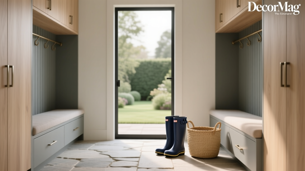
How to Choose Colors for a Mudroom - The Decor Mag
A mudroom works harder than almost any other space in the house. It’s the landing strip for wet boots, muddy paws, backpacks, sports gear, grocery bags, and the inevitable “where do we put this?” moments. Because it’s a high-traffic, high-function zone, the right paint colors and color scheme choices can make it feel calmer, cleaner, and more intentional—without asking you to baby the walls.
Color matters in a mudroom for two big reasons: perception and performance. The right hues can visually “edit” clutter, brighten a narrow pass-through, and create a welcoming transition between outdoors and indoors. The wrong ones can magnify scuffs, make the space feel dingy, or fight with adjacent rooms. With a smart palette and durable finishes, a mudroom can be both practical and beautiful—an everyday space that still feels designed.
Below, you’ll find expert guidance grounded in color theory, color psychology, and real-life application: how to read light, choose undertones, build cohesive color schemes, and pick specific paint color names that stand up to busy life.
Start with How Your Mudroom Functions
Before you fall in love with a paint chip, define how the mudroom needs to feel and work. Color selection becomes much easier once you know what you’re designing for.
Ask these quick questions
- Is it a pass-through or a destination? A hallway-style mudroom often benefits from lighter, brighter paint colors to avoid a tunnel effect.
- Who uses it most? Kids and pets call for forgiving mid-tones and washable finishes.
- What’s stored here? If the space is visually busy (open cubbies, lots of gear), calmer neutrals help reduce visual noise.
- Is there a bench, lockers, or built-ins? Your palette should define what recedes (walls) and what stands out (cabinetry, hooks, door).
Color psychology for mudrooms
- Soft greens feel restorative and pair beautifully with natural textures (jute, wood, stone).
- Blues read clean and orderly; deeper blues add sophistication and hide scuffs.
- Warm neutrals feel welcoming, especially when the mudroom connects to a kitchen or family room.
- Charcoal and deep tones create a tailored “utility-chic” look, especially in larger mudrooms with good lighting.
Read the Light: The Most Overlooked Step
Lighting influences paint colors more in a mudroom than in many rooms because mudrooms often have limited windows, shaded porches, or mixed lighting (overhead fixtures + daylight spill from adjacent spaces). Choosing colors based on light is foundational interior color design.
How to evaluate your mudroom light
- Identify the natural light direction (if any).
- North-facing: cooler, grayer light; warm neutrals and soft greiges prevent the space from feeling cold.
- South-facing: bright, warm light; cooler tones (blue-grays, crisp whites) stay balanced.
- East-facing: warm morning light, cooler afternoons; look for balanced undertones.
- West-facing: cooler mornings, warm afternoons; avoid overly yellow paints that can turn brassy at sunset.
- Check your bulbs. Warm LEDs (2700K–3000K) make whites creamier; neutral LEDs (3500K) keep colors truer; cool LEDs can make grays look steely.
- Test large swatches. Paint poster boards and move them around—mudroom walls often have shadows from doors, built-ins, and hooks.
Choose a Base: Light, Mid-Tone, or Deep Color Scheme
A successful mudroom palette usually follows a simple hierarchy: a wall color, a trim color, and one accent (cabinetry, door, or wallpaper). Decide your “base level” first.
Option 1: Light and airy mudroom paint colors
Best for small mudrooms, narrow entry corridors, and spaces without windows. Light colors reflect what little light exists and feel cleaner—especially with a semi-gloss or satin finish that wipes easily.
- Benjamin Moore White Dove (OC-17): a warm white that stays soft, not stark; great for walls or trim.
- Sherwin-Williams Alabaster (SW 7008): warm, creamy, and welcoming; pairs well with black hooks and oak benches.
- Farrow & Ball School House White (No. 291): a muted, lived-in off-white that feels classic in older homes.
Application scenario: A small mudroom off a garage with no window. Paint walls White Dove, use Chantilly Lace (OC-65) for crisp trim if you want extra contrast, and ground the space with a charcoal tile floor and a durable runner.
Option 2: Mid-tone “forgiving” neutrals
Mid-tones are the sweet spot for many homeowners: they hide scuffs better than bright whites, still feel open, and make built-ins look intentional. This is where greige, taupe, and soft earthy colors shine.
- Benjamin Moore Edgecomb Gray (HC-173): a warm greige that reads cozy and clean; excellent for mudrooms that connect to warm wood floors.
- Sherwin-Williams Accessible Beige (SW 7036): a versatile neutral for open-plan homes; pairs well with white trim and matte black hardware.
- Benjamin Moore Pale Oak (OC-20): a gentle greige that looks elevated in both modern and traditional spaces.
Application scenario: A family mudroom with open cubbies. Use Edgecomb Gray on walls, bright white trim, and add a deep accent on the interior of cubbies (like Hale Navy) to make everyday clutter feel more “contained.”
Option 3: Deep, dramatic mudroom color schemes
Deep paint colors make a mudroom feel upscale and tailored. They’re also practical: darker walls disguise marks, especially around doorways and bench backs. The key is balancing with enough light elements (trim, ceiling, tile, or built-ins) so it doesn’t feel heavy.
- Benjamin Moore Hale Navy (HC-154): a classic navy that works with brass, nickel, or black hardware.
- Sherwin-Williams Iron Ore (SW 7069): a soft charcoal-black; great for modern mudrooms and dramatic doors.
- Farrow & Ball Railings (No. 31): an inky blue-black that feels rich and architectural.
Application scenario: A larger mudroom with windows and built-in lockers. Paint the built-ins Iron Ore in a durable enamel, keep walls a warm white like Alabaster, and add a patterned floor tile to energize the palette.
Undertones: The Secret to Mudroom Colors That “Click”
Undertones are the quiet color shifts inside neutrals—yellow, pink, green, blue—that determine whether paint colors harmonize or clash. In a mudroom, undertones matter because the space is often adjacent to kitchens, hallways, or living areas. A mudroom color scheme should bridge those transitions.
Quick undertone matching guide
- Warm wood floors (oak, honey maple): choose warm whites (Alabaster), warm greiges (Edgecomb Gray), or earthy greens (Saybrook Sage).
- Cool gray tile or concrete: choose crisp whites (Chantilly Lace), blue-grays (Stonington Gray), or charcoals (Iron Ore).
- Lots of greenery visible outside: avoid green-leaning grays that can look murky; consider a balanced greige or a clean white.
Color recommendation: If you love gray but want it to stay timeless, try Benjamin Moore Stonington Gray (HC-170)—a popular choice for entryways and mudrooms that feels calm without turning icy in many settings.
Build a Cohesive Palette (Walls + Trim + Built-Ins)
The easiest way to create a polished mudroom is to assign each surface a role. Think in layers: background, structure, and accents.
A reliable 60/30/10 approach
- 60%: wall color (the backdrop)
- 30%: built-ins/bench/cabinetry or flooring (the “architecture”)
- 10%: accents—door color, hooks, baskets, wallpaper, artwork
Color combinations that work in real mudrooms
- Classic coastal utility: Walls White Dove + Built-ins Hale Navy + Accents in natural seagrass and brushed nickel
- Warm modern farmhouse: Walls Accessible Beige + Trim Alabaster + Door Iron Ore + Oak bench
- Earthy, nature-inspired: Walls Benjamin Moore Saybrook Sage (HC-114) + Trim White Dove + Black hooks + terracotta or slate floor
- Clean and contemporary: Walls Stonington Gray + Trim Chantilly Lace + Built-ins in matte black + concrete-look tile
Where to Use Bold Color in a Mudroom
If you want personality without overwhelming the space, concentrate strong color in smaller zones. This is especially effective in mudrooms with lots of doors and trim breaks.
High-impact, low-risk places for color
- The front or back door: Try Benjamin Moore Caliente (AF-290) for an energizing red or Sherwin-Williams Evergreen Fog (SW 9130) for a modern green-gray.
- Built-in lockers/cubbies: Deep tones like Hale Navy or Railings make storage feel intentional.
- Wainscoting or beadboard: Paint the lower half a mid-tone to hide scuffs and keep the top half light.
- Ceiling: A soft color overhead can feel charming in cottage-style homes (especially if walls are white).
Finish and Durability: Paint That Can Handle Real Life
Mudrooms need washable paint colors and durable finishes. The best color scheme in the world won’t matter if it scuffs instantly.
Best finishes by surface
- Walls: satin or eggshell for wipeability without too much shine
- Trim and doors: semi-gloss for durability and crispness
- Built-ins: cabinet-grade enamel in satin or semi-gloss (ask your paint store for their best cabinet line)
Practical tip for high-traffic zones
- Use a slightly deeper wall color near bench areas (or add wainscoting) to reduce visible marks.
- Choose a matte paint only if you’re using a premium washable matte specifically designed for scrubbing.
Real Room Examples and Application Scenarios
1) The “garage entry” mudroom (no windows, lots of mess)
- Goal: Brighten and disguise scuffs
- Walls: Sherwin-Williams Alabaster (SW 7008)
- Built-ins: Sherwin-Williams Iron Ore (SW 7069)
- Trim: match Alabaster in semi-gloss
- Why it works: Warm white expands the space; charcoal storage hides daily wear; the contrast looks intentional.
2) The “historic home” mudroom (wood floors, vintage character)
- Goal: Honor warmth and tradition
- Walls: Benjamin Moore Edgecomb Gray (HC-173)
- Trim: Benjamin Moore White Dove (OC-17)
- Accent: a deep green door like Benjamin Moore Essex Green (HC-188)
- Why it works: Greige echoes aged wood; white trim feels period-appropriate; green connects to the outdoors.
3) The “open-plan connector” mudroom (visible from kitchen)
- Goal: Flow with adjacent rooms
- Walls: Benjamin Moore Pale Oak (OC-20)
- Built-ins: Benjamin Moore Hale Navy (HC-154) or a softer blue-gray for subtlety
- Hardware: brushed brass for warmth and polish
- Why it works: Pale Oak acts as a quiet bridge; navy adds structure and helps the mudroom feel “designed,” not incidental.
Common Mudroom Color Mistakes to Avoid
- Choosing bright white walls with no contrast. In a muddy, busy space, flat bright white can read harsh and show marks. Add a mid-tone lower half, deeper built-ins, or warmer white paint colors.
- Ignoring undertones next to tile and countertops. A gray with green undertones can look swampy next to certain stone or vinyl floors. Always compare samples against fixed finishes.
- Using a trendy color without a supporting palette. A bold shade looks best when trim, flooring, and hardware are chosen to support it (not compete).
- Skipping sample tests under real lighting. Mudrooms are shadowy and mixed-light; a color that looks perfect in the store can turn dull at home.
- Picking the wrong sheen. Chalky matte walls that can’t be scrubbed won’t survive backpacks and boots. Choose washable finishes.
FAQ: Mudroom Paint Colors and Color Schemes
What are the best paint colors for a small mudroom?
Light, warm neutrals tend to open up tight spaces. Try Benjamin Moore White Dove (OC-17), Sherwin-Williams Alabaster (SW 7008), or a soft greige like Benjamin Moore Pale Oak (OC-20). Pair with slightly higher sheen (eggshell or satin) for durability and light bounce.
Should a mudroom be the same color as the hallway or kitchen?
It doesn’t have to match, but it should coordinate. If the mudroom is visible from adjacent rooms, choose a related undertone (warm with warm, cool with cool). A mudroom can be one shade deeper or lighter than the nearby wall color to create gentle definition while maintaining flow.
What colors hide dirt and scuffs best in a mudroom?
Mid-tone neutrals and deeper hues are the most forgiving. Consider Benjamin Moore Edgecomb Gray, Sherwin-Williams Accessible Beige, or a deep option like Sherwin-Williams Iron Ore. Avoid ultra-bright whites in the highest-contact zones unless you add wainscoting or washable paint.
Are dark mudroom paint colors a good idea?
Yes—if you balance them. Dark colors like Benjamin Moore Hale Navy or Farrow & Ball Railings look sophisticated and can disguise wear. Use lighter trim, good lighting, and reflective elements (mirrors, glossy tile) to keep the space from feeling heavy.
How do I choose a mudroom color if there’s no natural light?
Start with a warm white or warm greige to prevent a gray, cave-like effect. Sherwin-Williams Alabaster and Benjamin Moore White Dove are strong choices. Upgrade your light bulbs to a consistent color temperature and test samples at night, since artificial light will do most of the work.
What sheen is best for mudroom walls and trim?
For most mudrooms: satin or eggshell on walls and semi-gloss on trim and doors. Built-ins benefit from a cabinet-grade enamel in satin or semi-gloss for maximum durability.
Next Steps: A Simple Plan to Choose Your Mudroom Colors
- Take inventory of fixed finishes (flooring, tile, countertops, adjacent room colors).
- Decide the mood: airy and bright, warm and grounding, or dark and dramatic.
- Pick one anchor color for walls or built-ins, then choose trim and accent colors that support it.
- Test 2–4 samples on large boards and check them morning, afternoon, and night.
- Choose durable finishes suited for washable, high-traffic performance.
A mudroom color scheme doesn’t need to be complicated—it needs to be intentional. When the paint colors align with your light, your finishes, and the way your household actually moves through the space, your mudroom becomes more than a drop zone. It becomes a smooth, welcoming transition that makes the whole home feel more put together.
For more paint color ideas, color combinations, and room-by-room interior color design guides, explore the latest color articles on thedecormag.com.
More Articles
 Best Kitchen Design for Studio Apartments: Smart, Stylish & Space-Saving Solutions
 How to Use Color to Create Warmth - The Decor Mag
 Sage Green Paint: Most Versatile Neutral (2026)
 How to Choose Colors for a Nursery - The Decor Mag
 How to Choose Colors for a Garage Conversion - The Decor Mag
 Kitchen & Bedroom Inspiration Essentials: Functional Design, Proven Color Systems, and Space-Smart Layouts
 How to Choose Colors for a Garden Room - The Decor Mag
 Best Pine Green Paint Colors - The Decor Mag
 Best Jade Green Paint Colors - The Decor Mag
 Saturated Colors in Decor: Use Without Overwhelming