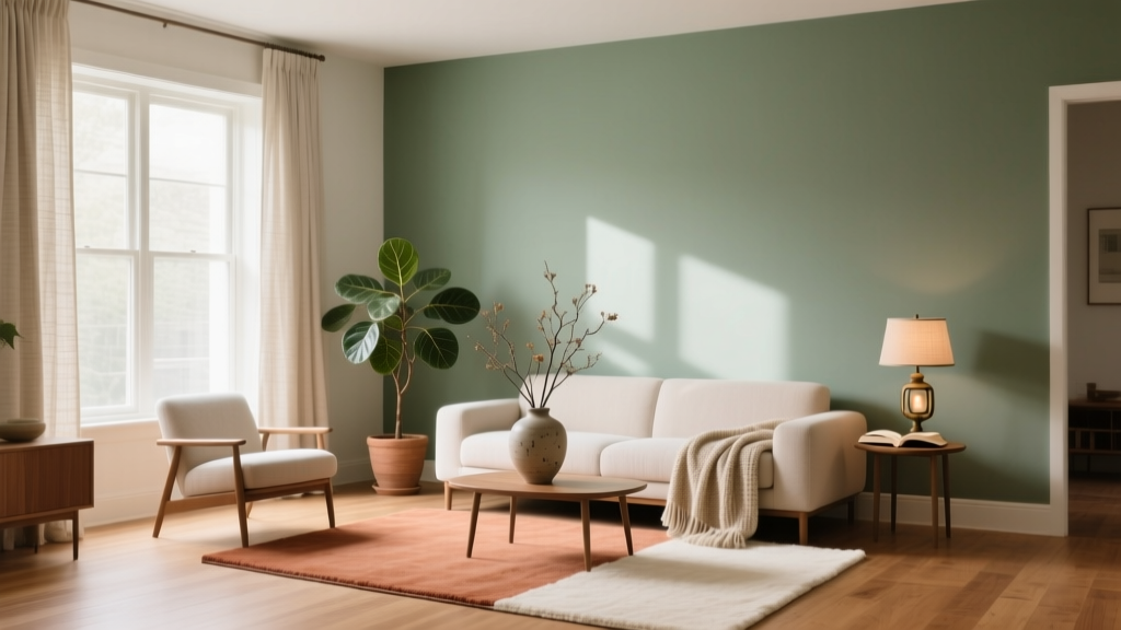
Color Psychology in Home Design Guide - The Decor Mag
Color is one of the fastest ways to change how a home feels. Before you buy a new sofa or start a renovation, paint colors and color schemes can quietly reshape mood, energy, and even how spacious a room appears. That’s color psychology at work—your brain’s learned associations with hues, light levels, and contrast.
Home design gets especially interesting when you pair color psychology with practical interior color design principles: undertones, natural light, sheen, and how adjacent rooms connect. The goal isn’t to follow rigid rules; it’s to choose paint colors that support how you want to live—calmer mornings, more focused workdays, cozier evenings, or a more welcoming entry.
This guide breaks down how to use color theory in real homes, with paint color recommendations, room-by-room examples, and common mistakes to avoid—so your next color decision feels confident rather than overwhelming.
How Color Psychology Works in Interiors
Color temperature: warm vs. cool
Warm colors (reds, oranges, warm beiges, many yellows) tend to feel energizing and intimate. Cool colors (blues, greens, cool grays) read calmer and can visually “push” walls outward, making spaces feel larger.
- Warm palettes suit social areas: living rooms, dining rooms, kitchens (especially in cooler climates).
- Cool palettes are strong for relaxation and focus: bedrooms, bathrooms, home offices.
Value and saturation: why “how bright” matters
Two blues can behave like different colors. A pale, low-saturation blue feels airy and restorative; a deep, saturated navy can feel dramatic, secure, and cocooning. Value (lightness/darkness) affects perceived size, and saturation affects intensity.
- Light colors reflect more light and often feel open and fresh.
- Dark colors absorb light, increase contrast, and create mood (great for dens, powder rooms, and bedrooms).
- Muted colors are easier to live with long-term and pair well with natural materials.
Undertones: the hidden reason colors clash
Undertone is the subtle color cast within a paint color (yellow, pink, green, violet, etc.). It explains why one “white” looks creamy and another looks icy. Undertones matter most when you’re matching:
- fixed finishes (countertops, tile, wood floors)
- metals (brass vs. chrome)
- adjacent rooms in an open floor plan
Room-by-Room Color Psychology (with Paint Color Recommendations)
Living Room: welcoming, balanced, and flexible
Living rooms need a color scheme that works day-to-night and complements upholstery, rugs, and art. Psychologically, you want “approachable calm”—a hue that supports conversation without feeling sleepy.
Best color directions:
- Warm greige and soft taupe for a grounded, modern-neutral feel
- Muted blue-green for calm and sophistication
- Earthy clay tones for warmth that still feels elevated
Paint color ideas (popular, designer-approved):
- Benjamin Moore Edgecomb Gray (HC-173) — warm greige that reads cozy, not beige
- Sherwin-Williams Agreeable Gray (SW 7029) — versatile greige for open-concept color schemes
- Farrow & Ball Pigeon (No. 25) — a complex blue-green that shifts beautifully in daylight
Real-room scenario: In a north-facing living room (cool light), a warm greige like Edgecomb Gray keeps the space inviting. Pair it with creamy trim (Benjamin Moore White Dove (OC-17)) and add contrast with charcoal textiles and walnut wood.
Kitchen: clean energy without visual fatigue
Kitchens perform better with crisp, appetizing color. Bright whites and light neutrals signal cleanliness, while certain greens and blues feel fresh and timeless.
Best color directions:
- Warm white for a bright, welcoming heart-of-home feel
- Sage green for a natural, calming kitchen that still has personality
- Deep navy for lower cabinets or an island to add sophistication
Paint color ideas:
- Benjamin Moore Simply White (OC-117) — warm, luminous white (great for cabinets)
- Sherwin-Williams Alabaster (SW 7008) — soft warm white that’s forgiving in varied light
- Farrow & Ball Setting Plaster (No. 231) — a modern blush-beige that pairs well with brass
- Benjamin Moore Hale Navy (HC-154) — classic, rich navy for an island or pantry door
Real-room scenario: For a family kitchen with white quartz counters and warm oak floors, use Alabaster on walls, a sage green like Sherwin-Williams Clary Sage (SW 6178) on cabinetry, and matte black hardware for crisp contrast.
Bedroom: calm, cocooning, and sleep-supportive
Bedrooms benefit from colors that lower perceived stimulation. Cool hues often support rest, while deeper shades can reduce visual “noise” and make a room feel like a retreat.
Best color directions:
- Dusty blue for serenity
- Soft green for restoration and connection to nature
- Warm taupe for calm without feeling cold
Paint color ideas:
- Benjamin Moore Boothbay Gray (HC-165) — a calming blue-gray that works with white bedding
- Sherwin-Williams Sea Salt (SW 6204) — a light blue-green that reads spa-like
- Farrow & Ball Railings (No. 31) — deep blue-black for a moody, boutique-hotel feel
Real-room scenario: In a primary bedroom with lots of warm wood, Boothbay Gray balances warmth and coolness. Use crisp white trim, linen curtains, and a warm brass bedside lamp to keep it from feeling chilly.
Bathroom: fresh, flattering, and spa-like
Bathrooms are often smaller and have cooler artificial lighting. Choose paint colors that stay pleasant under LEDs and complement tile.
Best color directions:
- Soft blue-green for a spa vibe
- Clean off-white for timeless brightness
- Deep color in powder rooms for drama (small rooms can handle bold)
Paint color ideas:
- Sherwin-Williams Snowbound (SW 7004) — bright, slightly cool white that feels crisp
- Benjamin Moore Quiet Moments (1563) — gentle blue-green for a tranquil bath
- Farrow & Ball Hague Blue (No. 30) — statement color for a powder room with brass accents
Application tip: In humid spaces, choose a moisture-resistant paint line and consider a satin or semi-gloss finish for wipeability—especially on the ceiling above a shower.
Home Office: focus, clarity, and reduced stress
For productivity, color should support concentration without feeling sterile. Blues can reduce perceived stress, greens are balanced and eye-friendly, and warm neutrals can prevent “office coldness.”
- Benjamin Moore October Mist (1495) — soft green that feels modern and calm
- Sherwin-Williams Accessible Beige (SW 7036) — warm neutral that pairs with wood desks
- Benjamin Moore Chantilly Lace (OC-65) — crisp white for trim or a bright minimal office
Real-room scenario: If your desk faces a window and glare is an issue, avoid bright pure white on the wall in front of you. Instead, use a gentle green like October Mist to soften contrast on video calls and reduce visual fatigue.
Entryway and Hallways: first impressions and flow
These transition zones influence how the whole home feels. Light-reflective colors make tight hallways feel larger, while richer tones can turn an entry into a moment.
Great choices:
- Benjamin Moore White Dove (OC-17) — warm, classic for cohesive whole-home color schemes
- Sherwin-Williams Repose Gray (SW 7015) — soft gray that reads clean in many lights
- Benjamin Moore Caliente (AF-290) — bold red for a confident front door (use strategically)
Winning Color Schemes (Tried-and-True Combinations)
1) Warm neutral + crisp white + black accents
- Walls: Sherwin-Williams Agreeable Gray (SW 7029)
- Trim: Benjamin Moore Chantilly Lace (OC-65)
- Accents: matte black lighting, frames, or cabinet hardware
Why it works: high contrast reads tailored and timeless, and it plays well with most furniture styles.
2) Sage green + cream + natural wood
- Walls/Cabinets: Sherwin-Williams Clary Sage (SW 6178)
- Trim: Benjamin Moore White Dove (OC-17)
- Materials: oak, rattan, linen, antique brass
Why it works: green sits in the middle of the spectrum and feels restful, making it an easy “new neutral.”
3) Moody navy + warm white + brass
- Feature wall or cabinetry: Benjamin Moore Hale Navy (HC-154)
- Walls/trim: Sherwin-Williams Alabaster (SW 7008)
- Accents: brass, warm leather, creamy textiles
Why it works: navy adds depth and perceived luxury; warm white prevents the room from feeling heavy.
Choosing Paint Colors Like a Designer
Step-by-step process (fast, reliable)
- Start with fixed elements: flooring, tile, countertops, large upholstery pieces.
- Pick a direction: warm, cool, or balanced (based on undertones you already have).
- Test large samples: paint 2’x2’ swatches on multiple walls or use large peel-and-stick samples.
- Check color shifts: morning, afternoon, evening, and under lamps.
- Confirm sheen: matte for low-traffic walls, eggshell for most rooms, satin for kitchens/halls, semi-gloss for trim.
Practical light guidance
- North-facing rooms: light is cooler; lean warmer (creamy whites, warm greiges).
- South-facing rooms: bright warm light; many colors work, but watch overly warm yellows.
- East-facing rooms: warm morning, cooler later; choose balanced neutrals.
- West-facing rooms: intense warm afternoon; avoid overly saturated warm tones if you want calm.
Real Application Scenarios (What to Paint Where)
Scenario A: Open-concept living/dining/kitchen
Goal: A cohesive interior color design that doesn’t feel flat.
- Main walls: Sherwin-Williams Accessible Beige (SW 7036) (warm, steady)
- Trim: Benjamin Moore White Dove (OC-17)
- Kitchen island: Benjamin Moore Hale Navy (HC-154)
Why it works: one continuous neutral keeps flow, while the island adds a focal point without “chopping up” the space.
Scenario B: Small bedroom that feels cramped
Goal: Expand the feel while staying cozy.
- Walls: Sherwin-Williams Sea Salt (SW 6204)
- Ceiling: same color at 50% strength (or full strength if you want a cocoon effect)
- Trim: Sherwin-Williams Snowbound (SW 7004)
Scenario C: Dated beige home that needs modernizing
Goal: Update without going stark gray.
- Main walls: Benjamin Moore Edgecomb Gray (HC-173)
- Accent room (office/den): Benjamin Moore October Mist (1495)
- Front door: Benjamin Moore Caliente (AF-290) for a confident pop
Common Color Mistakes to Avoid
- Picking paint first: Start with floors, tile, and key furnishings so undertones align.
- Testing only on one wall: Paint shifts dramatically with light direction; test multiple areas.
- Ignoring sheen: The same color in satin looks brighter than matte; sheen changes perception.
- Overusing bright white: In rooms with warm finishes, a cool white can look harsh or bluish.
- Too many unrelated colors: A whole-home color scheme needs repetition—repeat one neutral, one metal finish, and one wood tone for harmony.
- Forgetting transitions: Hallways and adjacent rooms should share a common undertone to avoid visual “jolts.”
FAQ: Color Psychology and Paint Colors at Home
What are the best calming paint colors for bedrooms?
Muted blues, blue-greens, and soft greens tend to read restful. Try Benjamin Moore Boothbay Gray (HC-165), Sherwin-Williams Sea Salt (SW 6204), or Benjamin Moore Quiet Moments (1563).
How do I choose between warm white and cool white?
Look at your fixed finishes. Warm woods and beige stone usually pair best with warm whites like Sherwin-Williams Alabaster (SW 7008) or Benjamin Moore Simply White (OC-117). Cool grays, marble, and chrome often suit cooler whites like Sherwin-Williams Snowbound (SW 7004).
Can I use dark paint colors in small rooms?
Yes. Dark colors can make small rooms feel intentional and cozy, especially in powder rooms, dens, and bedrooms. Try Farrow & Ball Hague Blue (No. 30) or Benjamin Moore Hale Navy (HC-154), and balance with warm lighting and lighter textiles.
What’s the easiest way to create a cohesive whole-home color scheme?
Choose one main neutral with a consistent undertone, one crisp trim color, and 1–2 accent hues you repeat in multiple rooms (textiles, art, or an accent wall). Keeping undertones consistent is what makes the flow feel natural.
How many paint samples should I test before deciding?
Plan to test 3–6 options per room, especially for whites and neutrals. Use large samples and view them across the full day under both natural and artificial light.
Next Steps: Make Color Psychology Work for Your Home
Choose one room and define the feeling you want there—energized, calm, cozy, focused, or social. Then narrow your options to a small set of paint colors with matching undertones, test large samples, and confirm how they look at night under your actual bulbs. Once you find a “home base” neutral you love, building a cohesive color scheme across adjacent rooms becomes much easier.
For more paint color ideas, color scheme formulas, and room-by-room interior color design help, explore the latest color guides on thedecormag.com.
More Articles
 How to Choose Accent Wall Colors - The Decor Mag
 Best Red Paint Colors for Drama and Warmth - The Decor Mag
 Friendly and Smart Compared: How Human-Centered Design and AI Intelligence Shape Modern Product Experiences
 How to Choose Colors for Small Spaces - The Decor Mag
 How to Choose Colors for a Mudroom - The Decor Mag
 How To Organize Island: A Practical, Space-Smart Guide for Kitchens of All Sizes
 Best Oxblood Paint Colors - The Decor Mag
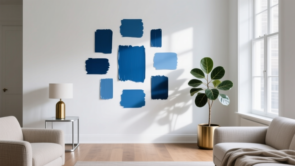 Best Cerulean Blue Paint Colors - The Decor Mag
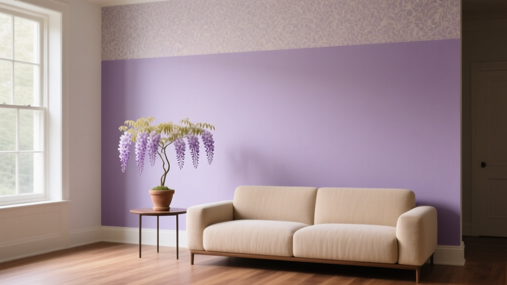 Best Wisteria Paint Colors - The Decor Mag
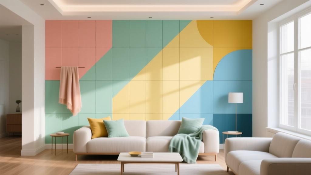 How to Create a Playful Color Palette - The Decor Mag