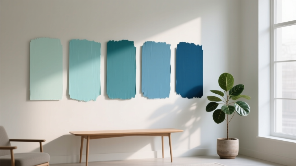
Best Aqua Paint Colors - The Decor Mag
Aqua sits in that sweet spot between blue and green—fresh, clean, and quietly energizing. It can read coastal and carefree, or polished and architectural, depending on the undertone and the light in your space. Homeowners love aqua because it brightens rooms without the intensity of a bold primary, and it pairs beautifully with today’s most popular materials: white oak, warm brass, matte black, honed marble, and natural textures like linen and jute.
Choosing the best aqua paint color matters because “aqua” isn’t one color—it’s a family. Some aquas lean blue (crisper and calmer), others lean green (more botanical and spa-like), and some have a gray cast (sophisticated and modern). The difference is subtle on a paint chip and dramatic on a wall. When you select the right aqua, it can make a small bathroom feel airy, turn a dim bedroom into a restorative retreat, or give a kitchen island a confident focal point without overpowering the room.
Below, you’ll find designer-approved aqua paint colors, guidance on undertones and lighting, real room scenarios, color combinations, and the most common mistakes that lead to “too bright” or “too baby-ish” results—plus easy fixes.
What Makes a Paint Color “Aqua” (And Why Undertones Matter)
Aqua is typically a light-to-mid value blue-green. The most livable aquas balance saturation (color intensity) with a touch of gray or white so the color feels airy rather than neon. Where aqua lands on the spectrum influences the mood:
- Blue-leaning aqua: cleaner, cooler, often reads “coastal” and pairs well with crisp whites and chrome.
- Green-leaning aqua: more organic, spa-like, and flattering with warm woods and brass.
- Gray-leaning aqua: calmer and more modern; better for open-concept spaces where you want subtle color.
Color psychology plays a role, too. Blue-green hues are associated with clarity, calm, and balance. Used thoughtfully, aqua can reduce visual “heat” in sunny rooms, soften busy spaces, and create the sense of fresh air—especially when paired with natural light and tactile neutrals.
How Lighting Changes Aqua on Your Walls
- North-facing light: cooler and dimmer; aquas can look more blue/gray. Choose a slightly warmer aqua or one with a hint of green.
- South-facing light: warm and bright; aquas can look more vibrant. Consider a softened or gray-leaning aqua for a refined look.
- East-facing light: bright and cool in the morning, flatter later; aquas may shift from crisp to muted.
- West-facing light: warm afternoon light can make aqua feel greener; sample on multiple walls.
Best Aqua Paint Colors (Designer-Approved Picks)
These aqua paint colors are reliable standouts across a range of homes and styles. Always test with large peel-and-stick samples or painted poster boards before committing—especially with aquas, which can shift dramatically as the day changes.
1) Benjamin Moore Palladian Blue (HC-144)
Why it works: A classic soft aqua with a gentle gray cast. It reads airy and upscale rather than playful, making it one of the most versatile blue-green paint colors.
- Best for: bedrooms, bathrooms, living rooms, open-concept areas
- Pairs well with: Benjamin Moore White Dove (trim), warm oak, brushed brass, creamy stone
- Look: “Relaxed elegance” with a coastal nod
Real room scenario: Use Palladian Blue on bedroom walls with white linen bedding, a natural jute rug, and warm brass reading sconces. Add depth with navy accents (pillows or art) to keep it from feeling too pastel.
2) Benjamin Moore Woodlawn Blue (HC-147)
Why it works: A lighter, fresher aqua that feels clean and uplifting. It’s slightly more “sky-washed” than Palladian Blue.
- Best for: nurseries (without feeling babyish), guest rooms, hallways, laundry rooms
- Pairs well with: soft whites, light gray tile, pale maple, matte black hardware
- Look: bright, breezy, tidy
Real room scenario: Paint a narrow hallway Woodlawn Blue with crisp white trim and framed black-and-white photography. The aqua expands the space visually and adds personality without darkening the corridor.
3) Sherwin-Williams Rainwashed (SW 6211)
Why it works: A spa-like blue-green that often reads as a soft aqua in natural light. It’s soothing, flattering, and especially popular for bathrooms.
- Best for: bathrooms, primary suites, calm home offices
- Pairs well with: white subway tile, honed marble, light oak, polished nickel
- Look: “high-end wellness retreat”
Real room scenario: In a bathroom with white tile and a marble-top vanity, Rainwashed on the walls creates a clean, refreshed feel. Add woven baskets and a eucalyptus arrangement for a layered, organic finish.
4) Sherwin-Williams Sea Salt (SW 6204)
Why it works: Sea Salt is a subtle blue-green that can read aqua, green-gray, or soft blue depending on lighting. If you want aqua energy without obvious color, this is a safe and sophisticated entry point.
- Best for: open-concept spaces, kitchens, transitional homes, low-contrast palettes
- Pairs well with: creamy whites, greige upholstery, driftwood tones, satin brass
- Look: muted coastal modern
Real room scenario: Use Sea Salt in a kitchen breakfast nook with upholstered chairs in oatmeal linen and a natural wood pedestal table. The color reads calm and cohesive with stone counters and warm metals.
5) Farrow & Ball Pale Powder (No. 204)
Why it works: A refined, chalky blue-green that feels timeless in traditional and contemporary spaces. It has a softly powdered finish that plays beautifully with heritage details and modern silhouettes.
- Best for: powder rooms, dining rooms, built-ins, cabinetry
- Pairs well with: warm whites, aged brass, dark walnut, classic marble
- Look: understated European calm
Real room scenario: Paint built-in bookcases Pale Powder with a warm white wall. Style shelves with cream ceramics, brass picture frames, and a few black accents to keep the palette crisp and curated.
6) Behr Watery (500E-3)
Why it works: A brighter aqua that still feels livable when balanced with grounding neutrals. Great when you want a cheerful “pop” but not a neon statement.
- Best for: accent walls, kids’ rooms, creative studios, furniture refreshes
- Pairs well with: bright white, light gray, pale birch, colorful art
- Look: playful, upbeat, modern
Real room scenario: Use Behr Watery on a single wall behind a desk in a home office. Keep the rest of the room neutral and introduce a warm wood desktop to prevent the aqua from feeling cold.
7) Valspar Sea Glass (Many retailers carry a “Sea Glass” shade; confirm undertone in-store)
Why it works: Sea-glass-inspired aquas tend to be softly gray-green and easy to live with. This category is excellent for homeowners who want a “found object” color—collected, not loud.
- Best for: bedrooms, bathrooms, cottage-style interiors
- Pairs well with: creamy trim, rattan, weathered woods, linen textures
- Look: relaxed, natural, coastal without theme
How to Choose the Right Aqua for Your Home
Step-by-step selection checklist
- Identify fixed finishes: tile, countertops, floors, and stone are your anchors.
- Decide on the mood: crisp (blue-leaning), botanical (green-leaning), or modern (gray-leaning).
- Sample on multiple walls: especially the wall opposite your main window.
- Check at three times of day: morning, mid-day, evening under lamp light.
- Confirm sheen: aqua often looks best in eggshell (walls) and satin/semigloss (trim/cabinetry) depending on durability needs.
Quick guide: Aqua by room
- Bedroom: Rainwashed, Palladian Blue, Sea Salt for restful, sleep-friendly color.
- Bathroom: Rainwashed or Sea Salt for spa calm; Woodlawn Blue for freshness.
- Kitchen island or cabinets: Pale Powder for sophistication; Palladian Blue for a classic blue-green focal point.
- Living room: Palladian Blue or Sea Salt to keep it inviting and flexible with changing decor.
- Front door: A brighter aqua like Behr Watery works well as a cheerful statement—pair with crisp white trim and black hardware.
Winning Aqua Color Schemes (With Pairing Ideas)
Aqua is a natural team player. Use these combinations to create a cohesive interior color design that feels intentional, not accidental.
Classic coastal (not theme-y)
- Aqua wall: Benjamin Moore Palladian Blue
- Trim: Benjamin Moore White Dove
- Accents: navy, sandy beige, and sun-bleached wood
- Materials: linen, sisal, light oak, aged brass
Modern spa
- Aqua wall: Sherwin-Williams Rainwashed
- Supporting neutral: soft warm white or light greige
- Accents: charcoal, eucalyptus green, matte black
- Materials: honed marble, microcement, ribbed glass, plush white towels
Mid-century cheerful
- Aqua feature: Behr Watery on an accent wall or cabinetry
- Supporting neutral: warm white
- Accents: terracotta, mustard, walnut, and graphic black
- Materials: walnut furniture, boucle upholstery, geometric art
Soft traditional
- Aqua: Farrow & Ball Pale Powder
- Trim: a creamy white
- Accents: antique brass, deep olive, soft blush
- Materials: tailored drapery, classic marble, warm wood tones
Real-World Application Scenarios (Where Aqua Shines)
Aqua in a small bathroom
Small bathrooms often benefit from aqua because it reflects light and suggests cleanliness. For a polished look:
- Choose a soft aqua like Rainwashed or Sea Salt.
- Use white tile and light grout to keep the room open.
- Add one contrast element: a black-framed mirror or brass sconces.
Aqua on kitchen cabinetry or an island
Aqua cabinetry feels custom when the undertone aligns with your counters and floors.
- Pair aqua cabinets with white quartz or marble-look surfaces for freshness.
- Ground the look with natural wood stools or a wood hood.
- Choose hardware based on undertone: brass warms green-leaning aquas; chrome/nickel complements blue-leaning aquas.
Aqua in a bedroom for better rest
Blue-green hues are associated with calm and balance, making aqua a strong choice for sleep spaces.
- Keep contrast low: aqua walls + warm white trim + soft textiles.
- Use one deeper anchor (navy throw, charcoal headboard, or dark wood nightstands) to prevent a washed-out look.
- Avoid overly cool bulbs; use 2700K–3000K lighting for a cozy evening feel.
Common Aqua Paint Mistakes (And How to Fix Them)
- Mistake: Choosing aqua without checking undertones.
Fix: Compare your sample directly against a true white and a warm beige. The undertone becomes obvious. - Mistake: Going too bright in a sun-drenched room.
Fix: Switch to a more muted aqua like Sea Salt or Palladian Blue, or reduce the color to an accent wall. - Mistake: Pairing aqua with the wrong white.
Fix: Blue-leaning aquas like crisper whites; green-leaning aquas often look best with slightly warm whites (avoid icy whites that can turn the room stark). - Mistake: Ignoring the role of sheen.
Fix: Use eggshell or satin for most walls to keep aqua looking smooth and refined; use matte where you want a softer, velvety look (and have good wall prep). - Mistake: Over-accessorizing with beach decor.
Fix: Let the paint carry the coastal reference. Add texture (linen, cane, wood) rather than themed accessories.
FAQ: Aqua Paint Colors
Is aqua a good whole-house paint color?
Aqua can work in multiple rooms, but it’s rarely the best choice for every space. A more flexible approach is using a light neutral in main areas and adding aqua in bedrooms, bathrooms, or a feature like an island, built-ins, or a powder room.
What trim color looks best with aqua walls?
Most aquas look great with warm, soft whites (for a welcoming feel) or crisp whites (for a clean, coastal look). Popular choices include Benjamin Moore White Dove and similar balanced whites. Sample your trim white next to the aqua—whites shift, too.
How do I keep aqua from looking childish or too “pastel”?
Balance it with grown-up materials and contrast. Add darker anchors (navy, charcoal, black) and natural textures (oak, linen, stone). Choosing a slightly grayed aqua like Palladian Blue or Sea Salt also helps.
What colors pair well with aqua in a coordinated color scheme?
Strong pairings include warm whites, greige, sandy beige, navy, charcoal, soft blush, terracotta, and muted olive. Metals matter: brass warms aqua; chrome and nickel keep it crisp.
Should I use aqua in a north-facing room?
You can, but select carefully. North light can make aqua feel cooler and grayer. Consider a green-leaning or slightly warmer aqua, and use warm lighting (2700K–3000K) to keep the room inviting.
What’s the best way to test aqua paint colors before painting?
Use large samples and place them on multiple walls. View them next to your flooring and any stone/tile, and check the color in daylight and at night under your lamps. Aqua is sensitive to both natural and artificial lighting shifts.
Next Steps: Bring Aqua Into Your Home With Confidence
Start by choosing the “job” you want aqua to do—calm a bedroom, brighten a hallway, elevate a bathroom, or add personality to cabinetry. Then narrow your options by undertone (blue-leaning, green-leaning, or gray-leaning), test generously, and build a supporting cast of whites, woods, and metals that makes the aqua feel intentional.
If you’re ready to keep exploring, browse more paint color ideas, color schemes, and interior color design guides on thedecormag.com for room-by-room inspiration and expert-tested palettes.
More Articles
 How to Choose Colors for a Craft Room - The Decor Mag
 How to Create a Bold Color Story - The Decor Mag
 Best Mango Paint Colors - The Decor Mag
 Best Burnt Orange Paint Colors - The Decor Mag
 Sage Green Paint: Most Versatile Neutral (2026)
 How to Choose Colors for a Patio - The Decor Mag
 How to Choose Colors for an Entryway - The Decor Mag
 How to Choose Colors for a Gym - The Decor Mag
 Monochromatic Color Scheme Design Guide - The Decor Mag
 How to Mix Warm and Cool Tones Successfully - The Decor Mag